circular_progress_stack 0.0.1  circular_progress_stack: ^0.0.1 copied to clipboard
This package use multple circular progress bar
Stack Circular Progress #


Make an Simple or Animated multiple circular progress bar using Stack Circular Progress.
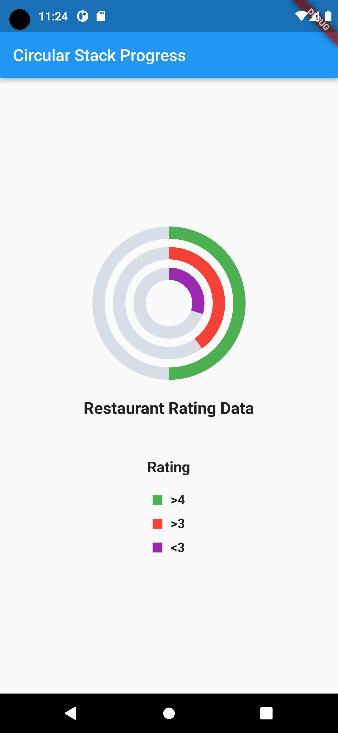
Screenshots #
| Simple Cricular Porgress | Animated Cricular Porgress |
|---|---|
 |
 |
Getting started #
Installing #
dependencies:
  circular_progress_stack: ^0.0.1
Import #
import 'package:circular_progress_stack/circularprogressstack.dart';
Example #
Stack Circular Progress #
Center(
              child: StackCircularProgress(
                //CircleSize set size according your UI
                circleSize: MediaQuery.of(context).size.width - 200,
                //StrokeWidth you can define value as per your need
                strokeWidth: 15,
                //strokeSpacePadding you can define value as per your need
                strokeSpacePadding: 10,
                //unporgressBarColor : set the color empty area of progress bar
                unporgressBarColor: const Color(0xffD7DEE7),
                //bar values list you can change according your values
                barValues: [
                  // you can set bar percentage according you progress value
                  // you can use your own color (Colors.anyColor)
                  BarValue(
                      progressValueInPercentage: 50, barColor: BarColor.green),
                  BarValue(
                      progressValueInPercentage: 40, barColor: BarColor.red),
                  BarValue(
                      progressValueInPercentage: 30, barColor: BarColor.purple),
                ],
              ),
            ),
Animated Stack Circular Progress #
  Center(
              child: AnimatedStackCircularProgress(
                //CircleSize set size according your UI
                circleSize: MediaQuery.of(context).size.width - 300,
                //StrokeWidth you can define value as per your need
                strokeWidth: 10,
                //strokeSpacePadding you can define value as per your need
                strokeSpacePadding: 0,
                //unPorgressBarWidth you can set negative or positive value both accroding your need
                unPorgressBarWidth: -5,
                //isAnimated is define progressbar will be animate or not hence, if you want disable animation set it false
                isAnimated: true,
                //unporgressBarColor : set the color empty area of progress bar
                unProgressBarColor: const Color(0xffD7DEE7),
                //animationDurationIn you can set duration of animation
                animationDurationIn: const Duration(seconds: 1),
                //bar values list you can change according your values
                barValues: [
                  // you can set bar percentage according you progress value
                  // you can use your own color (Colors.anyColor)
                  BarValue(
                      progressValueInPercentage: 50, barColor: BarColor.blue),
                  BarValue(
                      progressValueInPercentage: 40, barColor: BarColor.red),
                  BarValue(
                      progressValueInPercentage: 30, barColor: BarColor.green),
                ],
              ),
            ),
Support #
If you find any bugs or issues while using the plugin, please register an issues on GitHub. You can also contact us at mistrytrushar88@gmail.com.
Want to contribute #
If you would like to contribute to the plugin (e.g. by improving the documentation, solving a bug or adding a cool new feature), feel free to send your pull request.
Author #
This circular_progress_stack plugin for Flutter is developed by Trushar Mistry.
Metadata
10
likes
0
pub points
81%
popularity
Publisher
unverified uploader
Metadata
This package use multple circular progress bar
Homepage
Repository (GitHub)
View/report issues
License
 unknown (LICENSE)