circle_bottom_navigation_bar 1.0.0  circle_bottom_navigation_bar: ^1.0.0 copied to clipboard
An animated, beauty and functional Bottom Navigation Bar you app.
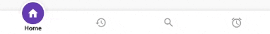
Circle Bottom Navigation #
Getting started #
Add the plugin:
dependencies:
  ...
  circle_bottom_navigation_bar: ^1.0.0
Minimum usage #
import 'package:circle_bottom_navigation_bar/circle_bottom_navigation_bar.dart';
import 'package:circle_bottom_navigation_bar/widgets/tab_data.dart';

Scaffold(
    appBar: ...,
    body: ....
    bottomNavigationBar: CircleBottomNavigationBar(
      initialSelection: currentPage,
      circleColor: Colors.purple,
      activeIconColor: Colors.white,
      inactiveIconColor: Colors.grey,
      tabs: [
        TabData(
            icon: Icons.home
            iconSize: 25,// Optional
            title: 'Home',// Optional
            fontSize: 12,// Optional
        ),
        TabData(icon: Icons.history),
        TabData(icon: Icons.search),
        TabData(icon: Icons.alarm),
      ],
      onTabChangedListener: (index) => setState(() => currentPage = index),
    )
);
Attributes #
Required #
initialSelection -> The number of page you want to start/navigate, receive a int
tabs -> List of TabData objects
onTabChangedListener -> Function to handle a tap on a tab, receives int position
Optional #
circleColor -> Defaults to null, derives from Theme
activeIconColor -> Defaults to null, derives from Theme
inactiveIconColor -> Defaults to null, derives from Theme
textColor -> Defaults to null, derives from Theme
barBackgroundColor -> Defaults to null, derives from Theme
circleSize -> Defaults to 60.0, size of intern circle
barHeight -> Defaults to 60.0, height of bar
arcHeight -> Defaults to 70.0, height of external circle arc
arcWidth -> Defaults to 90.0, width of external circle arc
circleOutline -> Defaults to 10.0
shadowAllowance -> Defaults to 20.0, size of icon shadow
hasElevationShadows -> Defaults to true, define if bar have elevation shadows
blurShadowRadius -> Defaults to 8.0, size of bar shadow if hasElevationShadows is true
key -> Defaults to null
TabData #
Required #
icon -> Icon to be used for the TabData
Optional #
title -> String to be used for the tab
onClick -> Function to be used when the circle itself is clicked, on an active tab
iconSize -> Size of icon displayed active and not active
fontSize -> Size of font in case of title has informed
fontWeight -> Weight of font in case of title has informed
Example #
There is an example project in the example folder. Check it out.
Showcase #
If you use this package in a live app, let me know and I'll add your app here. ;)
Contributing #
Found a bug? Please, open an issue and if you wanna help, do a PR :D
Metadata
Publisher
unverified uploader
Metadata
An animated, beauty and functional Bottom Navigation Bar you app.
Repository (GitHub)
View/report issues
Documentation
License
 MIT (LICENSE)
Dependencies
analyzer, flutter, vector_math