checkbox_grouped 1.1.0-nullsafety.1  checkbox_grouped: ^1.1.0-nullsafety.1 copied to clipboard
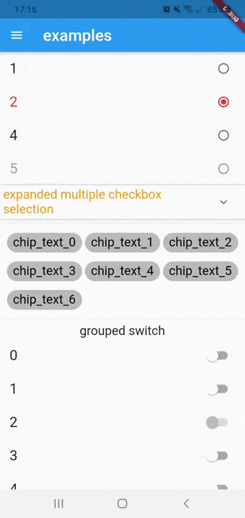
flutter widget that grouping checkbox, recuperate the actual selection,support multiple selection
checkbox_grouped #

* grouped (checkbox/radioButton)
* customisable grouped checkbox
* grouped chips
* grouped switch
* recuperate the actual selection
* make multiple selection
* dialogGroupedCheckbox
* list of groupedCheckbox
Getting Started #
Installing #
Add the following to your pubspec.yaml file:
dependencies:
	checkbox_grouped: ^1.1.0-nullsafety.1
Simple Usage #
Creating a basic SimpleGroupedCheckbox
    SimpleGroupedCheckbox<int>(
                    controller: controller,
                    itemsTitle: ["1" ,"2","4","5"],
                    values: [1,2,4,5],
                    activeColor: Colors.red,
                    checkFirstElement: false,
                    multiSelection: false,
                  )
Declare GroupController to get selection and enabled/disabled Items #
GroupController controller = GroupController();
GroupController
| Properties | Description |
|---|---|
isMultipleSelection |
(bool) enable multiple selection in grouped checkbox (default:false). |
initSelectedItem |
(List) A Initialize list of values that will be selected in grouped. |
Get current selection #
final selectedItems = controller.selectedItem;
enabled items #
controller.enabledItemsByValues(List<T> values);
controller.enabledItemsByTitles(List<String> itemsTitles);
disable item #
controller.disabledItemsByValues(List<T> values);
controller.disabledItemsByTitles(List<String> items)
NOTICE
- those method
disabledItemsandenabledItemshas been removed - if you are using complex object in values , you need to implement operator == and hashcode
SimpleGroupedCheckbox
| Properties | Description |
|---|---|
controller |
(required) Group Controller to recuperate selectionItems and disable or enableItems. |
activeColor |
The color to use when a CheckBox is checked. |
itemsTitle |
(required) A list of strings that describes each checkbox button. Each label must be distinct. |
itemsSubTitle |
A list of strings that describes second Text. |
onItemSelected |
Callback fire when the user make selection |
disableItems |
Specifies which item should be disabled. The strings passed to this must match the Titles |
values |
(required) Values contains in each element. |
checkFirstElement |
make first element in list checked. |
isExpandableTitle |
enable group checkbox to be expandable . |
groupTitle |
Text title for group checkbox. |
groupTitleStyle |
TextStyle of title for group checkbox. |
helperGroupTitle |
(bool) hide/show checkbox in title to help all selection or de-selection,use it when you want to disable checkbox in groupTitle default:true . |
groupTitleAlignment |
(Alignment) alignment of group title in group checkbox. |
Customisable Checkbox Grouped #
Creating a basic CustomGroupedCheckbox
    CustomGroupedCheckbox<int>(
            controller:customController,
            groupTitle: "Custom GroupedCheckbox",
            itemBuilder: (ctx,index,value,isDisabled){
            return Card(
                child: Row(
                    children: <Widget>[
                        Expanded(
                            child: Align(
                                alignment: Alignment.centerLeft,
                                child: Text("$index"),
                            ),
                        ),
                        Opacity(
                              opacity: v?1:0,
                              child: Icon(Icons.check,
                                color: Colors.green,
                                size: 24,
                              ),
                         ),
                      ],
                   ),
                );
            },
            itemCount: 10,
            values: List<int>.generate(10, (i)=>i),
        )
Declare CustomGroupController to get selection ,enabled/disable items #
CustomGroupController controller = CustomGroupController();
Get current selection #
final selectedItem = controller.selectedItem;
enable items #
controller.enabledItems([value]);
disable items #
controller.disabledItems([value]);
listen to changed values #
controller.listen((value){
 print(value);
})
CustomGroupedCheckbox
| Properties | Description |
|---|---|
controller |
(required) Custom Group Controller to recuperate selectionItems and disable or enableItems. |
groupTitle |
widget title for group checkbox. |
itemBuilder |
(required) Called to build children. |
values |
(required) Values contains in each element. |
itemExtent |
The extent the children are forced to have in the main axis |
isScroll |
(bool) To make list of item scrollable |
CustomGroupedCheckbox.grid
| Properties | Description |
|---|---|
controller |
(required) Custom Group Controller to recuperate selectionItems and disable or enableItems. |
groupTitle |
widget title for group checkbox. |
itemBuilder |
(required) Called to build children. |
values |
(required) Values contains in each element. |
isScroll |
(bool) To indicate that the list of children scrollable |
gridDelegate |
(SliverGridDelegate) a delegate that controls the layout of the children |
Chip grouped Usage #
Creating a basic SimpleGroupedChips
SimpleGroupedChips<int>(
                    controller: controller,
                    values: [1,2,3,4,5,6,7],
                    itemTitle: ["1" ,"2","4","5","6","7"],
                    backgroundColorItem: Colors.black26,
                  )
Declare GroupController to get selection and enabled/disabled Items #
GroupController controller = GroupController();
GroupController
| Properties | Description |
|---|---|
isMultipleSelection |
(bool) enable multiple selection in grouped checkbox (default:false). |
initSelectedItem |
(List) A Initialize list of values that will be selected in grouped. |
Get current selection #
final selectedItems = controller.selectedItem;
enabled items #
controller.enabledItemsByValues(List<T> values);
controller.enabledItemsByTitles(List<String> itemsTitles);
disable item #
controller.disabledItemsByValues(List<T> values);
controller.disabledItemsByTitles(List<String> items)
SimpleGroupedChip
| Properties | Description |
|---|---|
controller |
(required) Group Controller to recuperate selectionItems and disable or enableItems. |
itemsTitle |
(required) A list of strings that describes each chip button. Each label must be distinct. |
disabledItems |
Specifies which item should be disabled. The strings passed to this must match the Titles |
values |
(required) Values contains in each element. |
onItemSelected |
Callback when users make selection or deselection |
backgroundColorItem |
the background color for each item. |
selectedColorItem |
the background color to use when item is selected. |
textColor |
the color to use for each text of item . |
selectedTextColor |
the color to use for the selected text of item. |
selectedIcon |
the icon to use when item is selected. |
isScrolling |
enable horizontal scrolling. |
Switch grouped Usage #
Creating a basic SimpleGroupedSwitch
SimpleGroupedSwitch<int>(
                    controller: controller,
                    values: [1,2,4,5],
                    itemsTitle: ["1 " ,"2 ","4 ","5 ","6","7"],
                    isMutlipleSelection: false,
                  )
Declare GroupController to get selection and enabled/disabled Items #
GroupController controller = GroupController();
GroupController
| Properties | Description |
|---|---|
isMultipleSelection |
(bool) enable multiple selection in grouped checkbox (default:false). |
initSelectedItem |
(List) A Initialize list of values that will be selected in grouped. |
Get current selection #
final selectedItems = controller.selectedItem;
enabled items #
controller.enabledItemsByValues(List<T> values);
controller.enabledItemsByTitles(List<String> itemsTitles);
disable item #
controller.disabledItemsByValues(List<T> values);
controller.disabledItemsByTitles(List<String> items)
SimpleGroupedSwitch
| Properties | Description |
|---|---|
controller |
(required) Group Controller to recuperate selectionItems and disable or enableItems. |
itemsTitle |
(required) A list of strings that describes each chip button. Each label must be distinct. |
values |
(required) Values contains in each element. |
disableItems |
Specifies which item should be disabled. The value passed to this must match the values list |
onItemSelected |
Call when users make selection or deselection |
showDialogGroupedCheckbox #
display groupedCheckbox inside dialog return values selected
Creating a basic showDialogGroupedCheckbox
showDialogGroupedCheckbox(
                        context: context,
                        cancelDialogText: "cancel",
                        isMultiSelection: true,
                        itemsTitle: List.generate(15, (index) => "$index"),
                        submitDialogText: "select",
                        dialogTitle:Text("example dialog") ,
                        values: List.generate(15, (index) => index)
                      )
showDialogGroupedCheckbox
| Properties | Description |
|---|---|
dialogTitle |
(required) Text Widget that describe Title of dialog. |
itemsTitle |
(required) Values contains in each element. |
values |
(required) list of values. |
initialSelectedValues |
list of initial values that you want to be selected. |
isDismissible |
enable multiple selection. |
cancelDialogText |
(string) label for cancelButton. |
submitDialogText |
(string) label for submitButton. |
isMultiSelection |
enable multiple selection. |
ListGroupedCheckbox #
display list of groupedCheckbox return all values selected
Declare ListGroupController to get all item selected or get item selected by group index #
ListGroupController controller = ListGroupController();
ListGroupController
| Properties | Description |
|---|---|
isMultipleSelectionPerGroup |
(List |
initSelectedValues |
(List) A Initialize list of values on each group of checkbox that will be selected in group. |
Get current selection #
- get all selection
final selectedItems = controller.allSelectedItems;
- get all selection by group
final selectedItems = controller.selectedItemsByGroupIndex(indexGroup);
Creating a basic ListGroupedCheckbox
                ListGroupedCheckbox(
                        controller: listController,
                        groupTitles: List.generate(3, (index) => "groupe $index"),
                        values: List.generate(
                          3,
                          (i) =>
                              List.generate(5, (j) => "${(i + Random().nextInt(100)) * j}"),
                        ),
                        titles: List.generate(
                          3,
                          (i) => List.generate(5, (j) => "Title:$i-$j"),
                        ),
                      )
ListGroupedCheckbox
| Properties | Description |
|---|---|
controller |
(required) manage the ListGroupedCheckbox. |
groupTitles |
(required)Text title for group checkbox in each groupedCheckbox. |
titles |
(required) A list of list of strings that describes each checkbox button. Each label must be distinct in groupedCheckbox. |
values |
(required) Values contains in each element in each groupedCheckbox. |
subTitles |
A list of list strings that describes second Text in each groupedChckbox. |
onSelectedGroupChanged |
CallBack to get all selected items when users make select new items or deselect items |
disabledValues |
A nested list of string ,specifies which item should be disabled in each groupedCheckbox. The strings passed to this must match the Titles |
MIT Licences
Metadata
45
likes
0
pub points
92%
popularity
Publisher
unverified uploader
Metadata
flutter widget that grouping checkbox, recuperate the actual selection,support multiple selection
Repository (GitHub)
View/report issues
License
 unknown (license)
Dependencies
auto_size_text, collection, flutter