card_slider 1.0.3  card_slider: ^1.0.3 copied to clipboard
A draggable Flutter image carousel slider, swipe or drag to change the slide!
card_slider #
A draggable Flutter image carousel slider on swipe or drag! Card slider for carousel images and widgets. This widget works on both Android & iOS.

Installing #
Add the following to your pubspec.yaml file:
dependencies:
  card_slider: ^1.0.3
Maintaining card_slider #
Thank you everyone for the support surrounding this project! card_slider has grown far larger than I could have ever imagined, so parsing through all the feature requests and new issues has taken me more time than I'd like. If you're interested in helping maintain this project, please send me an email at asylzatwww@gmail.com. As a sidenote, I'll always try to make sure that this project is compatible with the latest version of Flutter.
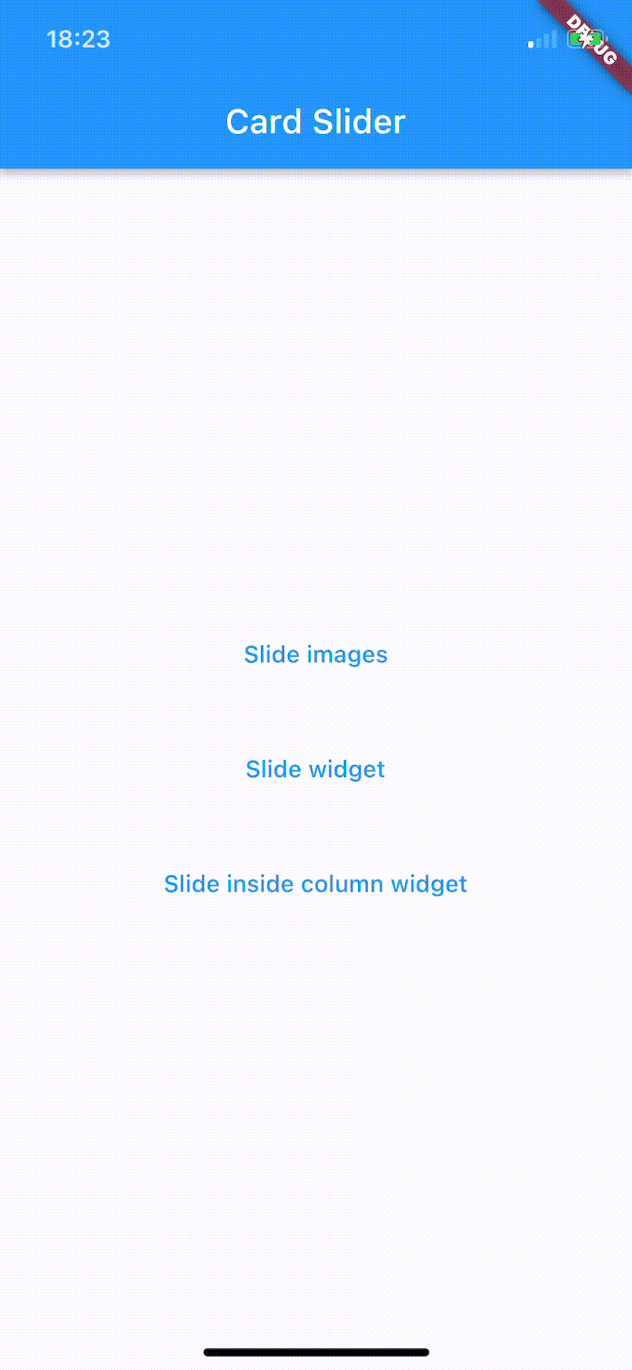
Simple Usage #
There are two ways which the CardSlider can easily be added to your project.
- Using the
CardSliderslides as widgets. - Using the
CardSliderslides as images
CardSlider slides as widgets
This method uses widgets as a slide cards. For example:
@override
Widget build(BuildContext context) {

  List<Color> valuesDataColors = [
    Colors.purple,
    Colors.yellow,
    Colors.green,
    Colors.red,
    Colors.grey,
    Colors.blue,
  ];

  List<Widget> valuesWidget = [];
  for (int i = 0; i < valuesDataColors.length; i++) {
    valuesWidget.add(
        Container(
            decoration: BoxDecoration(
              borderRadius: BorderRadius.circular(12.0),
              color: valuesDataColors[i],
            ),
            child: Align(
              alignment: Alignment.center,
              child: Text( i.toString(), style: const TextStyle( fontSize: 28,  ), ),
            )
        )
    );
  }

  return
    Scaffold(
        backgroundColor: const Color(0xFF1560BD),
        appBar: AppBar(
          backgroundColor: Colors.transparent,
          elevation: 0,
          title: const Text("Cards",
            style: TextStyle(fontSize: 14, fontWeight: FontWeight.w600, color: Colors.white),
          ),
          centerTitle: true,
          leading: IconButton(
            icon: const Icon(Icons.arrow_back, color: Colors.white,),
            tooltip: 'Back',
            onPressed: () => Navigator.of(context).pop(),
          ),
        ),
        body:
        CardSlider(
          cards: valuesWidget,
          bottomOffset: .0003,
          cardHeight: 0.75,
        )
    );
}
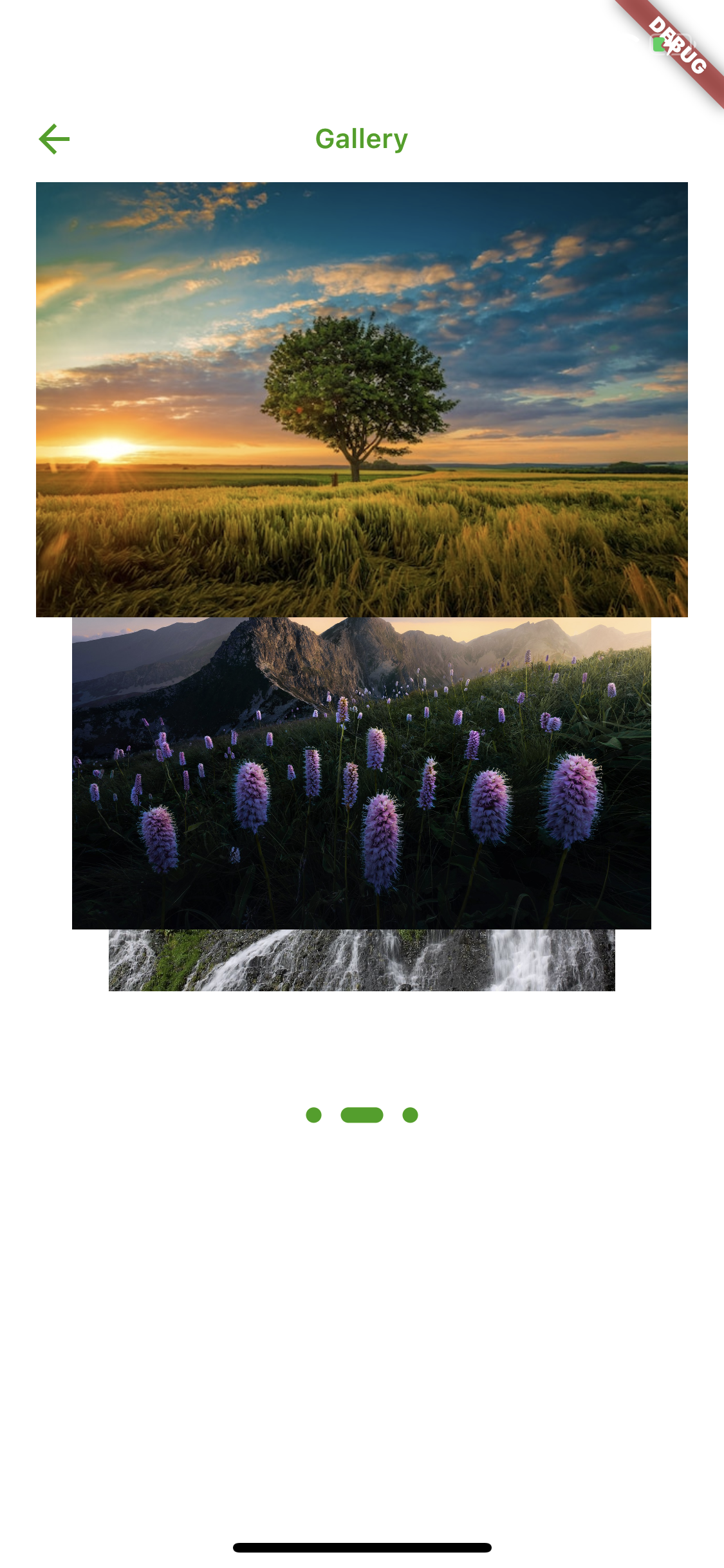
CardSlider slides as images
This method uses images as a slide cards. For example:
@override
Widget build(BuildContext context) {

  List<Widget> valuesWidget = [];

  List<String> valuesUrl = [
    'https://upload.wikimedia.org/wikipedia/commons/thumb/4/42/Shaqi_jrvej.jpg/1200px-Shaqi_jrvej.jpg',
    'https://img.freepik.com/free-photo/wide-angle-shot-single-tree-growing-clouded-sky-during-sunset-surrounded-by-grass_181624-22807.jpg',
    'https://www.eea.europa.eu/themes/biodiversity/state-of-nature-in-the-eu/state-of-nature-2020-subtopic/image_print'
  ];

  for (int i = 0; i < valuesUrl.length; i++) {
    valuesWidget.add(
      Image.network( valuesUrl[i] ),
    );
  }

  return
    Scaffold(
      backgroundColor: Colors.white,
      appBar: AppBar(
        backgroundColor: Colors.transparent,
        elevation: 0,
        title: const Text("Gallery",
          style: TextStyle(fontSize: 14, fontWeight: FontWeight.w600, color: Color(0xFF33a000)),
        ),
        centerTitle: true,
        leading: IconButton(
          icon: Icon(Icons.arrow_back, color: Color(0xFF33a000),),
          tooltip: 'Back',
          onPressed: () => Navigator.of(context).pop(),
        ),
      ),
      body:
      CardSlider(
        cards: valuesWidget,
        bottomOffset: .0006,
        itemDotWidth: 14,
        itemDot:
            (itemDotWidth){
          return Container(
              margin: EdgeInsets.all(5),
              width: 8 + itemDotWidth,
              height: 8,
              decoration: BoxDecoration(
                borderRadius: BorderRadius.circular(10),
                color: Color(0xFF33a000),
              )
          );
        },
      ),
    );
}
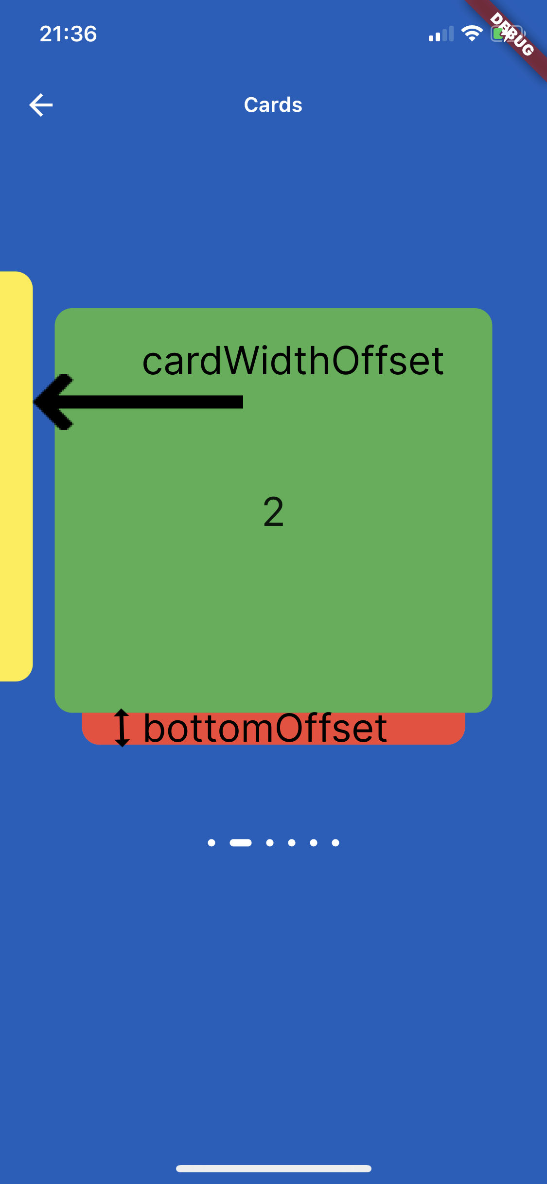
Screenshots
On the image below is shown how to use parameters cardWidthOffset, cardHeightOffset, bottomOffset :
Custom Usage #
There are several options that allow for more control:
| Properties | Description |
|---|---|
cards |
The List of Widgets for slider |
slideChanged |
Optional Event fired when ever slide is changed, (sliderIndex){ } sliderIndex has a value of a current slide. |
blurValue |
Optional blurValue used for blurring the slider |
blurOnClick |
Optional blurOnClick is method which listens if users clicks over blurred slider to be able to remove blurry |
sliderBackGroundWidget |
Optional widget which placed on the background of slider, can be placed logo or any other image or widget . |
itemDotWidth |
Optional is a width of dots under slider showing current location. |
bottomOffset |
Optional is a double value, the height of a bottom of previous slide |
cardWidth |
Optional is a width of a slides |
cardHeight |
Optional is a height of a slides |
cardWidthOffset |
Optional is a width which is used for how far slide must go on in horizontal distance when swiping or dragging |
cardHeightOffset |
Optional is a height which is used for how far slide must go on in vertical distance when swiping or dragging |
itemDot |
Optional is a widget by which can be changed the dots of th slider position |
Metadata
Publisher
unverified uploader
Metadata
A draggable Flutter image carousel slider, swipe or drag to change the slide!
Repository (GitHub)
View/report issues
License
 unknown (LICENSE)