button_animations 1.0.0  button_animations: ^1.0.0 copied to clipboard
Highly customizable animated buttons
Button Animations #

button_animations is a package to make highly customizable Flutter widgets with 3d animations.
Getting Started #
To use this plugin, add the latest version of button_animations as a dependency in your pubspec.yaml file.
Parameters and their Description #
| Datatype | Parameter | Description | Default Value | Required |
|---|---|---|---|---|
function |
onTap | The function that is called whenever the widget is tapped | -- | Yes |
widget |
child | The child widget | -- | Yes |
PredefinedThemes |
type | There are 16 predefined themes from which you can choose from if you dont want to customize the widget yourself | PredefinedThemes.primary | No |
Curve |
animationCurve | The curve that the animation will follow | Curves.easeIn | No |
bool |
enabled | To check whether the button is enabbled or not | true | No |
bool |
isMultiColor | To check whether the button has multiple color gradient or not | false | No |
bool |
isOutline | To check whether the button has a outline or not | false | No |
bool |
darkshadow | To check whether the button has dark or light shadow | true | No |
int |
duration | The time that the animation takes in milliseconds | 70 | No |
double |
height | The height of the widget | 64 | No |
double |
width | The width of the widget | 200 | No |
double |
blurRadius | The radius of the blur effect of the widget | 0 | No |
double |
borderRadius | The radius of the borders of the widget | 12 | No |
double |
shadowHeightBottom | The height of the shadow and the animation of the widget from the bottom of the child widget | 4 | No |
double |
shadowHeightLeft | The height of the shadow and the animation of the widget from the left of the child widget | 0 | No |
double |
borderWidth | The width of the border of the widget | 1 | No |
Color |
borderColor | The color of the border of the widget(if type is not null, this will not work, is Outline should be true for this to work) | Colors.black | No |
Color |
blurColor | The color of the blur of the widget(if type is not null, this will not work) | Colors.black | No |
Color |
color | The color of the widget(if type is not null, this will not work) | Colors.blue | No |
Color |
shadowColor | The color of the shadow of the widget(if type is not null, this will not work) | Colors.black | No |
List<Color> |
colors | The list of colors for the gradient for the background of the widget(isMulticolor should be true for this to work) | [] | No |
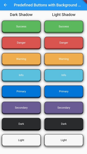
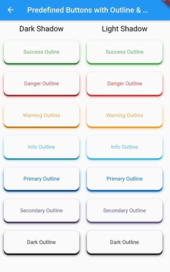
PredefinedThemes #
| Theme Name | Example |
|---|---|
| Success |  |
| SuccessOutline | 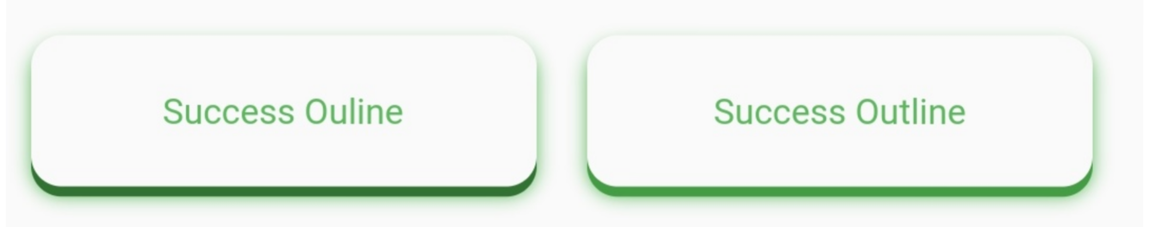 |
| Danger | 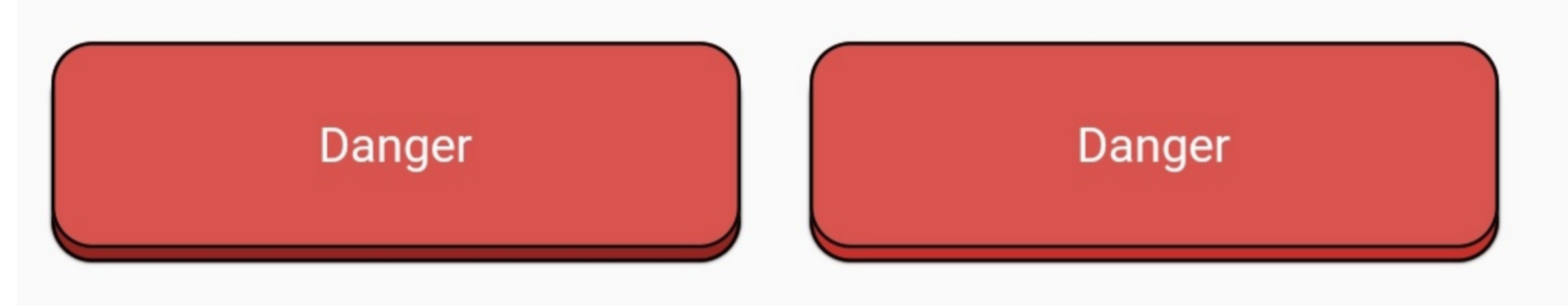 |
| DangerOutline | 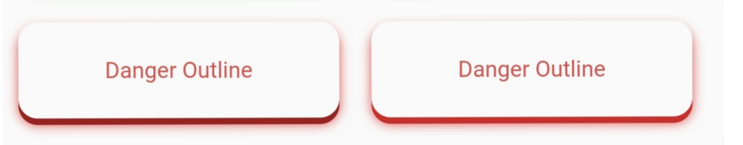 |
| Warning | 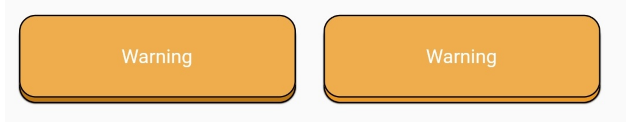 |
| WarningOutline | 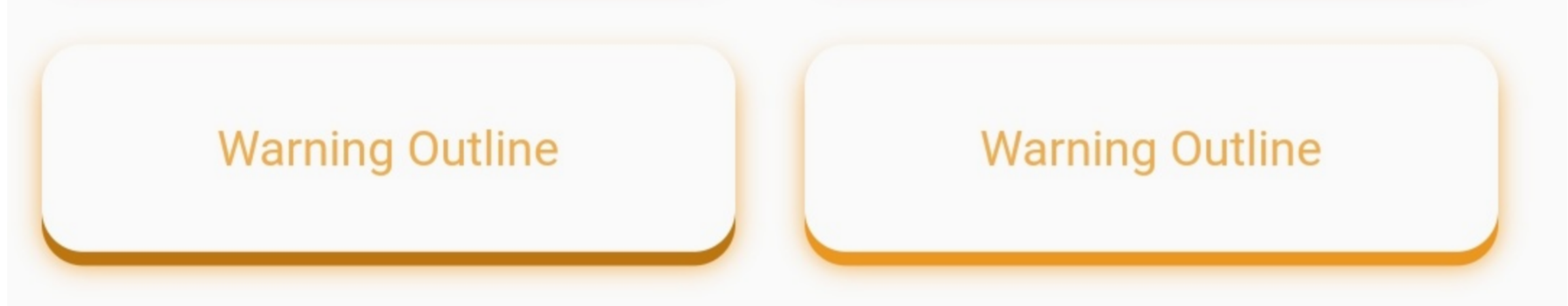 |
| Info | 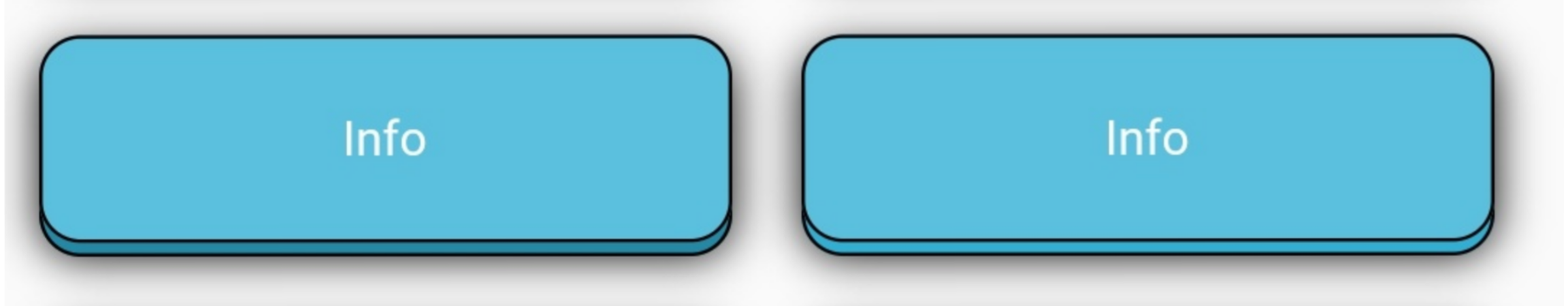 |
| InfoOutline | 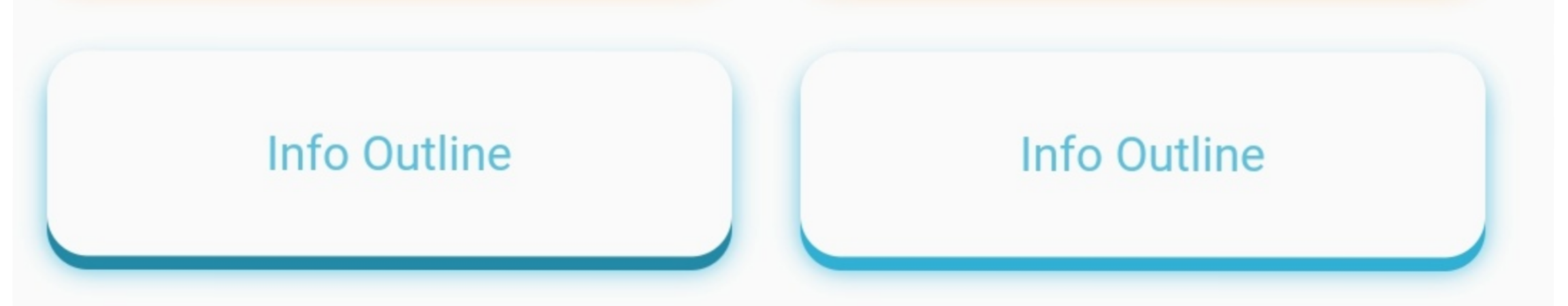 |
| Primary | 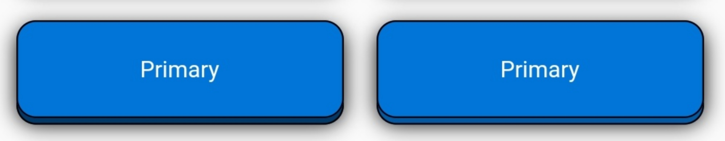 |
| PrimaryOutline | 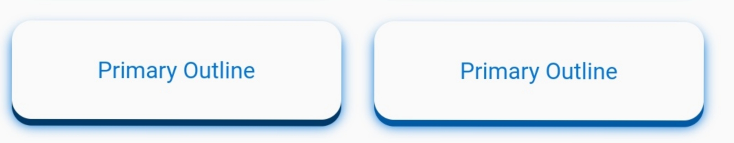 |
| Secondary | 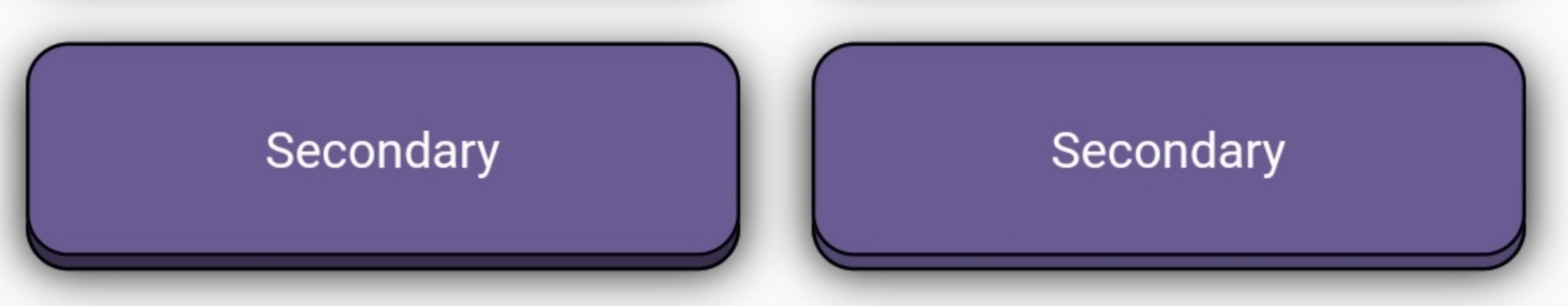 |
| SecondaryOutline | 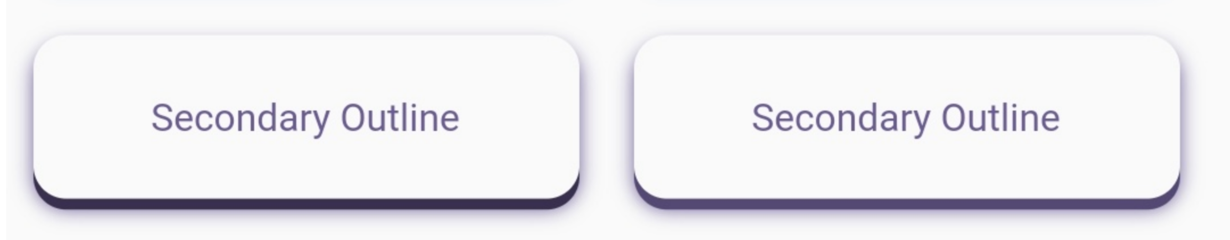 |
| Dark | 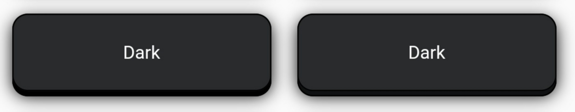 |
| DarkOutline | 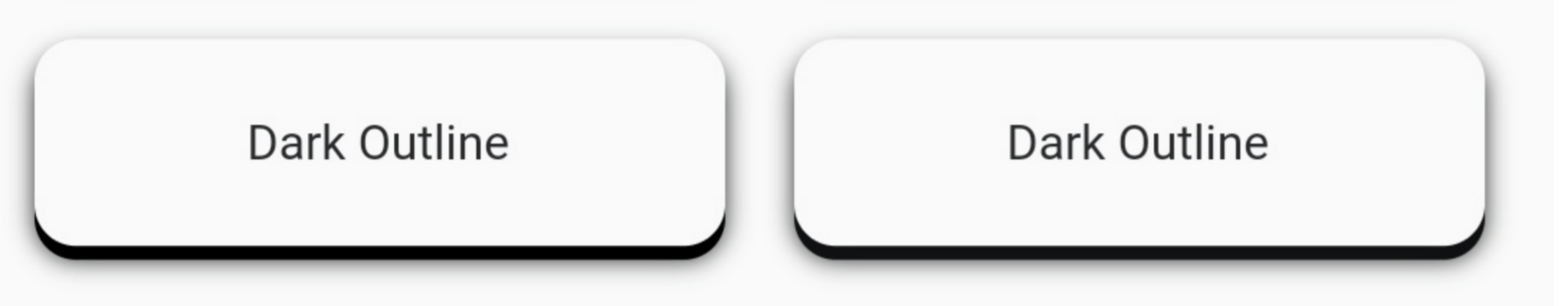 |
| Light | 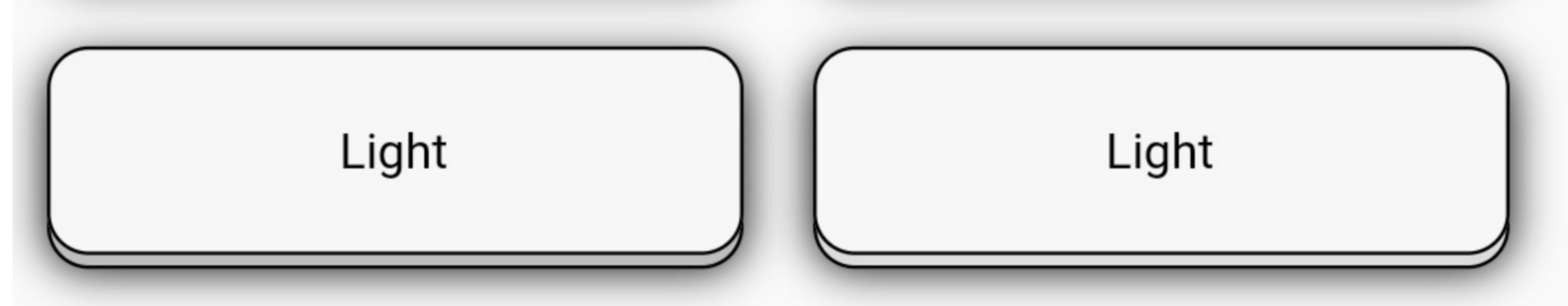 |
Example #
For any of the predefined themes you can just have to add the child widget, type, and the onTap function.
1. Add borderRadius and, isOutline to add more customization.
AnimatedButton(
  child: Text(
    'Danger', // add your text here
    style: TextStyle(
      color: Colors.white,
    ),
  ),
  type: PredefinedTheme.danger,
  isOutline: true,
  borderWidth: 1,
  onTap: () {},
),
AnimatedButton(
  child: Text(
    'Danger', // add your text here
    style: TextStyle(
      color: Colors.white,
    ),
  ),
  type: PredefinedTheme.danger,
  darkshadow: false,
  isOutline: true,
  borderWidth: 1,

  onTap: () {},
),
2. Use blurRadius and blurColor
AnimatedButton(
  child: Text(
    'Dark', // add your text here
    style: TextStyle(
      color: Colors.white,
    ),
  ),
  type: PredefinedTheme.dark,
  blurRadius: 10,
  onTap: () {},
),
AnimatedButton(
  child: Text(
    'Danger', // add your text here
    style: TextStyle(
      color: Colors.white,
    ),
  ),
  type: PredefinedTheme.danger,
  darkshadow: false,
  blurRadius: 10,
  onTap: () {},
),
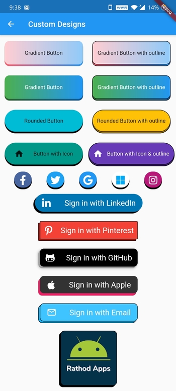
3. Use all other parameters to make custom buttons
- Gradient Buttons
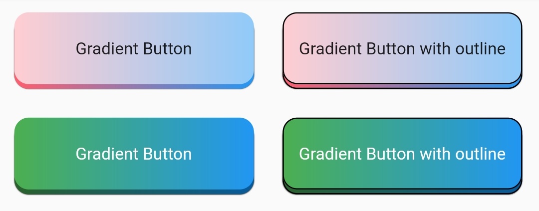
Row(
  children: [
    Padding(
      padding: const EdgeInsets.all(12.0),
      child: AnimatedButton(
        child: Text("Gradient Button"),
        onTap: () {},
        isMultiColor: true,
        colors: [
          Colors.red[100],
          Colors.blue[200],
        ],
      ),
    ),
    Padding(
      padding: const EdgeInsets.all(12.0),
      child: AnimatedButton(
        child: Text("Gradient Button with outline"),
        onTap: () {},
        isMultiColor: true,
        isOutline: true,
        colors: [
          Colors.red[100],
          Colors.blue[200],
        ],
      ),
    ),
  ],
),
Row(
  children: [
    Padding(
      padding: const EdgeInsets.all(12.0),
      child: AnimatedButton(
        child: Text(
          "Gradient Button",
          style: TextStyle(
            color: Colors.white,
          ),
        ),
        onTap: () {},
        isMultiColor: true,
        colors: [
          Colors.green,
          Colors.blue,
        ],
      ),
    ),
    Padding(
      padding: const EdgeInsets.all(12.0),
      child: AnimatedButton(
        child: Text(
          "Gradient Button with outline",
          style: TextStyle(
            color: Colors.white,
          ),
        ),
        onTap: () {},
        isMultiColor: true,
        isOutline: true,
        colors: [
          Colors.green,
          Colors.blue,
        ],
      ),
    ),
  ],
),
- Rounded Buttons
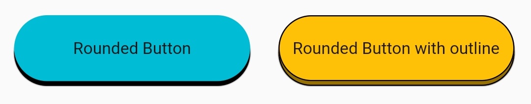
Row(
  children: [
    Padding(
      padding: const EdgeInsets.all(12.0),
      child: AnimatedButton(
        child: Text("Rounded Button"),
        onTap: () {},
        height: 60,
        type: null,
        borderRadius: 30,
        color: Colors.cyan,
      ),
    ),
    Padding(
      padding: const EdgeInsets.all(12.0),
      child: AnimatedButton(
        child: Text("Rounded Button with outline"),
        onTap: () {},
        height: 60,
        type: null,
        borderRadius: 30,
        isOutline: true,
        color: Colors.amber,
      ),
    ),
  ],
),
- Rounded Buttons with Icons
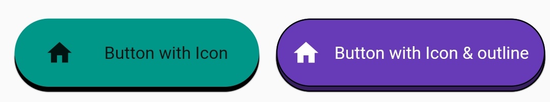
Row(
  children: [
    Padding(
      padding: const EdgeInsets.all(12.0),
      child: AnimatedButton(
        child: Row(
          mainAxisAlignment: MainAxisAlignment.spaceEvenly,
          children: [
            Icon(Icons.home),
            Text("Button with Icon"),
          ],
        ),
        onTap: () {},
        type: null,
        height: 60,
        borderRadius: 30,
        color: Colors.teal,
      ),
    ),
    Padding(
      padding: const EdgeInsets.all(2.0),
      child: AnimatedButton(
        child: Row(
          mainAxisAlignment: MainAxisAlignment.spaceEvenly,
          children: [
            Icon(Icons.home, color: Colors.white),
            Text("Button with Icon & outline",
                style: TextStyle(color: Colors.white)),
          ],
        ),
        onTap: () {},
        type: null,
        height: 60,
        width: 220,
        borderRadius: 30,
        isOutline: true,
        color: Colors.deepPurple,
      ),
    ),
  ],
),
- Social Media Buttons
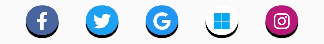
Row(
  mainAxisAlignment: MainAxisAlignment.spaceEvenly,
  children: [
    Padding(
      padding: const EdgeInsets.all(2),
      child: AnimatedButton(
        child: Icon(
          FontAwesomeIcons.facebookF,
          color: Colors.white,
          size: 25,
        ),
        onTap: () {},
        type: null,
        height: 45,
        width: 45,
        borderRadius: 22.5,
        color: Color(0xFF49659F),
      ),
    ),
    Padding(
      padding: const EdgeInsets.all(2),
      child: AnimatedButton(
        child: Icon(
          FontAwesomeIcons.twitter,
          color: Colors.white,
          size: 25,
        ),
        onTap: () {},
        type: null,
        height: 45,
        width: 45,
        borderRadius: 22.5,
        color: Color(0xFF1DA1F2),
      ),
    ),
    Padding(
      padding: const EdgeInsets.all(2),
      child: AnimatedButton(
        child: Icon(
          FontAwesomeIcons.google,
          color: Colors.white,
          size: 25,
        ),
        onTap: () {},
        type: null,
        height: 45,
        width: 45,
        borderRadius: 22.5,
        color: Colors.blue,
      ),
    ),
    Padding(
      padding: const EdgeInsets.all(2),
      child: AnimatedButton(
        child: Icon(
          FontAwesomeIcons.microsoft,
          color: Colors.lightBlue,
          size: 25,
        ),
        onTap: () {},
        type: null,
        height: 45,
        width: 45,
        borderRadius: 22.5,
        color: Colors.white,
      ),
    ),
    Padding(
      padding: const EdgeInsets.all(2),
      child: AnimatedButton(
        child: Icon(
          FontAwesomeIcons.instagram,
          color: Colors.white,
          size: 25,
        ),
        onTap: () {},
        type: null,
        height: 45,
        width: 45,
        borderRadius: 22.5,
        color: Color(0xFFB81877),
      ),
    ),
  ],
),
- Sign in Buttons
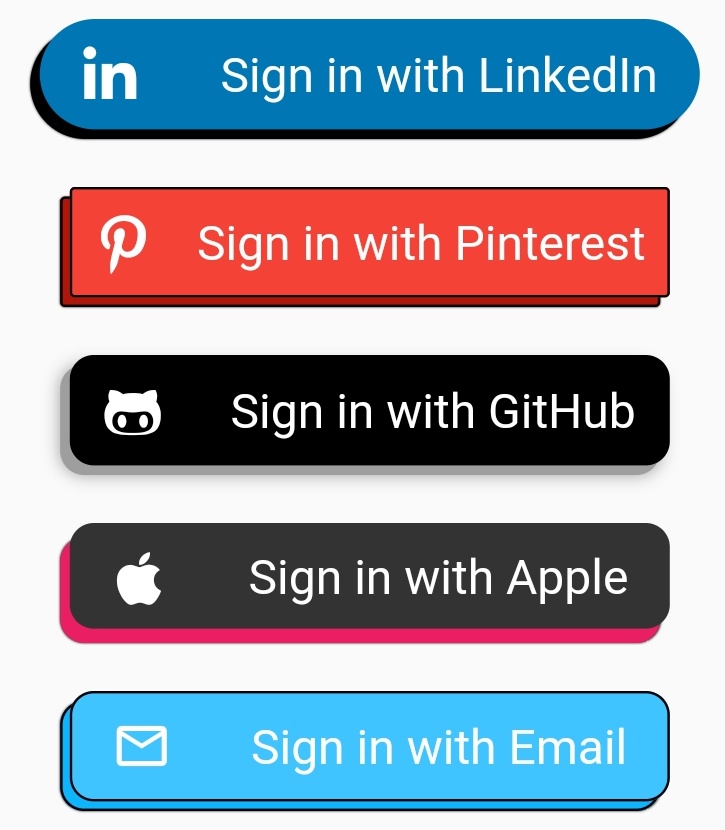
Padding(
  padding: const EdgeInsets.all(10),
  child: AnimatedButton(
    child: Row(
      mainAxisAlignment: MainAxisAlignment.spaceAround,
      children: [
        Icon(
          FontAwesomeIcons.linkedinIn,
          color: Colors.white,
          size: 25,
        ),
        Text(
          "Sign in with LinkedIn",
          style: TextStyle(
            color: Colors.white,
            fontSize: 20.0,
          ),
        )
      ],
    ),
    onTap: () {},
    type: null,
    height: 50,
    shadowHeightBottom: 4,
    shadowHeightLeft: 4,
    width: 275,
    borderRadius: 25,
    color: Color(0xFF0077B5),
  ),
),
Padding(
  padding: const EdgeInsets.all(10),
  child: AnimatedButton(
    child: Row(
      mainAxisAlignment: MainAxisAlignment.spaceAround,
      children: [
        Icon(
          FontAwesomeIcons.pinterestP,
          color: Colors.white,
          size: 25,
        ),
        Text(
          "Sign in with Pinterest",
          style: TextStyle(
            color: Colors.white,
            fontSize: 20.0,
          ),
        )
      ],
    ),
    onTap: () {},
    type: null,
    height: 50,
    isOutline: true,
    shadowHeightBottom: 4,
    shadowHeightLeft: 4,
    width: 250,
    borderRadius: 2,
    color: Colors.red,
  ),
),
Padding(
  padding: const EdgeInsets.all(10),
  child: AnimatedButton(
    child: Row(
      mainAxisAlignment: MainAxisAlignment.spaceAround,
      children: [
        Icon(
          FontAwesomeIcons.githubAlt,
          color: Colors.white,
          size: 25,
        ),
        Text(
          "Sign in with GitHub",
          style: TextStyle(
            color: Colors.white,
            fontSize: 20.0,
          ),
        )
      ],
    ),
    onTap: () {},
    type: null,
    height: 50,
    shadowHeightBottom: 4,
    shadowHeightLeft: 4,
    width: 250,
    shadowColor: Colors.grey,
    blurColor: Colors.grey,
    blurRadius: 5,
    borderRadius: 10,
    color: Colors.black,
  ),
),
Padding(
  padding: const EdgeInsets.all(10),
  child: AnimatedButton(
    child: Row(
      mainAxisAlignment: MainAxisAlignment.spaceAround,
      children: [
        Icon(
          FontAwesomeIcons.apple,
          color: Colors.white,
          size: 25,
        ),
        Text(
          "Sign in with Apple",
          style: TextStyle(
            color: Colors.white,
            fontSize: 20.0,
          ),
        )
      ],
    ),
    onTap: () {},
    type: null,
    shadowColor: Colors.pink,
    height: 50,
    width: 250,
    shadowHeightBottom: 6,
    shadowHeightLeft: 4,
    borderRadius: 10,
    color: Color(0xFF333333),
  ),
),
Padding(
  padding: const EdgeInsets.all(10),
  child: AnimatedButton(
    child: Row(
      mainAxisAlignment: MainAxisAlignment.spaceAround,
      children: [
        Icon(
          Icons.mail_outline,
          color: Colors.white,
          size: 25,
        ),
        Text(
          "Sign in with Email",
          style: TextStyle(
            color: Colors.white,
            fontSize: 20.0,
          ),
        )
      ],
    ),
    onTap: () {},
    type: null,
    height: 50,
    width: 250,
    isOutline: true,
    darkShadow: false,
    shadowHeightBottom: 4,
    shadowHeightLeft: 4,
    borderRadius: 10,
    color: Colors.lightBlueAccent,
  ),
),
- Custom Buttons

Padding(
  padding: const EdgeInsets.all(10),
  child: AnimatedButton(
    child: ClipRRect(
      borderRadius: BorderRadius.circular(10.0),
      child: Image.network(
        "my_logo_image_url",
        fit: BoxFit.fill,
      ),
    ),
    onTap: () {},
    type: null,
    height: 144,
    width: 144,
    isOutline: true,
    shadowHeightBottom: 4,
    shadowHeightLeft: 4,
    borderRadius: 10,
    color: Color(0xFF033249),
  ),
),
Metadata
27
likes
0
pub points
83%
popularity
Publisher
unverified uploader
Metadata
Highly customizable animated buttons
Repository (GitHub)
View/report issues
License
 unknown (LICENSE)