board_datetime_picker 1.6.9  board_datetime_picker: ^1.6.9 copied to clipboard
Picker to select date and time for Flutter. It is both a calendar and a picker, offering a variety of options as a package.
board_datetime_picker #
Picker to select date and time for Flutter.
It is both a calendar and a picker, offering a variety of options as a package.
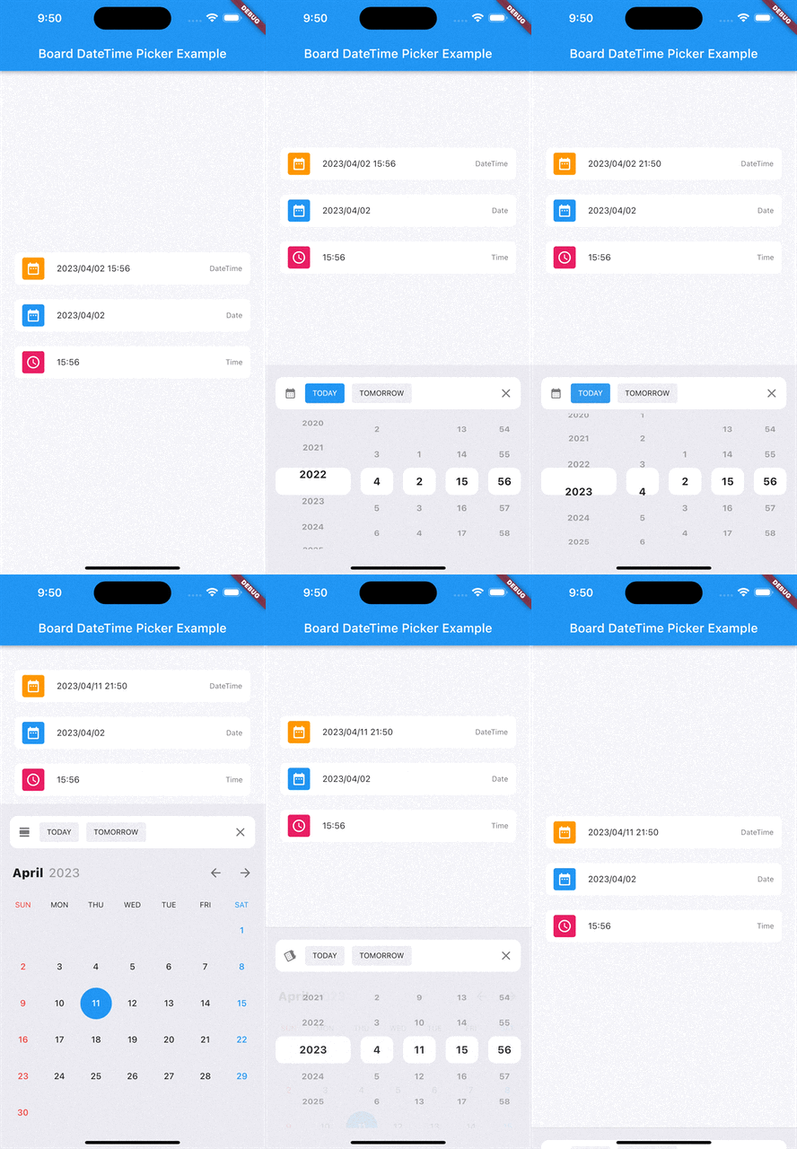
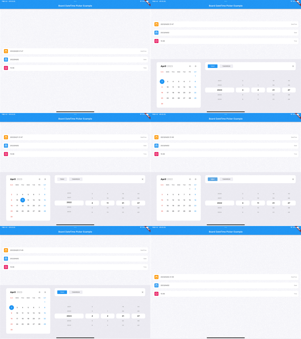
On tablets, the calendar and picker can be displayed simultaneously for easy date/time selection. In other cases, the calendar and picker can be switched at the touch of a button for easy date/time selection.
Features #
| Standard | Wide |
|---|---|
 |
 |
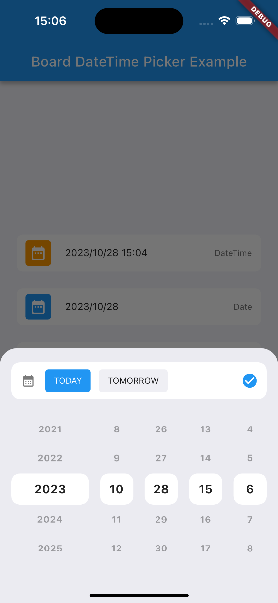
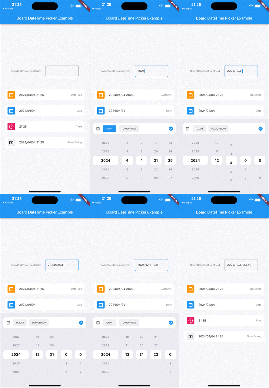
Modal Bottom Sheet & Input Field #
| Modal Sheed | Input Field |
|---|---|
 |
 |
Getting Started #
In order to add board_datetime_picker package to your project add this line to your pubspec.yaml file
dependencies:
    board_datetime_picker: 1.6.9
Usage #
import #
import 'package:board_datetime_picker/board_datetime_picker.dart';
Exapmle #
Builder
final controller = BoardDateTimeController();

DateTime date = DateTime.now();

@override
Widget build(BuildContext context) {
    return BoardDateTimeBuilder(
        controller: controller,
        pickerType: DateTimePickerType.datetime
        builder: (context) {
            return Scaffold(
                appBar: AppBar(
                    title: Text('Example'),
                ),
                body: Center(
                    child: Text(BoardDateFormat('yyyy/MM/dd').format(date))
                ),
            );
        },
        onChange: (val) {
            setState(() => date = val);
        }
    );
}
Modal
final result = await showBoardDateTimePicker(
  context: context,
  pickerType: DateTimePickerType.datetime,
)
Example of handling by button press.
ElevatedButton(
  child: Text(
    BoardDateFormat('yyyy/MM/dd').format(date),
  ),
  onPressed: () {
    final result = await showBoardDateTimePicker(
      context: context,
      pickerType: DateTimePickerType.datetime,
    );
    if (result != null) {
      setState(() => d = result);
    }
  },
)
Input Field
final textController = BoardDateTimeTextController();

@override
Widget build(BuildContext context) {
  return SizedBox(
    width: 160,
    child: BoardDateTimeInputField(
      controller: textController,
      pickerType: DateTimePickerType.datetime,
      options: const BoardDateTimeOptions(
        languages: BoardPickerLanguages.en(),
      ),
      textStyle: Theme.of(context).textTheme.bodyMedium,
      onChanged: (date) {
        print('onchanged: $date');
      },
      onFocusChange: (val, date, text) {
        print('on focus changed date: $val, $date, $text');
      },
    ),
  );
}
Picker Type #
DateTimePickerType types include [date], [datetime], [time]. The picker to be displayed depends on the type selected. Only [datetime] and [date] types can be displayed for calendars.
Parameters #
In using BoardDateTimeBuilder, there are several parameters.
Those without [required] are optional.
| Parameter | Type | Description |
|---|---|---|
| builder | Widget Function(BuildContext context) | [required] builder function to form a widget for a screen that uses a picker. |
| controller | BoardDateTimeController | [required] Controller to open or close the picker. |
| onChange | void Function(DateTime) | [required] Callback when date is changed in the picker. |
| pickerType | DateTimePickerType | Display picker type. datetime, date. time. default is datetime. |
| breakpoint | double | Breakpoints for switching between Wide and Standard modes. default is 800. |
| initialDate | DateTime | Date and time of initial display. default is DateTime.now(). |
| minimumDate | DateTime | Minimum date in the selectable range. default is DateTime(1970, 1, 1, 0, 0). |
| maximumDate | DateTime | Maximum date in the selectable range. default is DateTime(2050, 12, 31, 23, 59). |
| resizeBottom | bool | Flag whether to resize the bottom of the specified Builder. If true, the picker is displayed under the builder in Column. default is true. |
| options | BoardDateTimeOptions | Class for defining options related to the UI used by [BoardDateTimeBuilder]. |
BoardDateTimeOptions #
Introduce the definition of the property class that controls UI among the BoardDateTimeBuilder's parameters.
All properties are optional.
| Parameter | Type | Description |
|---|---|---|
| backgroundColor | Color | Picker Background Color. default is Theme.of(context).scaffoldBackgroundColor |
| foregroundColor | Color | Picket Foreground Color. default is Theme.of(context).cardColor |
| textColor | Color | Picker Text Color. default is Theme.of(context).textTheme.bodyLarge?.color |
| activeColor | Color | Use the color of the currently selected date or button in the calendar as a color to indicate the selection status. default is Theme.of(context).primaryColor |
| activeTextColor | Color | activeColor is used as the background color and activeTextColor as the text color. default color is white. |
| backgroundDecoration | BoxDecoration | BoxDecoration of the widget displayed on the backmost side of the picker. If not specified, it will be a standard BoxDecoration with the color specified in the normal backgroundColor (default). |
| languages | BoardPickerLanguages | Language information for text displayed in the picker. Default is en |
| customOptions | BoardPickerCustomOptions | Option to specify items to be displayed in the picker by date and time. Only time can be specified. Default is null |
| startDayOfWeek | int | First day of the week in the calendar. Defailt is DateTime.sunday |
| pickerFormat | String | Date format for pickers. Specify if you want to change the display order of year, month, date. Default is ymd |
Sample of gradient background:
options: BoardDateTimeOptions(
    backgroundDecoration: const BoxDecoration(
        gradient: LinearGradient(
            colors: <Color>[
                Color(0xff1A2980),
                Color(0xff26D0CE),
            ],
        ),
    ),
),
Language Option
By default, English, Japanese, and Italian definitions are prepared.
If you want to use other languages, define the BoardPickerLanguages class and set it as an option.
Bellow is an example of using French.
option = BoardDateTimeOptions(
  languages: BoardPickerLanguages(
    locale: 'fr',
    today: 'Aujourd’hui',
    tomorrow: 'Demain',
    now: 'Maintenant',
  ),
);
LICENSE #
BSD 3-Clause License

Copyright (c) 2023, mytooyo

Redistribution and use in source and binary forms, with or without
modification, are permitted provided that the following conditions are met:

1. Redistributions of source code must retain the above copyright notice, this
   list of conditions and the following disclaimer.

2. Redistributions in binary form must reproduce the above copyright notice,
   this list of conditions and the following disclaimer in the documentation
   and/or other materials provided with the distribution.

3. Neither the name of the copyright holder nor the names of its
   contributors may be used to endorse or promote products derived from
   this software without specific prior written permission.

THIS SOFTWARE IS PROVIDED BY THE COPYRIGHT HOLDERS AND CONTRIBUTORS "AS IS"
AND ANY EXPRESS OR IMPLIED WARRANTIES, INCLUDING, BUT NOT LIMITED TO, THE
IMPLIED WARRANTIES OF MERCHANTABILITY AND FITNESS FOR A PARTICULAR PURPOSE ARE
DISCLAIMED. IN NO EVENT SHALL THE COPYRIGHT HOLDER OR CONTRIBUTORS BE LIABLE
FOR ANY DIRECT, INDIRECT, INCIDENTAL, SPECIAL, EXEMPLARY, OR CONSEQUENTIAL
DAMAGES (INCLUDING, BUT NOT LIMITED TO, PROCUREMENT OF SUBSTITUTE GOODS OR
SERVICES; LOSS OF USE, DATA, OR PROFITS; OR BUSINESS INTERRUPTION) HOWEVER
CAUSED AND ON ANY THEORY OF LIABILITY, WHETHER IN CONTRACT, STRICT LIABILITY,
OR TORT (INCLUDING NEGLIGENCE OR OTHERWISE) ARISING IN ANY WAY OUT OF THE USE
OF THIS SOFTWARE, EVEN IF ADVISED OF THE POSSIBILITY OF SUCH DAMAGE.