blinking_border 1.2.0  blinking_border: ^1.2.0 copied to clipboard
 jamalianpour.ir
A lightweight, highly configurable Flutter widget that animates a border around any child widget with multiple styles and smooth animations.
Blinking Border


A lightweight, highly configurable Flutter widget that animates a border around any child widget. The border supports multiple blink styles (normal, corner-to-corner sweep), stroke styles (solid, dotted/dashed), respects child corner radius, and works with any child widget.
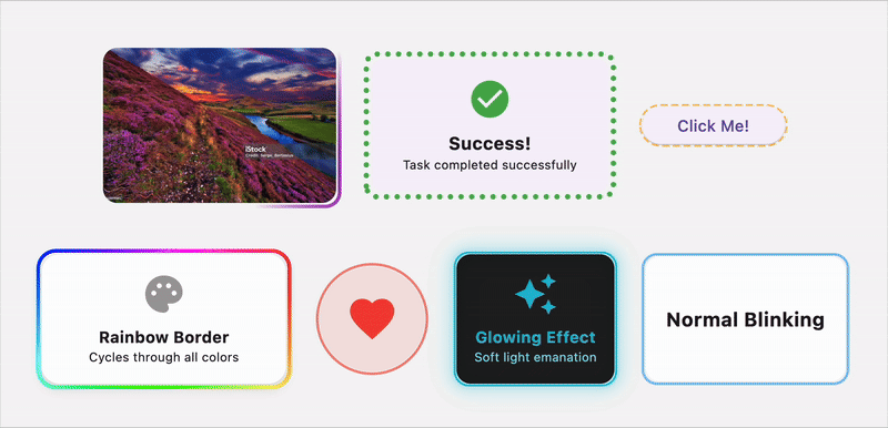
🌟 Features #
- 🎨 Multiple Animation Styles: Normal pulsing, corner-to-corner sweep, rainbow colors, pulsing with scale, and glowing effects
- 🌈 Rainbow Animation: Smooth color cycling through the entire spectrum
- 💗 Pulsing Scale Effect: Combined border and scale animation for attention-grabbing effects
- ✨ Glowing Effect: Soft light emanation with customizable intensity
- ✏️ Stroke Styles: Solid, dashed, and dotted border patterns
- 🎯 Fully Customizable: Control colors, widths, speeds, and more
- 📐 Respects Border Radius: Works perfectly with rounded corners
- 🚀 Smooth Animations: Hardware-accelerated smooth animations
- 📱 Responsive: Works with any child widget and adapts to size changes
- ⚡ Lightweight: Minimal performance impact
📦 Installation #
Add this to your package's pubspec.yaml file:
dependencies:
  blinking_border: ^1.2.0
Then run:
flutter pub get
✏️ Usage #
Basic Usage #
import 'package:blinking_border/blinking_border.dart';

BlinkingBorder(
  child: Container(
    width: 200,
    height: 100,
    child: Center(child: Text('Hello World')),
  ),
)
With Custom Configuration #
BlinkingBorder(
  color: Colors.blue,
  strokeWidth: 3.0,
  blinkStyle: BlinkStyle.cornerSweep,
  strokeStyle: StrokeStyle.dashed,
  borderRadius: BorderRadius.circular(16),
  duration: Duration(seconds: 2),
  child: YourWidget(),
)
Animation Styles #
Normal Blink (Pulsing)
BlinkingBorder(
  blinkStyle: BlinkStyle.normal,
  color: Colors.green,
  child: YourWidget(),
)
Corner-to-Corner Sweep
BlinkingBorder(
  blinkStyle: BlinkStyle.cornerSweep,
  color: Colors.purple,
  child: YourWidget(),
)
Rainbow Animation
BlinkingBorder(
  blinkStyle: BlinkStyle.rainbow,
  strokeWidth: 4.0,
  duration: Duration(seconds: 3),
  child: YourWidget(),
)
The rainbow style automatically cycles through all colors of the spectrum. The color property is ignored when using this style.
Pulsing with Scale
BlinkingBorder(
  blinkStyle: BlinkStyle.pulsing,
  color: Colors.red,
  pulseScale: 0.08, // 8% scale change
  duration: Duration(milliseconds: 1500),
  child: YourWidget(),
)
The pulsing style combines border opacity animation with a scale transformation, creating an attention-grabbing heartbeat effect.
Glowing Effect
BlinkingBorder(
  blinkStyle: BlinkStyle.glowing,
  color: Colors.cyan,
  strokeWidth: 2.0,
  duration: Duration(seconds: 2),
  child: YourWidget(),
)
The glowing style creates a soft light emanation effect with multiple blur layers, perfect for creating neon-like or sci-fi UI elements.
Stroke Styles #
Solid Border
BlinkingBorder(
  strokeStyle: StrokeStyle.solid,
  child: YourWidget(),
)
Dashed Border
BlinkingBorder(
  strokeStyle: StrokeStyle.dashed,
  dashWidth: 8.0,
  dashSpace: 4.0,
  child: YourWidget(),
)
Dotted Border
BlinkingBorder(
  strokeStyle: StrokeStyle.dotted,
  dotRadius: 3.0,
  dotSpace: 6.0,
  child: YourWidget(),
)
Advanced Examples #
Highlighted Card
BlinkingBorder(
  blinkStyle: BlinkStyle.normal,
  strokeStyle: StrokeStyle.solid,
  color: Colors.amber,
  strokeWidth: 4.0,
  borderRadius: BorderRadius.circular(12),
  duration: Duration(seconds: 1),
  child: Card(
    child: Padding(
      padding: EdgeInsets.all(16),
      child: Text('Important Notice'),
    ),
  ),
)
Loading State Button
BlinkingBorder(
  blinkStyle: BlinkStyle.cornerSweep,
  strokeStyle: StrokeStyle.dotted,
  color: Colors.blue,
  autoStart: isLoading,
  child: ElevatedButton(
    onPressed: () {},
    child: Text('Processing...'),
  ),
)
Image with Animated Border
BlinkingBorder(
  blinkStyle: BlinkStyle.cornerSweep,
  color: Colors.red,
  strokeWidth: 5.0,
  borderRadius: BorderRadius.circular(20),
  child: ClipRRect(
    borderRadius: BorderRadius.circular(20),
    child: Image.network('your-image-url'),
  ),
)
Rainbow Card Effect
BlinkingBorder(
  blinkStyle: BlinkStyle.rainbow,
  strokeStyle: StrokeStyle.solid,
  strokeWidth: 4.0,
  borderRadius: BorderRadius.circular(16),
  duration: Duration(seconds: 4),
  child: Card(
    elevation: 8,
    child: Padding(
      padding: EdgeInsets.all(24),
      child: Text('✨ Magic Card ✨'),
    ),
  ),
)
Heartbeat Button
BlinkingBorder(
  blinkStyle: BlinkStyle.pulsing,
  color: Colors.pink,
  strokeWidth: 3.0,
  pulseScale: 0.1, // 10% scale change
  duration: Duration(milliseconds: 800),
  borderRadius: BorderRadius.circular(30),
  child: ElevatedButton.icon(
    onPressed: () {},
    icon: Icon(Icons.favorite),
    label: Text('Like'),
    style: ElevatedButton.styleFrom(
      padding: EdgeInsets.symmetric(horizontal: 32, vertical: 16),
      shape: RoundedRectangleBorder(
        borderRadius: BorderRadius.circular(30),
      ),
    ),
  ),
)
Notification Badge
BlinkingBorder(
  blinkStyle: BlinkStyle.pulsing,
  color: Colors.red,
  strokeWidth: 2.0,
  pulseScale: 0.15,
  duration: Duration(seconds: 1),
  borderRadius: BorderRadius.circular(12),
  child: Container(
    padding: EdgeInsets.symmetric(horizontal: 12, vertical: 6),
    decoration: BoxDecoration(
      color: Colors.red,
      borderRadius: BorderRadius.circular(12),
    ),
    child: Text(
      'NEW',
      style: TextStyle(
        color: Colors.white,
        fontWeight: FontWeight.bold,
      ),
    ),
  ),
)
Neon Sign Effect
BlinkingBorder(
  blinkStyle: BlinkStyle.glowing,
  color: Colors.pinkAccent,
  strokeWidth: 3.0,
  borderRadius: BorderRadius.circular(8),
  duration: Duration(seconds: 2),
  child: Container(
    padding: EdgeInsets.all(16),
    color: Colors.black,
    child: Text(
      'OPEN 24/7',
      style: TextStyle(
        color: Colors.pinkAccent,
        fontSize: 24,
        fontWeight: FontWeight.bold,
      ),
    ),
  ),
)
Sci-Fi Button
BlinkingBorder(
  blinkStyle: BlinkStyle.glowing,
  color: Colors.cyan,
  strokeStyle: StrokeStyle.solid,
  strokeWidth: 2.0,
  borderRadius: BorderRadius.circular(8),
  child: Container(
    padding: EdgeInsets.symmetric(horizontal: 24, vertical: 12),
    decoration: BoxDecoration(
      gradient: LinearGradient(
        colors: [Colors.black, Colors.grey.shade900],
      ),
      borderRadius: BorderRadius.circular(8),
    ),
    child: Text(
      'INITIALIZE',
      style: TextStyle(
        color: Colors.cyan,
        letterSpacing: 2,
        fontWeight: FontWeight.w300,
      ),
    ),
  ),
)
API Reference #
BlinkingBorder Properties #
| Property | Type | Default | Description |
|---|---|---|---|
child |
Widget |
required | The widget to wrap with the blinking border |
color |
Color? |
Primary color | Border color (ignored for rainbow style) |
strokeWidth |
double |
2.0 | Width of the border stroke |
blinkStyle |
BlinkStyle |
BlinkStyle.normal |
Animation style (normal, cornerSweep, rainbow, pulsing, glowing) |
strokeStyle |
StrokeStyle |
StrokeStyle.solid |
Border stroke pattern |
duration |
Duration |
2 seconds | Duration of one animation cycle |
borderRadius |
BorderRadius |
BorderRadius.zero |
Border radius for rounded corners |
autoStart |
bool |
true | Start animation automatically |
repeat |
bool |
true | Repeat animation continuously |
dashWidth |
double |
5.0 | Width of dashes (for dashed style) |
dashSpace |
double |
3.0 | Space between dashes |
dotRadius |
double |
2.0 | Radius of dots (for dotted style) |
dotSpace |
double |
4.0 | Space between dots |
curve |
Curve |
Curves.linear |
Animation curve |
padding |
EdgeInsetsGeometry? |
null | Padding between child and border |
pulseScale |
double |
0.05 | Scale factor for pulsing animation (5% default) |
Enums #
BlinkStyle
BlinkStyle.normal- Smooth fade in/out animationBlinkStyle.cornerSweep- Animated sweep around the borderBlinkStyle.rainbow- Continuous rainbow color cyclingBlinkStyle.pulsing- Combined border and scale pulsing effectBlinkStyle.glowing- Soft light emanation with blur effect
StrokeStyle
StrokeStyle.solid- Continuous lineStrokeStyle.dashed- Dashed line patternStrokeStyle.dotted- Dotted line pattern
Examples #
Check out the example folder for a complete sample app showcasing all features.
Contributing #
Contributions are welcome! Please feel free to submit a Pull Request.
- Fork the repository
- Create your feature branch (
git checkout -b feature/AmazingFeature) - Commit your changes (
git commit -m 'Add some AmazingFeature') - Push to the branch (
git push origin feature/AmazingFeature) - Open a Pull Request
License #
This project is licensed under the MIT License - see the LICENSE file for details.
If you find this package helpful, please give it a ⭐ on GitHub!
For issues and feature requests, please visit the issue tracker.
Metadata
Publisher
Weekly Downloads
Metadata
A lightweight, highly configurable Flutter widget that animates a border around any child widget with multiple styles and smooth animations.
Repository (GitHub)
View/report issues
Documentation
License
 MIT (license)