blinc_ui_flutter 0.0.3  blinc_ui_flutter: ^0.0.3 copied to clipboard
User-friendly custom widget pack. Including inputs, button, progress bar, typography, borders, gradient and other useful widgets.

Blinc UI Flutter provides pre-built, ready-to-use flutter components.
It includes buttons, typography, spacing, decorations, and more.
Table of contents #
Installing #
1. Depend on it #
Add this to your package's pubspec.yaml file:
dependencies:
  blinc_ui_flutter: ^1.0.0
2. Install it #
You can install packages from the command line:
$ flutter pub get blinc_ui_flutter
3. Import it #
Now in your Dart code, you can use:
import 'package:blinc_ui_flutter/blinc_ui_flutter.dart';
Usage #
Spacings #
You can easily create your spacings by using the BlincSpacer component. You can choose if it's vertical or horizontal and then the size, ranging from xxxs, the smallest size, to huge:
- xxxs
- xxs
- xs
- sm
- md
- lg
- xl
- xxl
- xxxl
- huge
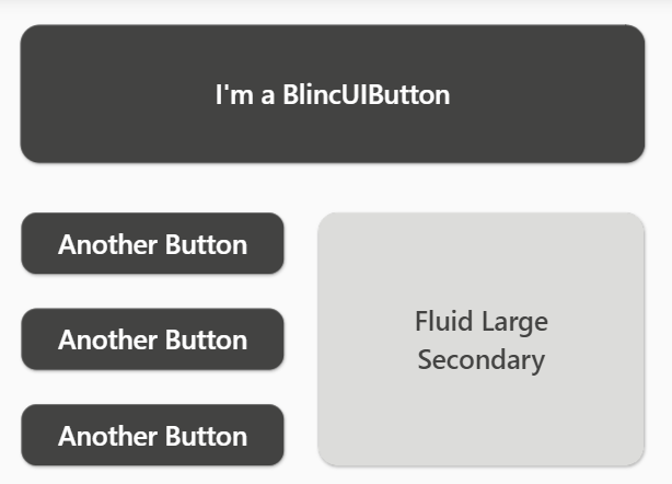
Example #
SizedBox(
  width: MediaQuery.of(context).size.width,
  child: Column(
    crossAxisAlignment: CrossAxisAlignment.center,
    children: [
      BlincSpacer.vertical.xxs,
      BlincButton(
        text: "I'm a BlincUIButton",
        onPressed: () {},
      ).largePrimary(),
      BlincSpacer.vertical.xxs,
      Row(
        mainAxisAlignment: MainAxisAlignment.center,
        crossAxisAlignment: CrossAxisAlignment.start,
        children: [
          Column(
            children: [
              BlincButton(
                text: 'Another Button',
                onPressed: () {},
              ).smallPrimary(),
              BlincSpacer.vertical.xxxs,
              BlincButton(
                text: 'Another Button',
                onPressed: () {},
              ).smallPrimary(),
              BlincSpacer.vertical.xxxs,
              BlincButton(
                text: 'Another Button',
                onPressed: () {},
              ).smallPrimary(),
            ],
          ),
          BlincSpacer.horizontal.xxxs,
          SizedBox(
            width: 180,
            height: 142,
            child: BlincButton(
              text: 'Fluid Large Secondary',
              isFluid: true,
              onPressed: () {},
            ).largeSecondary(),
          ),
        ],
      )
    ],
  ),
),
Buttons #
You can create buttons with BlincButton component. There are fixed button sizes and styles to use. It's possible to create themes and different sizings passing properties:
- text: sets the buttons' text
- textStyle: sets the text style
- isUnderlined: if true will create a text underline
- buttonTheme: accepts a BlincButtonTheme, where you can create your customized preset settings
- padding: the padding space inside the button
- icon: here you can pass an IconData with your icon
- isIconInverted: if true, the icon will be placed at the right size. The default is on the left.
- isLoading: if true will show a progress indicator component
- isFluid: if true the button will take all the available space around
You can access the presets with the function .smallSecondary, for example. It will create a small button with secondary style.
Example #
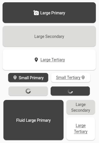
SizedBox(
  child: Column(
    crossAxisAlignment: CrossAxisAlignment.center,
    children: [
      BlincButton(
        text: 'Large Primary',
        icon: Icons.add_a_photo,
        onPressed: () {},
      ).largePrimary(),
      SizedBox(
        child: BlincButton(
          text: 'Large Secondary',
          onPressed: () {},
        ).largeSecondary(),
      ),
      BlincButton(
        text: 'Large Tertiary',
        onPressed: () {},
        icon: Icons.location_on,
      ).largeTertiary(),
      Padding(
        padding: const EdgeInsets.only(bottom: 5.0),
        child: Row(
          mainAxisAlignment: MainAxisAlignment.center,
          children: [
            BlincButton(
              text: 'Small Primary',
              icon: Icons.person_pin_circle_outlined,
              onPressed: () {},
            ).smallPrimary(),
            BlincButton(
              text: 'Small Tertiary',
              icon: Icons.person_pin_circle_outlined,
              onPressed: () {},
              isIconInverted: true,
            ).smallTertiary(),
          ],
        ),
      ),
      Padding(
        padding: const EdgeInsets.only(bottom: 5.0),
        child: Row(
          mainAxisAlignment: MainAxisAlignment.center,
          children: [
            BlincButton(
              isLoading: true,
              onPressed: () {},
            ).smallSecondary(),
            BlincButton(
              isLoading: true,
              onPressed: () {},
            ).smallPrimary(),
          ],
        ),
      ),
      Row(
        mainAxisAlignment: MainAxisAlignment.center,
        children: [
          SizedBox(
            width: 220,
            height: 150,
            child: BlincButton(
              text: 'Fluid Large Primary',
              isFluid: true,
              onPressed: () {},
            ).largePrimary(),
          ),
          Column(
            children: [
              SizedBox(
                width: 110,
                height: 60,
                child: BlincButton(
                  text: 'Large Secondary',
                  isFluid: true,
                  onPressed: () {},
                ).largeSecondary(),
              ),
              SizedBox(
                width: 110,
                height: 90,
                child: BlincButton(
                  text: 'Large Tertiary',
                  isFluid: true,
                  onPressed: () {},
                ).largeTertiary(),
              ),
            ],
          ),
        ],
      )
    ],
  ),
  ),
IconButtons #
You can create buttons with IconBlincButton component. Just as the BlincButton component, there are fixed button sizes and styles to use. It's possible to create themes and different sizings passing properties:
- child: support child components
- buttonTheme: accepts a BlincIconButtonTheme, where you can create your customized preset settings
- iconPresets: accepts an IconPresets, to customize the button sizing, shape and border
- icon: here you can pass an IconData with your icon
You can access the presets with the function .smallSecondary, for example. It will create a small button with secondary style.
Example #
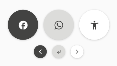
 SizedBox(
  child: Column(
      crossAxisAlignment: CrossAxisAlignment.center,
      children: [
        Row(
          mainAxisAlignment: MainAxisAlignment.center,
          children: [
            BlincIconButton(
              icon: Icons.facebook,
              onPressed: () {},
            ).iconLargePrimary(),
            BlincIconButton(
              onPressed: () {},
              icon: Icons.whatsapp,
            ).iconLargeSecondary(),
            BlincIconButton(
              onPressed: () {},
              icon: Icons.accessibility_new_sharp,
            ).iconLargeTertiary(),
          ],
        ),
        Row(
          mainAxisAlignment: MainAxisAlignment.center,
          children: [
            BlincIconButton(
              onPressed: () {},
              icon: Icons.arrow_back_ios_new,
            ).iconSmallPrimary(),
            BlincIconButton(
              onPressed: () {},
              icon: Icons.subdirectory_arrow_left_sharp,
            ).iconSmallSecondary(),
            BlincIconButton(
              onPressed: () {},
              icon: Icons.arrow_forward_ios,
            ).iconSmallTertiary(),
          ],
        ),
      ]
    ),
  ),
Shadows #
The BlincShadow component creates pre-defined styles for Container shadows. It has a variety of sizes:
- zero: provides a Container with no shadow
- sm: provides a Container with a small shadow
- md: provides a Container with a medium shadow
- lg: provides a Container with a large shadow
- xl: provides a Container with an extra large shadow
- huge: provides a Container with a huge shadow
It should be placed inside the boxShadow method inside the BoxDecoration:
 Container(
    width: 60,
    height: 60,
    decoration: BoxDecoration(
      color: const Color.fromARGB(255, 227, 227, 225),
      boxShadow: [
        blincShadow,
      ],
    ),
  );
Example #
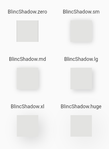
 SafeArea(
  child: Column(
    crossAxisAlignment: CrossAxisAlignment.center,
    children: [
      BlincSpacer.vertical.lg,
      Row(
        mainAxisAlignment: MainAxisAlignment.center,
        children: [
          block(BlincShadow.zero, 'zero'),
          block(BlincShadow.sm, 'sm')
        ],
      ),
      BlincSpacer.vertical.md,
      Row(
        mainAxisAlignment: MainAxisAlignment.center,
        children: [
          block(BlincShadow.md, 'md'),
          block(BlincShadow.lg, 'lg')
        ],
      ),
      BlincSpacer.vertical.md,
      Row(
        mainAxisAlignment: MainAxisAlignment.center,
        children: [
          block(BlincShadow.xl, 'xl'),
          block(BlincShadow.huge, 'huge')
        ],
      ),
    ],
  ),
),

Widget block(BoxShadow blincShadow, String size) {
  return SizedBox(
    width: 150,
    child: Column(
      mainAxisAlignment: MainAxisAlignment.center,
      children: [
        Text('BlincShadow.$size'),
        BlincSpacer.vertical.xxs,
        Container(
          width: 60,
          height: 60,
          decoration: BoxDecoration(
            color: const Color.fromARGB(255, 227, 227, 225),
            boxShadow: [
              blincShadow,
            ],
          ),
        ),
      ],
    ),
  );
}
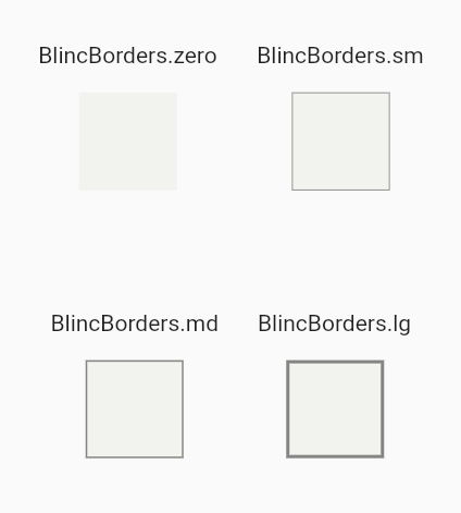
Borders #
The BlincBorders component creates pre-defined borders for Container's BoxDecoration. The available styles are:
- zero: no border
- sm: thin border
- md: medium border
- lg: thick border
Example #
SafeArea(
  child: Column(
    mainAxisAlignment: MainAxisAlignment.spaceEvenly,
    children: [
      Row(
        mainAxisAlignment: MainAxisAlignment.center,
        children: [
          block(BlincBorders.zero, 'zero'),
          block(BlincBorders.sm, 'sm'),
        ],
      ),
      Row(
        mainAxisAlignment: MainAxisAlignment.center,
        children: [
          block(BlincBorders.md, 'md'),
          block(BlincBorders.lg, 'lg'),
        ],
      ),
    ],
  ),
),

Widget block(BoxBorder blincBorder, String size) {
  return Padding(
    padding: const EdgeInsets.all(12.0),
    child: Column(
      mainAxisAlignment: MainAxisAlignment.center,
      children: [
        Text('BlincBorders.$size'),
        const SizedBox(height: 15),
        Container(
          width: 60,
          height: 60,
          decoration: BoxDecoration(
            color: const Color.fromARGB(255, 242, 242, 239),
            border: blincBorder,
          ),
        ),
      ],
    ),
  );
}
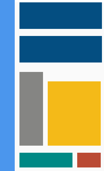
AppColors #
The AppColors is a class that provides a color palette for general use. It can be accessed through static methods.
Example #
SafeArea(
  child: SizedBox(
    child: Row(
      crossAxisAlignment: CrossAxisAlignment.start,
      children: [
        block(
          context,
          width: 50,
          height: MediaQuery.of(context).size.height,
          color: AppColors.colorBlueInfo_200,
        ),
        BlincSpacer.horizontal.xxs,
        Column(
          crossAxisAlignment: CrossAxisAlignment.start,
          children: [
            BlincSpacer.vertical.xxxs,
            block(
              context,
              width: 280,
              height: 90,
              color: AppColors.colorBlueSecondary,
            ),
            BlincSpacer.vertical.xs,
            block(
              context,
              width: 280,
              height: 90,
              color: AppColors.colorBlueSecondary,
            ),
            BlincSpacer.vertical.sm,
            Row(
              crossAxisAlignment: CrossAxisAlignment.start,
              children: [
                block(
                  context,
                  width: 80,
                  height: 250,
                  color: AppColors.colorNeutral_600,
                ),
                BlincSpacer.horizontal.xxs,
                Column(
                  children: [
                    BlincSpacer.vertical.sm,
                    block(
                      context,
                      width: 180,
                      height: 218,
                      color: AppColors.colorOrangePrimary,
                    ),
                  ],
                ),
              ],
            ),
            BlincSpacer.vertical.xs,
            Row(
              crossAxisAlignment: CrossAxisAlignment.start,
              children: [
                block(
                  context,
                  width: 180,
                  height: 50,
                  color: AppColors.colorGreenSecondary,
                ),
                BlincSpacer.horizontal.xxs,
                block(
                  context,
                  width: 80,
                  height: 50,
                  color: AppColors.colorOrangeAlert_300,
                ),
              ],
            ),
          ],
        ),
      ],
    ),
  ),
),

Widget block(
  context, {
  required double width,
  required double height,
  required Color color,
}) {
  return Container(
    width: width,
    height: height,
    color: color,
  );
}
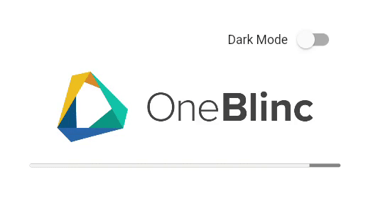
ProgressBar #
The BlincProgressBar component creates a progress bar.
- value: the percentage of the current progress. The value can range from 0.0 to 1.0
- dark: if true, switches to the dark theme.
BlincProgressBar(
  value: 0.1 //10%,
  dark: isDarkMode,
),
Example #
  SafeArea(
    child: Padding(
      padding: const EdgeInsets.only(top: 35.0),
      child: Container(
        alignment: Alignment.center,
        child: SizedBox(
          width: 350,
          child: Expanded(
            child: Column(
              crossAxisAlignment: CrossAxisAlignment.center,
              children: [
                Row(
                  mainAxisAlignment: MainAxisAlignment.end,
                  children: [
                    Text(
                      'Dark Mode',
                      style: TextStyle(
                        color: isDarkMode
                            ? AppColors.colorNeutral_0
                            : AppColors.colorNeutral_900,
                      ),
                    ),
                    Switch(
                      value: isDarkMode,
                      onChanged: ((value) {
                        setState(() {
                          isDarkMode = !isDarkMode;
                        });
                      }),
                    ),
                  ],
                ),
                BlincSpacer.vertical.xxs,
                BlincLogo(
                  logoTheme:
                      isDarkMode ? LogoTheme.white : LogoTheme.standard,
                ),
                BlincSpacer.vertical.xs,
                BlincProgressBar(
                  value: value,
                  dark: isDarkMode,
                ),
              ],
            ),
          ),
        ),
      ),
    ),
  ),
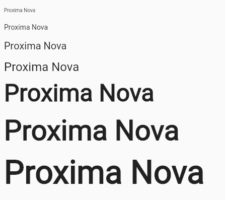
Typography #
The Typography component creates a text, where you can customize with a series of methods.
Weight #
- weightThin
- weightLight
- weightRegular
- weightMedium
- weightSemiBold
- weightBold
- weightExtraBold
- weightBlack
Size #
- sizeXXXS
- sizeXXS
- sizeXS
- sizeSM
- sizeMD
- sizeLG
- sizeXL
- sizeXXL
- sizeXXXL
- sizeHuge
- sizeXHuge
- sizeXXHuge
Line Height #
- heightXXXS
- heightXXS
- heightXS
- heightSM
- heightMD
- heightLG
- heightXL
- heightXXL
- heightXXXL
- heightHuge
- heightXHuge
Example #
  SafeArea(
    child: ListView(
      padding: const EdgeInsets.all(8.0),
      children: [
        BlincSpacer.vertical.xxs,
        BlincText('Proxima Nova').weightThin.heightXXS.sizeXXXS,
        BlincSpacer.vertical.xxs,
        BlincText('Proxima Nova').weightLight.heightXS.sizeXS,
        BlincSpacer.vertical.xxs,
        BlincText('Proxima Nova').weightRegular.heightSM.sizeMD,
        BlincSpacer.vertical.xxs,
        BlincText('Proxima Nova').weightMedium.heightMD.sizeLG,
        BlincSpacer.vertical.xxs,
        BlincText('Proxima Nova').weightSemiBold.heightXXL.sizeHuge,
        BlincSpacer.vertical.xxs,
        BlincText('Proxima Nova').weightExtraBold.heightHuge.sizeXHuge,
        BlincSpacer.vertical.xxs,
        BlincText('Proxima Nova').weightBlack.heightXHuge.sizeXXHuge,
      ],
    ),
  ),
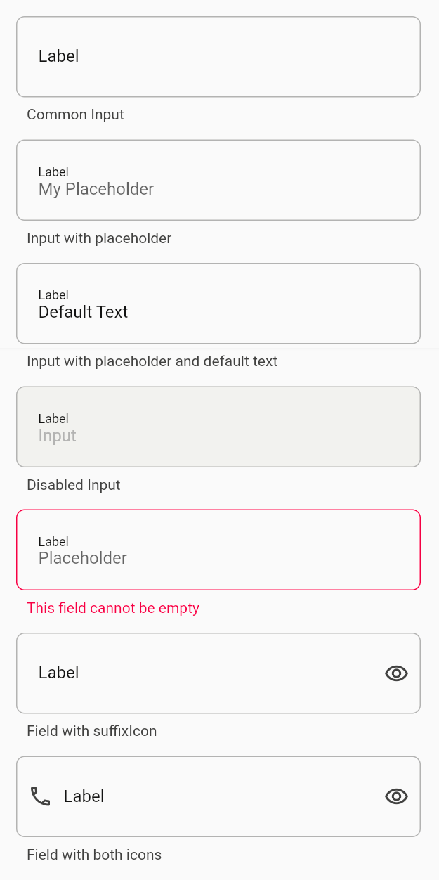
Inputs #
The BlincInputComponent can create forms and inputs and has pre-built validators. To use it, you must wrap a BlincInputComponent.input inside a BlincInputComponent.form.
To create a BlincInputComponent.form you must provide the key and the child:
  final _globalKey = GlobalKey<FormState>();
  BlincInputComponent.form(
    globalKey: _globalKey,
    child: Container(
      ...
    )
  )
To customize a BlincInputComponent.input you can provide:
- label: the label text
- placeholder - the placeholder text
- obscureText - if true, will hide the inserted content (for passwords, for example)
- prefixIcon - adds an icon to the left
- suffixIcon - adds an icon to the right
- descriptionText - the description text below the input
- enabled - if set to false the input gets disabled
- textEditingController - controls the text inside the input
- textInputType - keyboard type (Mobile for example)
- validator - pre-built validations (E.g.: BlincInputComponent.validations.required)
Example #
  class InputExample extends StatelessWidget {
  InputExample({Key? key}) : super(key: key);

  final _globalKey = GlobalKey<FormState>();

  void _validateForm() {
    _globalKey.currentState?.validate();
  }

  @override
  Widget build(BuildContext context) {
    return Scaffold(
      appBar: AppBar(
        backgroundColor: Colors.black87,
        title: const Text('Input component example'),
      ),
      body: SafeArea(
        child: BlincInputComponent.form(
          globalKey: _globalKey,
          child: Container(
            alignment: Alignment.center,
            child: SizedBox(
              width: 400,
              child: ListView(
                padding: const EdgeInsets.all(8.0),
                children: [
                  BlincSpacer.vertical.xxs,
                  BlincInputComponent.textField(
                    obscureText: true,
                    label: 'Label',
                    descriptionText: 'Common Input',
                  ),
                  BlincSpacer.vertical.xxs,
                  BlincInputComponent.textField(
                    label: 'Label',
                    placeholder: 'My Placeholder',
                    descriptionText: 'Input with placeholder',
                  ),
                  BlincSpacer.vertical.xxs,
                  BlincInputComponent.textField(
                    label: 'Label',
                    placeholder: 'Placeholder',
                    descriptionText: 'Input with placeholder and default text',
                    textEditingController:
                        TextEditingController(text: 'Default Text'),
                  ),
                  BlincSpacer.vertical.xxs,
                  BlincInputComponent.textField(
                    label: 'Label',
                    placeholder: 'Placeholder',
                    descriptionText: 'Disabled Input',
                    textEditingController: TextEditingController(text: 'Input'),
                    enabled: false,
                  ),
                  BlincSpacer.vertical.xxs,
                  BlincInputComponent.textField(
                    label: 'Label',
                    placeholder: 'Placeholder',
                    descriptionText: 'Required field',
                    validator: BlincInputComponent.validations.required,
                  ),
                  BlincSpacer.vertical.xxs,
                  BlincInputComponent.textField(
                    label: 'Label',
                    descriptionText: 'Field with suffixIcon',
                    suffixIcon: Icons.remove_red_eye_outlined,
                  ),
                  BlincSpacer.vertical.xxs,
                  BlincInputComponent.textField(
                    label: 'Label',
                    descriptionText: 'Field with both icons',
                    suffixIcon: Icons.remove_red_eye_outlined,
                    prefixIcon: Icons.phone_outlined,
                  ),
                ],
              ),
            ),
          ),
        ),
      ),
      floatingActionButton: FloatingActionButton(
        onPressed: _validateForm,
        child: const Icon(Icons.send),
      ),
    );
  }
}
Metadata
Documentation
Publisher
unverified uploader
Weekly Downloads
Metadata
User-friendly custom widget pack. Including inputs, button, progress bar, typography, borders, gradient and other useful widgets.
License
 BSD-3-Clause (license)