auto_skeleton 0.1.0  auto_skeleton: ^0.1.0 copied to clipboard
Auto-generate skeleton/shimmer loading screens from your actual widget tree. Zero fake data needed — just wrap your widget and get a matching placeholder shape automatically.
auto_skeleton #

Auto-generate skeleton/shimmer loading screens from your actual widget tree. No fake data needed — just wrap your widget and get a matching placeholder shape automatically.
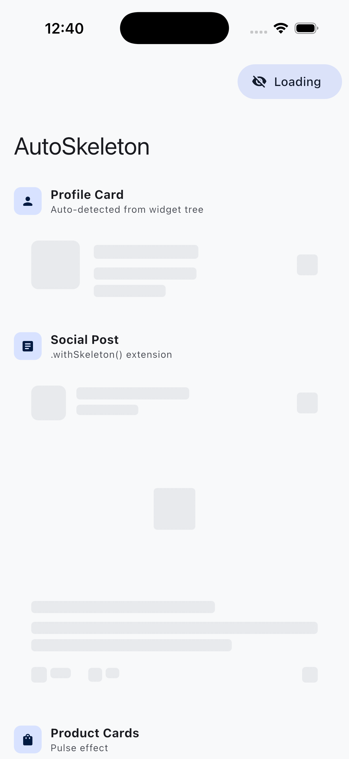
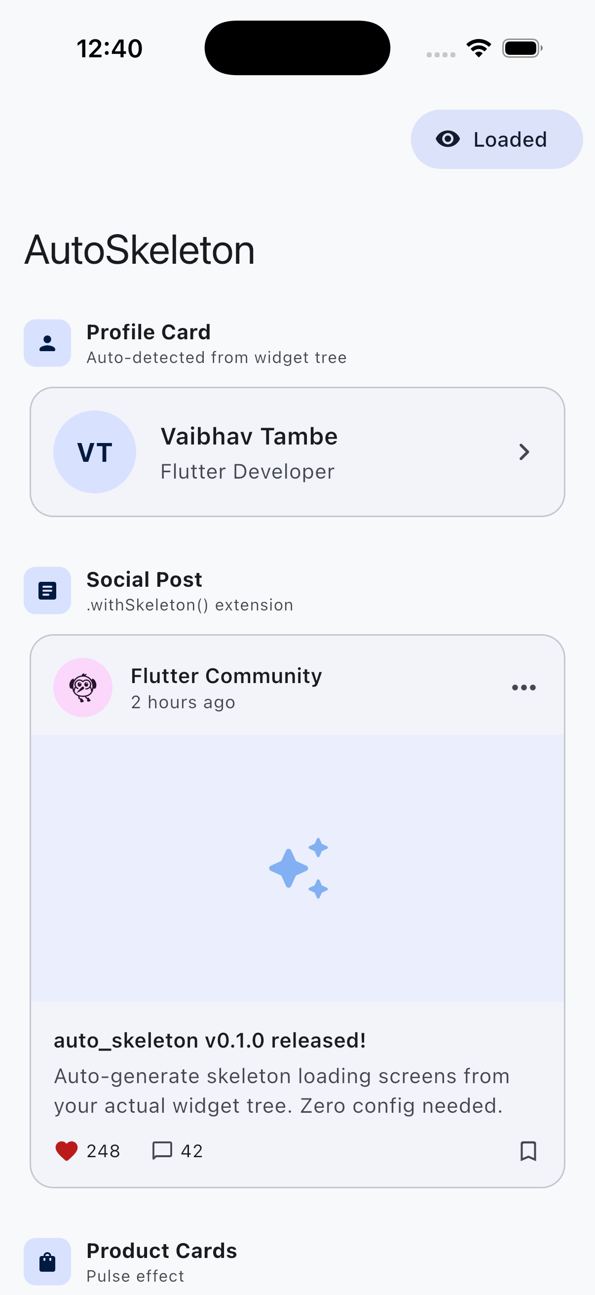
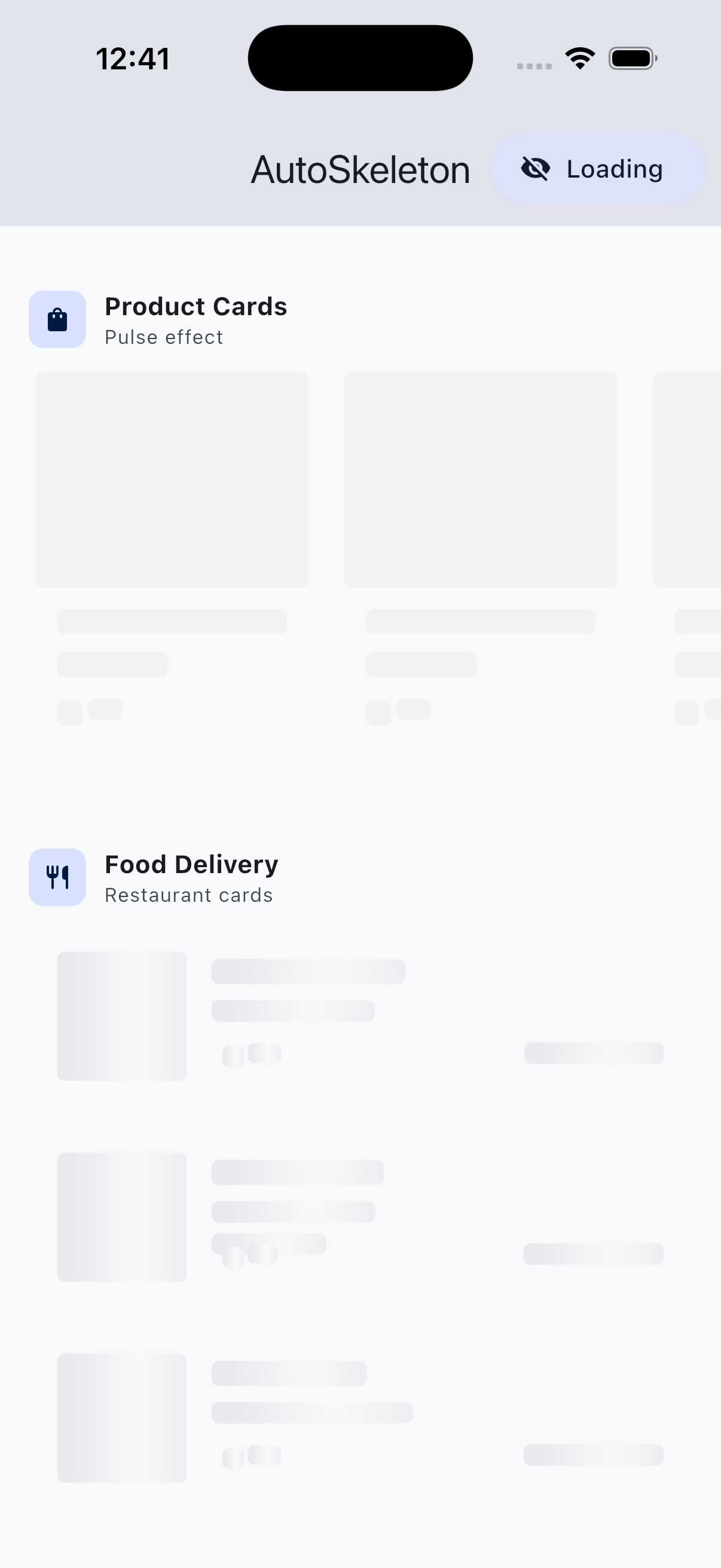
Screenshots #
| Skeleton (Loading) | Loaded (Content) |
|---|---|
 |
 |
 |
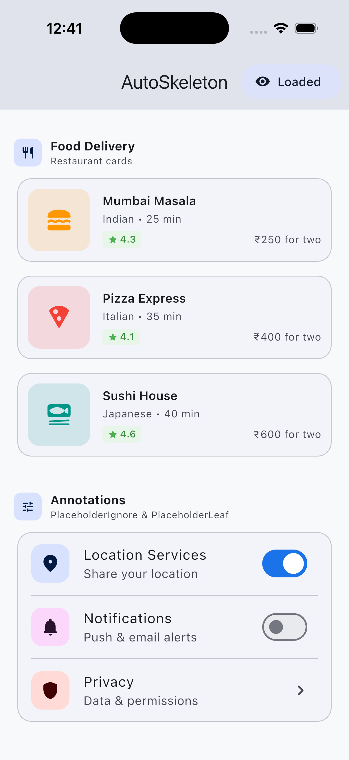 |
| Annotations (Skeleton) |
|---|
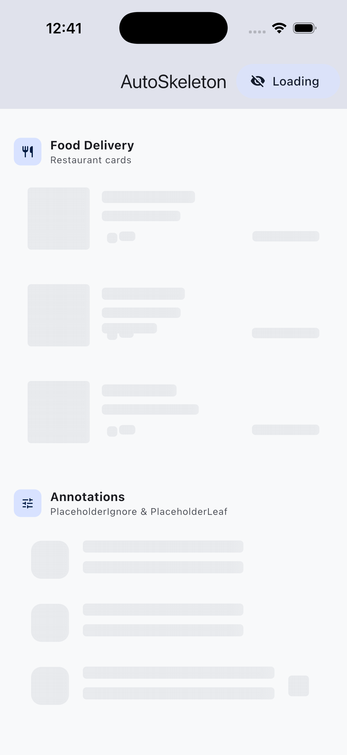 |
Toggle button switches between skeleton and real content. Annotations let you control which widgets get skeleton bones —
PlaceholderIgnorehides the switches,PlaceholderLeaftreats icon boxes as solid bones.
Why auto_skeleton? #
Building skeleton loading UIs manually is tedious and goes out of sync with your real layouts. auto_skeleton solves this by introspecting your widget tree at render time and generating matching bone shapes for every content widget (Text, Image, Icon, Button, etc.).
Key Differences from Other Packages #
| Feature | auto_skeleton | skeletonizer | shimmer |
|---|---|---|---|
| Auto-detect widget shapes | ✅ | ✅ | ❌ |
| Zero fake data needed | ✅ | ❌ (needs mock data) | ❌ |
| Theme-aware colors | ✅ | ❌ | ❌ |
Extension syntax .withSkeleton() |
✅ | ❌ | ❌ |
| Pre-built presets (food card, product card) | ✅ | ❌ | ❌ |
| Multiple effects (shimmer, pulse, solid) | ✅ | ✅ | Shimmer only |
| Annotation system | ✅ | ✅ | ❌ |
| Switch animation | ✅ | ✅ | ❌ |
| Dark mode auto-detection | ✅ | ✅ | ❌ |
Installation #
Add to your pubspec.yaml:
dependencies:
  auto_skeleton: ^0.1.0
Then run:
flutter pub get
Quick Start #
Basic Usage #
Wrap any widget with AutoSkeleton:
AutoSkeleton(
  enabled: _isLoading,
  child: Card(
    child: ListTile(
      leading: CircleAvatar(child: Icon(Icons.person)),
      title: Text('John Doe'),
      subtitle: Text('Software Developer'),
      trailing: Icon(Icons.chevron_right),
    ),
  ),
)
That's it! When enabled: true, the package scans the widget tree and renders matching skeleton bones with a shimmer animation. When enabled: false, your actual content is shown.
Colors are automatically derived from your app's theme — works in both light and dark mode with zero configuration.
Extension Syntax #
Even simpler — use the .withSkeleton() extension:
Card(
  child: ListTile(
    title: Text('Hello World'),
    subtitle: Text('This is a subtitle'),
  ),
).withSkeleton(loading: _isLoading)
Color Customization #
Layer 1: Theme-aware (zero config) #
Colors are automatically derived from your app's ColorScheme. Just works in light and dark mode.
Layer 2: Global override #
Set colors once at the app root:
AutoSkeletonConfig(
  data: AutoSkeletonConfigData(
    baseColor: Colors.grey.shade300,
    highlightColor: Colors.grey.shade100,
  ),
  child: MaterialApp(...),
)
Layer 3: Per-widget override #
Override on a specific widget:
AutoSkeleton(
  enabled: _isLoading,
  effect: ShimmerEffect(baseColor: Colors.blue.shade200),
  child: myWidget,
)
Effects #
Shimmer (Default) #
AutoSkeleton(
  enabled: _isLoading,
  effect: ShimmerEffect(
    baseColor: Colors.grey.shade300,
    highlightColor: Colors.grey.shade100,
    duration: Duration(milliseconds: 1500),
    direction: ShimmerDirection.ltr,
  ),
  child: MyWidget(),
)
Pulse #
A gentle breathing/fade animation:
AutoSkeleton(
  enabled: _isLoading,
  effect: PulseEffect(
    color: Colors.blue.shade100,
    duration: Duration(milliseconds: 1200),
    minOpacity: 0.4,
    maxOpacity: 1.0,
  ),
  child: MyWidget(),
)
Solid #
Static placeholder with no animation:
AutoSkeleton(
  enabled: _isLoading,
  effect: SolidEffect(color: Colors.grey.shade200),
  child: MyWidget(),
)
Annotations #
Control how specific widgets are skeletonized using annotation wrappers:
PlaceholderIgnore #
Hide a widget completely during loading:
AutoSkeleton(
  enabled: _isLoading,
  child: Column(
    children: [
      Text('This gets a skeleton bone'),
      PlaceholderIgnore(
        child: Text('This is hidden during loading'),
      ),
    ],
  ),
)
PlaceholderLeaf #
Mark complex widgets (charts, maps, custom painters) as a single bone instead of traversing their children:
PlaceholderLeaf(
  borderRadius: BorderRadius.circular(12),
  child: MyComplexChartWidget(),
)
PlaceholderReplace #
Replace a widget with a custom placeholder:
PlaceholderReplace(
  replacement: Container(
    width: 48,
    height: 48,
    decoration: BoxDecoration(
      color: Colors.grey.shade300,
      shape: BoxShape.circle,
    ),
  ),
  child: CircleAvatar(
    backgroundImage: NetworkImage(user.avatarUrl),
  ),
)
Pre-built Presets #
Ready-to-use skeleton patterns for common UI layouts:
List Tile #
SkeletonPresets.listTile(
  itemCount: 5,
  itemHeight: 72.0,
)
Product Card (E-commerce) #
SkeletonPresets.productCard(
  width: 160.0,
  imageHeight: 160.0,
)
Food Card (Delivery Apps) #
SkeletonPresets.foodCard()
Horizontal Card Row #
SkeletonPresets.horizontalCardRow(
  itemCount: 4,
  cardWidth: 140.0,
  cardHeight: 180.0,
)
Global Configuration #
Set defaults for your entire app using AutoSkeletonConfig:
AutoSkeletonConfig(
  data: AutoSkeletonConfigData(
    baseColor: Color(0xFFE8E8E8),
    highlightColor: Color(0xFFF8F8F8),
    textBorderRadius: 4.0,
    containerBorderRadius: 8.0,
    enableSwitchAnimation: true,
    switchAnimationDuration: Duration(milliseconds: 300),
    switchAnimationCurve: Curves.easeInOut,
    justifyMultiLineText: true,
  ),
  child: MaterialApp(...),
)
Switch Animation #
Smoothly transition from skeleton to content:
AutoSkeleton(
  enabled: _isLoading,
  enableSwitchAnimation: true,
  switchAnimationDuration: Duration(milliseconds: 500),
  switchAnimationCurve: Curves.easeOut,
  child: MyWidget(),
)
Sliver Support #
For use inside CustomScrollView:
CustomScrollView(
  slivers: [
    SliverAutoSkeleton(
      enabled: _isLoading,
      child: MyListContent(),
    ),
  ],
)
How It Works #
- Layout Phase: The child widget tree is built and laid out (invisibly on the first frame).
- Scan Phase: After layout,
WidgetTreeScannerwalks the element tree and identifies content widgets (Text, Image, Icon, Button, etc.). - Bone Generation: For each content widget, a
BoneRectis created matching its position and size in the layout. - Paint Phase:
BonePainterrenders the chosen effect (shimmer/pulse/solid) over each bone rectangle. - Transition: When loading completes, the skeleton fades out and real content fades in.
Supported Widgets #
The scanner automatically detects and creates bones for:
Text&RichText(with multi-line support)ImageIconCircleAvatarElevatedButton,TextButton,OutlinedButton,IconButtonFloatingActionButtonSwitch,Checkbox,RadioChip
Containers (Card, Container, Padding, etc.) are traversed to find their content children.
Example #
Check the example directory for a complete demo app showing all features.
Contributing #
Contributions are welcome! Please feel free to submit a Pull Request.
License #
BSD 3-Clause License
Copyright (c) 2026, Vaibhav Tambe
Metadata
Publisher
unverified uploader
Weekly Downloads
Metadata
Auto-generate skeleton/shimmer loading screens from your actual widget tree. Zero fake data needed — just wrap your widget and get a matching placeholder shape automatically.
Repository (GitHub)
View/report issues
Topics
#skeleton #shimmer #loading #placeholder #ui
License
 unknown (license)