arculus_auth_widgets 0.1.1  arculus_auth_widgets: ^0.1.1 copied to clipboard
 moseskarunia.com
Collection of theme-aware flutter auth-related widgets such as social sign in buttons, splash page, and sign in page, etc.
Arculus Auth Widgets #
⚠️ This package is still under development and not yet tested. That's why it's not 1.0.0 yet. With that being said, I don't expect any major changes to the existing widgets.

Collection of flutter auth-related widgets such as social sign in buttons, splash page, and sign in page, etc. These widgets are designed to work nicely with your app theming as well as respective brand guidelines. Feel free to post an issue if there's anything wrong.
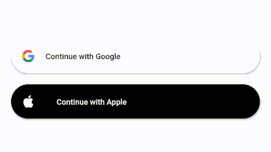
For your convenience, you can see the button brand guidelines here:
As for the email sign in button, I just use the default theming of ElevatedButton, which is usually have background color equals to your app's primary color, and foreground color equals to your app's primaryTextTheme.button (Primary Text Theme = Text Theme with color contrast to your primary color.)
Features Overview #
✨ Easily show LoadingIndicator using the provided isLoading property. When isLoading:true buttons will automatically disabled, preventing repeated taps. The button also visible as translucent as a cue to the user that it's not interactable at the moment.
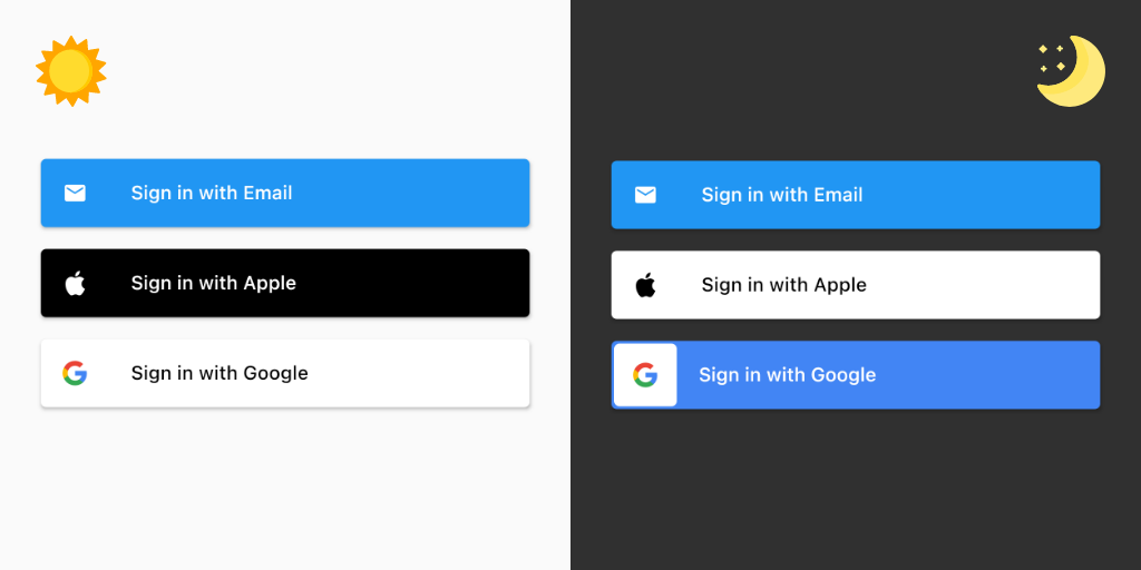
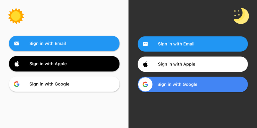
✨ Automatically adapts to your root Theme, such as Theme brightness and ElevatedButton shape.
About Brightness / Theme Mode #
Flutter's ThemeData has a property called themeMode. ThemeMode is basically tells the flutter app which theme to use. I usually use ThemeMode.system to make the app theme matches the user's device system configuration.
- ThemeMode.light = Uses
ThemeData.theme. - ThemeMode.dark = Force use
ThemeData.darkTheme.
Features #
Generic Button #

Generic buttons basically just customized ElevatedButton.icon().
GenericEmailButton(label: 'Sign in with Email', onPressed: (_) {});
GenericAppleButton(label: 'Sign in with Apple', onPressed: (_) {});
GenericGoogleButton(label: 'Sign in with Google', onPressed: (_) {});

And since they are basically a ElevatedButton, they will adapt to your ElevatedButtonThemeData in your root ThemeData. For example, I can modify the style of the button to be rounded with elevatedButtonTheme's shape like below. (See the rounded google dark button with that nice circular white background? Yep. It's automatically applied if you make your ElevatedButton theme rounded 😉)
class MyApp extends StatelessWidget {
  OutlinedBorder getBorder(Set<MaterialState> states) {
    return RoundedRectangleBorder(
      /// The value 100 doesn't really matter because, afaik, it will be rounded down to 50%
      /// of the final height of the widget. (Please correct me if I'm wrong)
      borderRadius: BorderRadius.circular(100),
    );
  }

  @override
  Widget build(BuildContext context) {
    return MaterialApp(
      /// Use ThemeMode.dark to force darkTheme or ThemeMode.system to match device's theme.
      themeMode: ThemeMode.light
      /// Other codes
      theme: ThemeData(
        brightness: Brightness.light
        /// Other codes
        elevatedButtonTheme: ElevatedButtonThemeData(
            style: ButtonStyle(
          shape: MaterialStateProperty.resolveWith(getBorder),
        )),
      ),
      darkTheme: ThemeData(
        brightness: Brightness.dark
      /// Other codes
        elevatedButtonTheme: ElevatedButtonThemeData(
            style: ButtonStyle(
          shape: MaterialStateProperty.resolveWith(getBorder),
        )),
      ),
      /// Other codes
    );
  }
}
Arculus Style Button #
Arculus-Style buttons are still ElevatedButton at heart, but with more adjustments to make it nicer-looking (for my taste). And yes, they will still adapt to your ElevatedButtonThemeData in your root ThemeData. (though maybe not as flexible as the generic ones)
ArculusEmailButton(label: 'Sign in with Email', onPressed: (_) {});
ArculusAppleButton(label: 'Sign in with Apple', onPressed: (_) {});
ArculusGoogleButton(label: 'Sign in with Google', onPressed: (_) {});
They can also be made rounded, similar to how you make the generic ones rounded.
class MyApp extends StatelessWidget {
  OutlinedBorder getBorder(Set<MaterialState> states) {
    return RoundedRectangleBorder(
      /// The value 100 doesn't really matter because, afaik, it will be rounded down to 50%
      /// of the final height of the widget. (Please correct me if I'm wrong)
      borderRadius: BorderRadius.circular(100),
    );
  }

  @override
  Widget build(BuildContext context) {
    return MaterialApp(
      /// Use ThemeMode.dark to force darkTheme or ThemeMode.system to match device's theme.
      themeMode: ThemeMode.light
      /// Other codes
      theme: ThemeData(
        brightness: Brightness.light
        /// Other codes
        elevatedButtonTheme: ElevatedButtonThemeData(
            style: ButtonStyle(
          shape: MaterialStateProperty.resolveWith(getBorder),
        )),
      ),
      darkTheme: ThemeData(
        brightness: Brightness.dark
        /// Other codes
        elevatedButtonTheme: ElevatedButtonThemeData(
            style: ButtonStyle(
          shape: MaterialStateProperty.resolveWith(getBorder),
        )),
      ),
      /// Other codes
    );
  }
}
Brand Icon #
In case you needed it, you can use the available plain icon. Note that GoogleIcon() doesn't come with the default white background regardles your app's brightness, because the white background is a button feature, not an icon feature. The apple one will still matches the Brightness of your active theme.
GoogleIcon();
AppleIcon();
Overriding root themeMode #
In case you need the button to diverge from the root themeMode, you can wrap your button with a modified Theme. For example, you have your app themeMode set to ThemeMode.light, but you want to use the dark mode version of the google button. You can then do this:
Theme(
  data: Theme.of(context).copyWith(brightness: Brightness.dark),
  child: GenericGoogleButton(label: 'Sign in with Google', onPressed: (_) {})
),
You can use this method to override anything else as well. For example, in case you want to use regular shaped ElevatedButton globally, but want to use the rounded version of ArculusGoogleButton.
Coming Soon #
- Write widget testing with codecov.
- Other social buttons (Request in Issue!)
- Predefined splash page
- Predefined onboarding page
Support #
I will appreciate any star to the github repo as well as like to the pub.dev page of this library. If you want, you can also buy me a cup of coffee by clicking the button below to motivate me creating helpful libraries in the future! Thanks for your support!

Why "Arculus"? #
Inspired from the Roman tutelary god of chests and strongboxes, Arculus flutter plugin family will also grow larger in the future to help you implement security features easier to your apps. The one I'm working on currently is a plugin to quickly implement Firebase Auth in flutter apps, so that we don't need to repeatedly rewrite everything from scratch at the beginning of a flutter projects.
Credit #
- Freepik via flaticon.com for those beautiful sun and moon icons!
Metadata
Publisher
Metadata
Collection of theme-aware flutter auth-related widgets such as social sign in buttons, splash page, and sign in page, etc.
License
 MIT (license)