appsize 1.0.4+1  appsize: ^1.0.4+1 copied to clipboard
 mibus-app.com.ar
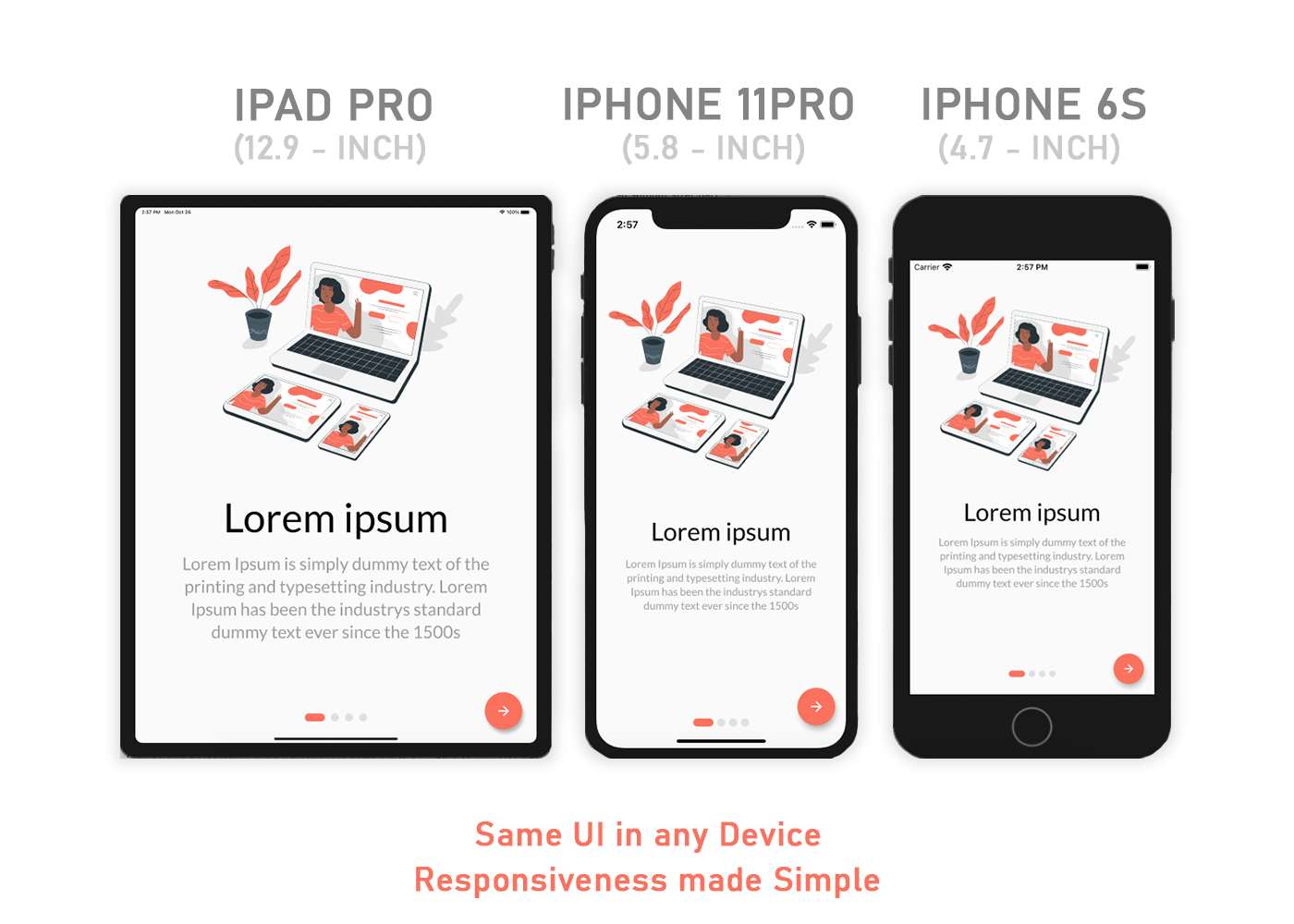
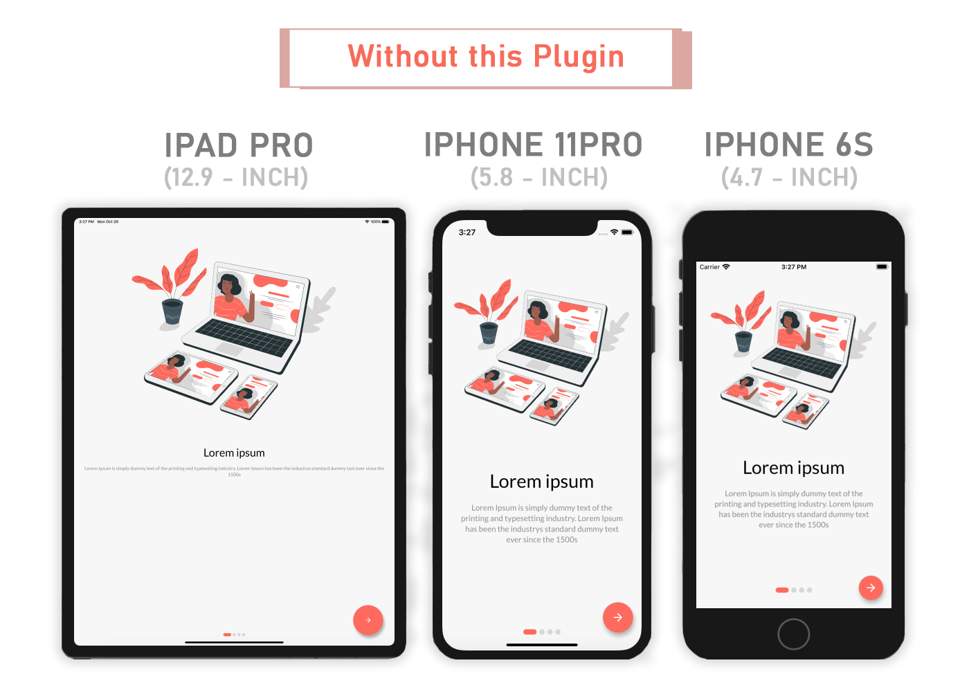
A Flutter package for Easily make Flutter apps responsive. Automatically adapt UI to different screen sizes. Responsiveness made simple.
AppSize #
This is a Fork of the sizer package.
A Flutter package for Easily make Flutter apps responsive. Automatically adapt UI to different screen sizes. Responsiveness made simple.
Content #
Installation ⬇️ #
Add to pubspec.yaml.
dependencies:
  ...
  appsize: ^1.0.4
Parameters ⚙️ #
.h- Returns a calculated height based on the app size..w- Returns a calculated width based on the app size..dh- Returns a calculated height based on the device..dw- Returns a calculated width based on the device..sp- Returns a calculated "Sizeable Pixel" width based on the canvas width.AppSizeUtil.orientation- for screen orientation portrait or landscape.AppSizeUtil.deviceType- for device type mobile or tablet.
Usage 💻 #
Add the following imports to your Dart code: #
import 'package:appsize/appsize.dart';
Wrap MaterialApp with ResponsiveAppSize widget #
  AppSize(
    canvasWidth: 375,
    builder: (context, orientation, deviceType) {
      return MaterialApp();
    }
  )
Whenever you use height and width first import AppSize package.
import 'package:appsize/appsize.dart';
Widget Size 🕓 #
    Container(
      width: 20.w,    //It will take a 20% of app width
      height:30.h     //It will take a 30% of app height
    )
Widget Size 🕓 #
    Container(
      width: 20.dw,    //It will take a 20% of screen width
      height: 30.dh    //It will take a 30% of screen height
    )
Padding ⏹ #
    Padding(
      padding: EdgeInsets.symmetric(
        vertical: 15.sp,    //It will use 15 sizeables pixels
        horizontal: 30.sp,  //It will use 30 sizeables pixels
      ),
      child: Container(),
    );
Font size 🆎 #
    Text(
      'AppSize',
      style: TextStyle(
        fontSize: 15.sp,
      ),
    );
Square Widget 🟩 #
If you want to make square size widget then give height or width in both height and width.
    Container(
      width: 30.h,      //It will take a 30% of app height
      height: 30.h,     //It will take a 30% of app height
    );
Orientation 🔄 #
If you want to support both portrait and landscape orientations use .h and .w.
Container(   // Widget for Landscape
  width: 100.w,
  height: 12.5.h,
)
DeviceType 📱 #
If you want the same layout to look different in tablet and mobile, use the AppSizeUtil.deviceType method:
AppSizeUtil.deviceType == DeviceType.mobile
  ? Container(   // Widget for Mobile
      width: 100.w,
      height: 20.5.h,
   )
  : Container(   // Widget for Tablet
      width: 100.w,
      height: 12.5.h,
   )
Suggestion #
Orientation
If you want to give support for both portrait and landscape then make separate widget for both like orientation example.
DeviceType
If you want to give support for both mobile and tablet then make separate widget for both like deviceType example.
Note #
You need to import appsize package in order to access number.h, number.w, and number.sp
Auto import in VSCode and Android Studio doesn't work for dart extension methods. Typing 10.h would not bring up auto import suggestion for this package
One workaround is to type Device so that the auto import suggestion would show up:
import 'package:appsize/appsize.dart';
Issue and feedback 💭 #
If you have any suggestion for including a feature or if something doesn't work, feel free to open a Github issue for us to have a discussion on it.
Metadata
Publisher
Metadata
A Flutter package for Easily make Flutter apps responsive. Automatically adapt UI to different screen sizes. Responsiveness made simple.
Repository (GitHub)
View/report issues
License
 unknown (LICENSE)