app_alert_dialog 0.0.4  app_alert_dialog: ^0.0.4 copied to clipboard
A simple customizable alert dialog with two buttons for Flutter apps.
App Alert Dialog 🚀 #
A Flutter package to display customizable alert dialogs with two buttons and an optional close icon.
Features #
- Customizable title, message, and icons (supports SVG)
- Optional close button
- Supports primary and secondary buttons
- Fully customizable button actions
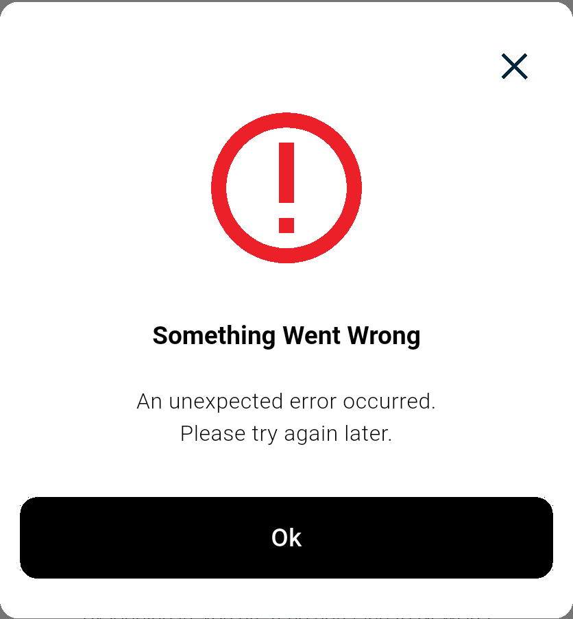
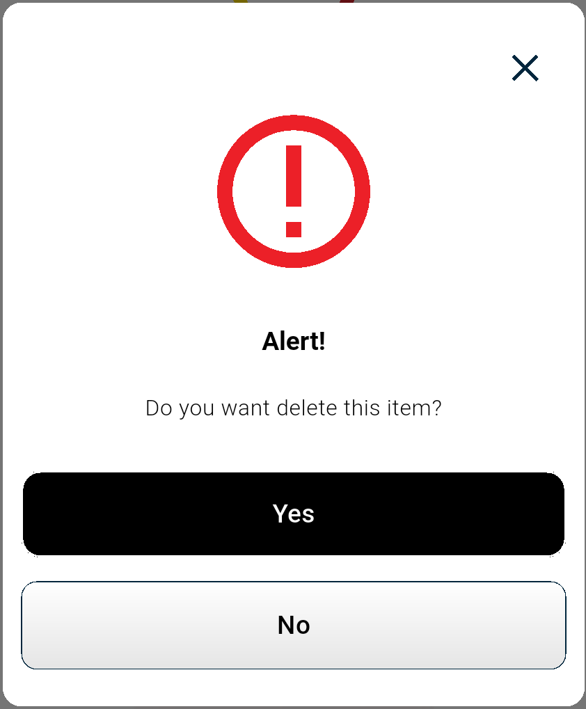
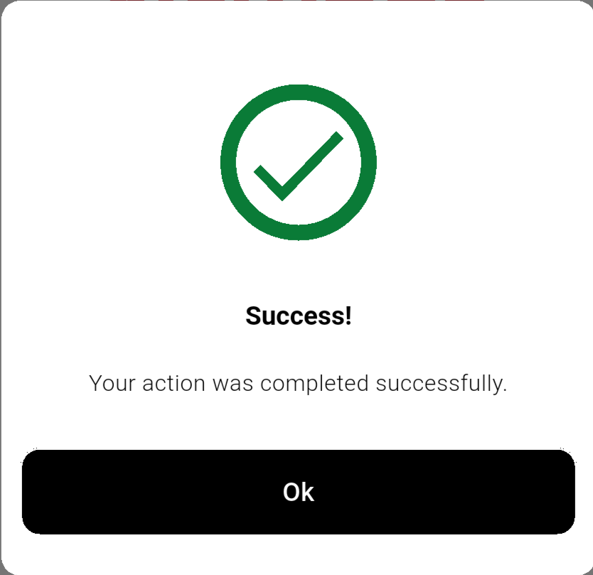
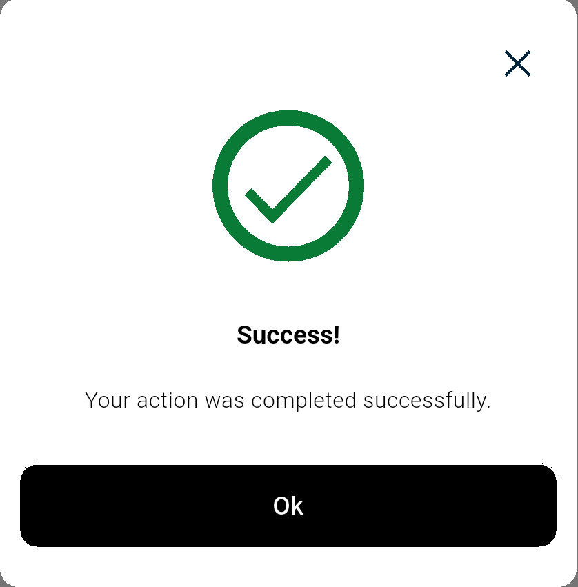
Screenshots #
Error Alert Dialog #
Success Alert Dialog #
Installation #
Add this dependency to your pubspec.yaml file:
dependencies:
  app_alert_dialog: ^0.0.1
Then, run:
flutter pub get
Usage #
Import the package:
import 'package:app_alert_dialog/app_alert_dialog.dart';
Showing an Alert Dialog #
AppAlertDialogs.showAlertDialog(
  context: context,
  title:'Success',
  message:'You have pushed the button this many times: \$_counter',
  primaryButton: (pContext) {
    return ElevatedButton(
      onPressed: () {
        Navigator.of(pContext).pop();
      },
      child: Text('OK'),
    );
  },
  secondaryButton: (sContext) {
    return ElevatedButton(
      onPressed: () {
        Navigator.of(sContext).pop();
      },
      child: Text('NO'),
    );
  },
);
Customization #
You can customize the alert dialog by modifying the DialogBodyObject properties:
title: Set the title of the dialog.message: Provide a description or message.iconSvg: Pass an optional SVG icon.primaryButton: Define the primary action button.secondaryButton: Define the secondary action button.
License #
This package is licensed under the MIT License. See the LICENSE file for details.
Contributions #
Contributions are welcome! Feel free to submit a pull request or report issues.
Contact #
For any queries or support, feel free to reach out via GitHub Issues.
Metadata
2
likes
150
points
51
downloads
Publisher
unverified uploader
Weekly Downloads
Metadata
A simple customizable alert dialog with two buttons for Flutter apps.
Repository (GitHub)
View/report issues
Documentation
License
 MIT (license)