animated_widgets 1.0.0+1  animated_widgets: ^1.0.0+1 copied to clipboard
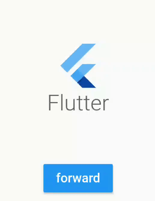
Easily add animations on your screen with AnimatedWidgets. Add always your animated widgets in your component's tree, then activate them when you want to activate the animations.
animated_widgets #
Easily add animations on your screen with AnimatedWidgets.
Optimized for MVVM using Bloc, updating the enabled value of the widget will forward or reverse the animation.
Available widgets : TranslationAnimatedWidget, OpacityAnimatedWidget, RotationAnimatedWidget, ScaleAnimatedWidget, SizeAnimatedWidget
For example : add a TranslationAnimatedWidget on a button, then activate it to display it !
TranslationAnimatedWidget(
    enabled: this.displayMyWidget, //update this boolean to forward/reverse the animation
    values: [
        Offset(0, 200), // disabled value value
        Offset(0, 250), //intermediate value
        Offset(0, 0) //enabled value
    ],
    child: /* your widget */
),

or using a tween constructor
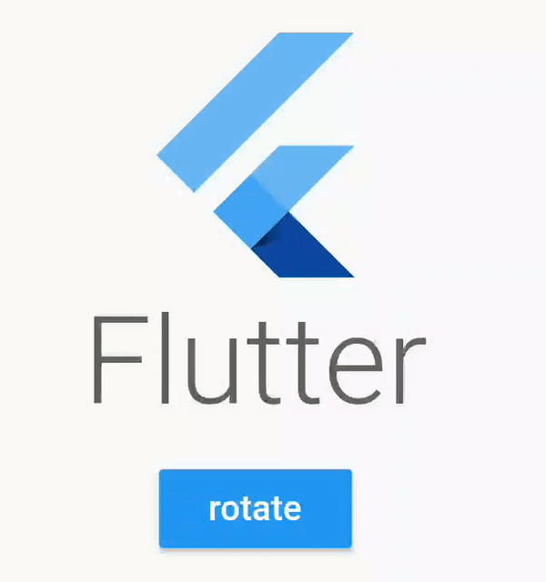
RotationAnimatedWidget.tween(
    enabled: this.displayMyWidget, //update this boolean to forward/reverse the animation
    rotationDisabled: Rotation.degrees(z: 0),
    rotationEnabled: Rotation.degrees(z: 90),
    child: /* your widget */
),
Compose #
Don't hesitate to compose them
TranslationAnimatedWidget.tween(
    enabled: this.displayMyWidget,
    translationDisabled: Offset(0, 200),
    translationEnabled: Offset(0, 0),
    child:
        OpacityAnimatedWidget.tween(
        enabled: this.displayMyWidget,
        opacityDisabled: 0,
        opacityEnabled: 1,
        child: /* your widget */
    ),
),
Opacity #
Example using a Stateful Widget
class _StatefulScreenState extends State<StatefulScreen> {
// will determine if the opacity animation is launched
bool _display = false;
@override
Widget build(BuildContext context) {
return Scaffold(
appBar: AppBar(),
body: Column(
crossAxisAlignment: CrossAxisAlignment.stretch,
mainAxisAlignment: MainAxisAlignment.center,
mainAxisSize: MainAxisSize.max,
children: <Widget>[
//wrap your widget with OpacityAnimatedWidget
OpacityAnimatedWidget.tween(
opacityEnabled: 1, //define start value
opacityDisabled: 0, //and end value
enabled: _display, //bind with the boolean
child: Container(
height: 200,
width: 200,
child: FlutterLogo(
style: FlutterLogoStyle.stacked,
),
),
),
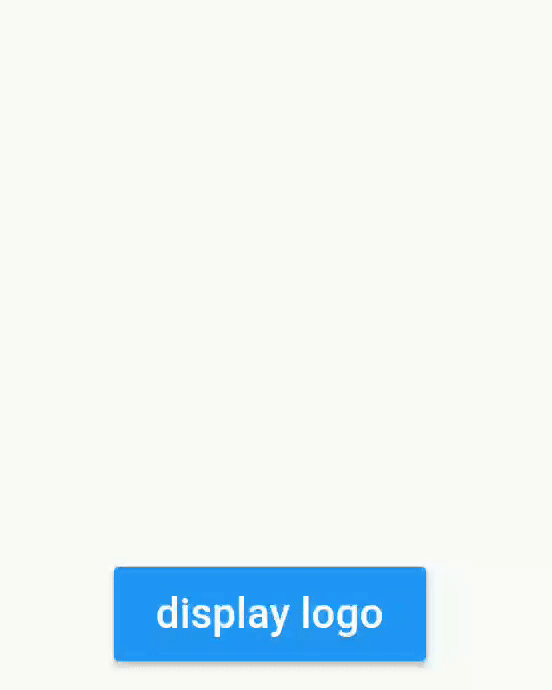
RaisedButton(
color: Colors.blue,
child: Text(
_display ? "hide logo" : "display logo",
style: TextStyle(color: Colors.white),
),
onPressed: () {
setState(() {
//will fire the animation
_display = !_display;
});
},
)
],
),
);
}
}
Translation #
Example using bloc pattern
class FirstScreenBloc extends Bloc {
  final _viewState = BehaviorSubject<FirstScreenViewState>.seeded(FirstScreenViewState());
  Observable<FirstScreenViewState> get viewState => _viewState;

  void onClicked() {
    _viewState.add(FirstScreenViewState(buttonVisible: true));
  }

  void onDismissClicked() {
    _viewState.add(FirstScreenViewState(buttonVisible: false));
  }

  @override
  void dispose() {
    _viewState.close();
  }
}

class FirstScreenViewState {
  final bool buttonVisible;

  const FirstScreenViewState({
    this.buttonVisible = false,
  });
}
class FirstScreenView extends StatelessWidget {
  @override
  Widget build(BuildContext context) {
    final bloc = BlocProvider.of<FirstScreenBloc>(context);

    return StreamBuilder<FirstScreenViewState>(
            stream: bloc.viewState,
            builder: (context, snapshot) {

                final viewState = snapshot.data;

                return Stack(
                  fit: StackFit.expand,
                  children: [
                    _buildInputButton(onClicked: () {
                      bloc.onClicked();
                    }),
                    Positioned(
                      bottom: 20,
                      left: 20,
                      right: 20,

                      child: TranslationAnimatedWidget(
                        enabled: viewState.buttonVisible, //will forward/reverse the animation
                        curve: Curves.easeIn,
                        duration: Duration(seconds: 1),
                        values: [
                          Offset(0, 200),
                          Offset(0, -50),
                          Offset(0, 0),
                        ],
                        child: RaisedButton(
                          onPressed: () {
                            bloc.onDismissClicked();
                          },
                          child: Text("Dismiss"),
                        ),

                      ),
                    ),
                  ],
               );
            }
        );
  }
}
Rotation #
RotationAnimatedWidget.tween(
    enabled: enabled,
    rotationDisabled: Rotation.deg(),
    rotationEnabled: Rotation.deg(z: 90, x: 80),
    child: /* your widget */
),

RotationAnimatedWidget.tween(
    enabled: enabled,
    rotation: Rotation.deg(),
    rotationEnabled: Rotation.deg(z: 90, x: 80),
    child: /* your widget */
),
Scale #
ScaleAnimatedWidget.tween(
      enabled: this._enabled,
      duration: Duration(milliseconds: 600),
      scaleDisabled: 0.5,
      scaleEnabled: 1,

      //your widget
      child: Container(
        height: 200,
        width: 200,
        child: FlutterLogo(
          style: FlutterLogoStyle.stacked,
        ),
      ),
    ),
Size #
SizeAnimatedWidget(
      enabled: this._enabled,
      duration: Duration(milliseconds: 1500),
      values: [Size(100, 100),  Size(100, 150), Size(200, 150), Size(200, 200)],
      curve: Curves.linear,

      //your widget
      child: Container(
        decoration: BoxDecoration(
          border: Border.all(color: Colors.blue)
        ),
        child: FlutterLogo(
          style: FlutterLogoStyle.stacked,
        ),
      ),
    ),
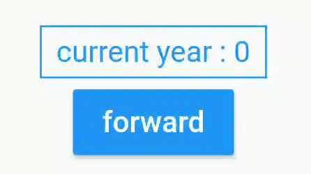
Custom Animated #
CustomAnimatedWidget(
      enabled: this._enabled,
      duration: Duration(seconds: 3),
      curve: Curves.easeOut,
      builder: (context, percent) { //for custom animation, use builders
        final int displayedDate = (2018 * percent).floor();
        return Container(
            padding: EdgeInsets.symmetric(horizontal: 8, vertical: 4),
            decoration: BoxDecoration(border: Border.all(color: Colors.blue)),
            child: Text(
              "current year : $displayedDate",
              style: TextStyle(color: Colors.blue),
            ));
      },
),
Flutter Package #
Animated widget is available at https://pub.dev/packages/animated_widgets
dependencies:
  animated_widgets:
Getting Started with Flutter #
For help getting started with Flutter, view our online documentation, which offers tutorials, samples, guidance on mobile development, and a full API reference.
Metadata
Publisher
unverified uploader
Metadata
Easily add animations on your screen with AnimatedWidgets. Add always your animated widgets in your component's tree, then activate them when you want to activate the animations.
Repository (GitHub)
View/report issues
License
 unknown (LICENSE)