animated_toggle 0.0.3  animated_toggle: ^0.0.3 copied to clipboard
Animated Toggle Give you easy way to make your custom Animated toggle.
Animated Toggle #


Animated Toggle Give you easy way to make your custom Animated toggle.
Installation #
Add this to your pubspec.yaml:
dependencies:
  animated_toggle: ^0.0.3
Features #
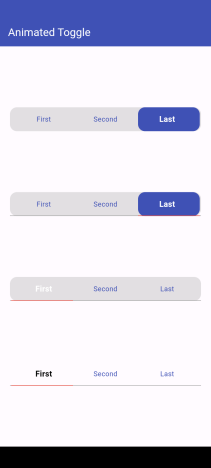
Easy to use the Animated Toggle Package you can handle all colors and width and the height. You can control the start from left or right if you need this for arabic or english or etc. you can control the Text Style and the padding for the Animated Toggle.
Getting started #
import 'package:animated_toggle/animated_toggle.dart';

void main() {

}

// Start use th package in your State Widget
What you can handle #
final List<String> taps;
final double width;
final double height;
final Color background;
final Color activeColor;
final Color underLineColor;
final Color activeUnderLineColor;
final TextStyle activeTextStyle;
final TextStyle inActiveTextStyle;
final double horizontalPadding;
final double verticalPadding;
final double activeHorizontalPadding;
final double activeVerticalPadding;
final double radius;
final double underLineHeight;
final double activeUnderLineHeight;
final double activeButtonRadius;
final Function(int index)? onChange;
final bool showUnderLine;
final bool showActiveButtonColor;
final Duration duration;
final String local;
Usage #
Simple Example about how to use
class MyAnimatedToggle extends StatefulWidget {
  const MyAnimatedToggle({super.key});

  @override
  State<MyAnimatedToggle> createState() => _MyAnimatedToggleState();
}

class _MyAnimatedToggleState extends State<MyAnimatedToggle> {

  @override
  Widget build(BuildContext context) {
    return Scaffold(
      appBar: AppBar(
        backgroundColor: Theme.of(context).colorScheme.inversePrimary,
        title: const Text('Animated Toggle'),
      ),
      body: Center(
        child: AnimatedToggle(
          taps: const ['First', 'Second', 'Last'],
          width: MediaQuery.of(context).size.width,
          height: 48,
          duration: const Duration(milliseconds: 500),
          background: Colors.grey,
          activeColor: Colors.indigo,
          activeTextStyle: const TextStyle(
              fontSize: 16, fontWeight: FontWeight.w600, color: Colors.white),
          inActiveTextStyle: const TextStyle(
              fontSize: 14, fontWeight: FontWeight.w400, color: Colors.indigo),
          horizontalPadding: 4,
          verticalPadding: 4,
          activeHorizontalPadding: 0,
          activeVerticalPadding: 0,
          radius: 14,
          activeButtonRadius: 14,
          underLineHeight: 1,
          activeUnderLineHeight: 2,
          index: 0,
          onChange: (index) {},
          underLineColor: Colors.grey,
          activeUnderLineColor: Colors.black,
          showUnderLine: false,
          showActiveButtonColor: true,
        ),
      ),
    );
  }
}
Additional information #
Say to me in GitHub what you need to see in the package in the next update
Author #
Metadata
17
likes
0
pub points
78%
popularity
Publisher
unverified uploader
Metadata
Animated Toggle Give you easy way to make your custom Animated toggle.
Repository (GitHub)
View/report issues
License
 unknown (LICENSE)