advance_notification 1.0.1  advance_notification: ^1.0.1 copied to clipboard
 shyamkumar.info
Advance Notification package for Snackbar and alert.
Advance_Notification #
Advance_Notification is a Flutter package with custom snackabar.
Development is continue #
- There are many new features planned for Advance_Notification.
Installing #
1. Depend on it #
Add this to your package's pubspec.yaml file:
dependencies:
  smart_notification: <latest_version>
2. Install it #
You can install packages from the command line:
Run this command with flutter:
flutter pub add smart_notification
3. Import it #
Now in your Dart code, you can use:
import 'package:smart_notification/smart_notification.dart';
Getting Started || Usage #
Why Advance Notification #
The Advance_Notification provide multiple design of snackbar notification.
Examples #
Advance_Notification have three mode in Advance_Notification snackbar => BASIC,ADVANCE,MODERN.
1: Basic Mode #
You can use basic snackbar with background color, text color, position

1.1 => Example
// For Basic mode you don't need to write mode
AdvanceSnackBar(message: "Hello...").show(context);
// Basic with Background color
 AdvanceSnackBar(
     message: "Notification Message",
     bgColor: Colors.blueAccent).show(context);
1.2 => Example
// Basic with background color or text color
AdvanceSnackBar(
    message: "Notification Message",
    bgColor: Colors.tealAccent,
    textColor: Colors.red).show(context);
1.3 => Example
// Basic with background color or text  or fixed position
AdvanceSnackBar(
    message: "Notification Message",
    bgColor: Colors.tealAccent,
    textColor: Colors.red,
    isFixed: false).show(context);
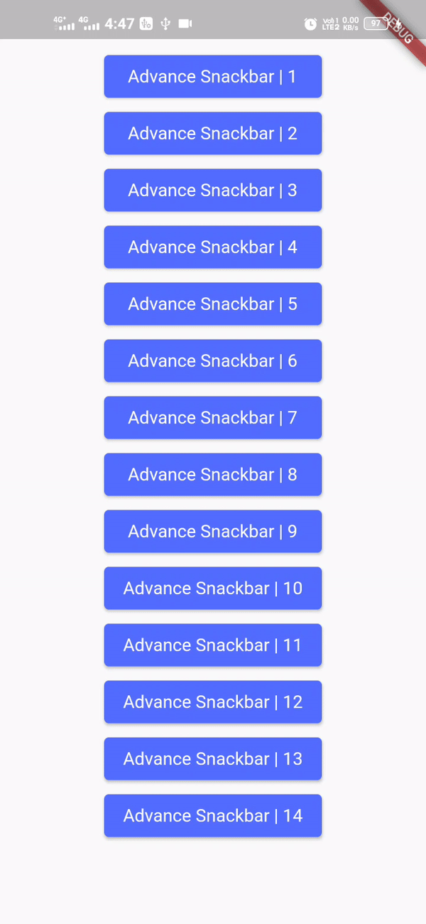
2: Advance mode #
You can use advance mode snackbar with many features. It has default close button. You can override the close button event, color and icon image.
2.1 => Example
 AdvanceSnackBar(
     message: "Notification Message",
     mode: "ADVANCE",).show(context);
2.2 => Example
// You can add your custom duration for hide notification. default duration is 4 seconds.
// We have multiple types in Advance mode like : PRIMARY,SECONDARY,LIGHT,DARK,SUCCESS,INFO,WARNING,ERROR
// default type is SUCCESS

AdvanceSnackBar(
    message: "Notification Message",
    mode: "ADVANCE",
    duration: Duration(seconds: 5),).show(context);
2.3 => Example
// Change bgColor , text color close iconColor
AdvanceSnackBar(
    message: "Notification Message",
    mode: "ADVANCE",
    duration: Duration(seconds: 5),
    bgColor: Colors.red,
    textColor: Colors.black,
    iconColor: Colors.black,).show(context);
2.4 => Example
// With this example you can change textSize or show notification icon
AdvanceSnackBar(
        message: "Notification Message",
        mode: "ADVANCE",
        duration: Duration(seconds: 5),
        bgColor: Colors.red,
        textColor: Colors.white,
        iconColor: Colors.white,
        textSize: 22,
        isIcon: true,
    ).show(context);
2.5 => Example
// Every type has owen icon you can show and hode with isIcon
AdvanceSnackBar(
        message: "Notification Message",
        mode: "ADVANCE",
        duration: Duration(seconds: 5),
        type: "ERROR",
        textSize: 20,
        isIcon: true,// it shold be after text
    ).show(context);
2.6 => Example
// Change type icon position
AdvanceSnackBar(
        message: "Notification Message",
        mode: "ADVANCE",
        duration: Duration(seconds: 5),
        type: "ERROR",
        textSize: 20,
        isIcon: true,
        iconPosition: "RIGHT",
    ).show(context);
2.7 => Example
// You can also add tittle
AdvanceSnackBar(
        message: "Notification Message",
        tittle: "Tittle message",
        mode: "ADVANCE",
        type: "ERROR",
        textSize: 20,
        isIcon: true,
        closeIconPosition: "LEFT",
    ).show(context);
2.8 => Example
// You can change divider color (hr line)
AdvanceSnackBar(
        message: "Notification Message",
        tittle: "Tittle message",
        mode: "ADVANCE",
        type: "ERROR",
        textSize: 20,
        isIcon: true,
        dividerColor: Colors.red,
        closeIconPosition: "LEFT",
    ).show(context);
2.9 => Example
// with child you can add an extra widgets it can be a button, icon, image, etc.
AdvanceSnackBar(
        message: "Notification Message ",
        mode: "ADVANCE",
        type: "PRIMARY",
        tittle: "Tittle message",
        iconPosition: "RIGHT",
        child: Padding(
            padding: const EdgeInsets.only(left: 2),
            child: Icon(
            Icons.all_inbox,
            color: Colors.red,
            size: 25,
            ),
        ),
        isIcon: true)
    .show(context);
2.10 => Example
// You can override onclick function of close button
AdvanceSnackBar(
        message: "Notification Message ",
        mode: "ADVANCE",
        type: "PRIMARY",
        onClick: ()
        {
            print("Hello");
        },
        isIcon: true).show(context);
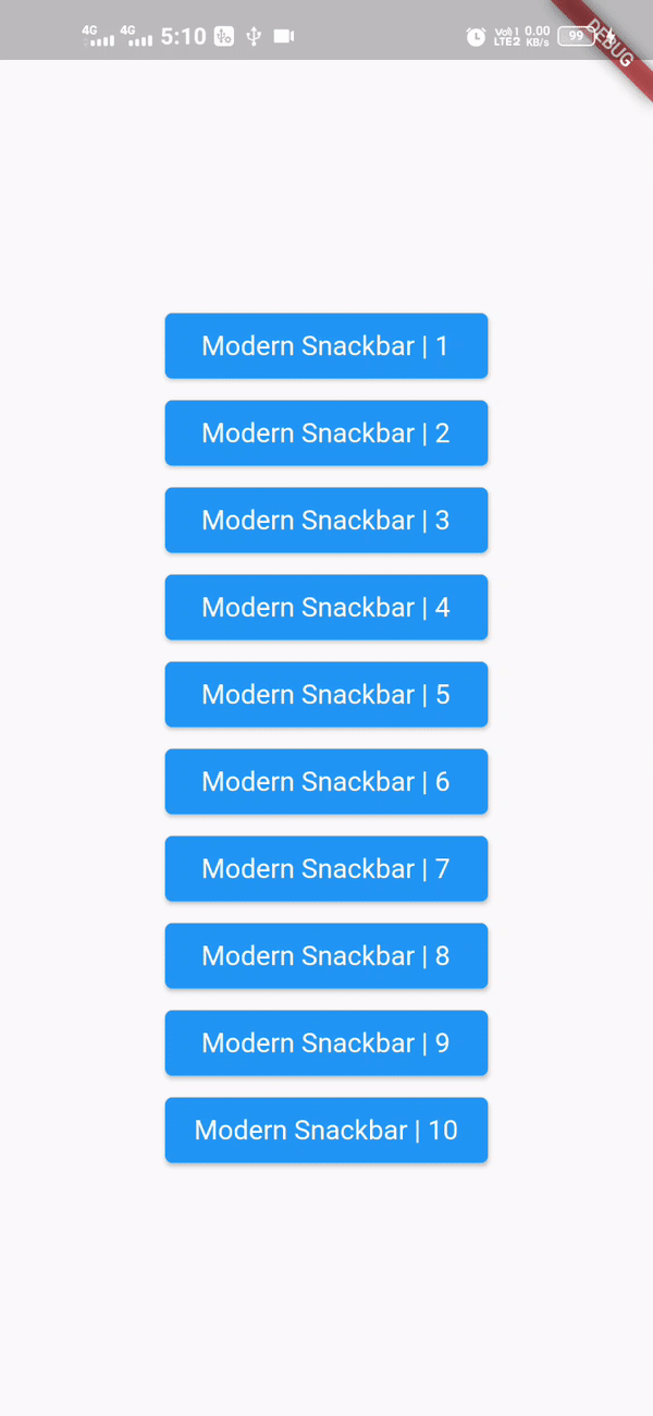
3: Modern mode #
Modern mode have all advance mode features and it have some new features. It has a unique design. You can change advance mode design with add a single word "MODERN". In modern mode you can't change divider color we are working on it.
3.1 => Example
AdvanceSnackBar(
        message: "Notification Message",
        mode: "MODERN",).show(context);
3.2 => Example
// You can change the type like advance mode
AdvanceSnackBar(
        message: "Notification Message",
        mode: "MODERN",type: "WARNING")).show(context);
3.3 => Example
AdvanceSnackBar(
        message: "Notification Message",
        mode: "MODERN",
        type: "ERROR",
        isIcon: true)
    .show(context);
3.4 => Example
// Modern mode :- Example 3
AdvanceSnackBar(
        message: "Notification Message content",
        mode: "MODERN",
        type: "ERROR",
        tittle: "Tittle message",
        isIcon: true)
    .show(context);
### The component takes 1 compulsory prop - message. Other props are optional. The table below explains more.
| Prop | Mode | Type | Description/Purpose | Default | Required |
|---|---|---|---|---|---|
| tittle | Advance,Modern | String |
it is for notification tittle | "" | NO |
| message | All | String |
it is for notification Message | "" | YES |
| duration | Advance,Modern | Duration |
Duration of notification hide | "Duration(seconds: 4)" | NO |
| isIcon | Advance,Modern | String |
icon show in advance and modern | false | NO |
| isFixed | Basic | bool |
it will work in basic mode only | "" | true |
| isClosable | Advance,Modern | bool |
hide/show close icon | true | NO |
| isDivider | Advance,Modern | bool |
it will show when you add tittle | true | NO |
| isChildLeft | Advance,Modern | bool |
it swap close icon and child widget left to right | true | NO |
| type | Advance,Modern | String |
these are default design of snackbar | PRIMARY, SECONDARY, LIGHT, DARK, SUCCESS, INFO, WARNING, ERROR | NO |
| mode | String |
BASIC, ADVANCE, MODERN | BASIC | NO | |
| iconPosition | Advance,Modern | String |
you can change icon position of types icons | "LEFT" | NO |
| closeIconPosition | Advance,Modern | String |
You can also change closeIconPosition | "RIGHT" | NO |
| onClick | Advance,Modern | function |
override the closeButton onclick function | "" | NO |
| icon | Advance,Modern | widget |
you can change icon | "" | NO |
| child | Advance,Modern | widget |
you can add extra widget | "" | NO |
| borderRadius | Advance,Modern | double |
can change borderRadius | 10 | NO |
| mHeight | Advance,Modern | double |
can change snackbar height | 40 | NO |
Bugs or Requests #
If you encounter any problems feel free to open an issue. If you feel the library is missing a feature, please raise a ticket on GitHub and I'll look into it. Pull request are also welcome.
Metadata
Publisher
Metadata
Advance Notification package for Snackbar and alert.
Repository (GitHub)
View/report issues
License
 unknown (LICENSE)