abhi_flutter_alertdialog 0.0.4  abhi_flutter_alertdialog: ^0.0.4 copied to clipboard
A new flutter library for creating alert dialog box also can perform customizations accordingly.
abhi_flutter_alertdialog #
A new Flutter package.
AlertDialog #
This project deals with flutter alert dialog's package, a library module containing code that can be utilised in flutter projects to create a alert dialog.
A customized alert dialog can be obtained using the available parameters.
For help getting started with abhi_flutter-alertdialog, view our online documentation, which offers tutorials, samples, guidance on mobile development, and a full API reference.
Dependency #
abhi_flutter_alertdialog: [latest version]
Customization #
Alert dialog can be customized using the parameters available
** Content **
These parameters are the basic parameter used to display details of the alert dialog.
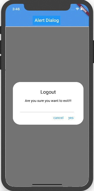
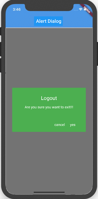
- Title : String format title to be displayed.
- Content : String format content to be displayed.
- action1 : Button 1 text to be displayed.
- action2 : Button 2 text to be displayed.
** Functional **
These parameters are used to perform action on the button clicks. You need to pass the function to the parameter so that the operation is performed on button click.
- function1 : This is the function to be performed on first button click.
- function2 : This is the function to be performed on second button click.
Ex:
  functionB(BuildContext context) {
    Navigator.pop(context);
  }
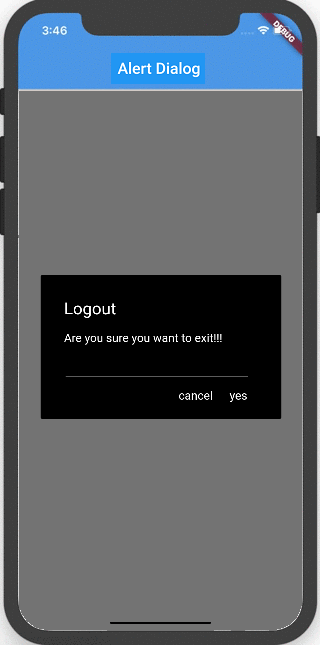
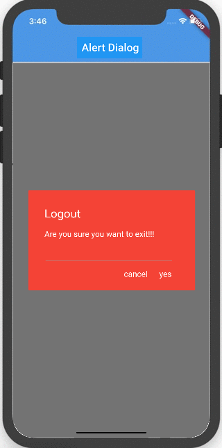
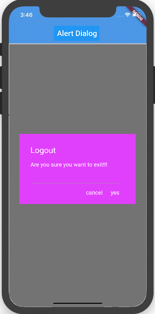
** Design **
These parameters are used to customize design changes to the alert dialog.
-
div : Add a divider line in the dialog above buttons.
-
txtAlign : Align the text to left, center and right using this key.
- left : 1 - center : 2 - right : 3 -
radius : Radius of the alert box can be specified in double format.
-
boxColor : Box background color can be specified.
-
btnTxtColor : Button text color can be specified.
-
txtColor : Title, Content text color is specified.
Usage #
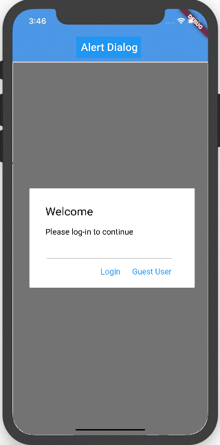
A sample dialog showing the usage of the library.
showDialog(
    context: context,
    builder: (context) => AlertDialog1(
      context: context,
      title: 'Welcome ',
      content: 'Hi how are you',
      action1: 'continue',
      action2: 'cancel',
      function1: () => functionA(),
      function2: () => functionB(context),
      div: true,
      txtAlign: 1,
      radius: 2.0,
      boxColor: Colors.white,
      btnTxtColor: Colors.blue,
      txtColor: Colors.black,
    ),
  )
Gallery #
 ,
,
 ,
,
 ,
,
 ,
,
 ,
,
 ,
,
Metadata
Publisher
unverified uploader
Metadata
A new flutter library for creating alert dialog box also can perform customizations accordingly.
License
 unknown (LICENSE)