MongolCheckboxListTile class
A MongolListTile with a Checkbox. In other words, a checkbox with a label.
The entire list tile is interactive: tapping anywhere in the tile toggles the checkbox.
The value, onChanged, activeColor and checkColor properties of this widget are identical to the similarly-named properties on the Checkbox widget.
The title, subtitle, isThreeLine, dense, and contentPadding properties are like those of the same name on MongolListTile.
The selected property on this widget is similar to the MongolListTile.selected property. This tile's activeColor is used for the selected item's text color, or the theme's CheckboxThemeData.overlayColor if activeColor is null.
This widget does not coordinate the selected state and the value state; to have the list tile appear selected when the checkbox is checked, pass the same value to both.
The checkbox is shown on the bottom (i.e. the trailing edge). This can be changed using controlAffinity. The secondary widget is placed on the opposite side. This maps to the MongolListTile.leading and MongolListTile.trailing properties of MongolListTile.
This widget requires a Material widget ancestor in the tree to paint itself on, which is typically provided by the app's Scaffold. The tileColor, and selectedTileColor are not painted by the MongolCheckboxListTile itself but by the Material widget ancestor. In this case, one can wrap a Material widget around the MongolCheckboxListTile, e.g.:
{@tool snippet}
ColoredBox(
  color: Colors.green,
  child: Material(
    child: MongolCheckboxListTile(
      tileColor: Colors.red,
      title: const Text('MongolCheckboxListTile with red background'),
      value: true,
      onChanged:(bool? value) { },
    ),
  ),
)
{@end-tool}
Performance considerations when wrapping MongolCheckboxListTile with Material
Wrapping a large number of MongolCheckboxListTiles individually with Materials is expensive. Consider only wrapping the MongolCheckboxListTiles that require it or include a common Material ancestor where possible.
To show the CheckboxListTile as disabled, pass null as the onChanged callback.
{@tool dartpad}
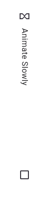
This widget shows a checkbox that, when checked, slows down all animations (including the animation of the checkbox itself getting checked!).
This sample requires that you also import 'package:flutter/scheduler.dart', so that you can reference timeDilation.
import 'package:flutter/material.dart';
import 'package:flutter/scheduler.dart' show timeDilation;

/// Flutter code sample for [CheckboxListTile].

void main() => runApp(const CheckboxListTileApp());

class CheckboxListTileApp extends StatelessWidget {
  const CheckboxListTileApp({super.key});

  @override
  Widget build(BuildContext context) {
    return MaterialApp(
      theme: ThemeData(useMaterial3: true),
      home: const CheckboxListTileExample(),
    );
  }
}

class CheckboxListTileExample extends StatefulWidget {
  const CheckboxListTileExample({super.key});

  @override
  State<CheckboxListTileExample> createState() =>
      _CheckboxListTileExampleState();
}

class _CheckboxListTileExampleState extends State<CheckboxListTileExample> {
  @override
  Widget build(BuildContext context) {
    return Scaffold(
      appBar: AppBar(title: const Text('CheckboxListTile Sample')),
      body: Center(
       child: MongolCheckboxListTile(
          title: const MongolText('Animate Slowly'),
          value: timeDilation != 1.0,
          onChanged: (bool? value) {
            setState(() {
              timeDilation = value! ? 10.0 : 1.0;
            });
          },
          secondary: const Icon(Icons.hourglass_empty),
        ),
      ),
    );
  }
}
{@end-tool}
{@tool dartpad}
This sample demonstrates how [MongolCheckboxListTile] positions the checkbox widget
relative to the text in different configurations.
import 'package:flutter/material.dart';
/// Flutter code sample for [CheckboxListTile].
void main() => runApp(const CheckboxListTileApp());
class CheckboxListTileApp extends StatelessWidget {
const CheckboxListTileApp({super.key});
@override
Widget build(BuildContext context) {
return MaterialApp(
theme: ThemeData(useMaterial3: true),
home: const CheckboxListTileExample(),
);
}
}
class CheckboxListTileExample extends StatefulWidget {
const CheckboxListTileExample({super.key});
@override
State<CheckboxListTileExample> createState() =>
_CheckboxListTileExampleState();
}
class _CheckboxListTileExampleState extends State<CheckboxListTileExample> {
bool checkboxValue1 = true;
bool checkboxValue2 = true;
bool checkboxValue3 = true;
@override
Widget build(BuildContext context) {
return Scaffold(
appBar: AppBar(title: const Text('CheckboxListTile Sample')),
body: Column(
children: <Widget>[
MongolCheckboxListTile(
value: checkboxValue1,
onChanged: (bool? value) {
setState(() {
checkboxValue1 = value!;
});
},
title: const MongolText('Headline'),
subtitle: const MongolText('Supporting text'),
),
const Divider(height: 0),
MongolCheckboxListTile(
value: checkboxValue2,
onChanged: (bool? value) {
setState(() {
checkboxValue2 = value!;
});
},
title: const MongolText('Headline'),
subtitle: const MongolText(
'Longer supporting text to demonstrate how the text wraps and the checkbox is centered vertically with the text.'),
),
const Divider(height: 0),
MongolCheckboxListTile(
value: checkboxValue3,
onChanged: (bool? value) {
setState(() {
checkboxValue3 = value!;
});
},
title: const MongolText('Headline'),
subtitle: const MongolText(
"Longer supporting text to demonstrate how the text wraps and how setting 'CheckboxListTile.isThreeLine = true' aligns the checkbox to the top vertically with the text."),
isThreeLine: true,
),
const Divider(height: 0),
],
),
);
}
}
```dart
{@end-tool}
## Semantics in MongolCheckboxListTile
Since the entirety of the MongolCheckboxListTile is interactive, it should represent
itself as a single interactive entity.
To do so, a MongolCheckboxListTile widget wraps its children with a [MergeSemantics]
widget. [MergeSemantics] will attempt to merge its descendant [Semantics]
nodes into one node in the semantics tree. Therefore, MongolCheckboxListTile will
throw an error if any of its children requires its own [Semantics] node.
For example, you cannot nest a [RichText] widget as a descendant of
MongolCheckboxListTile. [RichText] has an embedded gesture recognizer that
requires its own [Semantics] node, which directly conflicts with
MongolCheckboxListTile's desire to merge all its descendants' semantic nodes
into one. Therefore, it may be necessary to create a custom radio tile
widget to accommodate similar use cases.
{@tool dartpad}
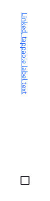
Here is an example of a custom labeled checkbox widget, called
LinkedLabelCheckbox, that includes an interactive [MongolRichText] widget that
handles tap gestures.
```dart
import 'package:flutter/gestures.dart';
import 'package:flutter/material.dart';
/// Flutter code sample for custom labeled checkbox.
void main() => runApp(const LabeledCheckboxApp());
class LabeledCheckboxApp extends StatelessWidget {
const LabeledCheckboxApp({super.key});
@override
Widget build(BuildContext context) {
return MaterialApp(
theme: ThemeData(useMaterial3: true),
home: const LabeledCheckboxExample(),
);
}
}
class LinkedLabelCheckbox extends StatelessWidget {
const LinkedLabelCheckbox({
super.key,
required this.label,
required this.padding,
required this.value,
required this.onChanged,
});
final String label;
final EdgeInsets padding;
final bool value;
final ValueChanged<bool> onChanged;
@override
Widget build(BuildContext context) {
return Padding(
padding: padding,
child: Column(
children: <Widget>[
Expanded(
child: MongolRichText(
text: MongolTextSpan(
text: label,
style: const TextStyle(
color: Colors.blueAccent,
decoration: TextDecoration.underline,
),
recognizer: TapGestureRecognizer()
..onTap = () {
debugPrint('Label has been tapped.');
},
),
),
),
Checkbox(
value: value,
onChanged: (bool? newValue) {
onChanged(newValue!);
},
),
],
),
);
}
}
class LabeledCheckboxExample extends StatefulWidget {
const LabeledCheckboxExample({super.key});
@override
State<LabeledCheckboxExample> createState() => _LabeledCheckboxExampleState();
}
class _LabeledCheckboxExampleState extends State<LabeledCheckboxExample> {
bool _isSelected = false;
@override
Widget build(BuildContext context) {
return Scaffold(
appBar: AppBar(title: const Text('Custom Labeled Checkbox Sample')),
body: Center(
child: LinkedLabelCheckbox(
label: 'Linked, tappable label text',
padding: const EdgeInsets.symmetric(horizontal: 20.0),
value: _isSelected,
onChanged: (bool newValue) {
setState(() {
_isSelected = newValue;
});
},
),
),
);
}
}
{@end-tool}
MongolCheckboxListTile isn't exactly what I want
If the way MongolCheckboxListTile pads and positions its elements isn't quite what you're looking for, you can create custom labeled checkbox widgets by combining Checkbox with other widgets, such as MongolText, Padding and InkWell.
{@tool dartpad}
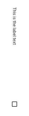
Here is an example of a custom LabeledCheckbox widget, but you can easily make your own configurable widget.
import 'package:flutter/material.dart';

Flutter code sample for custom labeled checkbox.

void main() => runApp(const LabeledCheckboxApp());

class LabeledCheckboxApp extends StatelessWidget {
  const LabeledCheckboxApp({super.key});

  @override
  Widget build(BuildContext context) {
    return MaterialApp(
      theme: ThemeData(useMaterial3: true),
      home: const LabeledCheckboxExample(),
    );
  }
}

class LabeledCheckbox extends StatelessWidget {
  const LabeledCheckbox({
    super.key,
    required this.label,
    required this.padding,
    required this.value,
    required this.onChanged,
  });

  final String label;
  final EdgeInsets padding;
  final bool value;
  final ValueChanged<bool> onChanged;

  @override
  Widget build(BuildContext context) {
    return InkWell(
      onTap: () {
        onChanged(!value);
      },
      child: Padding(
        padding: padding,
        child: Column(
          children: <Widget>[
            Expanded(child: MongolText(label)),
            Checkbox(
              value: value,
              onChanged: (bool? newValue) {
                onChanged(newValue!);
              },
            ),
          ],
        ),
      ),
    );
  }
}

class LabeledCheckboxExample extends StatefulWidget {
  const LabeledCheckboxExample({super.key});

  @override
  State<LabeledCheckboxExample> createState() => _LabeledCheckboxExampleState();
}

class _LabeledCheckboxExampleState extends State<LabeledCheckboxExample> {
  bool _isSelected = false;

  @override
  Widget build(BuildContext context) {
    return Scaffold(
      appBar: AppBar(title: const Text('Custom Labeled Checkbox Sample')),
      body: Center(
        child: LabeledCheckbox(
          label: 'This is the label text',
          padding: const EdgeInsets.symmetric(horizontal: 20.0),
          value: _isSelected,
          onChanged: (bool newValue) {
            setState(() {
              _isSelected = newValue;
            });
          },
        ),
      ),
    );
  }
}
{@end-tool}
See also:
- MongolListTileTheme, which can be used to affect the style of list tiles, including checkbox list tiles.
- MongolRadioListTile, a similar widget for radio buttons.
- MongolSwitchListTile, a similar widget for switches.
- MongolListTile and Checkbox, the widgets from which this widget is made.
- Inheritance
-
- Object
- DiagnosticableTree
- Widget
- StatelessWidget
- MongolCheckboxListTile
Constructors
-
MongolCheckboxListTile.new({Key? key, required bool? value, required ValueChanged<
bool?> ? onChanged, MouseCursor? mouseCursor, Color? activeColor, WidgetStateProperty<Color?> ? fillColor, Color? checkColor, Color? hoverColor, WidgetStateProperty<Color?> ? overlayColor, double? splashRadius, MaterialTapTargetSize? materialTapTargetSize, VisualDensity? visualDensity, FocusNode? focusNode, bool autofocus = false, ShapeBorder? shape, BorderSide? side, bool isError = false, bool? enabled, Color? tileColor, Widget? title, Widget? subtitle, bool isThreeLine = false, bool? dense, Widget? secondary, bool selected = false, ListTileControlAffinity controlAffinity = ListTileControlAffinity.platform, EdgeInsetsGeometry? contentPadding, bool tristate = false, OutlinedBorder? checkboxShape, Color? selectedTileColor, ValueChanged<bool> ? onFocusChange, bool? enableFeedback, String? checkboxSemanticLabel}) -
Creates a combination of a list tile and a checkbox.
const
-
MongolCheckboxListTile.adaptive({Key? key, required bool? value, required ValueChanged<
bool?> ? onChanged, MouseCursor? mouseCursor, Color? activeColor, WidgetStateProperty<Color?> ? fillColor, Color? checkColor, Color? hoverColor, WidgetStateProperty<Color?> ? overlayColor, double? splashRadius, MaterialTapTargetSize? materialTapTargetSize, VisualDensity? visualDensity, FocusNode? focusNode, bool autofocus = false, ShapeBorder? shape, BorderSide? side, bool isError = false, bool? enabled, Color? tileColor, Widget? title, Widget? subtitle, bool isThreeLine = false, bool? dense, Widget? secondary, bool selected = false, ListTileControlAffinity controlAffinity = ListTileControlAffinity.platform, EdgeInsetsGeometry? contentPadding, bool tristate = false, OutlinedBorder? checkboxShape, Color? selectedTileColor, ValueChanged<bool> ? onFocusChange, bool? enableFeedback, String? checkboxSemanticLabel}) -
Creates a combination of a list tile and a platform adaptive checkbox.
const
Properties
- activeColor → Color?
-
The color to use when this checkbox is checked.
final
- autofocus → bool
-
True if this widget will be selected as the initial focus when no other
node in its scope is currently focused.
final
- checkboxSemanticLabel → String?
-
The semantic label for the checkbox that will be announced by screen readers.
final
- checkboxShape → OutlinedBorder?
-
The shape of the checkbox's Material.
final
- checkColor → Color?
-
The color to use for the check icon when this checkbox is checked.
final
- contentPadding → EdgeInsetsGeometry?
-
Defines insets surrounding the tile's contents.
final
- controlAffinity → ListTileControlAffinity
-
Where to place the control relative to the text.
final
- dense → bool?
-
Whether this list tile is part of a vertically dense list.
final
- enabled → bool?
-
Whether the CheckboxListTile is interactive.
final
- enableFeedback → bool?
-
Whether detected gestures should provide acoustic and/or haptic feedback.
final
-
fillColor
→ WidgetStateProperty<
Color?> ? -
The color that fills the checkbox.
final
- focusNode → FocusNode?
-
An optional focus node to use as the focus node for this widget.
final
- hashCode → int
-
The hash code for this object.
no setterinherited
- hoverColor → Color?
-
The color for the checkbox's Material when a pointer is hovering over it.
final
- isError → bool
-
True if this checkbox wants to show an error state.
final
- isThreeLine → bool
-
Whether this list tile is intended to display three lines of text.
final
- key → Key?
-
Controls how one widget replaces another widget in the tree.
finalinherited
- materialTapTargetSize → MaterialTapTargetSize?
-
Configures the minimum size of the tap target.
final
- mouseCursor → MouseCursor?
-
The cursor for a mouse pointer when it enters or is hovering over the
widget.
final
-
onChanged
→ ValueChanged<
bool?> ? -
Called when the value of the checkbox should change.
final
-
onFocusChange
→ ValueChanged<
bool> ? -
Handler called when the focus changes.
final
-
overlayColor
→ WidgetStateProperty<
Color?> ? -
The color for the checkbox's Material.
final
- runtimeType → Type
-
A representation of the runtime type of the object.
no setterinherited
- secondary → Widget?
-
A widget to display on the opposite side of the tile from the checkbox.
final
- selected → bool
-
Whether to render icons and text in the activeColor.
final
- selectedTileColor → Color?
-
If non-null, defines the background color when CheckboxListTile.selected is true.
final
- shape → ShapeBorder?
-
Defines the tile's InkWell.customBorder and Ink.decoration shape.
final
- side → BorderSide?
-
The color and width of the checkbox's border.
final
- splashRadius → double?
-
The splash radius of the circular Material ink response.
final
- subtitle → Widget?
-
Additional content displayed below the title.
final
- tileColor → Color?
-
Defines the background color of
ListTilewhen selected is false.final - title → Widget?
-
The primary content of the list tile.
final
- tristate → bool
-
If true the checkbox's value can be true, false, or null.
final
- value → bool?
-
Whether this checkbox is checked.
final
- visualDensity → VisualDensity?
-
Defines how compact the list tile's layout will be.
final
Methods
-
build(
BuildContext context) → Widget -
Describes the part of the user interface represented by this widget.
override
-
createElement(
) → StatelessElement -
Creates a StatelessElement to manage this widget's location in the tree.
inherited
-
debugDescribeChildren(
) → List< DiagnosticsNode> -
Returns a list of DiagnosticsNode objects describing this node's
children.
inherited
-
debugFillProperties(
DiagnosticPropertiesBuilder properties) → void -
Add additional properties associated with the node.
inherited
-
noSuchMethod(
Invocation invocation) → dynamic -
Invoked when a nonexistent method or property is accessed.
inherited
-
toDiagnosticsNode(
{String? name, DiagnosticsTreeStyle? style}) → DiagnosticsNode -
Returns a debug representation of the object that is used by debugging
tools and by DiagnosticsNode.toStringDeep.
inherited
-
toString(
{DiagnosticLevel minLevel = DiagnosticLevel.info}) → String -
A string representation of this object.
inherited
-
toStringDeep(
{String prefixLineOne = '', String? prefixOtherLines, DiagnosticLevel minLevel = DiagnosticLevel.debug, int wrapWidth = 65}) → String -
Returns a string representation of this node and its descendants.
inherited
-
toStringShallow(
{String joiner = ', ', DiagnosticLevel minLevel = DiagnosticLevel.debug}) → String -
Returns a one-line detailed description of the object.
inherited
-
toStringShort(
) → String -
A short, textual description of this widget.
inherited
Operators
-
operator ==(
Object other) → bool -
The equality operator.
inherited