Wheel Slider
Wheel Slider offers a lot of customisation and enables you to scroll around with a wheel-like appearance.

Wheel Slider is built upon
wheel_chooser
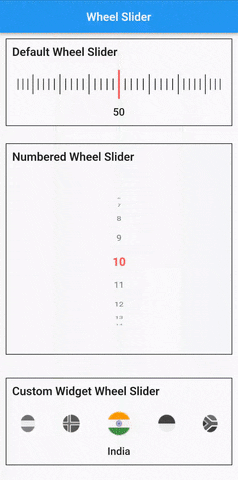
Features
- 🔢 Display numbers instead of lines.
- ↔↕ Horizontal/Vertical scroll.
- 📳 Vibrate on scroll.
- 🔧 Custom widgets.
- 🔧 Custom pointer.
- 🖼️ Add background widget to the slider.
- 🎨 Change Lines or Pointer color.
Getting started
Installation
Add wheel_slider: to your pubspec.yaml dependencies then run flutter pub get.
  dependencies:
    wheel_slider:
Import
Add this line to import the package.
import 'package:wheel_slider/wheel_slider.dart';
Android
Add the vibrate permission to your AndroidManifest.xml file, located in <project root>/android/app/src/main/AndroidManifest.xml.
android.permission.VIBRATE- allows access to the vibrator.
<uses-permission android:name="android.permission.VIBRATE"/>
IOS
Supports vibration with duration and pattern on CoreHaptics devices. On older devices, the pattern is emulated with 500ms long vibrations.
Usage
To use Line Slider:
WheelSlider(
    totalCount: _totalCount,
    initValue: _initValue,
    onValueChanged: (val) {
        setState(() {
          _currentValue = val;
        });
    },
    hapticFeedbackType: HapticFeedbackType.vibrate,
),
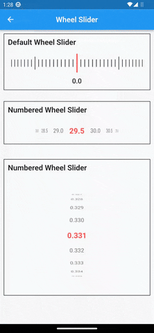
To use Line Slider with displaying double value:
WheelSlider(
    interval: 0.5,  // this field is used to show decimal/double values
    totalCount: _totalCount,
    initValue: _initValue,
    onValueChanged: (val) {
        setState(() {
          _currentValue = val;
        });
    },
    hapticFeedbackType: HapticFeedbackType.vibrate,
),
To use Number Slider:
WheelSlider.number(
    perspective: 0.01,
    totalCount: _nTotalCount,
    initValue: _nInitValue,
    unSelectedNumberStyle: const TextStyle(
        fontSize: 12.0,
        color: Colors.black54,
    ),
    currentIndex: _nCurrentValue,
    onValueChanged: (val) {
        setState(() {
          _nCurrentValue = val;
        });
    },
    hapticFeedbackType: HapticFeedbackType.heavyImpact,
),
To use Number Slider with displaying double value:
WheelSlider.number(
    interval: 0.5, // this field is used to show decimal/double values
    perspective: 0.01,
    totalCount: _nTotalCount,
    initValue: _nInitValue,
    unSelectedNumberStyle: const TextStyle(
        fontSize: 12.0,
        color: Colors.black54,
    ),
    currentIndex: _nCurrentValue,
    onValueChanged: (val) {
        setState(() {
          _nCurrentValue = val;
        });
    },
    hapticFeedbackType: HapticFeedbackType.heavyImpact,
),
To use Custom Widget Slider:
WheelSlider.customWidget(
    totalCount: 12,
    initValue: 5,
    isInfinite: false,
    scrollPhysics: const BouncingScrollPhysics(),
    children: List.generate(12, (index) => const Center(
        child: FlutterLogo(
            size: 100,
        ),
    )),
    onValueChanged: (val) {
        setState(() {
          _cCurrentValue = val;
        });
    },
    hapticFeedbackType: HapticFeedbackType.vibrate,
    showPointer: false,
    itemSize: 80,
),
Properties
interval- To display decimal values. By default it is set to 1, when changedtotalCountalso to be updated accordingly.currentIndex- Gets the current value as you scroll the Number Slider.perspective- Change the way you want the slider to look from a flat to a wheel like shape and the value must be <= 0.01.squeeze- Adjust the spacing between each item in the slider.isVibrate- To turn on/off vibration while scrolling.hapticFeedbackType- Allows you to change the vibration type.itemSize- Size of each item in the slider.background- Use any widget to add as a background to the slider.allowPointerTappable:- When this is set to
falsescroll functionality won't work for the occupied region. - When using customPointer with GestureDetector/InkWell, set it to
falseto enable gestures. - When using default pointer set it to default state i.e
true.
- When this is set to