StepProgress


StepProgress is a lightweight and highly flexible package designed to display step progress indicators for completing multi-step tasks in a user interface. This package supports both vertical and horizontal orientations, allowing developers to customize the display according to their application's needs. It provides a variety of customizable widgets that visually represent the progress of a task, making it easier for users to understand their current position and the steps remaining. With this flexibility, StepProgress can seamlessly integrate into various UI designs, enhancing user experience across different platforms.
Features
-
Visual Step Indication: Clearly displays progress through a sequence of steps, available in both horizontal and vertical orientations.
-
Theming and Customization:
- Comprehensive Theme: Easily customize the look and feel using
StepProgressThemeData, controlling colors, text styles, and border properties. - Step Sizing: Adjust the size of step nodes with
stepNodeSize. - Titles and Subtitles: Add descriptive labels to each step nodes and lines for enhanced user understanding.
- Visibility Control: Show or hide titles, subtitles, and connecting lines using
StepProgressVisibilityOptions. - Custom Icons: Utilize custom icons for step nodes using
nodeIconBuilder. - Custom Labels: Use
nodeLabelBuilderandlineLabelBuilderto provide custom labels for step nodes and connecting lines. - Breadcrumb Support: Display connecting lines as breadcrumbs for a unique visual style using the
isBreadcrumbproperty inStepLineStyle.
- Comprehensive Theme: Easily customize the look and feel using
-
Interactive Elements:
- Step Tapping: Enable user interaction with steps using
onStepNodeTappedcallbacks. - Line Tapping: Provide actions when users tap on the lines connecting steps with
onStepLineTapped. - Step Change Notification: Receive callbacks with
onStepChangedwhen the current step is updated.
- Step Tapping: Enable user interaction with steps using
-
Programmatic Control:
StepProgressController: Manage the current step externally, allowing integration with your application's logic.- Initial Step: Set the starting step with the
currentStepproperty. - Reversed: Display steps in reverse order using the
reversedproperty.
-
Flexible Layout:
- Dimensions: Control the width and height of the widget.
- Spacing: Adjust margins and padding for optimal visual placement.
Showcases
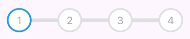
Example 1: Vertical Step Progress Indicator
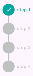
Show Implementation
StepProgress(
  totalSteps: 4,
  controller: stepProgressController,
  axis: Axis.vertical,
  nodeTitles: const ['step 1', 'step 2', 'step 3', 'step 4'],
  onStepChanged: (index) {
    debugPrint('on step changed: $index');
  },
  onStepNodeTapped: (index) {
    debugPrint('on step tapped with index: $index');
  },
  onStepLineTapped: (index) {
    debugPrint('on step line tapped with index: $index');
  },
),
Example 2: Horizontal Step Progress Without Labels
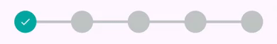
Show Implementation
StepProgress(
  totalSteps: 5,
  padding: const EdgeInsets.symmetric(horizontal: 24),
  controller: _stepProgressController,
  onStepChanged: (currentIndex) {
    setState(() {
      currentStep = currentIndex;
    });
  },
),
Example 3: Horizontal Step Progress (Line Only Mode)
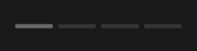
Show Implementation
StepProgress(
  totalSteps: 5,
  visibilityOptions: StepProgressVisibilityOptions.lineOnly,
  controller: stepProgressController,
  highlightOptions: StepProgressHighlightOptions.highlightCurrentLine,
  onStepChanged: (currentIndex) {
    debugPrint('onStepChanged: $currentIndex');
  },
  onStepLineTapped: (index) {
    debugPrint('onStepLineTapped: $index');
  },
  theme: const StepProgressThemeData(
    stepLineSpacing: 6,
    defaultForegroundColor: Color.fromARGB(255, 55, 55, 55),
    activeForegroundColor: Color.fromARGB(255, 105, 105, 105),
    stepLineStyle: StepLineStyle(
      lineThickness: 9,
      borderRadius: Radius.circular(2),
    ),
  ),
),
Example 4: Customized Horizontal Step Progress (Line Only Mode)
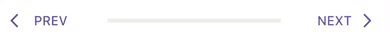
Show Implementation
Row(
  children: [
    TextButton.icon(
      onPressed: stepProgressController.previousStep,
      label: const Text('PREV'),
      icon: const Icon(Icons.arrow_back_ios),
    ),
    Expanded(
      child: StepProgress(
        totalSteps: 5,
        visibilityOptions: StepProgressVisibilityOptions.lineOnly,
        controller: stepProgressController,
        theme: const StepProgressThemeData(
          defaultForegroundColor: Color(0xFFeeeee4),
          activeForegroundColor: Color(0xFF1A76D2),
        ),
      ),
    ),
    TextButton.icon(
      onPressed: stepProgressController.nextStep,
      label: const Text('NEXT'),
      icon: const Icon(Icons.arrow_forward_ios),
      iconAlignment: IconAlignment.end,
    ),
  ],
),
Example 5: Horizontal Step Progress with Custom Node Icons
Show Implementation
StepProgress(
  totalSteps: 4,
  margin: const EdgeInsets.symmetric(horizontal: 12),
  controller: stepProgressController,
  nodeIconBuilder: (index, completedStepIndex) {
    if (index <= completedStepIndex) {
      return Text(
        '${index + 1}',
        style: const TextStyle(
          fontSize: 24,
          color: Color(0xFFb1acaa),
        ),
      );
    } else {
      return Text(
        '${index + 1}',
        style: const TextStyle(
          fontSize: 24,
          color: Color(0xFFa2a2ab),
        ),
      );
    }
  },
  theme: const StepProgressThemeData(
    defaultForegroundColor: Colors.white,
    activeForegroundColor: Colors.white,
    borderWidth: 4,
    activeBorderColor: Color(0xFF2d9ada),
    borderColor: Color(0xFFdee0e2),
    stepLineStyle: StepLineStyle(lineThickness: 0),
  ),
),
Example 6: Horizontal Step Progress with Positioned Labels
Show Implementation
StepProgress(
  totalSteps: 4,
  controller: stepProgressController,
  nodeTitles: const ['Step 1', 'Step 2', 'Step 3', 'Step 4'],
  theme: const StepProgressThemeData(
    stepLabelAlignment: StepLabelAlignment.topBottom,
    stepLineSpacing: 2,
    stepLineStyle: StepLineStyle(lineThickness: 2),
  ),
),
Example 7: Horizontal Step Progress (Node Only Mode)

Show Implementation
StepProgress(
  totalSteps: 4,
  controller: stepProgressController,
  visibilityOptions: StepProgressVisibilityOptions.nodeOnly,
  nodeSubTitles: const ['sub 1', 'sub 2', 'sub 3', 'sub 4'],
  padding: const EdgeInsets.all(18),
  theme: const StepProgressThemeData(
    stepLabelAlignment: StepLabelAlignment.right,
    nodeLabelStyle: StepLabelStyle(labelAxisAlignment: CrossAxisAlignment.start),
  ),
),
Example 8: Vertical Step Progress with Custom Line Spacing
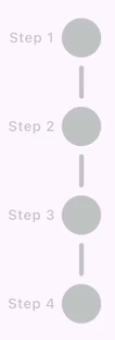
Show Implementation
StepProgress(
  totalSteps: 4,
  controller: stepProgressController,
  axis: Axis.vertical,
  height: 300,
  nodeTitles: const [
    'Step 1',
    'Step 2',
    'Step 3',
    'Step 4',
  ],
  padding: const EdgeInsets.all(18),
  theme: const StepProgressThemeData(
    stepLabelAlignment: StepLabelAlignment.left,
    nodeLabelStyle: StepLabelStyle(
      labelAxisAlignment: CrossAxisAlignment.start,
    ),
    stepLineSpacing: 24,
    stepLineStyle: StepLineStyle(
      borderRadius: Radius.circular(4),
    ),
  ),
),
Example 9: Horizontal Step Progress with Square Node Shape
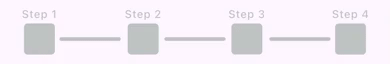
Show Implementation
StepProgress(
  totalSteps: 4,
  controller: stepProgressController,
  nodeTitles: const [
    'Step 1',
    'Step 2',
    'Step 3',
    'Step 4',
  ],
  padding: const EdgeInsets.all(18),
  theme: const StepProgressThemeData(
    shape: StepNodeShape.square,
    stepLabelAlignment: StepLabelAlignment.top,
    stepLineSpacing: 24,
    stepNodeStyle: StepNodeStyle(
      decoration: BoxDecoration(
        borderRadius: BorderRadius.all(
          Radius.circular(4),
        ),
      ),
      activeDecoration: BoxDecoration(
        borderRadius: BorderRadius.all(
          Radius.circular(6),
        ),
      ),
    ),
    stepLineStyle: StepLineStyle(
      borderRadius: Radius.circular(4),
    ),
  ),
),
Example 10: Horizontal Step Progress with Triangle Node Shape
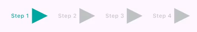
Show Implementation
StepProgress(
  totalSteps: 4,
  controller: stepProgressController,
  visibilityOptions: StepProgressVisibilityOptions.nodeOnly,
  nodeTitles: const [
    'Step 1',
    'Step 2',
    'Step 3',
    'Step 4',
  ],
  padding: const EdgeInsets.all(18),
  theme: const StepProgressThemeData(
    shape: StepNodeShape.triangle,
    stepLabelAlignment: StepLabelAlignment.left,
    stepNodeStyle: StepNodeStyle(
      activeIcon: null,
    ),
  ),
  ),
Example 11: Horizontal Step Progress with Diamond Node Shape
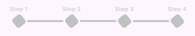
Show Implementation
StepProgress(
  totalSteps: 4,
  stepNodeSize: 24,
  controller: stepProgressController,
  nodeTitles: const [
    'Step 1',
    'Step 2',
    'Step 3',
    'Step 4',
  ],
  padding: const EdgeInsets.all(18),
  theme: const StepProgressThemeData(
    shape: StepNodeShape.diamond,
    stepLineSpacing: 18,
    stepLineStyle: StepLineStyle(
      borderRadius: Radius.circular(4),
    ),
    nodeLabelStyle: StepLabelStyle(
      margin: EdgeInsets.only(bottom: 6),
    ),
    stepNodeStyle: StepNodeStyle(
      activeIcon: null,
      decoration: BoxDecoration(
        borderRadius: BorderRadius.all(
          Radius.circular(6),
        ),
      ),
    ),
  ),
),
Example 12: Vertical Step Progress with Hexagon Node Shape
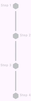
Show Implementation
StepProgress(
  totalSteps: 4,
  stepNodeSize: 24,
  height: 390,
  axis: Axis.vertical,
  controller: stepProgressController,
  nodeTitles: const [
    'Step 1',
    'Step 2',
    'Step 3',
    'Step 4',
  ],
  padding: const EdgeInsets.all(18),
  theme: const StepProgressThemeData(
    stepLabelAlignment: StepLabelAlignment.leftRight,
    shape: StepNodeShape.hexagon,
    stepLineSpacing: 18,
    stepLineStyle: StepLineStyle(
      borderRadius: BorderRadius.all(
        Radius.circular(4),
      ),
    ),
    stepNodeStyle: StepNodeStyle(
      decoration: BoxDecoration(
        borderRadius: BorderRadius.all(
          Radius.circular(6),
        ),
      ),
    ),
  ),
),
Example 13: Vertical Step Progress with Star Node Shape

Show Implementation
StepProgress(
  totalSteps: 4,
  stepNodeSize: 28,
  height: 390,
  axis: Axis.vertical,
  controller: stepProgressController,
  padding: const EdgeInsets.all(18),
  theme: const StepProgressThemeData(
    stepLabelAlignment: StepLabelAlignment.left,
    shape: StepNodeShape.star,
    stepLineSpacing: 18,
    stepLineStyle: StepLineStyle(
      lineThickness: 3,
      borderRadius: Radius.circular(3),
    ),
    stepNodeStyle: StepNodeStyle(
      activeIcon: Icon(
        Icons.verified_rounded,
        size: 10,
        color: Colors.white,
      ),
      icon: Icon(
        Icons.more_horiz_outlined,
        size: 10,
        color: Colors.white,
      ),
      decoration: BoxDecoration(
        borderRadius: BorderRadius.all(
          Radius.circular(6),
        ),
      ),
    ),
  ),
),
Example 14: Horizontal Step Progress with Line Labels

Show Implementation
StepProgress(
totalSteps: 4,
padding: const EdgeInsets.all(10),
lineTitles: const [
  'line title 1',
  'line title 2',
  'line title 3',
],
controller: stepProgressController,
nodeIconBuilder: (index, completedStepIndex) {
  if (index <= completedStepIndex) {
    return const Icon(
      Icons.check,
      color: Colors.white,
    );
  } else {
    return const Icon(
      Icons.more_horiz,
      color: Colors.white,
    );
  }
},
theme: const StepProgressThemeData(
  lineLabelAlignment: Alignment.bottomCenter,
  lineLabelStyle: StepLabelStyle(
    defualtColor: Colors.grey,
    activeColor: Colors.green,
  ),
  stepLineSpacing: 20,
  stepLineStyle: StepLineStyle(
    lineThickness: 3,
    borderRadius: Radius.circular(4),
  ),
),
),
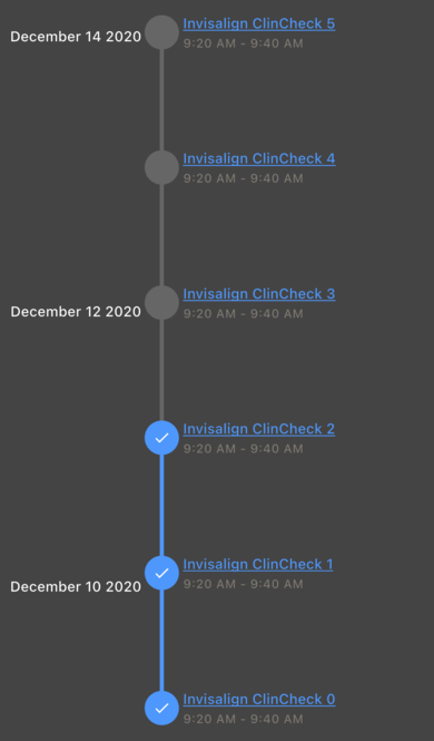
Example 15: Customized Vertical Step Progress with Line and Node Labels
Show Implementation
StepProgress(
  totalSteps: 6,
  padding: const EdgeInsets.all(10),
  axis: Axis.vertical,
  reversed: true,
  controller: stepProgressController,
  nodeIconBuilder: (index, completedStepIndex) {
    if (index <= completedStepIndex) {
      //step completed
      return const Icon(
        Icons.check,
        size: 18,
        color: Colors.white,
      );
    }
    return null;
  },
  lineLabelBuilder: (index, completedStepIndex) {
    // here index is index of current line
    // (numbers of lines is equal to toalSteps - 1)
    if (index.isEven) {
      return Text(
        'December ${index + 10} 2020',
        style: Theme.of(context)
            .textTheme
            .titleSmall
            ?.copyWith(color: Colors.white),
      );
    }
    return null;
  },
  nodeLabelBuilder: (index, completedStepIndex) {
    return Column(
      mainAxisSize: MainAxisSize.min,
      crossAxisAlignment: CrossAxisAlignment.start,
      spacing: 2,
      children: [
        Text(
          'Invisalign ClinCheck $index',
          maxLines: 3,
          style: Theme.of(context).textTheme.titleSmall?.copyWith(
                decorationColor: const Color(0xFF4e97fc),
                color: const Color(0xFF4e97fc),
                decoration: TextDecoration.underline,
              ),
        ),
        Text(
          '9:20 AM - 9:40 AM',
          style: Theme.of(context).textTheme.labelMedium?.copyWith(
                color: const Color(0xFF7e7971),
              ),
        ),
      ],
    );
  },
  theme: const StepProgressThemeData(
    defaultForegroundColor: Color(0xFF666666),
    activeForegroundColor: Color(0xFF4e97fc),
    lineLabelAlignment: Alignment.topLeft,
    nodeLabelStyle: StepLabelStyle(
      maxWidth: double.infinity,
      margin: EdgeInsets.all(4),
    ),
    lineLabelStyle: StepLabelStyle(
      maxWidth: double.infinity,
      margin: EdgeInsets.only(
        right: 18,
      ),
    ),
  ),
)
Example 16: Horizontal Step Progress with Breadcrumb Lines

Show Implementation
StepProgress(
  totalSteps: 5,
  padding: const EdgeInsets.all(10),
  controller: stepProgressController,
  lineSubTitles: const [
    'Step 2',
    'Step 3',
    'Step 4',
    'Step 5',
  ],
  theme: const StepProgressThemeData(
    stepLineSpacing: 28,
    stepLineStyle: StepLineStyle(
      lineThickness: 10,
      isBreadcrumb: true,
    ),
  ),
)
Example 17: Horizontal Step Progress with Dotted Lines

Show Implementation
StepProgress(
  totalSteps: 5,
  padding: const EdgeInsets.all(10),
  controller: stepProgressController,
  theme: const StepProgressThemeData(
    stepLineStyle: StepLineStyle(
      borderRadius: Radius.circular(8),
      borderStyle: OutterBorderStyle(
        isDotted: true,
        borderWidth: 3,
      ),
    ),
  ),
)
Example 18: Horizontal Step Progress with Ripple Effect on Nodes

Show Implementation
StepProgress(
  totalSteps: 5,
  padding: const EdgeInsets.all(10),
  controller: stepProgressController,
  theme: const StepProgressThemeData(
    enableRippleEffect: true,
  ),
)
Example 19: Horizontal Step Progress with Highlighted Current Step Node

Show Implementation
StepProgress(
  totalSteps: 5,
  padding: const EdgeInsets.all(10),
  controller: stepProgressController,
  highlightOptions: StepProgressHighlightOptions.highlightCurrentNode,
)
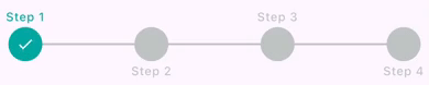
Example 20: Horizontal Step Progress Customized Icons
Show Implementation
final stepProgressController = StepProgressController(totalSteps: 5);
const nodeIcons = [
  Icon(Icons.home),
  Icon(Icons.star),
  Icon(Icons.settings),
  Icon(Icons.person),
  Icon(Icons.check)
];
StepProgress(
  totalSteps: 5,
  stepNodeSize: 75,
  padding: const EdgeInsets.all(10),
  controller: stepProgressController,
  visibilityOptions: StepProgressVisibilityOptions.nodeOnly,
  nodeIconBuilder: (index, completedStepIndex) => nodeIcons[index],
  theme: const StepProgressThemeData(
    stepAnimationDuration: Duration.zero,
    stepNodeStyle: StepNodeStyle(
      iconColor: Color(0xfffdfdfd),
      activeIconColor: Color(0xff72479e),
    ),
    activeForegroundColor: Color(0xFF181818),
    defaultForegroundColor: Color(0xff4c4c4c),
  ),
)
Example 21: Instagram Story Stepper

Show Implementation
StepProgress(
  totalSteps: 5,
  padding: const EdgeInsets.all(10),
  controller: stepProgressController,
  visibilityOptions: StepProgressVisibilityOptions.lineOnly,
  autoStartProgress: true,
  onStepChanged: (currentIndex) {
    debugPrint('Current step changed to: $currentIndex');
  },
  theme: const StepProgressThemeData(
    activeForegroundColor: Color.fromARGB(255, 255, 255, 255),
    defaultForegroundColor: Color.fromARGB(255, 171, 168, 168),
    stepLineSpacing: 3,
    stepLineStyle: StepLineStyle(
      lineThickness: 5,
      animationDuration: Duration(seconds: 3),
      borderRadius: Radius.circular(5),
    ),
  ),
),
Example 22: LineFirst mode (horizontal)
Show Implementation
StepProgress(
  totalSteps: 6,
  stepNodeSize: 20,
  padding: const EdgeInsets.symmetric(vertical: 24),
  visibilityOptions: StepProgressVisibilityOptions.lineThenNode,
  theme: const StepProgressThemeData(
      //stepLineSpacing: 20,
      stepNodeStyle: StepNodeStyle(
        shape: StepNodeShape.hexagon,
      )),
  controller: stepProgressController,
),
Example 23: LineFirst mode (horizontal)
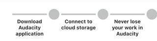
Show Implementation
StepProgress(
  totalSteps: 3,
  stepNodeSize: 30,
  hasEqualNodeAndLineCount: true, // enable equal node and line count
  padding: const EdgeInsets.symmetric(vertical: 24),
  visibilityOptions: StepProgressVisibilityOptions.lineThenNode,
  lineTitles: const [
    'Download Audacity application',
    'Connect to cloud storage',
    'Never lose your work in Audacity'
  ],
  theme: const StepProgressThemeData(
    stepLineSpacing: 20,
    lineLabelAlignment: Alignment.bottomCenter,
    lineLabelStyle: StepLabelStyle(
      defualtColor: Colors.black87,
      activeColor: Colors.black87,
      margin: EdgeInsets.only(top: 10),
      titleStyle: TextStyle(fontSize: 14, fontWeight: FontWeight.bold),
    ),
    stepNodeStyle: StepNodeStyle(
      shape: StepNodeShape.circle,
    ),
  ),
  controller: stepProgressController,
),
Installation
To use StepProgress, add it to your pubspec.yaml file:
dependencies:
  step_progress: latest_version
Then, run the following command to install the package:
flutter pub get
Usage
To use StepProgress in your Flutter app, first import the package:
import 'package:step_progress/step_progress.dart';
Initialize Your StepProgressController
final _stepProgressController = StepProgressController(totalStep: 4);
Then Pass Your StepProgressController to the StepProgress Widget
StepProgress(
  controller: _stepProgressController,
  totalSteps: 4,
  onStepChanged: (index) {
    debugPrint('on step changed: $index');
  },
),
StepProgressThemeData parameters
| Property | Type | Description | Default Value |
|---|---|---|---|
defaultForegroundColor |
Color |
The default color of the step nodes. | Color.fromARGB(255, 191, 196, 195) |
activeForegroundColor |
Color |
The color of the active step node. | Color.fromARGB(255, 0, 167, 160) |
borderStyle |
OutterBorderStyle |
border style of line and nodes. | null |
enableRippleEffect |
bool |
Whether to enable the ripple effect on step nodes. | false |
shape |
StepNodeShape |
The shape of the step nodes (e.g., circle, square). | StepNodeShape.circle |
stepAnimationDuration |
Duration |
The duration of the animation for step transitions. | Duration(milliseconds: 150) |
stepLineSpacing |
double |
The spacing between step lines. | 0.0 |
nodeLabelAlignment |
StepLabelAlignment? |
The alignment of the labels for the step nodes. | null |
lineLabelAlignment |
Alignment? |
The alignment of the labels for the step lines. | null |
nodeLabelStyle |
StepLabelStyle |
The style of the labels for the step nodes. | StepLabelStyle() |
lineLabelStyle |
StepLabelStyle |
The style of the labels for the step lines. | StepLabelStyle(maxWidth: double.infinity) |
stepNodeStyle |
StepNodeStyle |
The style of the step nodes. | StepNodeStyle() |
stepLineStyle |
StepLineStyle |
The style of the lines connecting the step nodes. | StepLineStyle() |
rippleEffectStyle |
RippleEffectStyle |
The style of the ripple effect on step nodes. | RippleEffectStyle() |
StepNodeStyle Properties
| Property | Type | Description | Default Value |
|---|---|---|---|
defaultForegroundColor |
Color? |
The default color for the foreground of the step node. If not set, it will be read from the theme. | null |
activeForegroundColor |
Color? |
The color for the foreground of the step node when it is active. If not set, it will be read from the theme. | null |
borderStyle |
OutterBorderStyle |
border style of nodes. | null |
animationDuration |
Duration? |
The duration of the animation for the step node. If not set, it will be read from the theme. | null |
iconColor |
Color |
The color of the icon. | null |
activeIconColor |
Color |
The color of the icon when the step node is active. | null |
shape |
StepNodeShape |
The shape of the step node. | null |
decoration |
BoxDecoration |
The decoration of the step node. | const BoxDecoration(color: Color.fromARGB(50, 255, 255, 255)) (semi-transparent white) |
activeDecoration |
BoxDecoration |
The decoration of the step node when it is active. | null |
icon |
Widget? |
The icon widget to display. | null |
activeIcon |
Widget? |
The icon widget to display when the step is active. | const Icon(Icons.check, size: 18, color: Colors.white) |
enableRippleEffect |
bool |
Whether to enable the ripple effect. | true |
RippleEffectStyle Properties
| Property | Type | Description | Default Value |
|---|---|---|---|
foregroundColor |
Color? |
The color of the ripple effect's foreground. If null, the theme determines the color. |
null |
animationDuration |
Duration? |
The duration of the ripple effect animation. If null, the theme determines the duration. |
null |
borderColor |
Color? |
The color of the ripple effect's border. If null, the theme determines the color. |
null |
borderWidth |
double |
The width of the ripple effect's border. | 1 |
StepLineStyle Properties
| Property | Type | Description | Default Value |
|---|---|---|---|
foregroundColor |
Color? |
The color of the step line. If not set, it will be determined by the theme. | null |
activeColor |
Color? |
The color used when the step is active. If not set, it will be determined by the theme. | null |
animationDuration |
Duration? |
The duration of the animation. If not set, it will be determined by the theme. | null |
lineThickness |
double |
The thickness of the line in the step progress. | 4.0 |
borderRadius |
Radius |
The border radius of the line in the step progress. | Radius.zero |
isBreadcrumb |
bool |
Indicates whether the step line is displayed as a breadcrumb. | false |
chevronAngle |
double |
Specifies the angle of the chevron in the step line. | 30.0 |
borderStyle |
OutterBorderStyle |
border style of nodes. | null |
OuterBorderStyle Properties
| Property | Type | Description | Default Value |
|---|---|---|---|
borderWidth |
double |
The width of the border around the step progress indicator. | 2 |
defaultBorderColor |
Color |
The default color of the border when the step is inactive. | Color.fromARGB(255, 191, 196, 195) |
activeBorderColor |
Color |
The color of the border when the step is active. | Color.fromARGB(255, 0, 167, 160) |
isDotted |
bool |
Determines whether the border is rendered as a dotted line. | false |
dashPattern |
List<double> |
The pattern of dashes and gaps for a dotted border. | [0.7, 4] |
StepLabelStyle Properties
| Property | Type | Description | Default Value |
|---|---|---|---|
labelAxisAlignment |
CrossAxisAlignment |
The alignment of the label along the cross axis. | CrossAxisAlignment.center |
titleStyle |
TextStyle? |
The style to use for the title text. | null |
subTitleStyle |
TextStyle? |
The style to use for the subtitle text. | null |
activeColor |
Color? |
The color to use when the step is active. | null |
defualtColor |
Color? |
The color to use when the step is not active. | null |
textAlign |
TextAlign |
How the text should be aligned horizontally. | TextAlign.center |
titleMaxLines |
int |
The maximum number of lines for the title text. | 3 |
maxWidth |
double |
The maximum width of the step label. | 48 |
subTitleMaxLines |
int |
The maximum number of lines for the subtitle text. | 3 |
overflow |
TextOverflow |
How visual overflow should be handled. | TextOverflow.ellipsis |
padding |
EdgeInsets |
The amount of space to surround the label with. | EdgeInsets.zero |
margin |
EdgeInsets |
The amount of space to surround the label with. | EdgeInsets.all(2) |
animationDuration |
Duration? |
The duration of the animation when the style changes. | null |
Support the Package
We appreciate your support for the StepProgress package! You can help us by:
- Liking the package on pub.dev.
- Starring the repository on GitHub.
- Reporting any issues or bugs you encounter here.
Your contributions and feedback are invaluable to us!
Donate
If you wants to support me:
License
StepProgress is released under the BSD-3-Clause License.
Contact Me 📨
Feel free to reach out to me through the following platforms:


I look forward to connecting with you!