size_helper
SizeHelper is a Flutter package for developing a responsive UI, with more control on UI components based on the current screen-size. 🥳️
Bad code!
  @override
  Widget build(BuildContext context) {
    final screenSize = MediaQuery.of(context).size;
    final screenHeight = screenSize.height;
    return Container(
      color: Colors.blue,
      margin: screenHeight < 300
          ? const EdgeInsets.all(4.0)
          : screenHeight < 1000
              ? screenHeight < 600
                  ? const EdgeInsets.all(8.0)
                  : const EdgeInsets.all(16.0)
              : screenHeight > 800
                  ? const EdgeInsets.all(32.0)
                  : const EdgeInsets.all(16.0),
      child: Text('Hello world'),
    );
  }
If you did something like that before and felt so bad about it and how you gonna read it on the future if you need to add more conditions. 😞️
No needs for feeling more guilty. 😮️
Then SizeHelper is for you. 🎉️🎉️
How to use it?
Just pass the context using of and then specify your preferred options (any DataType) and let SizeHelper do the rest for you. 💪️
- "help" method.
Method structure
SizeHelper.of(context).help(
	mobileSmall:  /*return whatever you want*/
...
)

//or

context.sizeHelper(
	mobileSmall: /*return whatever you want*/
...
)
Example 1
Container(
  margin: SizeHelper.of(context).help(
    mobileLarge: const EdgeInsets.all(8.0),
    tableNormal: const EdgeInsets.all(16.0),
    tabletExtraLarge: const EdgeInsets.all(24.0),
    desktopLarge: const EdgeInsets.all(32.0),
  )
)
Example 2
Container(
  width: SizeHelper.of(context).help(
    mobileLarge: 200.0,
    tableNormal: 240.0,
    tabletExtraLarge: 325.0,
    desktopLarge: 380.0,
  )
)
- "helpBuilder" method.
Use this method if you want to access width, height and orientation of the current screen-size.
Method structure
SizeHelper.of(context).helpBuilder(
	mobileSmall: (screenInfo)=> /* return whatever you want with help of screenInfo(width, height, orientation*/
...
)

//or

context.sizeHelperBuilder(
	mobileSmall: (screenInfo)=> /* return whatever you want with help of screenInfo(width, height, orientation*/
...
)
Example 1
Scaffold(
      body: SizeHelper.of(context, printScreenInfo: true).helpBuilder(
        mobileLarge: (_) => Container(
          alignment: Alignment.center,
          color: Colors.green,
          child: Text('mobileLarge'),
        ),
        tabletSmall: (_) => Container(
          alignment: Alignment.center,
          color: Colors.teal,
          child: Text('tabletSmall'),
        ),
        tabletLarge: (_) => Container(
          alignment: Alignment.center,
          color: Colors.deepPurple,
          child: Text('tabletLarge'),
        ),
		    //Here we used height to decide which color we will use.
        desktopNormal: (screenInfo) => Container(
          alignment: Alignment.center,
          color: screenInfo.height > 850 ? Colors.orange : Colors.yellow,
          child: Text('desktopNormal'),
        ),
      ),
    );
Example 2
Scaffold(
      body: context.sizeHelperBuilder(
        mobileExtraLarge: (_) => SingleChildScrollView(
            child: Column(
          children: [
            Text('text 1'),
            Text('text 2'),
            Text('text 3'),
          ],
        )),
        tabletLarge: (_) => SingleChildScrollView(
            scrollDirection: Axis.horizontal,
            child: Row(
              children: [
                Text('text 1'),
                Text('text 2'),
                Text('text 3'),
              ],
            )),
        desktopSmall: (_) => Wrap(
          children: [
            Text('text 1'),
            Text('text 2'),
            Text('text 3'),
          ],
        ),
      ),
    )
Screenshot
More information
-
it contains 12 breakpoints for different sizes from
mobileSmalltodesktopExtraLarge. -
but you don't have to pass all options for all breakpoints, you can just pass 3 option and the
SizeHelperwill choose the closest option to the current screen-size.
for example: passing 3 fontSize options!
Text(
 'dummy text',
 style:TextStyle(
   fontSize:SizeHelper.of(context).help(
     mobileLarge:14.0,
     tabletNormal:18.0,
     desktopSmall: 21.0,
   )
 )
)
if the current screen-size is tableLarge which is not specified inside SizeHelper then it will choose the closest size to it.
in our case it is 18.0 for tabletNormal.
-
Also, it provide another 12 breakpoints for the
landScapeorientation, which will be very useful for Web development -
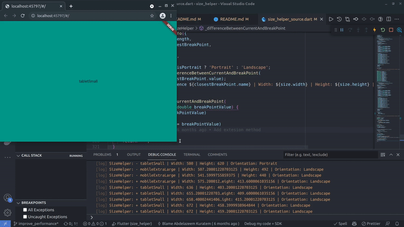
You can print your screen-size information by passing
printScreenInfo: trueinsideofmethod like this:
SizeHelper.of(context, printScreenInfo: true).help(
...
and it will print on your console logs:
SizeHelper: + desktopNormal | Width: 150.0 | Height: 1900.0 | Orientation: Portrait
- We have another shorthand extension method to access
SizeHelper
-
SizeHelper.of(context).help()=>context.sizeHelper() -
SizeHelper.of(context).helpBuilder()=>context.sizeHelperBuilder()