s_maintenance_button

A Flutter widget that provides a visual maintenance mode indicator button with an animated glow effect. This widget is only visible in debug and profile modes - it automatically hides in release builds, making it perfect for development-time features.
Features
- 🔧 Maintenance mode indicator with animated pulsing glow
- 🎨 Customizable colors for both active and inactive states
- 👻 Debug-only visibility - automatically hidden in release builds
- ⚡ Tap callback for handling toggle actions
- 🎯 Compact size (23x23 pixels) - fits anywhere in your UI
Installation
Add this to your package's pubspec.yaml file:
dependencies:
  s_maintenance_button: ^1.0.0
Then run:
flutter pub get
Usage
Basic Usage
The simplest way to use SMaintenanceButton:
import 'package:s_maintenance_button/s_maintenance_button.dart';

// Basic button with default styling
SMaintenanceButton(
  isOnMaintenance: false,
  onTap: () {
    print('Button tapped!');
  },
)
Toggle Maintenance Mode
A common pattern is to toggle the maintenance state when tapped:
class MyWidget extends StatefulWidget {
  @override
  State<MyWidget> createState() => _MyWidgetState();
}

class _MyWidgetState extends State<MyWidget> {
  bool _isOnMaintenance = false;

  @override
  Widget build(BuildContext context) {
    return SMaintenanceButton(
      isOnMaintenance: _isOnMaintenance,
      onTap: () {
        setState(() {
          _isOnMaintenance = !_isOnMaintenance;
        });
      },
    );
  }
}
API Reference
Basic API
| Property | Type | Default | Description |
|---|---|---|---|
isOnMaintenance |
bool |
false |
When true, displays the animated glow effect indicating maintenance mode is active |
onTap |
VoidCallback? |
null |
Callback function triggered when the button is tapped. If null, the button is still visible but non-interactive |
Advanced API
| Property | Type | Default | Description |
|---|---|---|---|
activeColor |
Color? |
Colors.red |
The color used for the glow effect and button background when isOnMaintenance is true |
nonActiveColor |
Color? |
Colors.blue.shade900 |
The icon color when isOnMaintenance is false |
Examples
Read-Only Indicator
Use as a visual indicator without tap handling:
SMaintenanceButton(
  isOnMaintenance: true, // Shows the glow effect
  onTap: null, // No tap handler - read-only display
)
Custom Colors
Customize the appearance for your app's theme:
SMaintenanceButton(
  isOnMaintenance: true,
  activeColor: Colors.orange, // Orange glow when active
  nonActiveColor: Colors.green, // Green icon when inactive
  onTap: () => toggleMaintenance(),
)
With AppBar Integration
Perfect for placing in an app bar for quick access:
AppBar(
  title: Text('My App'),
  actions: [
    Padding(
      padding: EdgeInsets.symmetric(horizontal: 8),
      child: SMaintenanceButton(
        isOnMaintenance: _maintenanceMode,
        activeColor: Colors.amber,
        onTap: () => setState(() => _maintenanceMode = !_maintenanceMode),
      ),
    ),
  ],
)
Scaled Button
Make the button larger for better visibility:
Transform.scale(
  scale: 2.0,
  child: SMaintenanceButton(
    isOnMaintenance: true,
    activeColor: Colors.purple,
    onTap: () => handleTap(),
  ),
)
Different Color Schemes
// Warning style (Orange/Yellow)
SMaintenanceButton(
  isOnMaintenance: isActive,
  activeColor: Colors.orange,
  nonActiveColor: Colors.grey,
  onTap: toggle,
)

// Success style (Green)
SMaintenanceButton(
  isOnMaintenance: isActive,
  activeColor: Colors.green,
  nonActiveColor: Colors.grey.shade600,
  onTap: toggle,
)

// Custom brand colors
SMaintenanceButton(
  isOnMaintenance: isActive,
  activeColor: Color(0xFFE91E63), // Pink
  nonActiveColor: Color(0xFF3F51B5), // Indigo
  onTap: toggle,
)
Behavior Notes
Release Mode
⚠️ Important: This widget returns SizedBox.shrink() in release mode (kReleaseMode == true). This means:
- The button will not be visible in production builds
- No space will be occupied in the layout
- This is intentional for development-only features
Visual States
| State | Appearance |
|---|---|
isOnMaintenance: false |
White circular button with colored wrench icon (no glow) |
isOnMaintenance: true |
Colored button with animated pulsing glow effect |
Dependencies
This package uses the following dependencies:
s_glow- For the animated glow effects_button- For button interactionss_disabled- For disabled state handlingassorted_layout_widgets- For layout utilities
Example App
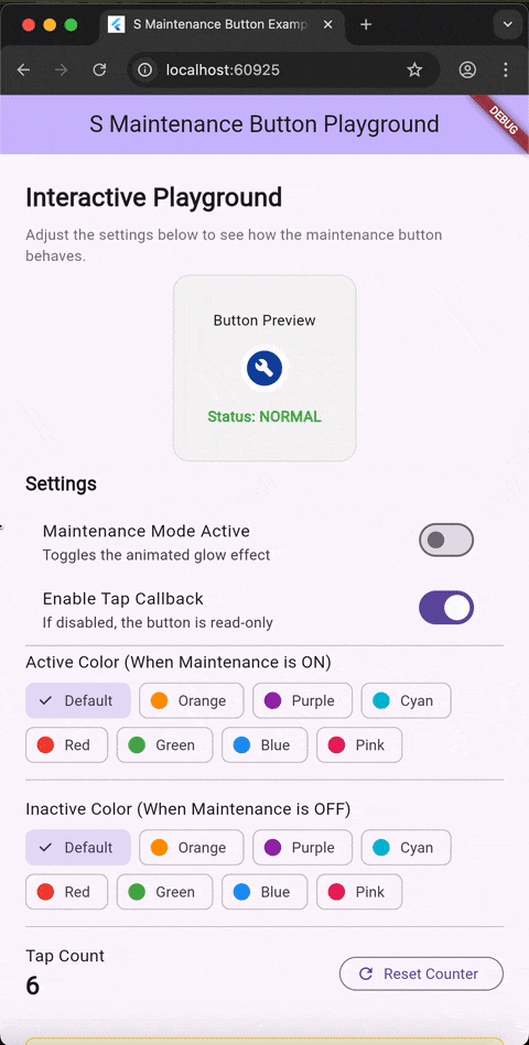
Check out the example directory for a complete interactive playground demonstrating all features.
To run the example:
cd example
flutter run
License
This project is licensed under the MIT License - see the LICENSE file for details.
Contributing
Contributions are welcome! Please feel free to submit a Pull Request.
Issues
Found a bug or have a feature request? Please open an issue on GitHub.
Libraries
- s_maintenance_button package