Riverpod Paging Utils
A Flutter package that provides utilities for implementing pagination with Riverpod. It includes a generic PagingHelperView widget and mixins for page-based, offset-based, and cursor-based pagination.
Demo
 |
 |
 |
|---|
Features
PagingHelperView: A generic widget that simplifies the implementation of pagination in Flutter apps.PagingHelperSliverView: A sliver version ofPagingHelperViewfor use inCustomScrollView.PagePagingNotifierMixin: A mixin for implementing page-based pagination logic.OffsetPagingNotifierMixin: A mixin for implementing offset-based pagination logic.CursorPagingNotifierMixin: A mixin for implementing cursor-based pagination logic.
Getting Started
Installation
Add the following dependency to your pubspec.yaml file:
dependencies:
  riverpod_paging_utils: ^{latest}
Then, run flutter pub get to install the package.
Usage
Here's a simple example of how to use the PagingHelperView widget with a Riverpod provider that uses the CursorPagingNotifierMixin:
/// A Riverpod provider that mixes in [CursorPagingNotifierMixin].
/// This provider handles the pagination logic for fetching [SampleItem] data using cursor-based pagination.
@riverpod
class SampleNotifier extends _$SampleNotifier
with CursorPagingNotifierMixin<SampleItem> {
/// Builds the initial state of the provider by fetching data with a null cursor.
@override
Future<CursorPagingData<SampleItem>> build() => fetch(cursor: null);
/// Fetches paginated data from the [SampleRepository] based on the provided [cursor].
/// Returns a [CursorPagingData] object containing the fetched items, a flag indicating whether more data is available,
/// and the next cursor for fetching the next page.
@override
Future<CursorPagingData<SampleItem>> fetch({
required String? cursor,
}) async {
final repository = ref.read(sampleRepositoryProvider);
final (items, nextCursor) = await repository.getByCursor(cursor);
final hasMore = nextCursor != null && nextCursor.isNotEmpty;
return CursorPagingData(
items: items,
hasMore: hasMore,
nextCursor: nextCursor,
);
}
}
/// A sample page that demonstrates the usage of [PagingHelperView] with the [SampleNotifier] provider.
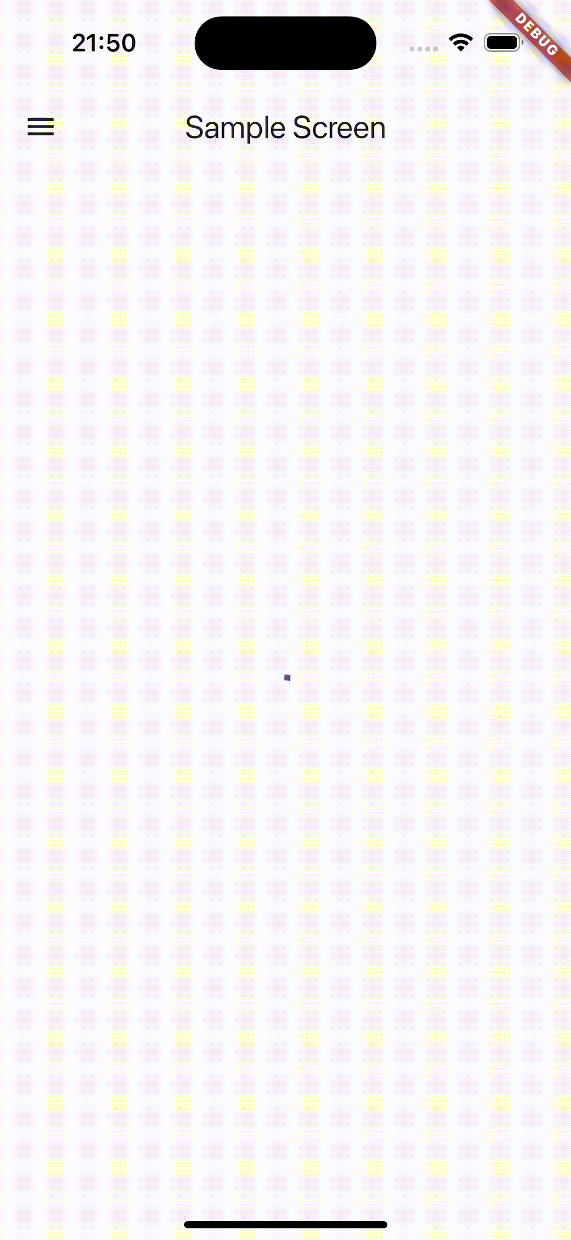
class SampleScreen extends StatelessWidget {
const SampleScreen({super.key});
@override
Widget build(BuildContext context) {
return Scaffold(
appBar: AppBar(
title: const Text('Sample Screen'),
),
body: PagingHelperView(
provider: sampleNotifierProvider,
futureRefreshable: sampleNotifierProvider.future,
notifierRefreshable: sampleNotifierProvider.notifier,
contentBuilder: (data, widgetCount, endItemView) => ListView.builder(
itemCount: widgetCount,
itemBuilder: (context, index) {
// if the index is last, then
// return the end item view.
if (index == widgetCount - 1) {
return endItemView;
}
// Otherwise, build a list tile for each sample item.
return ListTile(
title: Text(data.items[index].name),
subtitle: Text(data.items[index].id),
);
},
),
),
);
}
}
GridView Example
You can also use PagingHelperView with GridView to create paginated grid layouts:
class GridViewScreen extends StatelessWidget {
  const GridViewScreen({super.key});

  @override
  Widget build(BuildContext context) {
    return Scaffold(
      appBar: AppBar(
        title: const Text('GridView Example'),
      ),
      body: PagingHelperView(
        provider: gridViewNotifierProvider,
        futureRefreshable: gridViewNotifierProvider.future,
        notifierRefreshable: gridViewNotifierProvider.notifier,
        contentBuilder: (data, widgetCount, endItemView) {
          return GridView.builder(
            gridDelegate: const SliverGridDelegateWithFixedCrossAxisCount(
              crossAxisCount: 2,
              crossAxisSpacing: 8,
              mainAxisSpacing: 8,
              childAspectRatio: 1,
            ),
            padding: const EdgeInsets.all(8),
            itemCount: widgetCount,
            itemBuilder: (context, index) {
              if (index == widgetCount - 1) {
                return endItemView;
              }

              final item = data.items[index];
              return Card(
                child: Center(
                  child: Column(
                    mainAxisAlignment: MainAxisAlignment.center,
                    children: [
                      Icon(
                        Icons.folder,
                        size: 48,
                        color: Theme.of(context).primaryColor,
                      ),
                      const SizedBox(height: 8),
                      Text(
                        item.name,
                        style: Theme.of(context).textTheme.titleMedium,
                        textAlign: TextAlign.center,
                      ),
                      Text(
                        item.id,
                        style: Theme.of(context).textTheme.bodySmall,
                      ),
                    ],
                  ),
                ),
              );
            },
          );
        },
      ),
    );
  }
}
A complete implementation can be found in the example/lib/ui/gridview_screen.dart file.
CustomScrollView with PagingHelperSliverView
PagingHelperSliverView is a sliver version of PagingHelperView for use in CustomScrollView. It has the same API as PagingHelperView with these differences:
- Returns sliver widgets from
contentBuilder(e.g.,SliverListinstead ofListView) - Wraps loading/error states with
SliverFillRemaining - Uses
sliverLoadingViewBuilderandsliverErrorViewBuilderfrom theme - Does not support
RefreshIndicator(useCupertinoSliverRefreshControlinstead)
Example:
class CustomScrollViewScreen extends ConsumerWidget {
  const CustomScrollViewScreen({super.key});

  @override
  Widget build(BuildContext context, WidgetRef ref) {
    return Scaffold(
      body: CustomScrollView(
        slivers: [
          const SliverAppBar(
            title: Text('CustomScrollView with Sliver'),
            pinned: true,
            expandedHeight: 200,
          ),
          // CupertinoSliverRefreshControl for iOS-style pull-to-refresh
          CupertinoSliverRefreshControl(
            onRefresh: () async =>
                ref.refresh(customScrollViewNotifierProvider.future),
          ),
          // Static content before the list
          const SliverToBoxAdapter(
            child: Padding(
              padding: EdgeInsets.all(16),
              child: Text('Header Content'),
            ),
          ),
          // The paginated list using PagingHelperSliverView
          PagingHelperSliverView(
            provider: customScrollViewNotifierProvider,
            futureRefreshable: customScrollViewNotifierProvider.future,
            notifierRefreshable: customScrollViewNotifierProvider.notifier,
            contentBuilder: (data, widgetCount, endItemView) {
              return SliverList(
                delegate: SliverChildBuilderDelegate(
                  (context, index) {
                    if (index == widgetCount - 1) {
                      return endItemView;
                    }
                    return ListTile(
                      title: Text(data.items[index].name),
                    );
                  },
                  childCount: widgetCount,
                ),
              );
            },
          ),
        ],
      ),
    );
  }
}
A complete implementation can be found in the example/lib/ui/custom_scroll_view_screen.dart file.
UI Customization
Basic Customization
You can easily customize the appearance of loading and error states using ThemeExtension.
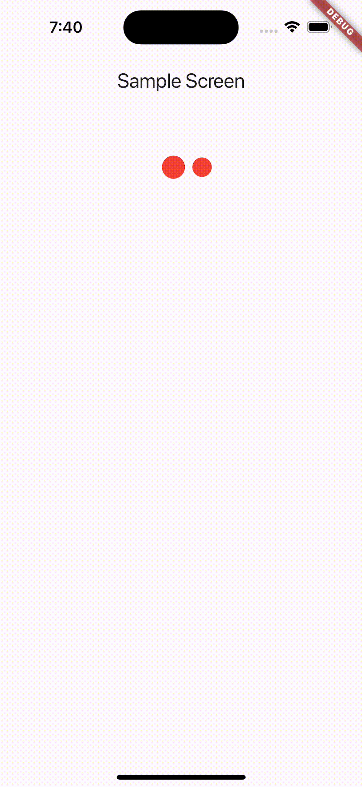
For example, if you're using the loading_animation_widget package, you can set up your code like this:
class MainApp extends StatelessWidget {
  const MainApp({super.key});

  @override
  Widget build(BuildContext context) {
    return MaterialApp(
      theme: ThemeData(
        extensions: [
          PagingHelperViewTheme(
            loadingViewBuilder: (context) => Padding(
              padding: const EdgeInsets.all(16),
              child: Align(
                alignment: Alignment.topCenter,
                child: LoadingAnimationWidget.horizontalRotatingDots(
                  color: Colors.red,
                  size: 100,
                ),
              ),
            ),
            endLoadingViewBuilder: (context) =>
                LoadingAnimationWidget.threeArchedCircle(
              color: Colors.red,
              size: 50,
            ),
          ),
        ],
      ),
      home: const SampleScreen(),
    );
  }
}
A complete sample implementation can be found in the example/lib/main2.dart file.
Advanced Customization
Customizing the appearance of RefreshIndicators requires a bit more setup.
1. Theme Configuration
First, adjust your PagingHelperViewTheme like this:
class MainApp extends StatelessWidget {
  const MainApp({super.key});

  @override
  Widget build(BuildContext context) {
    return MaterialApp(
      theme: ThemeData(
        extensions: [
          PagingHelperViewTheme(
            // disable pull-to-refresh
            enableRefreshIndicator: false,
          ),
        ],
      ),
      home: const SampleScreen(),
    );
  }
}
2. Integrating Custom Refresh (e.g., with easy_refresh)
If you're using a package like easy_refresh to provide a RefreshIndicator, modify your screen code as follows:
class SampleScreen extends ConsumerWidget {
  const SampleScreen({super.key});

  @override
  Widget build(BuildContext context, WidgetRef ref) {
    return Scaffold(
      appBar: AppBar(
        title: const Text('Advanced UI Customization'),
      ),
      body: PagingHelperView(
        provider: sampleNotifierProvider,
        futureRefreshable: sampleNotifierProvider.future,
        notifierRefreshable: sampleNotifierProvider.notifier,
        contentBuilder: (data, widgetCount, endItemView) {
          // Use EasyRefresh alternative to RefreshIndicator
          return EasyRefresh(
            onRefresh: () async => ref.refresh(sampleNotifierProvider.future),
            child: ListView.builder(
              itemCount: widgetCount,
              itemBuilder: (context, index) {
                // if the index is last, then
                // return the end item view.
                if (index == widgetCount - 1) {
                  return endItemView;
                }

                // Otherwise, build a list tile for each sample item.
                return ListTile(
                  title: Text(data.items[index].name),
                  subtitle: Text(data.items[index].id),
                );
              },
            ),
          );
        },
      ),
    );
  }
}
A complete sample implementation can be found in the example/lib/main3.dart file.