TextFormField class
A FormField that contains a TextField.
This is a convenience widget that wraps a TextField widget in a FormField.
A Form ancestor is not required. The Form simply makes it easier to save, reset, or validate multiple fields at once. To use without a Form, pass a GlobalKey to the constructor and use GlobalKey.currentState to save or reset the form field.
When a controller is specified, its TextEditingController.text defines the initialValue. If this FormField is part of a scrolling container that lazily constructs its children, like a ListView or a CustomScrollView, then a controller should be specified. The controller's lifetime should be managed by a stateful widget ancestor of the scrolling container.
If a controller is not specified, initialValue can be used to give the automatically generated controller an initial value.
Remember to call TextEditingController.dispose of the TextEditingController when it is no longer needed. This will ensure we discard any resources used by the object.
By default, decoration will apply the ThemeData.inputDecorationTheme for
the current context to the InputDecoration, see
InputDecoration.applyDefaults.
For a documentation about the various parameters, see TextField.
{@tool snippet}
Creates a TextFormField with an InputDecoration and validator function.
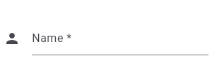
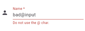
TextFormField(
  decoration: const InputDecoration(
    icon: Icon(Icons.person),
    hintText: 'What do people call you?',
    labelText: 'Name *',
  ),
  onSaved: (String? value) {
    // This optional block of code can be used to run
    // code when the user saves the form.
  },
  validator: (String? value) {
    return (value != null && value.contains('@')) ? 'Do not use the @ char.' : null;
  },
)
{@end-tool}
{@tool dartpad --template=stateful_widget_material} This example shows how to move the focus to the next field when the user presses the SPACE key.
import 'package:flutter/services.dart';
@override
Widget build(BuildContext context) {
  return Material(
    child: Center(
      child: Shortcuts(
        shortcuts: const <ShortcutActivator, Intent>{
          // Pressing space in the field will now move to the next field.
          SingleActivator(LogicalKeyboardKey.space): NextFocusIntent(),
        },
        child: FocusTraversalGroup(
          child: Form(
            autovalidateMode: AutovalidateMode.always,
            onChanged: () {
              Form.of(primaryFocus!.context!)!.save();
            },
            child: Wrap(
              children: List<Widget>.generate(5, (int index) {
                return Padding(
                  padding: const EdgeInsets.all(8.0),
                  child: ConstrainedBox(
                    constraints: BoxConstraints.tight(const Size(200, 50)),
                    child: TextFormField(
                      onSaved: (String? value) {
                        print('Value for field $index saved as "$value"');
                      },
                    ),
                  ),
                );
              }),
            ),
          ),
        ),
      ),
    ),
  );
}
{@end-tool}
See also:
- material.io/design/components/text-fields.html
- TextField, which is the underlying text field without the Form integration.
- InputDecorator, which shows the labels and other visual elements that surround the actual text editing widget.
- Learn how to use a TextEditingController in one of our cookbook recipes.
- Inheritance
-
- Object
- DiagnosticableTree
- Widget
- StatefulWidget
- FormField<
String> - TextFormField
Constructors
-
TextFormField({Key? key, TextEditingController? controller, String? initialValue, FocusNode? focusNode, InputDecorationV3? decoration = const InputDecorationV3(), TextInputType? keyboardType, TextCapitalization textCapitalization = TextCapitalization.none, TextInputAction? textInputAction, TextStyle? style, StrutStyle? strutStyle, TextDirection? textDirection, TextAlign textAlign = TextAlign.start, TextAlignVertical? textAlignVertical, bool autofocus = false, bool readOnly = false, ToolbarOptions? toolbarOptions, bool? showCursor, String obscuringCharacter = '•', bool obscureText = false, bool autocorrect = true, SmartDashesType? smartDashesType, SmartQuotesType? smartQuotesType, bool enableSuggestions = true, @Deprecated('Use autovalidateMode parameter which provide more specific ' 'behaviour related to auto validation. ' 'This feature was deprecated after v1.19.0.') bool autovalidate = false, @Deprecated('Use maxLengthEnforcement parameter which provides more specific ' 'behavior related to the maxLength limit. ' 'This feature was deprecated after v1.25.0-5.0.pre.') MaxLengthEnforcement? maxLengthEnforcement, int? maxLines = 1, int? minLines, bool expands = false, ValueChanged<
String> ? onChanged, GestureTapCallback? onTap, VoidCallback? onEditingComplete, ValueChanged<String> ? onFieldSubmitted, FormFieldSetter<String> ? onSaved, FormFieldValidator<String> ? validator, List<TextInputFormatter> ? inputFormatters, bool? enabled, Radius? cursorRadius, Brightness? keyboardAppearance, EdgeInsets scrollPadding = const EdgeInsets.all(20.0), bool enableInteractiveSelection = true, TextSelectionControls? selectionControls, InputCounterWidgetBuilder? buildCounter, ScrollPhysics? scrollPhysics, Iterable<String> ? autofillHints, AutovalidateMode? autovalidateMode, ScrollController? scrollController, String? restorationId, bool enableIMEPersonalizedLearning = true, bool hasFocus = false}) - Creates a FormField that contains a TextField.
Properties
- autovalidateMode → AutovalidateMode
-
Used to enable/disable this form field auto validation and update its
error text.
finalinherited
-
builder
→ FormFieldBuilder<
String> -
Function that returns the widget representing this form field. It is
passed the form field state as input, containing the current value and
validation state of this field.
finalinherited
- controller → TextEditingController?
-
Controls the text being edited.
final
- enabled → bool
-
Whether the form is able to receive user input.
finalinherited
- forceErrorText → String?
-
An optional property that forces the FormFieldState into an error state
by directly setting the FormFieldState.errorText property without
running the validator function.
finalinherited
- hashCode → int
-
The hash code for this object.
no setterinherited
- initialValue → String?
-
An optional value to initialize the form field to, or null otherwise.
finalinherited
- key → Key?
-
Controls how one widget replaces another widget in the tree.
finalinherited
-
onSaved
→ FormFieldSetter<
String> ? -
An optional method to call with the final value when the form is saved via
FormState.save.
finalinherited
- restorationId → String?
-
Restoration ID to save and restore the state of the form field.
finalinherited
- runtimeType → Type
-
A representation of the runtime type of the object.
no setterinherited
-
validator
→ FormFieldValidator<
String> ? -
An optional method that validates an input. Returns an error string to
display if the input is invalid, or null otherwise.
finalinherited
Methods
-
createElement(
) → StatefulElement -
Creates a StatefulElement to manage this widget's location in the tree.
inherited
-
createState(
) → FormFieldState< String> -
Creates the mutable state for this widget at a given location in the tree.
override
-
debugDescribeChildren(
) → List< DiagnosticsNode> -
Returns a list of DiagnosticsNode objects describing this node's
children.
inherited
-
debugFillProperties(
DiagnosticPropertiesBuilder properties) → void -
Add additional properties associated with the node.
inherited
-
noSuchMethod(
Invocation invocation) → dynamic -
Invoked when a nonexistent method or property is accessed.
inherited
-
toDiagnosticsNode(
{String? name, DiagnosticsTreeStyle? style}) → DiagnosticsNode -
Returns a debug representation of the object that is used by debugging
tools and by DiagnosticsNode.toStringDeep.
inherited
-
toString(
{DiagnosticLevel minLevel = DiagnosticLevel.info}) → String -
A string representation of this object.
inherited
-
toStringDeep(
{String prefixLineOne = '', String? prefixOtherLines, DiagnosticLevel minLevel = DiagnosticLevel.debug}) → String -
Returns a string representation of this node and its descendants.
inherited
-
toStringShallow(
{String joiner = ', ', DiagnosticLevel minLevel = DiagnosticLevel.debug}) → String -
Returns a one-line detailed description of the object.
inherited
-
toStringShort(
) → String -
A short, textual description of this widget.
inherited
Operators
-
operator ==(
Object other) → bool -
The equality operator.
inherited