pin_plus_keyboard
A highly customizable Flutter package that provides custom input fields and a custom numeric keyboard for PIN entry, OTP (One-Time Password) widgets, transaction PIN widgets, and simple login widgets.
Features
✨ Highly Customizable
- Customizable input field shapes (circular, rounded, or default)
- Customizable keyboard button shapes and styles
- Full control over colors, sizes, borders, and shadows
- Support for hidden input (password-style)
- Custom fonts and text styles
- Gradient support for buttons and inputs
- Custom builders for complete control
- Theme presets (iOS-style, Android-style, Material 3)
🎨 Beautiful UI
- Modern and clean design
- Smooth animations (fill, shake, success)
- Responsive layout
- Support for elevation and shadows
- Multiple input styles (box or dash)
- Material 3 design support
- Dynamic color theming
♿ Accessibility
- Full screen reader support
- Keyboard navigation
- Semantic labels and hints
- High contrast mode support
- ARIA-like attributes
🔒 Security
- Auto-clear after inactivity timeout
- Screenshot blocking (Android)
- Rate limiting for failed attempts
- Secure input handling
- Random keyboard layout (shoulder surfing protection)
🔐 Biometric Integration
- Face ID / Touch ID / Fingerprint support
- Optional biometric authentication button
- Fallback to PIN when biometrics fail
- Platform-agnostic interface
⚡ Easy to Use
- Simple API
- Well-documented
- Comprehensive examples
- Type-safe with null safety
- Platform-specific optimizations
Getting Started
Installation
Add this package to your pubspec.yaml file:
dependencies:
  flutter:
    sdk: flutter
  pin_plus_keyboard: ^3.0.0
For biometric features, also add local_auth:
dependencies:
  local_auth: ^2.0.0  # Optional, for biometric authentication
Then run:
flutter pub get
Import
import 'package:pin_plus_keyboard/pin_plus_keyboard.dart';
Usage
Basic Example
The most basic usage requires three things:
- A
PinInputControllerwith the desired PIN length - A
spacingvalue for layout - An
onSubmitcallback function
import 'package:flutter/material.dart';
import 'package:pin_plus_keyboard/pin_plus_keyboard.dart';

class PinEntryScreen extends StatefulWidget {
  const PinEntryScreen({super.key});

  @override
  State<PinEntryScreen> createState() => _PinEntryScreenState();
}

class _PinEntryScreenState extends State<PinEntryScreen> {
  // Initialize the controller with the desired PIN length
  final PinInputController _pinController = PinInputController(length: 6);

  @override
  void dispose() {
    // Don't forget to dispose the controller
    _pinController.dispose();
    super.dispose();
  }

  @override
  Widget build(BuildContext context) {
    return Scaffold(
      body: Center(
        child: Column(
          mainAxisAlignment: MainAxisAlignment.center,
          children: [
            const Text(
              'Enter Your PIN',
              style: TextStyle(fontSize: 24, fontWeight: FontWeight.bold),
            ),
            const SizedBox(height: 40),
            PinPlusKeyBoardPackage(
              pinInputController: _pinController,
              spacing: 40,
              onSubmit: () {
                // This is called when all fields are filled or done button is pressed
                print('PIN entered: ${_pinController.text}');
                // Add your validation/submission logic here
              },
            ),
          ],
        ),
      ),
    );
  }
}
Advanced Example with Customization
PinPlusKeyBoardPackage(
  // Required parameters
  pinInputController: _pinController,
  spacing: 40,
  onSubmit: () {
    print('PIN: ${_pinController.text}');
  },

  // Input field customization
  inputShape: InputShape.circular,
  inputType: InputType.box,
  inputFillColor: Colors.grey[200],
  inputBorderColor: Colors.blue,
  inputTextColor: Colors.black,
  inputHasBorder: true,
  inputBorderThickness: 2,
  inputElevation: 5,
  isInputHidden: false, // Set to true for password-style input

  // Keyboard customization
  keyboardButtonShape: KeyboardButtonShape.circular,
  buttonFillColor: Colors.blue,
  btnTextColor: Colors.white,
  btnHasBorder: false,
  btnElevation: 3,
  keyboardMaxWidth: 80, // Percentage of screen width

  // Error handling
  errorColor: Colors.red,
)
Example with Material 3
PinPlusKeyBoardPackage(
  pinInputController: _pinController,
  spacing: 40,
  onSubmit: () {
    // Handle PIN submission
  },
  // Enable Material 3 design tokens
  useMaterial3: true,
  // Colors will be automatically derived from theme
)
Example with Animations
PinPlusKeyBoardPackage(
  pinInputController: _pinController,
  spacing: 40,
  onSubmit: () {
    // Handle PIN submission
  },
  // Enable all animations
  enableAnimations: true,
  enableShakeAnimation: true,
  enableSuccessAnimation: true,
  animationCurve: Curves.easeInOut,
  animationDuration: Duration(milliseconds: 300),
)
Example with Biometric Authentication
PinPlusKeyBoardPackage(
  pinInputController: _pinController,
  spacing: 40,
  onSubmit: () {
    // Handle PIN submission
  },
  // Enable biometric authentication
  enableBiometric: true,
  biometricReason: 'Please authenticate to access your account',
  onBiometricSuccess: () {
    print('Biometric authentication successful');
  },
  onBiometricFailure: () {
    print('Biometric authentication failed');
  },
)
Note: For biometric features to work, you need to add local_auth to your pubspec.yaml:
dependencies:
  local_auth: ^2.0.0
Example with Security Features
PinPlusKeyBoardPackage(
  pinInputController: _pinController,
  spacing: 40,
  onSubmit: () {
    // Handle PIN submission
  },
  // Auto-clear PIN after 30 seconds of inactivity
  autoClearTimeout: Duration(seconds: 30),
  // Enable screenshot blocking (Android only)
  enableScreenshotBlocking: true,
  // Rate limiting
  maxFailedAttempts: 5,
  rateLimitWindow: Duration(minutes: 15),
)
Example with Random Keyboard Layout
The random keyboard feature shuffles the positions of numbers 1-9 on the keyboard, making it harder for observers to see which numbers are being pressed (shoulder surfing protection). The zero button always remains in the center position.
PinPlusKeyBoardPackage(
  pinInputController: _pinController,
  spacing: 40,
  onSubmit: () {
    // Handle PIN submission
  },
  // Enable random keyboard layout
  enableRandomKeyboard: true,
  // Reshuffle when PIN is cleared (optional)
  reshuffleOnClear: true,
  // Reshuffle when app comes to foreground (optional)
  reshuffleOnResume: true,
)
Security Benefits:
- Shoulder Surfing Protection: Random number positions make it difficult for observers to determine which numbers are being pressed
- Enhanced Privacy: Even if someone watches you enter your PIN, they can't easily replicate it on a standard keyboard layout
- Flexible Reshuffling: Choose when to reshuffle - on initialization, on clear, or when app resumes
Note: The random layout only affects numbers 1-9. The zero button (0) always remains in the center position of the bottom row for consistency.
Example with Theme Presets
import 'package:pin_plus_keyboard/pin_plus_keyboard.dart';

// Use iOS-style preset
PinPlusKeyBoardPackage(
  pinInputController: _pinController,
  spacing: 40,
  onSubmit: () {},
  ...PinThemePresets.iosStyle(),
)

// Use Material 3 preset
PinPlusKeyBoardPackage(
  pinInputController: _pinController,
  spacing: 40,
  onSubmit: () {},
  ...PinThemePresets.material3Style(
    colorScheme: Theme.of(context).colorScheme,
  ),
)
Example with Hidden Input (Password Style)
PinPlusKeyBoardPackage(
  pinInputController: _pinController,
  spacing: 40,
  onSubmit: () {
    // Handle PIN submission
  },
  isInputHidden: true, // Hide the input as user types
  inputHiddenColor: Colors.black, // Color to hide the input
)
Example with Dash Style Input
PinPlusKeyBoardPackage(
  pinInputController: _pinController,
  spacing: 40,
  onSubmit: () {
    // Handle PIN submission
  },
  inputType: InputType.dash, // Underline style instead of box
  inputBorderColor: Colors.blue,
)
Example with Haptic Feedback and Validation
PinPlusKeyBoardPackage(
  pinInputController: _pinController,
  spacing: 40,
  onSubmit: () {
    // Handle PIN submission
    print('PIN submitted: ${_pinController.text}');
  },
  // Enable haptic feedback for better user experience
  enableHapticFeedback: true,
  // Custom validation - return error message if invalid
  validator: (String pin) {
    // Example: Prevent PINs with all same digits
    if (pin.split('').every((digit) => digit == pin[0])) {
      return 'PIN cannot be all the same digit';
    }
    // Example: Prevent sequential PINs
    if (pin == '123456' || pin == '654321') {
      return 'PIN cannot be sequential';
    }
    return ''; // Empty string means validation passed
  },
  // Track each digit entry (useful for analytics)
  onDigitEntered: (String digit, int position) {
    print('Digit $digit entered at position $position');
  },
)
Example: Clearing PIN Input
To clear the PIN input (e.g., after validation error or successful submission), use the clear() method on the controller:
// ❌ INCORRECT - This will NOT work:
// pinInputController.text = '';  // Don't do this!

// ✅ CORRECT - Use the clear() method:
pinInputController.clear();

// Alternative - Use changeText() with empty string:
// pinInputController.changeText('');
Complete example with error handling:
class PinEntryScreen extends StatefulWidget {
  const PinEntryScreen({super.key});

  @override
  State<PinEntryScreen> createState() => _PinEntryScreenState();
}

class _PinEntryScreenState extends State<PinEntryScreen> {
  final PinInputController _pinController = PinInputController(length: 6);

  void _handlePinSubmission() {
    // Validate PIN (e.g., check with backend)
    if (_isValidPin(_pinController.text)) {
      // Success - clear PIN and navigate
      _pinController.clear();
      Navigator.push(context, MaterialPageRoute(builder: (_) => HomeScreen()));
    } else {
      // Error - show error message and clear PIN
      ScaffoldMessenger.of(context).showSnackBar(
        const SnackBar(content: Text('Invalid PIN. Please try again.')),
      );
      // Clear the PIN input so user can try again
      _pinController.clear();
    }
  }

  bool _isValidPin(String pin) {
    // Your validation logic here
    return pin == '123456'; // Example
  }

  @override
  Widget build(BuildContext context) {
    return Scaffold(
      body: PinPlusKeyBoardPackage(
        pinInputController: _pinController,
        spacing: 40,
        onSubmit: _handlePinSubmission,
        validator: (String pin) {
          if (pin.length < 6) {
            return 'PIN must be 6 digits';
          }
          return ''; // No error
        },
      ),
    );
  }

  @override
  void dispose() {
    _pinController.dispose();
    super.dispose();
  }
}
Important Notes:
- Always use
pinInputController.clear()to clear the PIN input - Do NOT directly assign to
pinInputController.textas it won't trigger UI updates - The
clear()method automatically notifies all listeners and resets animations - After clearing, the input fields will be empty and ready for new input
Example with Gradients
PinPlusKeyBoardPackage(
  pinInputController: _pinController,
  spacing: 40,
  onSubmit: () {
    // Handle PIN submission
  },
  // Gradient for keyboard buttons
  buttonGradient: LinearGradient(
    colors: [Colors.blue, Colors.purple],
    begin: Alignment.topLeft,
    end: Alignment.bottomRight,
  ),
  // Gradient for input fields
  inputGradient: LinearGradient(
    colors: [Colors.grey.shade100, Colors.grey.shade200],
  ),
)
Example with Custom Builders
PinPlusKeyBoardPackage(
  pinInputController: _pinController,
  spacing: 40,
  onSubmit: () {
    // Handle PIN submission
  },
  // Custom input field builder
  inputFieldBuilder: (context, position, hasCharacter, character) {
    return Container(
      // Your custom input field design
      child: Text(character ?? ''),
    );
  },
  // Custom keyboard button builder
  keyboardButtonBuilder: (context, number) {
    return ElevatedButton(
      onPressed: () {
        // Handle button press
      },
      child: Text(number),
    );
  },
)
Accessibility
The package includes comprehensive accessibility support:
- Screen Reader Support: All interactive elements have semantic labels
- Keyboard Navigation: Users can navigate using keyboard arrows (when enabled)
- High Contrast Mode: Automatically adapts to system accessibility settings
- Semantic Labels: Proper labels for all buttons and inputs
PinPlusKeyBoardPackage(
  pinInputController: _pinController,
  spacing: 40,
  onSubmit: () {},
  // Custom semantic label
  semanticLabel: 'Enter your 6-digit PIN code',
  // Enable keyboard navigation
  enableKeyboardNavigation: true,
)
API Reference
PinInputController
The controller manages the state of the PIN input.
Properties
length(int): The number of input fields (required)text(String): The current PIN value
Methods
changeText(String text): Updates the PIN value and notifies all listenersclear(): Clears the PIN value and notifies all listeners. This is the recommended way to clear the PIN input.addListener(VoidCallback listener): Listen to changesremoveListener(VoidCallback listener): Remove listener
Important: Do not directly assign to the text property. Always use clear() or changeText() methods to ensure the UI updates correctly.
Getters
isComplete(bool): Returns true if all fields are filledisEmpty(bool): Returns true if no input has been entered
PinPlusKeyBoardPackage
The main widget that displays the PIN input fields and keyboard.
Required Parameters
| Parameter | Type | Description |
|---|---|---|
pinInputController |
PinInputController |
Controller that manages the PIN state |
spacing |
double |
Space between input fields and keyboard |
onSubmit |
VoidCallback |
Callback called when PIN is submitted |
Optional Parameters
Input Field Customization
| Parameter | Type | Default | Description |
|---|---|---|---|
inputShape |
InputShape |
InputShape.defaultShape |
Shape of input fields (circular, rounded, defaultShape) |
inputType |
InputType |
InputType.box |
Style of input (box or dash) |
inputWidth |
double? |
null |
Width of individual input fields |
inputHeight |
double? |
null |
Height of individual input fields |
inputFillColor |
Color? |
null |
Fill color for empty input fields |
inputBorderColor |
Color? |
null |
Border color for input fields |
inputTextColor |
Color? |
null |
Text color for input numbers |
inputHasBorder |
bool |
true |
Whether input fields have borders |
inputBorderThickness |
double? |
null |
Thickness of input borders |
inputBorderRadius |
BorderRadius? |
null |
Custom border radius for inputs |
inputElevation |
double? |
null |
Shadow elevation for inputs |
inputShadowColor |
Color? |
null |
Shadow color for inputs |
inputTextStyle |
TextStyle? |
null |
Custom text style for inputs |
isInputHidden |
bool |
false |
Hide input as user types (password-style) |
inputHiddenColor |
Color |
Colors.black |
Color used to hide input |
inputsMaxWidth |
double |
70 |
Max width of input container (% of screen) |
focusColor |
Color? |
null |
Color for focused/active inputs |
inputGradient |
Gradient? |
null |
Gradient for input fields (overrides fillColor) |
inputFieldBuilder |
Widget Function(...)? |
null |
Custom builder for input fields |
Keyboard Customization
| Parameter | Type | Default | Description |
|---|---|---|---|
keyboardButtonShape |
KeyboardButtonShape |
defaultShape |
Shape of keyboard buttons |
keyboardMaxWidth |
double |
80 |
Max width of keyboard (% of screen) |
keyboardVerticalSpacing |
double |
8 |
Vertical spacing between button rows |
keyboardBtnSize |
double? |
null |
Custom size for keyboard buttons |
buttonFillColor |
Color? |
null |
Fill color for keyboard buttons |
buttonBorderColor |
Color? |
null |
Border color for keyboard buttons |
btnTextColor |
Color? |
null |
Text color for keyboard buttons |
btnHasBorder |
bool |
true |
Whether buttons have borders |
btnBorderThickness |
double? |
null |
Thickness of button borders |
btnElevation |
double? |
null |
Shadow elevation for buttons |
btnShadowColor |
Color? |
null |
Shadow color for buttons |
keyboardFontSize |
double? |
null |
Font size for keyboard button text |
keyboardFontFamily |
String? |
null |
Font family for keyboard buttons |
keyoardBtnBorderRadius |
BorderRadius? |
null |
Custom border radius for buttons |
buttonGradient |
Gradient? |
null |
Gradient for buttons (overrides fillColor) |
keyboardButtonBuilder |
Widget Function(...)? |
null |
Custom builder for keyboard buttons |
Action Buttons
| Parameter | Type | Default | Description |
|---|---|---|---|
backButton |
Icon? |
null |
Custom icon for backspace button |
doneButton |
Icon? |
null |
Custom icon for done/submit button |
cancelColor |
Color? |
null |
Color for backspace button |
extraInput |
String? |
null |
Extra character to display (e.g., "*", "#") |
leftExtraInputWidget |
Widget? |
null |
Custom widget for left side of bottom row |
Error Handling & Validation
| Parameter | Type | Default | Description |
|---|---|---|---|
errorColor |
Color |
Colors.red |
Color for error messages |
enableHapticFeedback |
bool |
false |
Enable haptic feedback on button presses |
validator |
String Function(String pin)? |
null |
Custom validation function (returns error message if invalid) |
onDigitEntered |
void Function(String digit, int position)? |
null |
Callback called when each digit is entered |
Accessibility
| Parameter | Type | Default | Description |
|---|---|---|---|
semanticLabel |
String? |
null |
Semantic label for screen readers |
enableKeyboardNavigation |
bool |
true |
Enable keyboard navigation |
Animations
| Parameter | Type | Default | Description |
|---|---|---|---|
enableAnimations |
bool |
true |
Enable input fill animations |
animationCurve |
Curve |
Curves.easeInOut |
Animation curve for fill animations |
animationDuration |
Duration |
200ms |
Duration for fill animations |
enableShakeAnimation |
bool |
true |
Enable shake animation on validation errors |
enableSuccessAnimation |
bool |
true |
Enable success animation on completion |
showLoadingState |
bool |
false |
Show loading indicator during submission |
Material 3
| Parameter | Type | Default | Description |
|---|---|---|---|
useMaterial3 |
true |
bool |
Use Material 3 design tokens |
colorScheme |
ColorScheme? |
null |
Custom ColorScheme (overrides theme) |
Platform-Specific
| Parameter | Type | Default | Description |
|---|---|---|---|
usePlatformSpecificStyling |
bool |
true |
Use platform-specific styling and behaviors |
Biometric
| Parameter | Type | Default | Description |
|---|---|---|---|
enableBiometric |
bool |
false |
Enable biometric authentication button |
biometricService |
BiometricService? |
null |
Custom biometric service instance |
onBiometricSuccess |
VoidCallback? |
null |
Callback when biometric succeeds |
onBiometricFailure |
VoidCallback? |
null |
Callback when biometric fails |
biometricReason |
String? |
null |
Reason shown to user during authentication |
Security
| Parameter | Type | Default | Description |
|---|---|---|---|
securityService |
SecurityService? |
null |
Custom security service instance |
autoClearTimeout |
Duration? |
null |
Auto-clear PIN after inactivity (null = disabled) |
enableScreenshotBlocking |
bool |
false |
Enable screenshot blocking (Android only) |
maxFailedAttempts |
int |
5 |
Max failed attempts before rate limiting |
rateLimitWindow |
Duration |
15 minutes |
Time window for rate limiting |
Random Keyboard Layout
| Parameter | Type | Default | Description |
|---|---|---|---|
enableRandomKeyboard |
bool |
false |
Enable random keyboard layout (shuffles numbers 1-9) |
reshuffleOnClear |
bool |
false |
Reshuffle keyboard when PIN is cleared |
reshuffleOnResume |
bool |
false |
Reshuffle keyboard when app comes to foreground |
PinThemePresets
Predefined theme presets for quick setup:
PinThemePresets.iosStyle()- iOS-style themePinThemePresets.androidStyle()- Android Material Design themePinThemePresets.material3Style(colorScheme?)- Material 3 themePinThemePresets.minimalStyle()- Minimal themePinThemePresets.darkStyle()- Dark theme
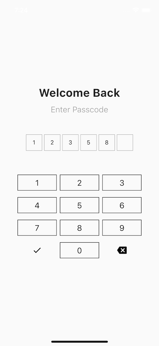
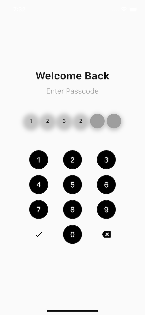
Screenshots
Requirements
- Flutter SDK: >=3.24.0
- Dart SDK: >=3.4.0
For biometric features:
local_auth: ^2.0.0(optional dependency)
Contributing
Contributions are welcome! Please read our Contributing Guidelines for details on our code of conduct and the process for submitting pull requests.
License
This project is licensed under the terms specified in the LICENSE file.
Support
If you encounter any issues or have questions, please:
Changelog
See CHANGELOG.md for a list of changes and version history.