pin_code_fields_liquid_glass
iOS 26 Liquid Glass styled PIN input field for Flutter.
Built on top of pin_code_fields with GPU-accelerated glass effects from liquid_glass_renderer.
Demos
| OTP Verification | Lock Screen | Playground |
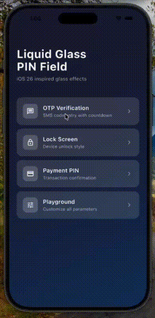 |
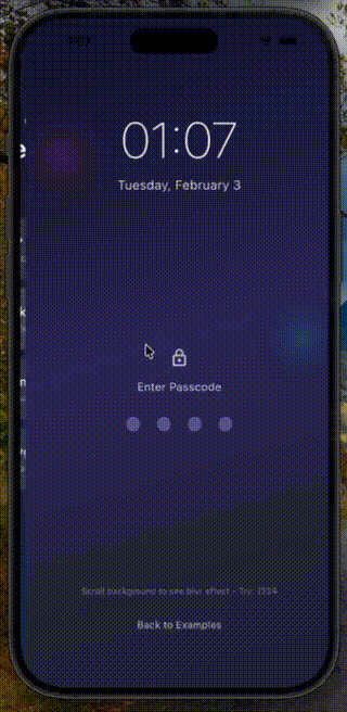 |
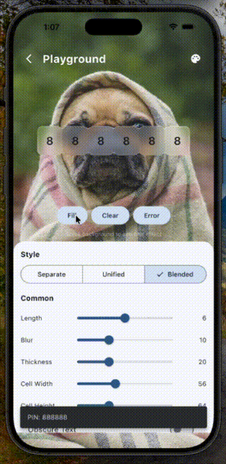 |
Requirements
This package requires the Impeller rendering engine and only works on:
- iOS
- Android
- macOS
Web, Windows, and Linux are NOT supported.
Installation
dependencies:
  pin_code_fields_liquid_glass: ^0.1.0
Quick Start
import 'package:pin_code_fields_liquid_glass/pin_code_fields_liquid_glass.dart';

LiquidGlassPinField(
  length: 6,
  theme: LiquidGlassPinTheme.blended(
    blur: 10,
    glassColor: Colors.white.withOpacity(0.2),
  ),
  onCompleted: (pin) => print('PIN: $pin'),
)
Available Styles
Separate Glass Cells
Individual glass cells with spacing between them. Traditional PIN field look.
LiquidGlassPinField(
  length: 4,
  theme: LiquidGlassPinTheme.separate(
    spacing: 12,
    borderRadius: 16,
    blur: 10,
  ),
)
Unified Glass Container
One glass container with internal dividers. Clean, minimal look.
LiquidGlassPinField(
  length: 4,
  theme: LiquidGlassPinTheme.unified(
    dividerWidth: 1,
    containerBorderRadius: 20,
    blur: 12,
  ),
)
Blended Glass Cells (iOS 26 Style)
Cells that blend together seamlessly. Modern iOS 26 aesthetic.
LiquidGlassPinField(
  length: 4,
  theme: LiquidGlassPinTheme.blended(
    blendAmount: 0.3,
    borderRadius: 12,
    blur: 10,
  ),
)
Theme Properties
Common Properties
| Property | Type | Default | Description |
|---|---|---|---|
cellSize |
Size |
Size(56, 64) |
Size of each cell |
blur |
double |
10 |
Glass blur intensity |
thickness |
double |
20 |
Glass material thickness |
glassColor |
Color? |
auto | Base glass color |
textStyle |
TextStyle? |
auto | PIN text style |
showCursor |
bool |
true |
Show cursor in focused cell |
Glass Settings
| Property | Type | Default | Description |
|---|---|---|---|
visibility |
double |
1.0 |
Glass visibility (0-1) |
chromaticAberration |
double |
0.01 |
Color fringing effect |
lightAngle |
double? |
auto | Light source angle |
lightIntensity |
double |
0.5 |
Light reflection intensity |
ambientStrength |
double |
0 |
Ambient light strength |
refractiveIndex |
double |
1.2 |
Glass refraction amount |
saturation |
double |
1.5 |
Color saturation boost |
Glow Settings
| Property | Type | Default | Description |
|---|---|---|---|
enableGlowOnFocus |
bool |
true |
Glow on focused cell |
glowColor |
Color? |
auto | Default glow color |
focusedGlowColor |
Color? |
auto | Focused state glow |
filledGlowColor |
Color? |
auto | Filled state glow |
errorGlowColor |
Color? |
auto | Error state glow |
glowRadius |
double |
1.0 |
Glow spread radius |
Stretch Animation Settings
| Property | Type | Default | Description |
|---|---|---|---|
enableStretchAnimation |
bool |
true |
Stretch on character entry |
stretchInteractionScale |
double |
1.05 |
Scale during stretch |
stretchAmount |
double |
0.5 |
Stretch intensity |
stretchResistance |
double |
0.08 |
Stretch spring resistance |
Separate Style Properties
| Property | Type | Default | Description |
|---|---|---|---|
spacing |
double |
8 |
Gap between cells |
borderRadius |
double |
12 |
Cell corner radius |
glowPerCell |
bool |
true |
Individual cell glow |
Unified Style Properties
| Property | Type | Default | Description |
|---|---|---|---|
dividerWidth |
double |
1 |
Divider thickness |
dividerColor |
Color? |
auto | Divider color |
containerBorderRadius |
double |
16 |
Container corner radius |
containerPadding |
EdgeInsets |
horizontal: 4 |
Inner padding |
Blended Style Properties
| Property | Type | Default | Description |
|---|---|---|---|
blendAmount |
double |
0.3 |
Blend intensity (0-1) |
borderRadius |
double |
12 |
Cell corner radius |
overlapOffset |
double |
0 |
Cell overlap amount |
Form Validation
Use LiquidGlassPinFormField for form integration with validation:
final _formKey = GlobalKey<FormState>();

Form(
  key: _formKey,
  child: LiquidGlassPinFormField(
    length: 6,
    theme: LiquidGlassPinTheme.blended(),
    validator: (value) {
      if (value == null || value.length < 6) {
        return 'Please enter all 6 digits';
      }
      if (value != '123456') {
        return 'Invalid PIN';
      }
      return null;
    },
    onSaved: (value) => print('PIN saved: $value'),
  ),
)

// Validate:
if (_formKey.currentState!.validate()) {
  _formKey.currentState!.save();
}
Form Field Properties
| Property | Type | Default | Description |
|---|---|---|---|
validator |
String? Function(String?) |
- | Validation function |
onSaved |
void Function(String?) |
- | Called on form save |
autovalidateMode |
AutovalidateMode |
disabled |
When to auto-validate |
initialValue |
String? |
- | Initial PIN value |
errorTextSpace |
double |
8.0 |
Space above error text |
errorTextStyle |
TextStyle? |
auto | Error text styling |
Controller
Use PinInputController for programmatic control:
final controller = PinInputController();

LiquidGlassPinField(
  length: 6,
  pinController: controller,
  theme: LiquidGlassPinTheme.blended(),
)

// Set value
controller.setText('123456');

// Clear
controller.clear();

// Trigger error shake
controller.triggerError();

// Focus control
controller.requestFocus();
controller.unfocus();
Background Setup
For proper glass effects, ensure there's visual content behind the PIN field:
Stack(
  children: [
    // Background image or gradient
    Image.asset('assets/background.jpg', fit: BoxFit.cover),

    // Your PIN field
    Center(
      child: LiquidGlassPinField(
        length: 6,
        theme: LiquidGlassPinTheme.blended(),
      ),
    ),
  ],
)
Credits
- pin_code_fields - Headless PIN input core
- liquid_glass_renderer - GPU-accelerated glass effects
Libraries
- pin_code_fields_liquid_glass
- iOS 26 Liquid Glass styled PIN input field for Flutter.