NumberInputWithIncrementDecrement class
A simple widget that wraps a TextFormField, exposes it as a number field and adds buttons to increment and decrement the numeric value. Performs some basic validation, formatting to fractionDigits and clamping the values between min and max when enabled through enableMinMaxClamping.
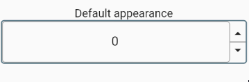
e.g. Default widget appearance.
- Inheritance
-
- Object
- DiagnosticableTree
- Widget
- StatefulWidget
- NumberInputWithIncrementDecrement
- Implementers
Constructors
-
NumberInputWithIncrementDecrement({required TextEditingController controller, Key? key, bool enabled = true, ButtonArrangement buttonArrangement = ButtonArrangement.rightEnd, num min = 0, num max = double.maxFinite, num initialValue = 0, num incDecFactor = 1, bool isInt = true, AutovalidateMode autovalidateMode = AutovalidateMode.always, bool enableMinMaxClamping = true, InputDecoration? numberFieldDecoration, Decoration? widgetContainerDecoration, FormFieldValidator<
String> ? validator, TextStyle? style, IconData incIcon = Icons.arrow_drop_up, IconData? decIcon = Icons.arrow_drop_down, int fractionDigits = 2, double scaleWidth = 1.0, double scaleHeight = 1.0, double? incIconSize, double? decIconSize, Color? decIconColor, Color? incIconColor, DiffIncDecCallBack? onDecrement, DiffIncDecCallBack? onIncrement, ValueCallBack? onSubmitted, ValueCallBack? onChanged, bool separateIcons = false, Decoration? decIconDecoration, Decoration? incIconDecoration, Color? incDecBgColor, TextAlign textAlign = TextAlign.center}) - A simple widget that wraps a TextFormField, exposes it as a number field and adds buttons to increment and decrement the numeric value. Performs some basic validation, formatting to fractionDigits and clamping the values between min and max when enabled through enableMinMaxClamping.
Properties
- autovalidateMode → AutovalidateMode
-
Passed to TextFormField.autovalidateMode
defaults to AutovalidateMode.always
final
-
Decides the button placement using ButtonArrangement.
Defaults to ButtonArrangement.rightEnd
final
- controller → TextEditingController
-
Provide a custom controller.
final
- decIcon → IconData?
-
Icon to be used for Decrement button.
final
- decIconColor → Color?
-
Icon color to be used for Decrement button.
Defaults to color defined in IconTheme
final
- decIconDecoration → Decoration?
-
Decoration for the Decrement Icon
Defaults to null;
final
- decIconSize → double?
-
Icon size to be used for Decrement button.
Defaults to size defined in IconTheme
final
- enabled → bool
-
Whether the user is able to interact or not
final
- enableMinMaxClamping → bool
-
Setting this to
trueclamps the entered value to the min and max if all the validations are successful.final - fractionDigits → int
-
No of digits after decimal point.
Defaults to value of 2 for non int fields.
Should be between 0 and 20 inclusively.
final
- hashCode → int
-
The hash code for this object.
no setterinherited
- incDecBgColor → Color?
-
Background color of increment decrement buttons.
final
- incDecFactor → num
-
A factor by which the numeric value should be incremented or decremented.
e.g. Setting
incDecFactor=0.5increments or decrement the number field by 0.5. Defaults to 1.final - incIcon → IconData
-
Icon to be used for Increment button.
final
- incIconColor → Color?
-
Icon color to be used for Increment button.
Defaults to color defined in IconTheme
final
- incIconDecoration → Decoration?
-
Decoration for the Increment Icon
Defaults to a black border in the bottom.
final
- incIconSize → double?
-
Icon size to be used for Increment button.
Defaults to size defined in IconTheme
final
- initialValue → num
-
Initial value for the number input field. Defaults to zero.
final
- isInt → bool
-
Decides if the field only accepts integer values.
Defaults to true.
final
- key → Key?
-
Key to be used for this widget.
final
- max → num
-
Maximum value allowed for this field. Defaults to
double.infinity.final - min → num
-
Minimum value allowed for this field. Defaults to zero.
final
- numberFieldDecoration → InputDecoration?
-
Decoration for the TextFormField.
Defaults to a simple outline border.
final
- onChanged → ValueCallBack?
-
A call back function to be called every time the number is changed
manually. This will not be called if the internal validators fail.
final
- onDecrement → DiffIncDecCallBack?
-
A call back function to be called on successful decrement.
This will not be called if the internal validators fail.
final
- onIncrement → DiffIncDecCallBack?
-
A call back function to be called on successful increment.
This will not be called if the internal validators fail.
final
- onSubmitted → ValueCallBack?
-
A call back function to be called on successful submit.
This will not be called if the internal validators fail.
final
- runtimeType → Type
-
A representation of the runtime type of the object.
no setterinherited
- scaleHeight → double
-
A scaling factor for the height of the widget.
Defaults to 1.
final
- scaleWidth → double
-
A scaling factor for the width of the widget.
Defaults to 1.
final
- separateIcons → bool
-
Show a transparent separator between the increment & decrement buttons.
Defaults to false.
final
- style → TextStyle?
-
The TextStyle that will passed down to
TextFormField.style. This is the style of the text being edited.final - textAlign → TextAlign
-
Alignment of the number in the text field.
Defaults to TextAlign.center
final
-
validator
→ FormFieldValidator<
String> ? -
validators for this field.
Defaults to
_NumberInputWithIncrementDecrementState._defaultValidatorvalidator based on the values of min and max field. Note: These values default to0and double.infinity respectively.final - widgetContainerDecoration → Decoration?
-
Decoration for the whole widget.
defaults to a simple container with rounded border.
final
Methods
-
createElement(
) → StatefulElement -
Creates a StatefulElement to manage this widget's location in the tree.
inherited
-
createState(
) → _NumberInputWithIncrementDecrementState -
Creates the mutable state for this widget at a given location in the tree.
override
-
debugDescribeChildren(
) → List< DiagnosticsNode> -
Returns a list of
DiagnosticsNodeobjects describing this node's children.inherited -
debugFillProperties(
DiagnosticPropertiesBuilder properties) → void -
Add additional properties associated with the node.
inherited
-
noSuchMethod(
Invocation invocation) → dynamic -
Invoked when a nonexistent method or property is accessed.
inherited
-
toDiagnosticsNode(
{String? name, DiagnosticsTreeStyle? style}) → DiagnosticsNode -
Returns a debug representation of the object that is used by debugging
tools and by DiagnosticsNode.toStringDeep.
inherited
-
toString(
{DiagnosticLevel minLevel = DiagnosticLevel.info}) → String -
A string representation of this object.
inherited
-
toStringDeep(
{String prefixLineOne = '', String? prefixOtherLines, DiagnosticLevel minLevel = DiagnosticLevel.debug}) → String -
Returns a string representation of this node and its descendants.
inherited
-
toStringShallow(
{String joiner = ', ', DiagnosticLevel minLevel = DiagnosticLevel.debug}) → String -
Returns a one-line detailed description of the object.
inherited
-
toStringShort(
) → String -
A short, textual description of this widget.
inherited
Operators
-
operator ==(
Object other) → bool -
The equality operator.
inherited