NumberInputPrefabbed class
A set of pre-fabricated widgets based on NumberInputWithIncrementDecrement.
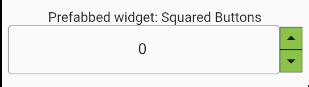
NumberInputPrefabbed.squaredButtons
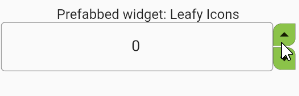
NumberInputPrefabbed.leafyButtons
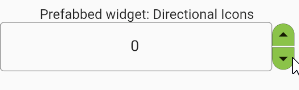
NumberInputPrefabbed.directionalButtons
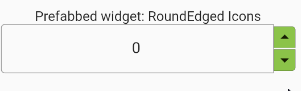
NumberInputPrefabbed.roundedEdgeButtons
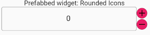
NumberInputPrefabbed.roundedButtons
- Inheritance
-
- Object
- DiagnosticableTree
- Widget
- StatefulWidget
- NumberInputWithIncrementDecrement
- NumberInputPrefabbed
Constructors
-
NumberInputPrefabbed.directionalButtons({required TextEditingController controller, Key? key, bool enabled = true, ButtonArrangement buttonArrangement = ButtonArrangement.rightEnd, num min = 0, num max = double.infinity, num initialValue = 0, num incDecFactor = 1, bool isInt = true, AutovalidateMode autovalidateMode = AutovalidateMode.always, bool enableMinMaxClamping = false, InputDecoration? numberFieldDecoration, Decoration widgetContainerDecoration = const BoxDecoration(), FormFieldValidator<
String> ? validator, TextStyle? style, IconData incIcon = Icons.arrow_drop_up, IconData decIcon = Icons.arrow_drop_down, int fractionDigits = 2, double scaleWidth = 1.0, double scaleHeight = 1.0, double incIconSize = 28, double decIconSize = 28, Color? decIconColor, Color? incIconColor, DiffIncDecCallBack? onDecrement, DiffIncDecCallBack? onIncrement, ValueCallBack? onSubmitted, ValueCallBack? onChanged, bool separateIcons = true, Color incDecBgColor = Colors.lightGreen, TextAlign textAlign = TextAlign.center}) - A pre-fabricated NumberInputWithIncrementDecrement widget with the increment/decrement buttons decorated as directional buttons.
-
NumberInputPrefabbed.leafyButtons({required TextEditingController controller, Key? key, bool enabled = true, ButtonArrangement buttonArrangement = ButtonArrangement.rightEnd, num min = 0, num max = double.infinity, num initialValue = 0, num incDecFactor = 1, bool isInt = true, AutovalidateMode autovalidateMode = AutovalidateMode.always, bool enableMinMaxClamping = false, InputDecoration? numberFieldDecoration, Decoration widgetContainerDecoration = const BoxDecoration(), FormFieldValidator<
String> ? validator, TextStyle? style, IconData incIcon = Icons.arrow_drop_up, IconData decIcon = Icons.arrow_drop_down, int fractionDigits = 2, double scaleWidth = 1.0, double scaleHeight = 1.0, double incIconSize = 28, double decIconSize = 28, Color? decIconColor, Color? incIconColor, DiffIncDecCallBack? onDecrement, DiffIncDecCallBack? onIncrement, ValueCallBack? onSubmitted, ValueCallBack? onChanged, bool separateIcons = true, Color incDecBgColor = Colors.lightGreen, TextAlign textAlign = TextAlign.center}) - A pre-fabricated NumberInputWithIncrementDecrement widget with the increment/decrement buttons decorated as leaf like buttons.
-
NumberInputPrefabbed.roundedButtons({required TextEditingController controller, Key? key, bool enabled = true, ButtonArrangement buttonArrangement = ButtonArrangement.rightEnd, num min = 0, num max = double.infinity, num initialValue = 0, num incDecFactor = 1, bool isInt = true, AutovalidateMode autovalidateMode = AutovalidateMode.always, bool enableMinMaxClamping = true, InputDecoration? numberFieldDecoration, Decoration widgetContainerDecoration = const BoxDecoration(), FormFieldValidator<
String> ? validator, TextStyle? style, IconData incIcon = Icons.arrow_drop_up, IconData decIcon = Icons.arrow_drop_down, int fractionDigits = 2, double scaleWidth = 1.0, double scaleHeight = 1.0, double incIconSize = 27, double decIconSize = 27, Color? decIconColor, Color? incIconColor, DiffIncDecCallBack? onDecrement, DiffIncDecCallBack? onIncrement, ValueCallBack? onSubmitted, ValueCallBack? onChanged, bool separateIcons = true, Color incDecBgColor = Colors.lightGreen, TextAlign textAlign = TextAlign.center}) - A pre-fabricated NumberInputWithIncrementDecrement widget with the increment/decrement buttons decorated as rounded/circular buttons.
-
NumberInputPrefabbed.roundedEdgeButtons({required TextEditingController controller, Key? key, bool enabled = true, ButtonArrangement buttonArrangement = ButtonArrangement.rightEnd, num min = 0, num max = double.infinity, num initialValue = 0, num incDecFactor = 1, bool isInt = true, AutovalidateMode autovalidateMode = AutovalidateMode.always, bool enableMinMaxClamping = true, InputDecoration? numberFieldDecoration, Decoration widgetContainerDecoration = const BoxDecoration(), FormFieldValidator<
String> ? validator, TextStyle? style, IconData incIcon = Icons.arrow_drop_up, IconData decIcon = Icons.arrow_drop_down, int fractionDigits = 2, double scaleWidth = 1.0, double scaleHeight = 1.0, double incIconSize = 27, double decIconSize = 27, Color? decIconColor, Color? incIconColor, DiffIncDecCallBack? onDecrement, DiffIncDecCallBack? onIncrement, ValueCallBack? onSubmitted, ValueCallBack? onChanged, bool separateIcons = true, Color incDecBgColor = Colors.lightGreen, TextAlign textAlign = TextAlign.center}) - A pre-fabricated NumberInputWithIncrementDecrement widget with the increment/decrement buttons decorated as rounded edge buttons.
-
NumberInputPrefabbed.squaredButtons({required TextEditingController controller, Key? key, bool enabled = true, ButtonArrangement buttonArrangement = ButtonArrangement.rightEnd, num min = 0, num max = double.infinity, num initialValue = 0, num incDecFactor = 1, bool isInt = true, AutovalidateMode autovalidateMode = AutovalidateMode.always, bool enableMinMaxClamping = false, InputDecoration? numberFieldDecoration, Decoration widgetContainerDecoration = const BoxDecoration(), FormFieldValidator<
String> ? validator, TextStyle? style, IconData incIcon = Icons.arrow_drop_up, IconData decIcon = Icons.arrow_drop_down, int fractionDigits = 2, double scaleWidth = 1.0, double scaleHeight = 1.0, double incIconSize = 28, double decIconSize = 28, Color? decIconColor, Color? incIconColor, DiffIncDecCallBack? onDecrement, DiffIncDecCallBack? onIncrement, ValueCallBack? onSubmitted, ValueCallBack? onChanged, bool separateIcons = false, Color incDecBgColor = Colors.lightGreen, TextAlign textAlign = TextAlign.center}) - A pre-fabricated NumberInputWithIncrementDecrement widget with the increment/decrement buttons decorated as
Properties
- autovalidateMode → AutovalidateMode
-
Passed to TextFormField.autovalidateMode
defaults to AutovalidateMode.always
finalinherited
-
Decides the button placement using ButtonArrangement.
Defaults to ButtonArrangement.rightEnd
finalinherited
- controller → TextEditingController
-
Provide a custom controller.
finalinherited
- decIcon → IconData?
-
Icon to be used for Decrement button.
finalinherited
- decIconColor → Color?
-
Icon color to be used for Decrement button.
Defaults to color defined in IconTheme
finalinherited
- decIconDecoration → Decoration?
-
Decoration for the Decrement Icon
Defaults to null;
finalinherited
- decIconSize → double?
-
Icon size to be used for Decrement button.
Defaults to size defined in IconTheme
finalinherited
- enabled → bool
-
Whether the user is able to interact or not
finalinherited
- enableMinMaxClamping → bool
-
Setting this to
trueclamps the entered value to the min and max if all the validations are successful.finalinherited - fractionDigits → int
-
No of digits after decimal point.
Defaults to value of 2 for non int fields.
Should be between 0 and 20 inclusively.
finalinherited
- hashCode → int
-
The hash code for this object.
no setterinherited
- incDecBgColor → Color?
-
Background color of increment decrement buttons.
finalinherited
- incDecFactor → num
-
A factor by which the numeric value should be incremented or decremented.
e.g. Setting
incDecFactor=0.5increments or decrement the number field by 0.5. Defaults to 1.finalinherited - incIcon → IconData
-
Icon to be used for Increment button.
finalinherited
- incIconColor → Color?
-
Icon color to be used for Increment button.
Defaults to color defined in IconTheme
finalinherited
- incIconDecoration → Decoration?
-
Decoration for the Increment Icon
Defaults to a black border in the bottom.
finalinherited
- incIconSize → double?
-
Icon size to be used for Increment button.
Defaults to size defined in IconTheme
finalinherited
- initialValue → num
-
Initial value for the number input field. Defaults to zero.
finalinherited
- isInt → bool
-
Decides if the field only accepts integer values.
Defaults to true.
finalinherited
- key → Key?
-
Key to be used for this widget.
finalinherited
- max → num
-
Maximum value allowed for this field. Defaults to
double.infinity.finalinherited - min → num
-
Minimum value allowed for this field. Defaults to zero.
finalinherited
- numberFieldDecoration → InputDecoration?
-
Decoration for the TextFormField.
Defaults to a simple outline border.
finalinherited
- onChanged → ValueCallBack?
-
A call back function to be called every time the number is changed
manually. This will not be called if the internal validators fail.
finalinherited
- onDecrement → DiffIncDecCallBack?
-
A call back function to be called on successful decrement.
This will not be called if the internal validators fail.
finalinherited
- onIncrement → DiffIncDecCallBack?
-
A call back function to be called on successful increment.
This will not be called if the internal validators fail.
finalinherited
- onSubmitted → ValueCallBack?
-
A call back function to be called on successful submit.
This will not be called if the internal validators fail.
finalinherited
- runtimeType → Type
-
A representation of the runtime type of the object.
no setterinherited
- scaleHeight → double
-
A scaling factor for the height of the widget.
Defaults to 1.
finalinherited
- scaleWidth → double
-
A scaling factor for the width of the widget.
Defaults to 1.
finalinherited
- separateIcons → bool
-
Show a transparent separator between the increment & decrement buttons.
Defaults to false.
finalinherited
- style → TextStyle?
-
The TextStyle that will passed down to
TextFormField.style. This is the style of the text being edited.finalinherited - textAlign → TextAlign
-
Alignment of the number in the text field.
Defaults to TextAlign.center
finalinherited
-
validator
→ FormFieldValidator<
String> ? -
validators for this field.
Defaults to
_NumberInputWithIncrementDecrementState._defaultValidatorvalidator based on the values of min and max field. Note: These values default to0and double.infinity respectively.finalinherited - widgetContainerDecoration → Decoration?
-
Decoration for the whole widget.
defaults to a simple container with rounded border.
finalinherited
Methods
-
createElement(
) → StatefulElement -
Creates a StatefulElement to manage this widget's location in the tree.
inherited
-
createState(
) → _NumberInputWithIncrementDecrementState -
Creates the mutable state for this widget at a given location in the tree.
inherited
-
debugDescribeChildren(
) → List< DiagnosticsNode> -
Returns a list of DiagnosticsNode objects describing this node's
children.
inherited
-
debugFillProperties(
DiagnosticPropertiesBuilder properties) → void -
Add additional properties associated with the node.
inherited
-
noSuchMethod(
Invocation invocation) → dynamic -
Invoked when a nonexistent method or property is accessed.
inherited
-
toDiagnosticsNode(
{String? name, DiagnosticsTreeStyle? style}) → DiagnosticsNode -
Returns a debug representation of the object that is used by debugging
tools and by DiagnosticsNode.toStringDeep.
inherited
-
toString(
{DiagnosticLevel minLevel = DiagnosticLevel.info}) → String -
A string representation of this object.
inherited
-
toStringDeep(
{String prefixLineOne = '', String? prefixOtherLines, DiagnosticLevel minLevel = DiagnosticLevel.debug}) → String -
Returns a string representation of this node and its descendants.
inherited
-
toStringShallow(
{String joiner = ', ', DiagnosticLevel minLevel = DiagnosticLevel.debug}) → String -
Returns a one-line detailed description of the object.
inherited
-
toStringShort(
) → String -
A short, textual description of this widget.
inherited
Operators
-
operator ==(
Object other) → bool -
The equality operator.
inherited