NewGradientAppBar class
A material design app bar.
An app bar consists of a toolbar and potentially other widgets, such as a TabBar and a FlexibleSpaceBar. App bars typically expose one or more common actions with IconButtons which are optionally followed by a PopupMenuButton for less common operations (sometimes called the "overflow menu").
App bars are typically used in the Scaffold.appBar property, which places the app bar as a fixed-height widget at the top of the screen. For a scrollable app bar, see SliverNewGradientAppBar, which embeds an NewGradientAppBar in a sliver for use in a CustomScrollView.
When not used as Scaffold.appBar, or when wrapped in a Hero, place the app bar in a MediaQuery to take care of the padding around the content of the app bar if needed, as the padding will not be handled by Scaffold.
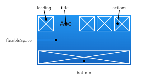
The GradientAppBar displays the toolbar widgets, leading, title, and actions, above the bottom (if any). The bottom is usually used for a TabBar. If a flexibleSpace widget is specified then it is stacked behind the toolbar and the bottom widget. The following diagram shows where each of these slots appears in the toolbar when the writing language is left-to-right (e.g. English):
If the leading widget is omitted, but the NewGradientAppBar is in a Scaffold with a Drawer, then a button will be inserted to open the drawer. Otherwise, if the nearest Navigator has any previous routes, a BackButton is inserted instead. This behavior can be turned off by setting the automaticallyImplyLeading to false. In that case a null leading widget will result in the middle/title widget stretching to start.
{@tool snippet --template=stateless_widget_material}
This sample shows an NewGradientAppBar with two simple actions. The first action opens a SnackBar, while the second action navigates to a new page.
final GlobalKey<ScaffoldState> scaffoldKey = GlobalKey<ScaffoldState>();
final SnackBar snackBar = const SnackBar(content: Text('Showing Snackbar'));

void openPage(BuildContext context) {
  Navigator.push(context, MaterialPageRoute(
    builder: (BuildContext context) {
      return Scaffold(
        appBar: GradientAppBar(
          title: const Text('Next page'),
        ),
        body: const Center(
          child: Text(
            'This is the next page',
            style: TextStyle(fontSize: 24),
          ),
        ),
      );
    },
  ));
}
Widget build(BuildContext context) {
  return Scaffold(
    key: scaffoldKey,
    appBar: GradientAppBar(
      title: const Text('GradientAppBar Demo'),
      actions: <Widget>[
        IconButton(
          icon: const Icon(Icons.add_alert),
          tooltip: 'Show Snackbar',
          onPressed: () {
            scaffoldKey.currentState.showSnackBar(snackBar);
          },
        ),
        IconButton(
          icon: const Icon(Icons.navigate_next),
          tooltip: 'Next page',
          onPressed: () {
            openPage(context);
          },
        ),
      ],
    ),
    body: const Center(
      child: Text(
        'This is the home page',
        style: TextStyle(fontSize: 24),
      ),
    ),
  );
}
{@end-tool}
See also:
- Scaffold, which displays the NewGradientAppBar in its Scaffold.appBar slot.
- SliverNewGradientAppBar, which uses NewGradientAppBar to provide a flexible app bar that can be used in a CustomScrollView.
- TabBar, which is typically placed in the bottom slot of the NewGradientAppBar if the screen has multiple pages arranged in tabs.
- IconButton, which is used with actions to show buttons on the app bar.
- PopupMenuButton, to show a popup menu on the app bar, via actions.
- FlexibleSpaceBar, which is used with flexibleSpace when the app bar can expand and collapse.
- material.io/design/components/app-bars-top.html
- Inheritance
-
- Object
- DiagnosticableTree
- Widget
- StatefulWidget
- NewGradientAppBar
- Implemented types
Constructors
-
NewGradientAppBar({Key? key, Widget? leading, bool automaticallyImplyLeading = true, Widget? title, List<
Widget> ? actions, Widget? flexibleSpace, PreferredSizeWidget? bottom, double? elevation, ShapeBorder? shape, Gradient? gradient, Brightness? brightness, IconThemeData? iconTheme, IconThemeData? actionsIconTheme, TextTheme? textTheme, bool primary = true, bool? centerTitle, double titleSpacing = NavigationToolbar.kMiddleSpacing, double toolbarOpacity = 1.0, double bottomOpacity = 1.0}) - Creates a material design app bar.
Properties
-
actions
→ List<
Widget> ? -
Widgets to display after the title widget.
final
- actionsIconTheme → IconThemeData?
-
The color, opacity, and size to use for the icons that appear in the app
bar's actions. This should only be used when the actions should be
themed differently than the icon that appears in the app bar's leading
widget.
final
- automaticallyImplyLeading → bool
-
Controls whether we should try to imply the leading widget if null.
final
- bottom → PreferredSizeWidget?
-
This widget appears across the bottom of the app bar.
final
- bottomOpacity → double
-
How opaque the bottom part of the app bar is.
final
- brightness → Brightness?
-
The gradient displayed at the appbar.
final
- centerTitle → bool?
-
Whether the title should be centered.
final
- elevation → double?
-
The z-coordinate at which to place this app bar relative to its parent.
final
- flexibleSpace → Widget?
-
This widget is stacked behind the toolbar and the tab bar. It's height will
be the same as the app bar's overall height.
final
- gradient → Gradient?
-
The color to use for the app bar's material. Typically this should be set
along with brightness, iconTheme, textTheme.
final
- hashCode → int
-
The hash code for this object.
no setterinherited
- iconTheme → IconThemeData?
-
The color, opacity, and size to use for app bar icons. Typically this
is set along with
backgroundColor, brightness, textTheme.final - key → Key?
-
Controls how one widget replaces another widget in the tree.
finalinherited
- leading → Widget?
-
A widget to display before the title.
final
- preferredSize → Size
-
A size whose height is the sum of kToolbarHeight and the bottom widget's
preferred height.
final
- primary → bool
-
Whether this app bar is being displayed at the top of the screen.
final
- runtimeType → Type
-
A representation of the runtime type of the object.
no setterinherited
- shape → ShapeBorder?
-
The material's shape as well its shadow.
final
- textTheme → TextTheme?
-
The typographic styles to use for text in the app bar. Typically this is
set along with brightness
backgroundColor, iconTheme.final - title → Widget?
-
The primary widget displayed in the appbar.
final
- titleSpacing → double
-
The spacing around title content on the horizontal axis. This spacing is
applied even if there is no leading content or actions. If you want
title to take all the space available, set this value to 0.0.
final
- toolbarOpacity → double
-
How opaque the toolbar part of the app bar is.
final
Methods
-
createElement(
) → StatefulElement -
Creates a StatefulElement to manage this widget's location in the tree.
inherited
-
createState(
) → _NewGradientAppBarState -
Creates the mutable state for this widget at a given location in the tree.
override
-
debugDescribeChildren(
) → List< DiagnosticsNode> -
Returns a list of
DiagnosticsNodeobjects describing this node's children.inherited -
debugFillProperties(
DiagnosticPropertiesBuilder properties) → void -
Add additional properties associated with the node.
inherited
-
noSuchMethod(
Invocation invocation) → dynamic -
Invoked when a nonexistent method or property is accessed.
inherited
-
toDiagnosticsNode(
{String? name, DiagnosticsTreeStyle? style}) → DiagnosticsNode -
Returns a debug representation of the object that is used by debugging
tools and by DiagnosticsNode.toStringDeep.
inherited
-
toString(
{DiagnosticLevel minLevel = DiagnosticLevel.info}) → String -
A string representation of this object.
inherited
-
toStringDeep(
{String prefixLineOne = '', String? prefixOtherLines, DiagnosticLevel minLevel = DiagnosticLevel.debug}) → String -
Returns a string representation of this node and its descendants.
inherited
-
toStringShallow(
{String joiner = ', ', DiagnosticLevel minLevel = DiagnosticLevel.debug}) → String -
Returns a one-line detailed description of the object.
inherited
-
toStringShort(
) → String -
A short, textual description of this widget.
inherited
Operators
-
operator ==(
Object other) → bool -
The equality operator.
inherited