Mouse Follower
Mouse Follower is a powerful package that empowers you to create custom mouse followers for your applications, breaking through design limitations. With additional features such as the flexibility to design any shape you want, uncomplicated properties, and ease of use, it offers unparalleled flexibility and creativity in enhancing user interactions.

Easy and Fast adding on feature for your Flutter Apps
https://github.com/mokaily/mouse_follower/assets/32467495/b57973bc-4c41-4804-917d-7853530fadf2
Why mouse_follower?
- 🚀 Easy to implement
- 🔌 Speed and Sensitivity Settings
- 💾 Opacity Control
- ⚡ Support for any child widgets
- ↩️ Position Control
- ❤️ Customize the cursor shape itself
- 💻 Documentation and Tutorials.
- 🛡️ Null safety support.
- 🖨️ Customizable designs.
Getting Started
🔩 Installation
Add to your pubspec.yaml:
dependencies:
  mouse_follower: ^1.2.2
import the library path:
import 'package:mouse_follower/mouse_follower.dart';
⚙️ Configuration app
Add MouseFollower widget like in the example.
class MyApp extends StatelessWidget {
  @override
  Widget build(BuildContext context) {
    return MaterialApp(
      home: MouseFollower(
          showDefaultMouse: true,
          child:MyHomePage(),
      )
    );
  }

📜 MouseFollower() widget properties
| Properties | Required | Default | Description |
|---|---|---|---|
| key | false | Widget key. | |
| isVisible | false | `kIsWeb | |
| child | true | Put your child widget here (recommanded to put the whole app). | |
| mouseStylesStack | false | [MouseStyle()] |
Stack of MouseStyle with multiple options |
| onHoverMouseStylesStack | false | [MouseStyle()] |
Stack of MouseStyle that appears when hovering over the MouseOnHoverEvent widget |
| showDefaultMouseStyle | false | true |
When true the default cursor will appear if mouseStylesStack and onHoverMouseStylesStack are empty. |
| defaultMouseCursor | false | MouseCursor.defer |
To change the default Mouse system icon |
| onHoverMouseCursor | false | MouseCursor.defer |
To change the default Mouse system icon for MouseOnHoverEvent Widget |
Usage
🔥 Add your mouse custom style
...
  Widget build(BuildContext context) {
  return MaterialApp(
      home: MouseFollower(
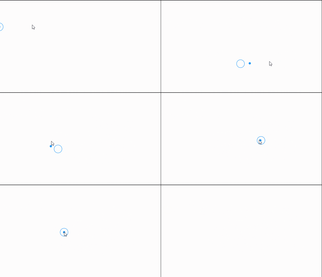
            mouseStylesStack: [
                MouseStyle(
                  size: const Size(7, 7), latency: const Duration(milliseconds: 25),
                  decoration: BoxDecoration(color: Theme.of(context).primaryColor, shape: BoxShape.circle),
                  ),
                MouseStyle(
                  size: const Size(26, 26), latency: const Duration(milliseconds: 75),
                  visibleOnHover: false,
                  decoration: BoxDecoration(
                      color: Colors.transparent,
                      shape: BoxShape.circle,
                      border: Border.all(color: Theme.of(context).primaryColor)),
                ),
            ],
            child:MyHomePage())
  );
}

🔥 Add your mouse on hover custom style
...
  Widget build(BuildContext context) {
  return MaterialApp(
      home: MouseFollower(
            mouseStylesList: ....
            onHoverMouseStylesStack: [
                MouseStyle(size: const Size(50,50),
                    latency: const Duration(milliseconds: 25),
                    decoration: BoxDecoration(shape: BoxShape.circle,
                    color: Theme.of(context).primaryColor.withAlpha(150)),
            ),
          ],
        child:MyHomePage())
  );
}

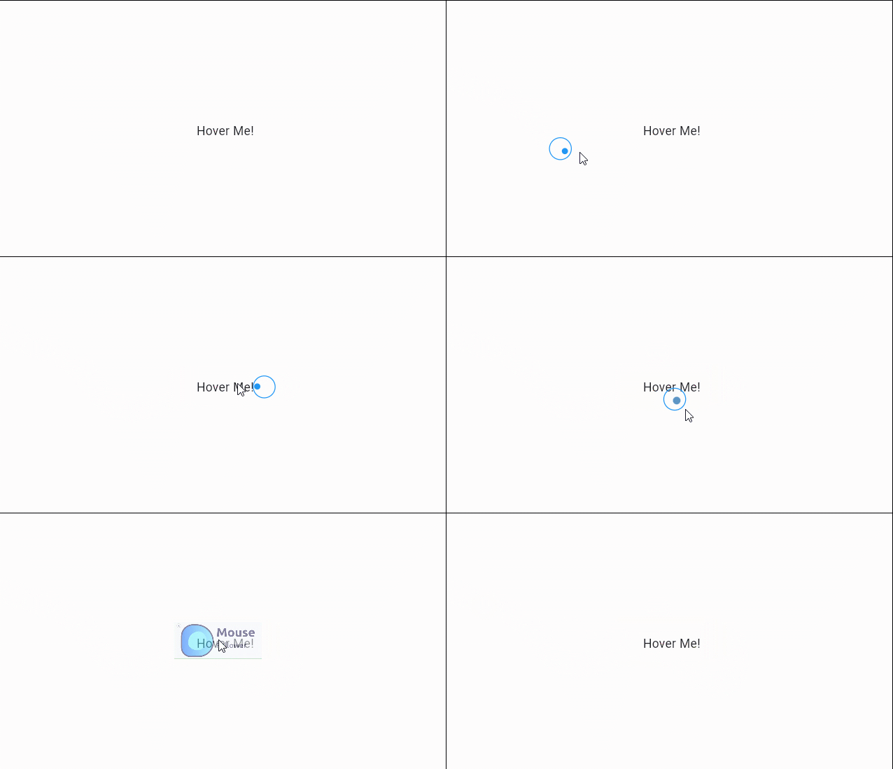
/// to activate onHover style you have to wrap the needed widget by `MouseOnHoverEvent`.
...
  MouseOnHoverEvent(child: Text("Hover Me!"))
...

📜 MouseStyle() widget properties
| Properties | Default | Description |
|---|---|---|
| key | Widget key. | |
| child | You can add your custom child for Mouse Style. | |
| size | Size(15,15) |
Resize the mouse style as you want. |
| decoration | Customize your own decoration. | |
| latency | Duration(milliseconds: 25) |
Add latency duration for the mouse follower style |
| alignment | Alignment.center |
By default the mouse style is in center position for the cursor |
| opacity | 1.0 |
You can adjust the opacity of the style from 0.0 not visible to 1.0 visible |
| opaque | false |
|
| animationDuration | Duration(milliseconds: 300) |
Animation duration when changing the style from widget to another |
| animationCurve | Curves.easeOutExpo |
You can change the animation style |
| transform | ||
| visibleOnHover | false |
If you want to enable the same style in onHoverMouseEvent enable this |
📜 MouseOnHoverEvent() widget properties
| Properties | Type | Description |
|---|---|---|
| key | Widget key. | |
| child | Widget |
A required child to be wrapped. |
| decoration | BoxDecoration? |
Override the default or the inialized decoration. |
| size | Size? |
Override the default or the inialized mouse size. |
| mouseChild | Widget? |
Override the default or the inialized mouse child. |
| onHoverMouseCursor | MouseCursor? |
Override the default or the inialized mouse cursor. |
| customOnHoverMouseStylesStack | List<MouseStyle>? |
Override the default or the inialized mouse styles stack. |
| animationCurve | Curve? |
Override the default or the the inialized animation curve. |
| animationDuration | Duration? |
Override the default or the inialized animation duration. |
| opacity | double? |
Override the default or the inialized opacity. |
| alignment | Alignment? |
Override the default or the inialized alignment. |
| latency | Duration? |
Override the default or the inialized latency. |
📜 Custom child
MouseOnHoverEvent(
    decoration: const BoxDecoration(shape: BoxShape.rectangle, color: Colors.transparent),
    size: const Size(100,50),
    opacity: 0.5,
    latency: const Duration(milliseconds: 75),
    mouseChild: Image.network("images/mouse_follower.jpg"),
    child: const Text("Hover Me!")
),

📜 magnifier
MouseOnHoverEvent(
    customOnHoverMouseStylesStack: [
        MouseStyle(
        size: Size(50, 50),
        latency: Duration(milliseconds: 0),
        child: RawMagnifier(
            size: Size(80, 80),
            magnificationScale: 1.5,
            decoration: MagnifierDecoration(shape: CircleBorder()),
            ),
        ),
    ],
    child: Text("Can you read this text!"),
),

📜 custom icon
MouseOnHoverEvent(
    onHoverMouseCursor: SystemMouseCursors.none,
    customOnHoverMouseStylesStack: [
    MouseStyle(
        latency: const Duration(milliseconds: 0),
        child: Image.network("images/cursor.png"),
        )
    ],
    child: const Text("You can replace the cursor itself with almost any widget"),
),

Donations
We need your support. Projects like this can not be successful without support from the community. If you find this project useful, and would like to support further development and ongoing maintenance, please consider donating.
Sponsors
Want to become a sponsor? [Become a Sponsor]


