Modal Date Picker
A modal-based date picker for Flutter that provides an intuitive and customizable way to select dates. Designed for seamless integration on Android, iOS, Windows and Web. 🎉
Compatible with Android, iOS, Windows & Web. :heart_eyes:

Versión 0.07
- Adds support to make date formatting optional.
- Removed intl because it tends to give errors in some cases where intl is used in conjunction.
- Clear example code is provided.
- It has been improved so that the date format dd/MM/yyyy or yyyy/MM/dd can be used
✨ Features
Fully customizable Supports multiple locales (e.g., English, Spanish, etc.) Allows different date formats Customizable colors and styles Works seamlessly with Flutter's TextFormField
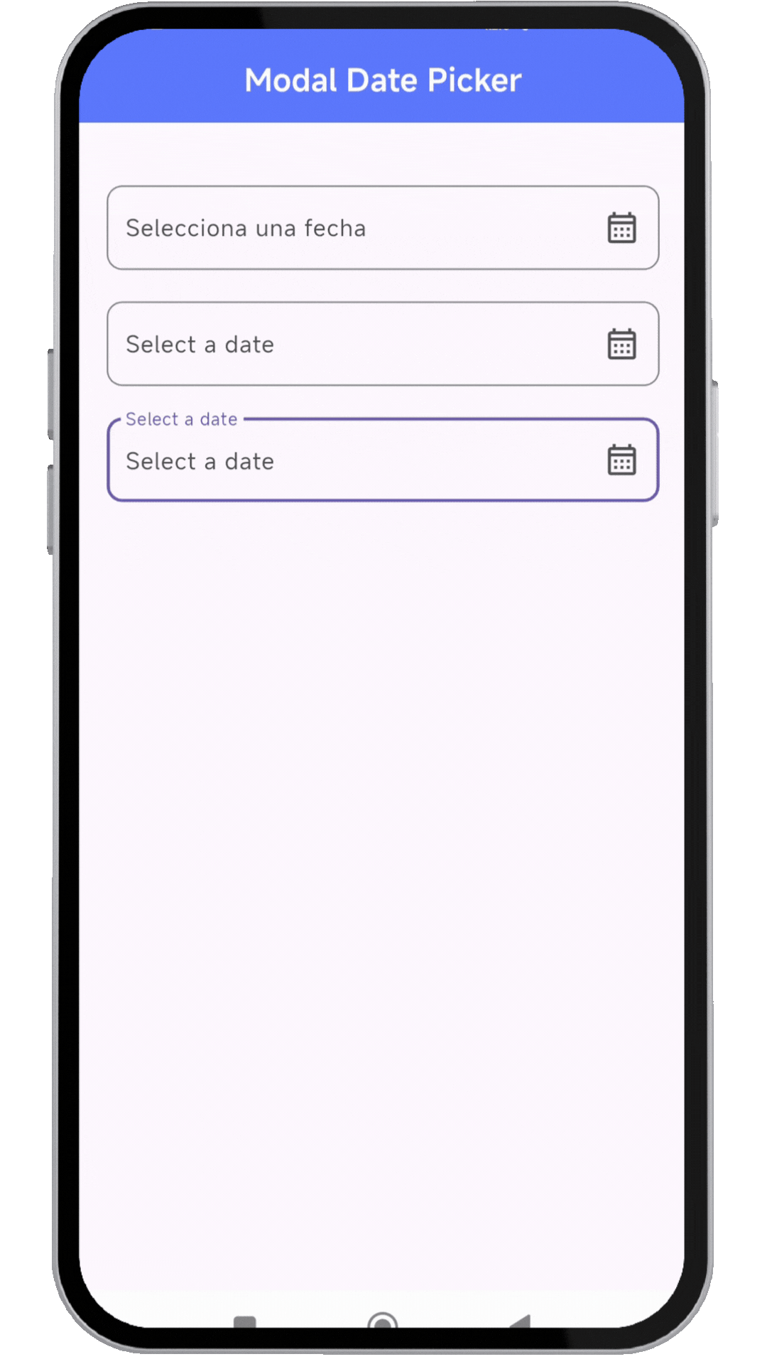
📸 Showcase
🚀 Installation
Add the dependency to your pubspec.yaml:
dependencies:
  modal_date_picker : "^lastest_version"
Then, run:
flutter pub get
🔥 Usage
Import the package:
import 'package:modal_date_picker/modal_date_picker.dart';
📌 Example
import 'package:flutter/material.dart';
import 'package:modal_date_picker/modal_date_picker.dart';

void main() {
  runApp(MaterialApp(home: const MyApp()));
}


class MyApp extends StatelessWidget {
  const MyApp({super.key});

  @override
  Widget build(BuildContext context) {
    return MaterialApp(
       debugShowCheckedModeBanner: false,
       home: HomePage(),
    );
  }
}

class HomePage extends StatefulWidget {
  const HomePage({super.key});

  @override
  State<HomePage> createState() => _HomePageState();
}

class _HomePageState extends State<HomePage> {
  final TextEditingController _controller = TextEditingController();
  final TextEditingController _controller2 = TextEditingController();
  final TextEditingController _controller3 = TextEditingController();

  void _onDateTimeChanged(DateTime value) {
    setState(() {
      _controller3.text =
          "${value.year}/${value.month.toString().padLeft(2, '0')}/${value.day.toString().padLeft(2, '0')}";
    });
  }

  @override
  Widget build(BuildContext context) {
    return Scaffold(
      appBar: AppBar(
        centerTitle: true,
        backgroundColor: Colors.indigoAccent,
        title: const Text('Modal Date Picker',
            style: TextStyle(color: Colors.white, fontWeight: FontWeight.bold)),
      ),
      body: Center(
          child: Padding(
        padding: const EdgeInsets.symmetric(horizontal: 20),
        child: Column(
          children: [
            SizedBox(height: 40),
            //ejemplo de usar en español
            TextFormField(
              readOnly: true,
              controller: _controller,
              decoration: InputDecoration(
                label: const Text('Selecciona una fecha'),
                hintText: 'Selecciona una fecha',
                suffixIcon: Icon(Icons.calendar_month_outlined),
                border: OutlineInputBorder(
                  borderRadius: BorderRadius.circular(10),
                ),
              ),
              onTap: () {
                dateCustomModalBottomSheet(
                  context: context,
                  controller: _controller,
                  //OPCIONALES
                  locale: Locale('es', 'ES'),
                );
              },
            ),
            SizedBox(height: 20),
            //ejemplo de usar en ingles
            TextFormField(
              readOnly: true,
              controller: _controller2,
              decoration: InputDecoration(
                label: const Text('Select a date'),
                hintText: 'Select a date',
                suffixIcon: Icon(Icons.calendar_month_outlined),
                border: OutlineInputBorder(
                  borderRadius: BorderRadius.circular(10),
                ),
              ),
              onTap: () {
                dateCustomModalBottomSheet(
                  context: context,
                  controller: _controller2,
                );
              },
            ),
            SizedBox(height: 20),
            //ejemplo al cambiar los colores
            TextFormField(
              readOnly: true,
              controller: _controller3,
              decoration: InputDecoration(
                label: const Text('Select a date'),
                hintText: 'Select a date',
                suffixIcon: Icon(Icons.calendar_month_outlined),
                border: OutlineInputBorder(
                  borderRadius: BorderRadius.circular(10),
                ),
              ),
              onTap: () {
                dateCustomModalBottomSheet(
                  //si desea formatear la fecha a yyyy/MM/dd
                  formatDate: true,
                  context: context,
                  controller: _controller3,
                  styleConfirmText: const TextStyle(
                      fontWeight: FontWeight.bold,
                      height: 1.0,
                      color: Colors.white),
                  //OPCIONALES
                  //cambiar colores
                  colorBackground: Colors.blue,
                  colorIndicator: Colors.white,
                  locale: Locale('en', 'US'),
                  //POR DEFECTO dd/MM/yyyy - asi puedes cambiar el orden
                  viewType: [
                    DatePickerViewType.year,
                    DatePickerViewType.month,
                    DatePickerViewType.day
                  ],
                  selectedTextStyle: const TextStyle(
                      color: Colors.black,
                      fontWeight: FontWeight.bold,
                      fontSize: 18),
                  textStyle: const TextStyle(color: Colors.white),
                  onDateTimeChanged: _onDateTimeChanged,
                );
              },
            ),
          ],
        ),
      )),
    );
  }
}
🎨 Customization
You can customize the date picker appearance, locale, and format.
dateCustomModalBottomSheet(
context: context,
controller: _controller,
//OPCIONALES
locale: Locale('es', 'ES'),
);
📜 License
Copyright © 2025, Flutter Project Authors.

Permission is hereby granted, free of charge, to any person obtaining a copy of this software and associated documentation files (the “Software”), to deal in the Software without restriction, including without limitation the rights to use, copy, modify, merge, publish, distribute, sublicense, and/or sell copies of the Software, and to permit persons to whom the Software is furnished to do so, subject to the following conditions:

The above copyright notice and this permission notice shall be included in all copies or substantial portions of the Software.

THE SOFTWARE IS PROVIDED “AS IS”, WITHOUT WARRANTY OF ANY KIND, EXPRESS OR IMPLIED, INCLUDING BUT NOT LIMITED TO THE WARRANTIES OF MERCHANTABILITY, FITNESS FOR A PARTICULAR PURPOSE AND NONINFRINGEMENT. IN NO EVENT SHALL THE AUTHORS OR COPYRIGHT HOLDERS BE LIABLE FOR ANY CLAIM, DAMAGES OR OTHER LIABILITY, WHETHER IN AN ACTION OF CONTRACT, TORT OR OTHERWISE, ARISING FROM, OUT OF OR IN CONNECTION WITH THE SOFTWARE OR THE USE OR OTHER DEALINGS IN THE SOFTWARE.