HashTagTextField class
A material design text field.
A text field lets the user enter text, either with hardware keyboard or with an onscreen keyboard.
The text field calls the onChanged callback whenever the user changes the text in the field. If the user indicates that they are done typing in the field (e.g., by pressing a button on the soft keyboard), the text field calls the onSubmitted callback.
To control the text that is displayed in the text field, use the controller. For example, to set the initial value of the text field, use a controller that already contains some text. The controller can also control the selection and composing region (and to observe changes to the text, selection, and composing region).
By default, a text field has a decoration that draws a divider below the text field. You can use the decoration property to control the decoration, for example by adding a label or an icon. If you set the decoration property to null, the decoration will be removed entirely, including the extra padding introduced by the decoration to save space for the labels.
If decoration is non-null (which is the default), the text field requires one of its ancestors to be a Material widget.
To integrate the HashTagTextField into a Form with other FormField widgets, consider using TextFormField.
Remember to call TextEditingController.dispose of the TextEditingController when it is no longer needed. This will ensure we discard any resources used by the object.
{@tool snippet} This example shows how to create a HashTagTextField that will obscure input. The InputDecoration surrounds the field in a border using OutlineInputBorder and adds a label.
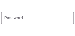
TextField(
  obscureText: true,
  decoration: InputDecoration(
    border: OutlineInputBorder(),
    labelText: 'Password',
  ),
)
{@end-tool}
Reading values
A common way to read a value from a TextField is to use the onSubmitted callback. This callback is applied to the text field's current value when the user finishes editing.
{@tool dartpad --template=stateful_widget_material}
This sample shows how to get a value from a TextField via the onSubmitted callback.
late TextEditingController _controller;

void initState() {
  super.initState();
  _controller = TextEditingController();
}

void dispose() {
  _controller.dispose();
  super.dispose();
}

Widget build(BuildContext context) {
  return Scaffold(
    body: Center(
      child: TextField(
        controller: _controller,
        onSubmitted: (String value) async {
          await showDialog<void>(
            context: context,
            builder: (BuildContext context) {
              return AlertDialog(
                title: const Text('Thanks!'),
                content: Text ('You typed "$value", which has length ${value.characters.length}.'),
                actions: <Widget>[
                  TextButton(
                    onPressed: () { Navigator.pop(context); },
                    child: const Text('OK'),
                  ),
                ],
              );
            },
          );
        },
      ),
    ),
  );
}
{@end-tool}
For most applications the onSubmitted callback will be sufficient for reacting to user input.
The onEditingComplete callback also runs when the user finishes editing. It's different from onSubmitted because it has a default value which updates the text controller and yields the keyboard focus. Applications that require different behavior can override the default onEditingComplete callback.
Keep in mind you can also always read the current string from a TextField's TextEditingController using TextEditingController.text.
Handling emojis and other complex characters
It's important to always use characters when dealing with user input text that may contain complex characters. This will ensure that extended grapheme clusters and surrogate pairs are treated as single characters, as they appear to the user.
For example, when finding the length of some user input, use
string.characters.length. Do NOT use string.length or even
string.runes.length. For the complex character "👨👩👦", this
appears to the user as a single character, and string.characters.length
intuitively returns 1. On the other hand, string.length returns 8, and
string.runes.length returns 5!
In the live Dartpad example above, try typing the emoji 👨👩👦
into the field and submitting. Because the example code measures the length
with value.characters.length, the emoji is correctly counted as a single
character.
See also:
- TextFormField, which integrates with the Form widget.
- InputDecorator, which shows the labels and other visual elements that surround the actual text editing widget.
- EditableText, which is the raw text editing control at the heart of a TextField. The EditableText widget is rarely used directly unless you are implementing an entirely different design language, such as Cupertino.
- material.io/design/components/text-fields.html
- Cookbook: Create and style a text field
- Cookbook: Handle changes to a text field
- Cookbook: Retrieve the value of a text field
- Cookbook: Focus and text fields
- Inheritance
-
- Object
- DiagnosticableTree
- Widget
- StatefulWidget
- HashTagTextField
Constructors
-
HashTagTextField({Key? key, TextEditingController? controller, TextStyle? decoratedStyle, VoidCallback? onDetectionFinished, ValueChanged<
String> ? onDetectionTyped, bool decorateAtSign = false, FocusNode? focusNode, InputDecoration? decoration = const InputDecoration(), TextInputType? keyboardType, TextInputAction? textInputAction, TextCapitalization textCapitalization = TextCapitalization.none, TextStyle? basicStyle, StrutStyle? strutStyle, TextAlign textAlign = TextAlign.start, TextAlignVertical? textAlignVertical, TextDirection? textDirection, bool readOnly = false, ToolbarOptions? toolbarOptions, bool? showCursor, bool autofocus = false, String obscuringCharacter = '•', bool obscureText = false, bool autocorrect = true, SmartDashesType? smartDashesType, SmartQuotesType? smartQuotesType, bool enableSuggestions = true, int? maxLines = 1, int? minLines, bool expands = false, int? maxLength, @Deprecated('Use maxLengthEnforcement parameter which provides more specific ' 'behavior related to the maxLength limit. ' 'This feature was deprecated after v1.25.0-5.0.pre.') bool maxLengthEnforced = true, MaxLengthEnforcement? maxLengthEnforcement, ValueChanged<String> ? onChanged, VoidCallback? onEditingComplete, ValueChanged<String> ? onSubmitted, AppPrivateCommandCallback? onAppPrivateCommand, List<TextInputFormatter> ? inputFormatters, bool? enabled, double cursorWidth = 2.0, double? cursorHeight, Radius? cursorRadius, Color? cursorColor, BoxHeightStyle selectionHeightStyle = ui.BoxHeightStyle.tight, BoxWidthStyle selectionWidthStyle = ui.BoxWidthStyle.tight, Brightness? keyboardAppearance, EdgeInsets scrollPadding = const EdgeInsets.all(20.0), DragStartBehavior dragStartBehavior = DragStartBehavior.start, bool enableInteractiveSelection = true, TextSelectionControls? selectionControls, GestureTapCallback? onTap, MouseCursor? mouseCursor, InputCounterWidgetBuilder? buildCounter, ScrollController? scrollController, ScrollPhysics? scrollPhysics, Iterable<String> ? autofillHints, String? restorationId}) -
Creates a Material Design text field.
const
Properties
- autocorrect → bool
-
Whether to enable autocorrection.
final
-
autofillHints
→ Iterable<
String> ? -
A list of strings that helps the autofill service identify the type of this
text input.
final
- autofocus → bool
-
Whether this text field should focus itself if nothing else is already
focused.
final
- basicStyle → TextStyle?
-
The style to use for the text being edited.
final
- buildCounter → InputCounterWidgetBuilder?
-
Callback that generates a custom InputDecoration.counter widget.
final
- controller → TextEditingController?
-
Controls the text being edited.
final
- cursorColor → Color?
-
The color of the cursor.
final
- cursorHeight → double?
-
How tall the cursor will be.
final
- cursorRadius → Radius?
-
How rounded the corners of the cursor should be.
final
- cursorWidth → double
-
How thick the cursor will be.
final
- decorateAtSign → bool
-
Decides if text with at sign(@) decorated
final
- decoratedStyle → TextStyle?
-
TextStyle of hashTag
final
- decoration → InputDecoration?
-
The decoration to show around the text field.
final
- dragStartBehavior → DragStartBehavior
-
Determines the way that drag start behavior is handled.
final
- enabled → bool?
-
If false the text field is "disabled": it ignores taps and its
decoration is rendered in grey.
final
- enableInteractiveSelection → bool
-
Whether to enable user interface affordances for changing the
text selection.
final
- enableSuggestions → bool
-
Whether to show input suggestions as the user types.
final
- expands → bool
-
Whether this widget's height will be sized to fill its parent.
final
- focusNode → FocusNode?
-
Defines the keyboard focus for this widget.
final
- hashCode → int
-
The hash code for this object.
no setterinherited
-
inputFormatters
→ List<
TextInputFormatter> ? -
Optional input validation and formatting overrides.
final
- key → Key?
-
Controls how one widget replaces another widget in the tree.
finalinherited
- keyboardAppearance → Brightness?
-
The appearance of the keyboard.
final
- keyboardType → TextInputType
-
The type of keyboard to use for editing the text.
final
- maxLength → int?
-
The maximum number of characters (Unicode scalar values) to allow in the
text field.
final
- maxLengthEnforced → bool
-
If maxLength is set, maxLengthEnforced indicates whether or not to
enforce the limit, or merely provide a character counter and warning when
maxLength is exceeded.
final
- maxLengthEnforcement → MaxLengthEnforcement?
-
Determines how the maxLength limit should be enforced.
final
- maxLines → int?
-
The maximum number of lines to show at one time, wrapping if necessary.
final
- minLines → int?
-
The minimum number of lines to occupy when the content spans fewer lines.
final
- mouseCursor → MouseCursor?
-
The cursor for a mouse pointer when it enters or is hovering over the
widget.
final
- obscureText → bool
-
Whether to hide the text being edited (e.g., for passwords).
final
- obscuringCharacter → String
-
Character used for obscuring text if obscureText is true.
final
- onAppPrivateCommand → AppPrivateCommandCallback?
-
This is used to receive a private command from the input method.
final
-
onChanged
→ ValueChanged<
String> ? -
Called when the user initiates a change to the TextField's
value: when they have inserted or deleted text.
final
- onDetectionFinished → VoidCallback?
-
final
-
onDetectionTyped
→ ValueChanged<
String> ? -
final
- onEditingComplete → VoidCallback?
-
Called when the user submits editable content (e.g., user presses the "done"
button on the keyboard).
final
-
onSubmitted
→ ValueChanged<
String> ? -
Called when the user indicates that they are done editing the text in the
field.
final
- onTap → GestureTapCallback?
-
Called for the first tap in a series of taps.
final
- readOnly → bool
-
Whether the text can be changed.
final
- restorationId → String?
-
Restoration ID to save and restore the state of the text field.
final
- runtimeType → Type
-
A representation of the runtime type of the object.
no setterinherited
- scrollController → ScrollController?
-
The ScrollController to use when vertically scrolling the input.
final
- scrollPadding → EdgeInsets
-
Configures the padding for the edges surrounding a Scrollable when the
text field scrolls into view.
final
- scrollPhysics → ScrollPhysics?
-
The ScrollPhysics to use when vertically scrolling the input.
final
- selectionControls → TextSelectionControls?
-
Optional delegate for building the text selection handles.
final
- selectionEnabled → bool
-
Same as enableInteractiveSelection.
no setter
- selectionHeightStyle → BoxHeightStyle
-
Controls how tall the selection highlight boxes are computed to be.
final
- selectionWidthStyle → BoxWidthStyle
-
Controls how wide the selection highlight boxes are computed to be.
final
- showCursor → bool?
-
Whether to show cursor.
final
- smartDashesType → SmartDashesType
-
Whether to allow the platform to automatically format dashes.
final
- smartQuotesType → SmartQuotesType
-
Whether to allow the platform to automatically format quotes.
final
- strutStyle → StrutStyle?
-
The strut style used for the vertical layout.
final
- textAlign → TextAlign
-
How the text should be aligned horizontally.
final
- textAlignVertical → TextAlignVertical?
-
How the text should be aligned vertically.
final
- textCapitalization → TextCapitalization
-
Configures how the platform keyboard will select an uppercase or
lowercase keyboard.
final
- textDirection → TextDirection?
-
The directionality of the text.
final
- textInputAction → TextInputAction?
-
The type of action button to use for the keyboard.
final
- toolbarOptions → ToolbarOptions
-
Configuration of toolbar options.
final
Methods
-
createElement(
) → StatefulElement -
Creates a StatefulElement to manage this widget's location in the tree.
inherited
-
createState(
) → _HashTagTextFieldState -
Creates the mutable state for this widget at a given location in the tree.
override
-
debugDescribeChildren(
) → List< DiagnosticsNode> -
Returns a list of DiagnosticsNode objects describing this node's
children.
inherited
-
debugFillProperties(
DiagnosticPropertiesBuilder properties) → void -
Add additional properties associated with the node.
override
-
noSuchMethod(
Invocation invocation) → dynamic -
Invoked when a nonexistent method or property is accessed.
inherited
-
toDiagnosticsNode(
{String? name, DiagnosticsTreeStyle? style}) → DiagnosticsNode -
Returns a debug representation of the object that is used by debugging
tools and by DiagnosticsNode.toStringDeep.
inherited
-
toString(
{DiagnosticLevel minLevel = DiagnosticLevel.info}) → String -
A string representation of this object.
inherited
-
toStringDeep(
{String prefixLineOne = '', String? prefixOtherLines, DiagnosticLevel minLevel = DiagnosticLevel.debug, int wrapWidth = 65}) → String -
Returns a string representation of this node and its descendants.
inherited
-
toStringShallow(
{String joiner = ', ', DiagnosticLevel minLevel = DiagnosticLevel.debug}) → String -
Returns a one-line detailed description of the object.
inherited
-
toStringShort(
) → String -
A short, textual description of this widget.
inherited
Operators
-
operator ==(
Object other) → bool -
The equality operator.
inherited
Constants
- noMaxLength → const int
- If maxLength is set to this value, only the "current input length" part of the character counter is shown.