Gui Shape Library
A gui control library for creating polygons, stars, custom shapes, bitmaps, and 2D gradients.
This library contains:
- Geometric classes
- Geometric coordinates for 2D (XY), and 3D (XYZ) planes
- Geometric angle (radian and degree)
- Geometric coordinate calculations for ellipse, circle, n-sided polygon, and n-point stars
- Generation of straight and curved/rounded paths from geometric coordinates
- Various geometric operations for calculating slopes, distance, intermediate points, centering, etc.
- GUI Shapes
- N-sided polygon clipper and border
- N-point star clipper and border
- Polar graph-based clipper and border
- Custom shape clipper and border
- Generic clipper and border
- Gradient
- 2-dimensional (2D) gradient
- Image
- Bitmap file-format generator
Although there are other libraries that support regular shaped polygons (e.g. polygon_clipper package by leonardocaldas), this library supports polygons shaped to fit their rectangular container using ellipse to calculate geometric points, and improve rounding of corners in polygons and stars.
Installation
Add to your package's pubspec.yaml file:
dependencies:
	gui_shape: ^1.0.5
Usage
Import library in your dart file:
import 'package:gui_shape/gui_shape.dart';
Examples
N-Sided Polygon
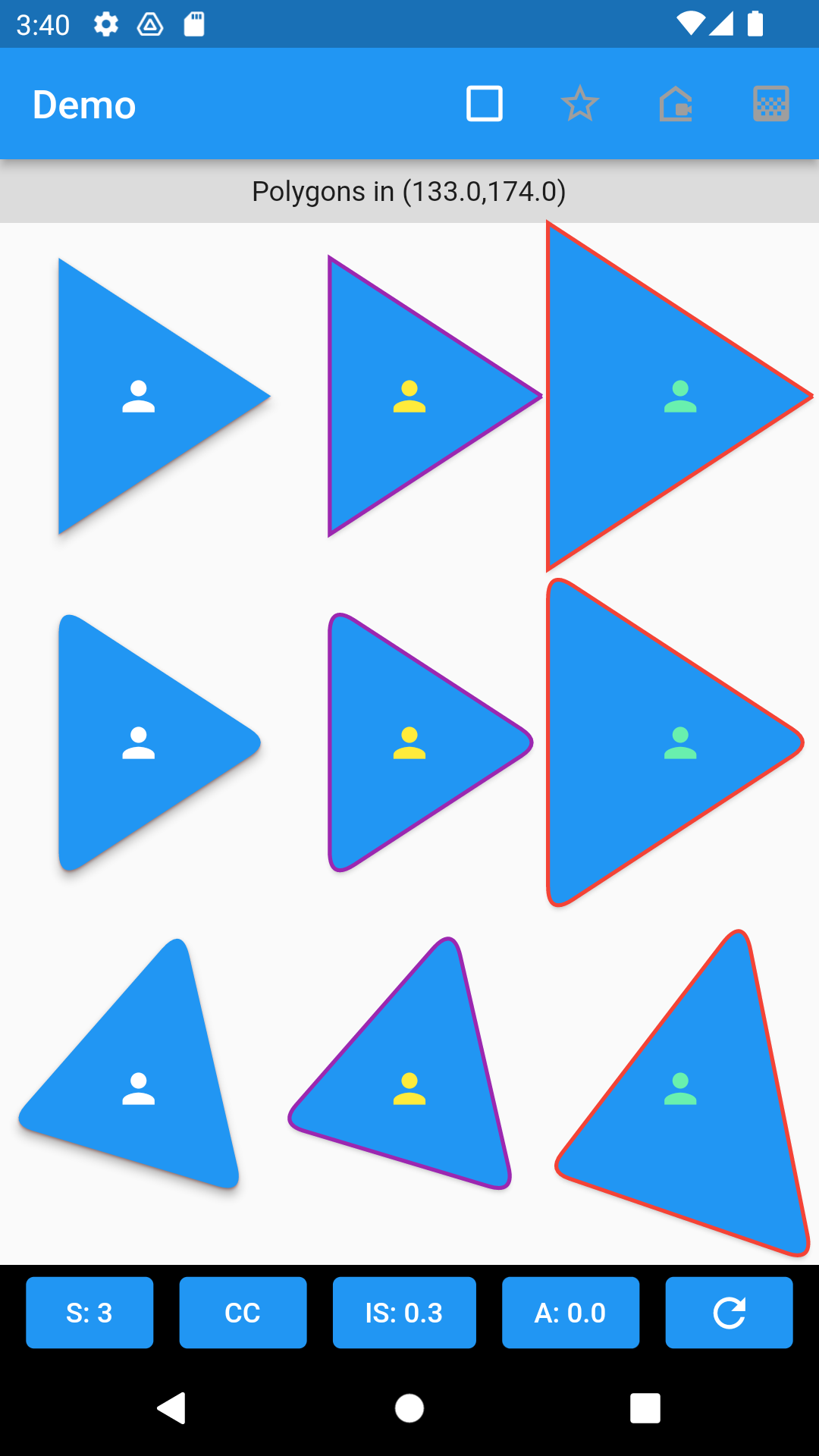
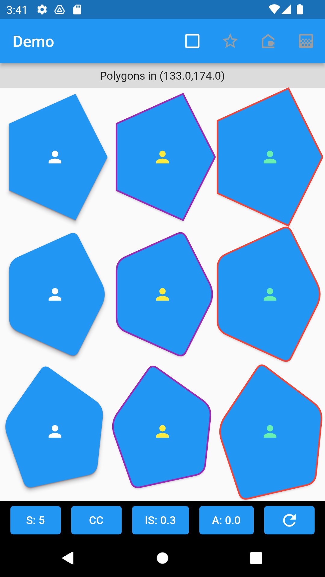
Samples show n-sided polygons using GuiClipShape, and GuiShapeBorder with straight, rounded, stretched, and rotated properties. Shape of polygon is defined by GuiShapePolygon.
 |
 |
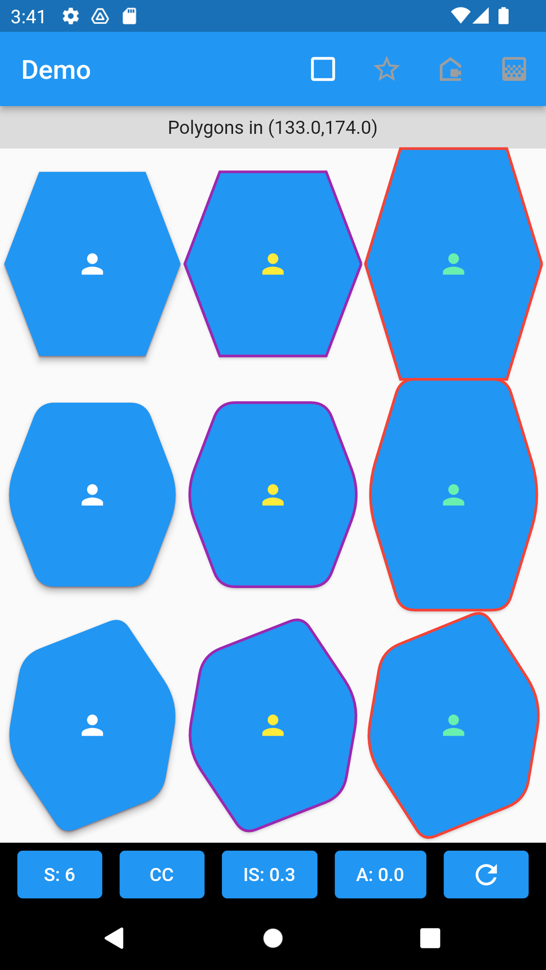 |
- A 5-sided clip (pentagon shaped).
	GuiClipShape(
		shape: GuiShapePolygon(sides: 5, startAngle: GeoAngle.zero),
		child: Container(color: Colors.blue,),
	)
- An elevated button w/ 5-sided border (pentagon shaped).
	ElevatedButton(
		style: ElevatedButton.styleFrom(
			shape: GuiShapeBorder(
				shape: GuiShapePolygon(sides: 5, startAngle: GeoAngle.zero),
				side: const BorderSide(color: Colors.purple,width: 2.0),
			),
		),
		onPressed: () {},
		child: const Icon(Icons.person, color: Colors.yellow),
	)
- A 5-sided clip (pentagon shaped), with rounded corners and fitted to container's dimensions.
	GuiClipShape(
		shape: GuiShapePolygon(
			sides: 5,
			cornerRadius: 8,
			startAngle: GeoAngle(degree: 0),
			clockwise: true,
			boxFit: BoxFit.fill,
		),
		shadows: [
			GuiShadow(color: Colors.red, elevation: 1.0),
			GuiShadow(color: Colors.grey, elevation: 4.0)
		],
		child: Container(
			color: Colors.blue,
				child: const Center(
					child: Icon(Icons.person, color: Colors.white),
				)
			),
		),
	)
- An elevated button w/ 5-sided border (pentagon shaped), with rounded corners and fitted to container's dimensions.
	ElevatedButton(
		style: ElevatedButton.styleFrom(
			shape: GuiShapeBorder(
				shape: GuiShapePolygon(
					sides: 5,
					cornerRadius: 8,
					startAngle: GeoAngle(degree: 0),
					clockwise: true,
					boxFit: BoxFit.fill,
				),
				side: const BorderSide(
					color: Colors.purple,
					width: 2.0
				),
			),
		),
		onPressed: () {},
		child: const Icon(Icons.person, color: Colors.yellow),
	)
N-Pointed Stars
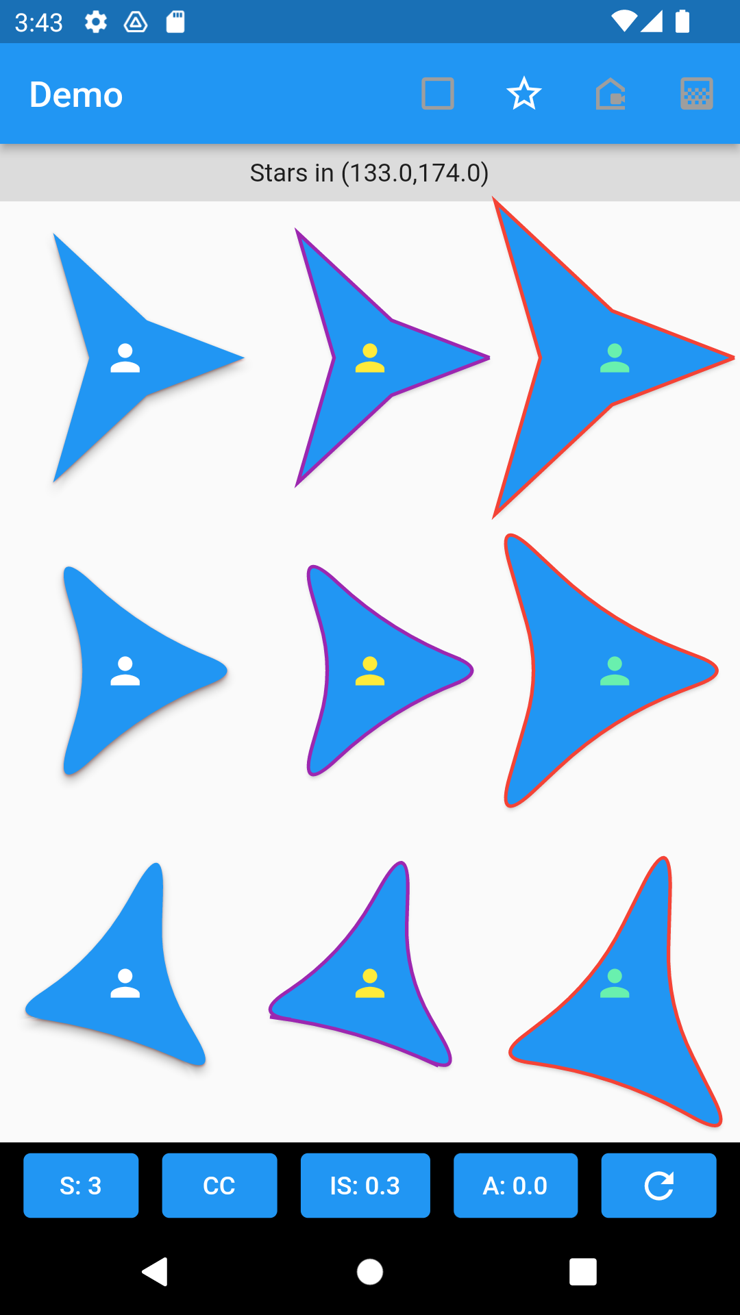
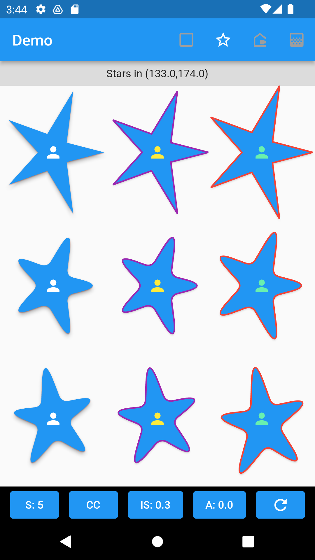
Samples show n-pointed stars using GuiClipShape, and GuiShapeBorder with straight, rounded, stretched, and rotated properties. Shape of polygon is defined by GuiShapeStar.
 |
 |
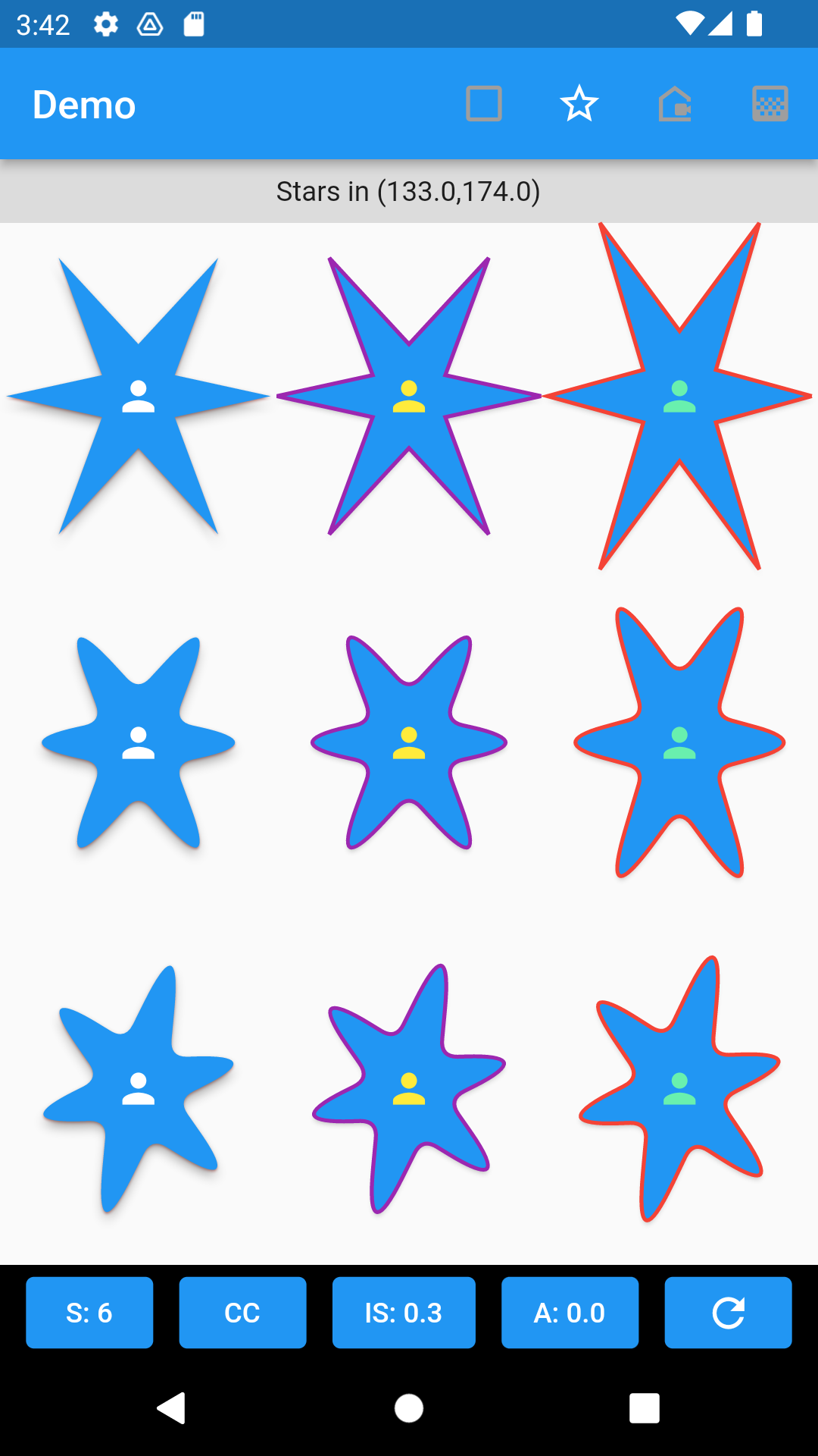 |
- A 5-pointed star clip.
	GuiClipShape(
		shape: GuiShapeStar(sides: 5,startAngle: GeoAngle.zero),
		child: Container(color: Colors.blue)
	)
- An elevated button w/ 5-pointed star border , with rounded corners and fitted to container's dimensions.
	ElevatedButton(
		style: ElevatedButton.styleFrom(
			shape: GuiShapeBorder(
				shape: GuiShapeStar(sides: 5, startAngle: GeoAngle.zero),
				side: const BorderSide(color: Colors.purple, width: 2.0)
			),
		),
		onPressed: () {},
		child: const Icon(Icons.person, color: Colors.yellow),
	)
- A 5-pointed star clip with rounded corners and fitted to container's dimensions.
	GuiClipShape(
		shape: GuiShapeStar(
			sides: 5,
			cornerRadius: 8,
			startAngle: GeoAngle(degree: 0),
			clockwise: true,
			boxFit: BoxFit.fill,
			indentSideFactor: 0.3,
		),
		shadows: [
			GuiShadow(color: Colors.red, elevation: 1.0),
			GuiShadow(color: Colors.grey, elevation: 4.0)
		],
		child: Container(
			color: Colors.blue,
			child: const Center(
				child: Icon(Icons.person, color: Colors.white),
			)
		),
	)
- An elevated button w/ 5-pointed star border , with rounded corners and fitted to container's dimensions.
	ElevatedButton(
		style: ElevatedButton.styleFrom(
			shape: GuiShapeBorder(
				shape: GuiShapeStar(
					sides: 5,
					cornerRadius: 8,
					startAngle: GeoAngle(degree: 0),
					clockwise: true,
					boxFit: BoxFit.fill,
					indentSideFactor: 0.3,
				),
				side: const BorderSide(
					color: Colors.purple,
					width: 2.0
				),
			),
		),
		onPressed: () {},
		child: const Icon(Icons.person, color: Colors.yellow),
	)
Polar Shapes
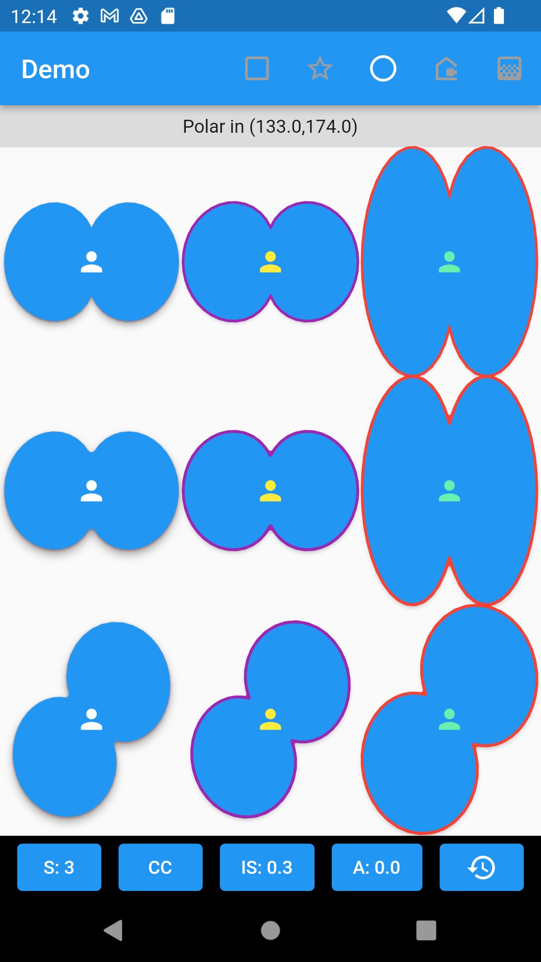
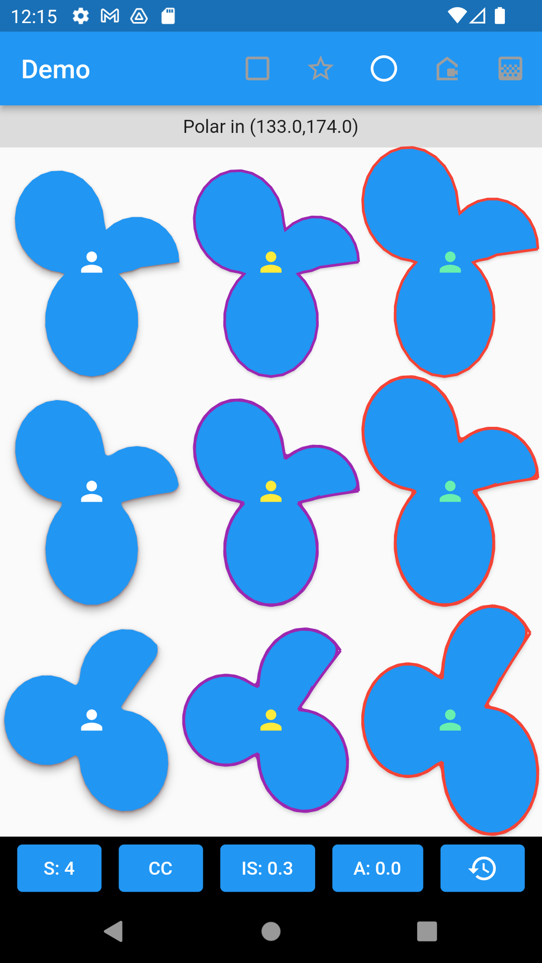
Samples show polar shapes rendered by a function that sweeps 360 degrees (default). Shape of a polar graph is defined by GuiShapePolar and may be used with GuiClipShape to clip a region, or GuiShapeBorder to create an outline.
 |
 |
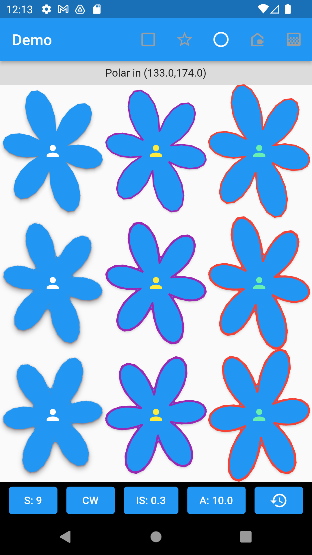 |
- A user-defined polar function-based clip
	GuiClipShape(
		shape: GuiShapePolar(
			formula: (GeoAngle angle) {
				return 0.7 * cos(3 * angle.radian).abs() + 0.3;
			}
		),
		child: Container(color: Colors.blue)
	)
- A user-defined polar function-based elevated button
	ElevatedButton(
		style: ElevatedButton.styleFrom(
			shape: GuiShapePolar(
				formula: (GeoAngle angle) {
					return 0.7 * cos(3 * angle.radian).abs() + 0.3;
				}
			),
		),
		onPressed: () {},
		child: const Icon(Icons.person, color: Colors.yellow),
	)
- A four-leaf clover polar shape clip region
	GuiClipShape(
		shape: GuiShapePolar(
			formula: (GeoAngle angle) {
				return 0.7 * cos(2 * angle.radian).abs() + 0.3;
			},
			sampling: 60,
			polarBeginAngle: GeoAngle.zero.radian,		// default
			polarEndAngle: GeoAngle.angle360.radian,	// default
			cornerRadius: 0,
			startAngle: GeoAngle(degree: 45),
			clockwise: true,
			boxFit: BoxFit.none,
		),
		shadows: const [
			GuiShadow(color: Colors.red, elevation: 1.0),
			GuiShadow(color: Colors.grey, elevation: 4.0)
		],
		child: Container(
			color: Colors.blue,
			child: const Center(
				child: Icon(Icons.person, color: Colors.white),
			)
		),
	)
- A four-leaf clover polar shape elevated button
	ElevatedButton(
		style: ElevatedButton.styleFrom(
			shape: GuiShapeBorder(
				shape: GuiShapePolar(
					formula: (GeoAngle angle) {
						return 0.7 * cos(2 * angle.radian).abs() + 0.3;
					},
					sampling: 60,
					cornerRadius: 0,
					startAngle: GeoAngle.zero,
					clockwise: true,
					boxFit: BoxFit.fill,
				),
				side: const BorderSide(
					color: Colors.purple,
					width: 2.0
				),
			),
		),
		onPressed: () {},
		child: const Icon(Icons.person, color: Colors.yellow),
	)
Custom Polygon
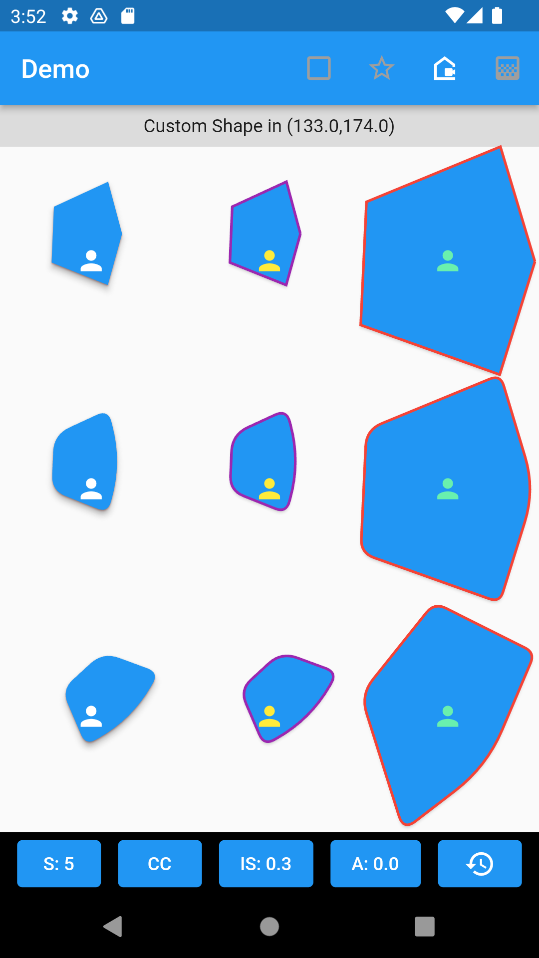
Samples show a custom polygon using GuiClipShape, and GuiShapeBorder with straight, rounded, stretched, and rotated properties. Shape of polygon is defined by GuiShapeCustom. Each point is defined by GeoCoordinate2D.
 |
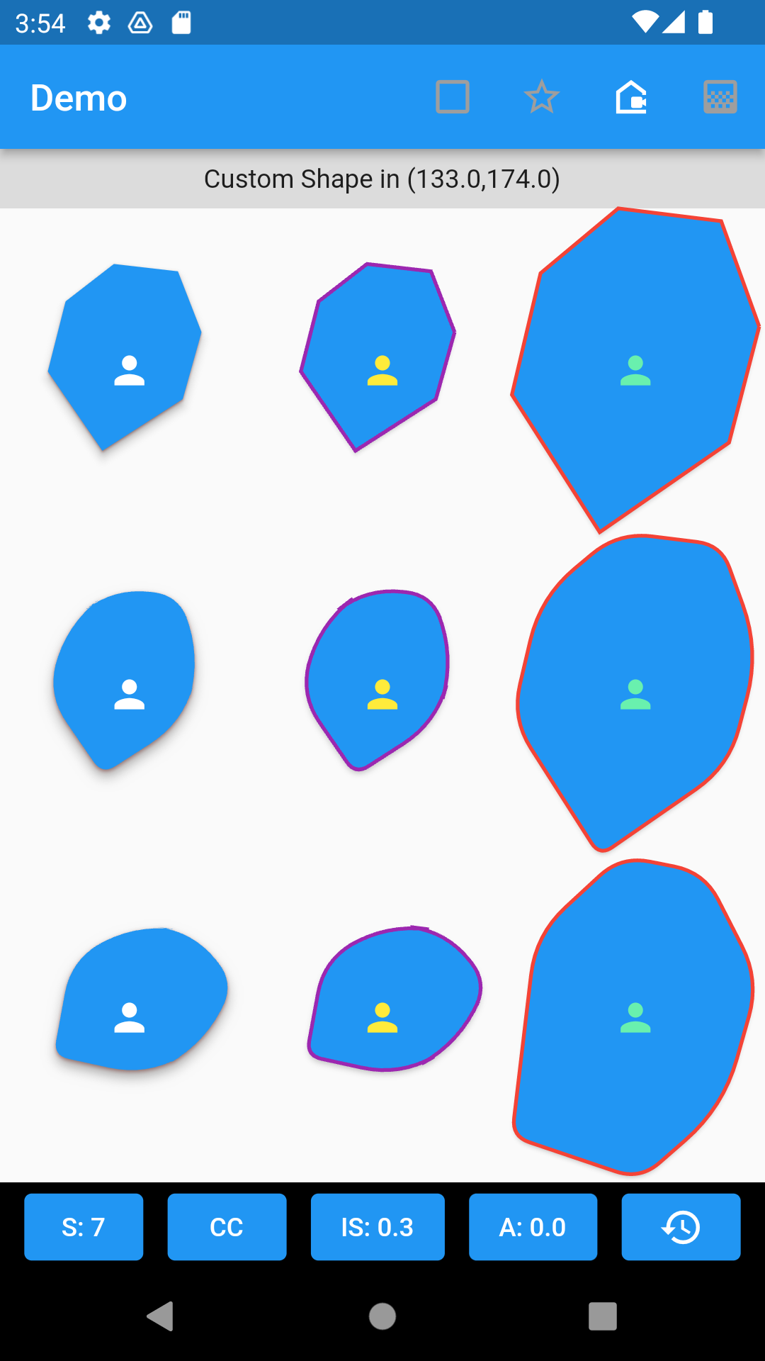 |
- A custom shaped clip with rounded corners and fitted to container's dimensions.
	GuiClipShape(
		shape: GuiShapeCustom(
			points: [
				GeoCoordinate2D( x1, y1 ),
				GeoCoordinate2D( x2, y2 ),
				GeoCoordinate2D( x3, y3 ),
				GeoCoordinate2D( x4, y4 ),
				GeoCoordinate2D( x5, y5 ),
			],
			cornerRadius: 8,
			rotate: GeoAngle.zero,
			boxFit: BoxFit.fill,
		),
		shadows: [
			GuiShadow(color: Colors.red, elevation: 1.0),
			GuiShadow(color: Colors.grey, elevation: 4.0)
		],
		child: Container(
			color: Colors.blue,
			child: const Center(
				child: Icon(Icons.person, color: Colors.white),
			)
		),
	)
- An elevated button w/ custom shape border, rounded corners and fitted to container's dimensions.
	ElevatedButton(
		style: ElevatedButton.styleFrom(
			shape: GuiShapeBorder(
				shape: GuiShapeCustom(
					points: [
						GeoCoordinate2D( x1, y1 ),
						GeoCoordinate2D( x2, y2 ),
						GeoCoordinate2D( x3, y3 ),
						GeoCoordinate2D( x4, y4 ),
						GeoCoordinate2D( x5, y5 ),
					],
					cornerRadius: 8,
					rotate: GeoAngle.zero,
                    clockwise: true,
					boxFit: BoxFit.fill,
				),
				side: const BorderSide(
					color: Colors.purple,
					width: 2.0
				),
			),
		),
		onPressed: () {},
		child: const Icon(Icons.person, color: Colors.yellow),
	)
2-Dimensional Custom Gradient
Samples show a custom gradient using GuiNormalizeGradient. A map of stops, along with list of colors are provided in a 2-dimensional. Each color is represented with it's stop location using GuiGradientColor. The normalized gradient will automatically compute stops within the range 0.0 (0%) and 1.0 (100%) (in cases stops with associated color are outside the rendering range). The operation createImage() creates a bitmap image of the gradient with the specified dimensions for stops within the 0.0 and 1.0 range (both horizontally and vertically).
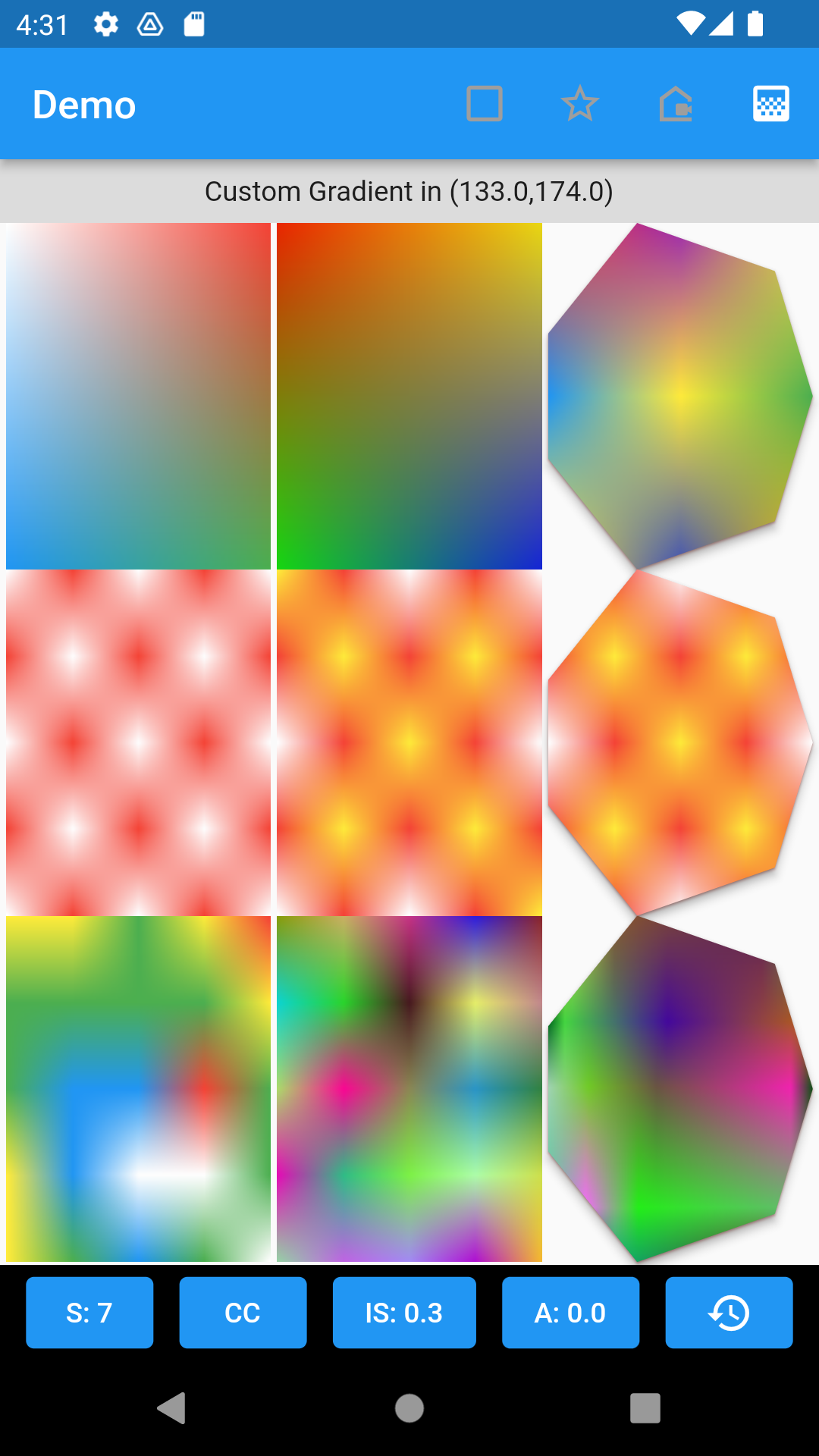
- A simple 100x200 gradient image with top left white, top right red, bottom left blue, and bottom right green.
	GuiNormalizeGradient({
		0.0: <GuiGradientColor>[
				GuiGradientColor(Colors.white,0.0),
				GuiGradientColor(Colors.red, 1.0)
			],
		1.0: <GuiGradientColor>[
				GuiGradientColor(Colors.blue,0.0),
				GuiGradientColor(Colors.green, 1.0)
			],
	})
	.createImage(100, 200)
- A 200x200 red and white checkered gradient image.
	GuiNormalizeGradient({
		0.0: <GuiGradientColor>[
			GuiGradientColor(Colors.white,0.0),
			GuiGradientColor(Colors.red, 0.25),
			GuiGradientColor(Colors.white, 0.5),
			GuiGradientColor(Colors.red, 0.75),
			GuiGradientColor(Colors.white, 1.0)
		],
		0.25: <GuiGradientColor>[
			GuiGradientColor(Colors.red,0.0),
			GuiGradientColor(Colors.white, 0.25),
			GuiGradientColor(Colors.red, 0.5),
			GuiGradientColor(Colors.white, 0.75),
			GuiGradientColor(Colors.red, 1.0)
		],
		0.5: <GuiGradientColor>[
			GuiGradientColor(Colors.white,0.0),
			GuiGradientColor(Colors.red, 0.25),
			GuiGradientColor(Colors.white, 0.5),
			GuiGradientColor(Colors.red, 0.75),
			GuiGradientColor(Colors.white, 1.0)
		],
		0.75: <GuiGradientColor>[
			GuiGradientColor(Colors.red,0.0),
			GuiGradientColor(Colors.white, 0.25),
			GuiGradientColor(Colors.red, 0.5),
			GuiGradientColor(Colors.white, 0.75),
			GuiGradientColor(Colors.red, 1.0)
		],
		1.0: <GuiGradientColor>[
			GuiGradientColor(Colors.white,0.0),
			GuiGradientColor(Colors.red, 0.25),
			GuiGradientColor(Colors.white, 0.5),
			GuiGradientColor(Colors.red, 0.75),
			GuiGradientColor(Colors.white, 1.0)
		],
	}).createImage(200, 200)
Geometric Classes
Supporting classes aid in performing computations, and rendering shapes and images.
- List of classes
- GeoCoordinate - Defines a coordinate (x,y,z) in 3D space. Supports operations to calculate distance, lerp, etc.
- GeoCoordinate2D - Defines a coordinate (x,y) in 2D plane (z=0 implied). Supports operations to calculate slope, distance, rotation, lerp, etc.
- GeoAngle - An angle (represented by either radian or degrees). Supports arithmetic operators.
- GeoEllipse - Calculates coordinates on an ellipse at an angle. The basis for calculating points of a polygon, and star encapsulated in a rectangular drawing area.
- GeoCircle - Calculates coordinates on a circle at an angle.
- GeoCustom - Helper class for storing user-defined coordinates, and generating a straight or curved Path.
- GeoPolygon - Helper class for generating coordinates for a n-sided polygon, and generating a straight or curved Path.
- GeoStar - Helper class for generating coordinates for a n-pointed star, and generating a straight or curved Path.
- GeoUtility - Helper class for manipulating coordinates (ie. re-centering, resetting origin, scaling, etc.)
Gui Shape Classes
Classes aid in clipping regions or creating borders based on a shape.
- List of classes
- GuiClipShape - A stateless widget for clipping a child widget in a user-defined shape
- GuiShapeBorder - A stateless widget for creating an outlined border in a user-defined shape
- GuiShapePolygon - A n-sided polygon shape
- GuiShapeStar - A n-pointed star shape
- GuiShapePolar - A polar function-based shape
- GuiShapeCustom - A custom shape defined by a list of coordinates
- IGuiShape - A shape interface for implementing additional shapes. Used by GuiClipShape and GuiShapeBorder.
Gradient Classes
Classes aid in creating 2-D color maps and rendering gradients as images.
- List of classes
- GuiGradientColor - A color and stop position in a gradient
- GuiNormalizeGradient - A 2-dimensional normalized gradient with colors and stops in both x and y axis._
- GuiGradientImage - A helper class that converts GuiNormalizeGradient into a Flutter Image widget._
Image Classes
Classes aid creating image buffers based on raw color pixel data.
- List of classes
- GuiBitmapBuffer - A class that prepares an image in BMP format, with BMP header populated. The user can populate the bitmap image data and use the resulting array to either load the Image (via Image.memory(…)) or store the resulting BMP data into an I/O stream (ie. file, network, etc…
Issues
If you encounter any issues, please report them at https://github.com/itusn/gui_shape/issues.
Libraries
- geo/geo
- geo/geo_common
- geo/geo_custom
- geo/geo_path
- geo/geo_polygon
- geo/geo_star
- geo/geo_utility
- gui/gui
- gui/gui_bitmap_data
- gui/gui_clip_shape
- gui/gui_gradient
- gui/gui_shadow
- gui/gui_shape_border
- gui_shape
- shape/gui_shape_custom
- shape/gui_shape_polar
- shape/gui_shape_polygon
- shape/gui_shape_star
- shape/i_gui_shape