fluid_sheet
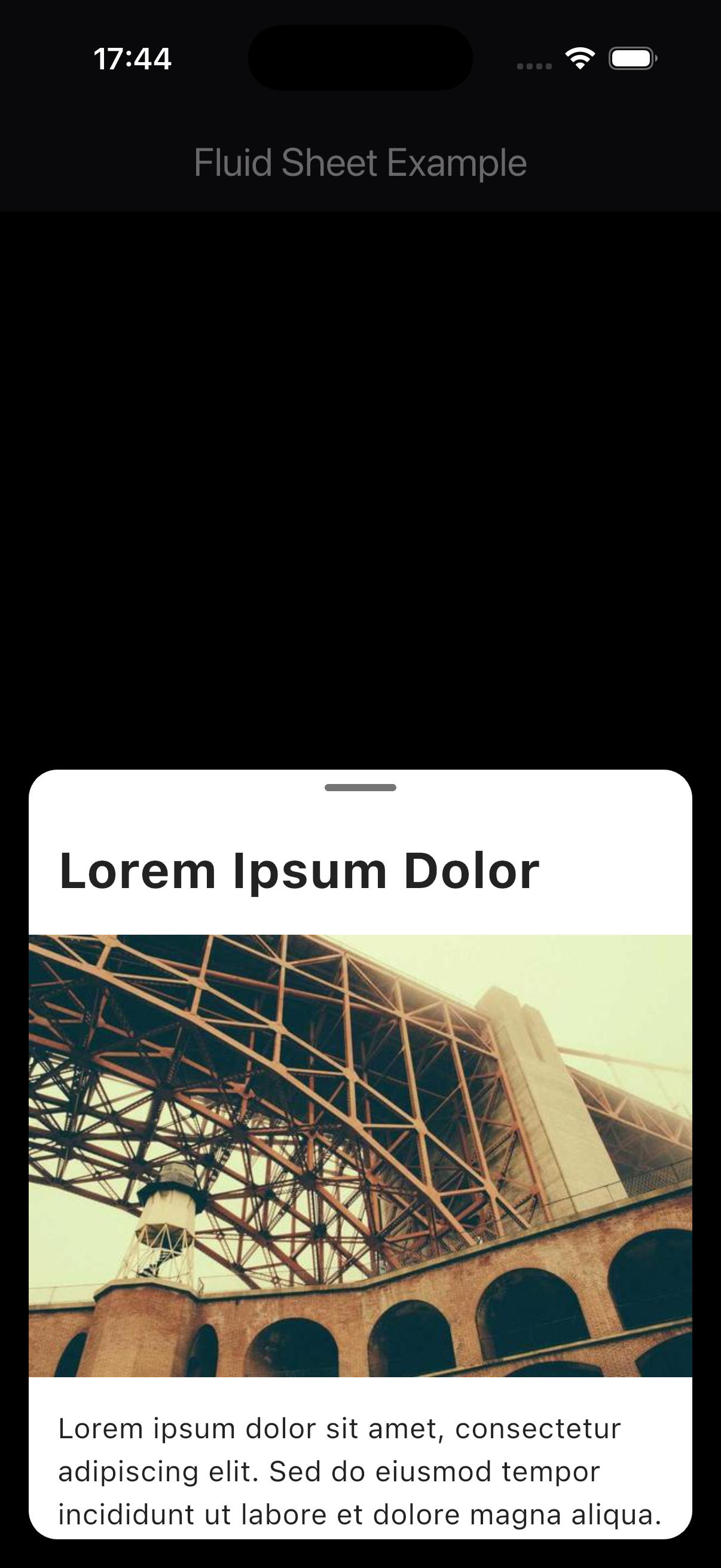
A fluid, iOS-style bottom sheet for Flutter with buttery-smooth animations that adapts its margins and corner radius as it expands to full screen.
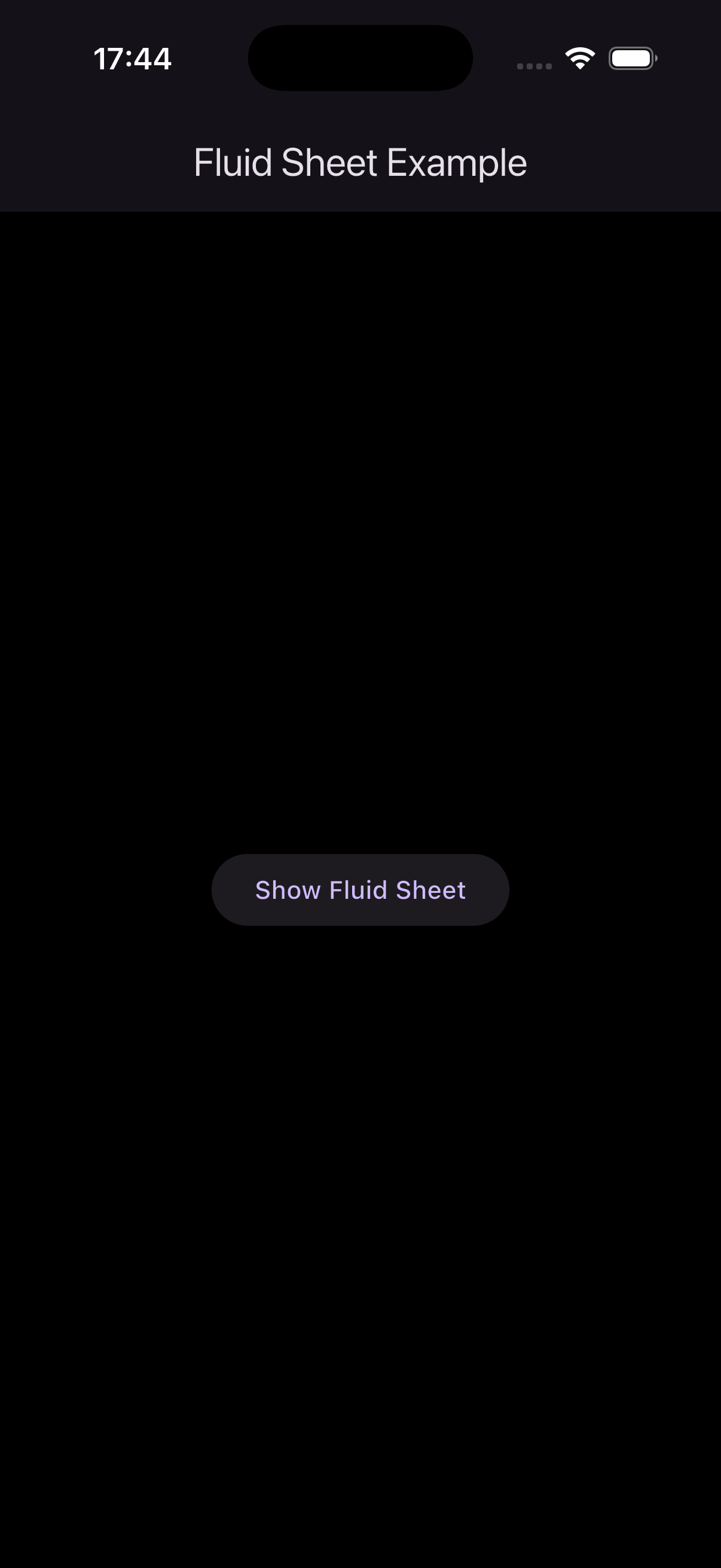
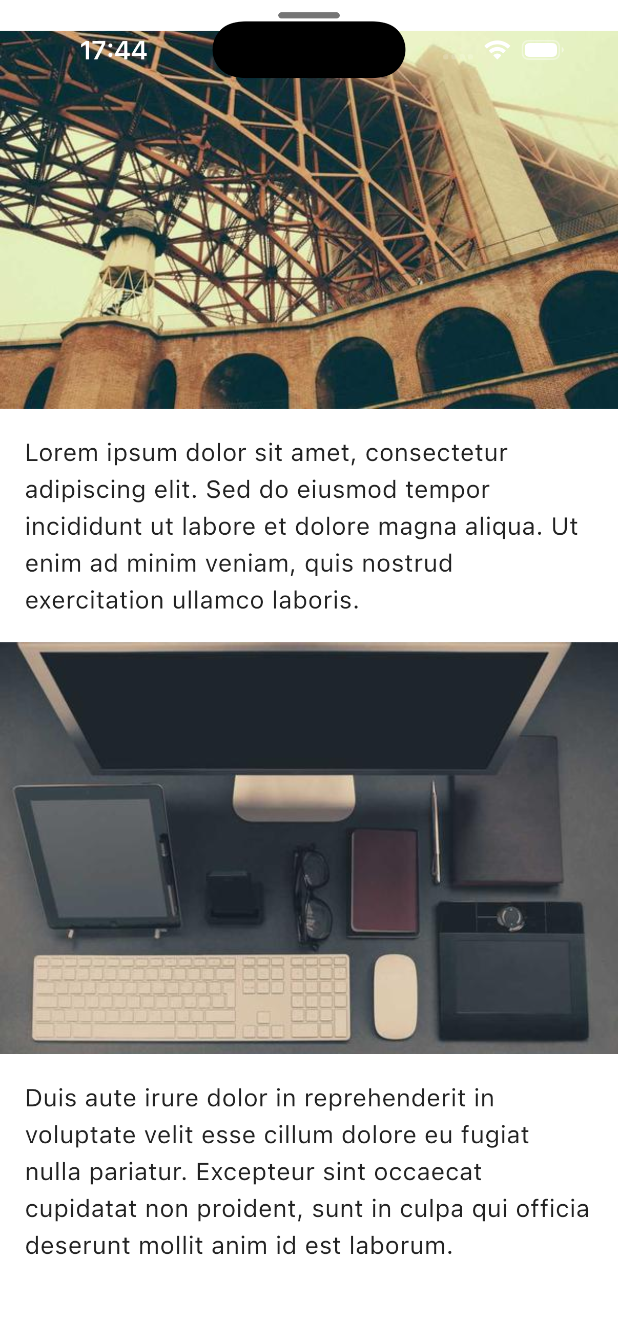
Screenshots
Features
- 🎯 Easy to Use: Simple API similar to
showModalBottomSheet - 🔧 Highly Customizable: Configure colors, heights, safe area, and dismissal behavior
- ✨ Smart Dismissal: Three ways to dismiss - drag pill, overscroll, or tap outside
- 🌈 Theme Support: Customize background color and pill indicator color
- 🔒 Safe Area Support: Optional respect for notches and dynamic islands
Installation
Add this to your package's pubspec.yaml file:
dependencies:
  fluid_sheet: ^0.1.0
Usage
Basic Example
import 'package:flutter/material.dart';
import 'package:fluid_sheet/fluid_sheet.dart';

void main() {
  runApp(const MyApp());
}

class MyApp extends StatelessWidget {
  const MyApp({super.key});

  @override
  Widget build(BuildContext context) {
    return MaterialApp(
      home: Scaffold(
        body: Center(
          child: ElevatedButton(
            onPressed: () {
              showFluidSheet(
                context: context,
                builder: (context) => Column(
                  children: [
                    const Padding(
                      padding: EdgeInsets.all(16.0),
                      child: Text(
                        'Hello from Fluid Sheet!',
                        style: TextStyle(fontSize: 24, fontWeight: FontWeight.bold),
                      ),
                    ),
                    // Add your content here
                  ],
                ),
              );
            },
            child: const Text('Show Fluid Sheet'),
          ),
        ),
      ),
    );
  }
}
Advanced Example with Customization
showFluidSheet(
  context: context,
  initialHeight: 0.6,              // Start at 60% of screen height
  maxHeight: 0.95,                 // Maximum 95% of screen height
  backgroundColor: Colors.white,    // Sheet background color
  barrierColor: Colors.black54,    // Overlay color
  barrierDismissible: true,        // Tap outside to dismiss
  showPillIndicator: true,         // Show drag indicator
  pillIndicatorColor: Colors.grey, // Pill indicator color
  useSafeArea: true,               // Respect safe area (notch, dynamic island)
  builder: (context) => YourContentWidget(),
);
API Reference
showFluidSheet<T>
Shows a fluid bottom sheet that expands with smooth animations.
Parameters:
| Parameter | Type | Default | Description |
|---|---|---|---|
context |
BuildContext |
required | The build context |
builder |
Widget Function(BuildContext) |
required | Builder function that creates the sheet content |
initialHeight |
double |
0.5 |
Initial height as a fraction of screen height (0.0 - 1.0) |
maxHeight |
double |
1.0 |
Maximum height as a fraction of screen height (0.0 - 1.0) |
backgroundColor |
Color |
Colors.white |
Background color of the sheet |
barrierColor |
Color |
Colors.black54 |
Color of the modal barrier (overlay) |
barrierDismissible |
bool |
true |
Whether tapping outside dismisses the sheet |
showPillIndicator |
bool |
true |
Whether to show the drag pill indicator |
pillIndicatorColor |
Color? |
Colors.grey[300] |
Color of the pill indicator |
useSafeArea |
bool |
false |
Whether to respect safe area (camera notch, dynamic island) |
Returns: Future<T?> - A future that completes when the sheet is dismissed
Behavior
Dismissal
The sheet can be dismissed in three intuitive ways:
- Drag the pill indicator down when the sheet is at initial height
- Overscroll down when content is scrolled to the top (with bounce effect)
- Tap outside the sheet (if
barrierDismissibleistrue)
All dismissals feature smooth 200ms animations with Curves.easeInCubic for natural closing motion.
Examples
List Content
showFluidSheet(
  context: context,
  builder: (context) => ListView.builder(
    shrinkWrap: true,
    itemCount: 20,
    itemBuilder: (context, index) => ListTile(
      title: Text('Item $index'),
      onTap: () {
        Navigator.pop(context, index);
      },
    ),
  ),
);
Form Content
showFluidSheet(
  context: context,
  backgroundColor: Colors.grey[100]!,
  builder: (context) => Padding(
    padding: const EdgeInsets.all(16.0),
    child: Column(
      mainAxisSize: MainAxisSize.min,
      children: [
        TextField(
          decoration: InputDecoration(labelText: 'Name'),
        ),
        SizedBox(height: 16),
        TextField(
          decoration: InputDecoration(labelText: 'Email'),
        ),
        SizedBox(height: 24),
        ElevatedButton(
          onPressed: () => Navigator.pop(context),
          child: Text('Submit'),
        ),
      ],
    ),
  ),
);
Full-Screen with Safe Area
showFluidSheet(
  context: context,
  initialHeight: 0.7,
  maxHeight: 1.0,
  useSafeArea: true, // Respects notch/dynamic island
  backgroundColor: Colors.white,
  builder: (context) => YourContentWidget(),
);
Custom Theme
showFluidSheet(
  context: context,
  backgroundColor: Colors.black87,
  pillIndicatorColor: Colors.white54,
  barrierColor: Colors.white24,
  builder: (context) => Column(
    mainAxisSize: MainAxisSize.min,
    children: [
      Text(
        'Dark Mode Sheet',
        style: TextStyle(color: Colors.white, fontSize: 24),
      ),
      // ... more content
    ],
  ),
);
Tips & Best Practices
Content-Only Widgets
For best results, make your sheet content widgets "content-only" - let FluidSheet handle scrolling:
// ✅ Good - Content only
class MySheetContent extends StatelessWidget {
  @override
  Widget build(BuildContext context) {
    return Column(
      children: [
        // Your content here
      ],
    );
  }
}

// ❌ Avoid - Don't add your own scroll view
class MySheetContent extends StatelessWidget {
  @override
  Widget build(BuildContext context) {
    return SingleChildScrollView( // FluidSheet already handles this!
      child: Column(children: [...]),
    );
  }
}
Performance
- Use
constconstructors where possible to reduce rebuilds - Avoid heavy computations in the
builderfunction - For large lists, use
ListView.builderinstead ofListViewwith all children - The sheet automatically optimizes rendering with
RepaintBoundary
Responsive Design
showFluidSheet(
  context: context,
  initialHeight: MediaQuery.of(context).size.height > 800 ? 0.6 : 0.7,
  builder: (context) => YourContent(),
);
Technical Details
- Animation Framework: Custom
AnimationControllerwith cubic easing curves - Scroll Physics:
BouncingScrollPhysicsfor iOS-like behavior
Compatibility
- ✅ iOS
- ✅ Android
- ✅ Web (not tested)
- ✅ macOS (not tested)
- ✅ Windows (not tested)
- ✅ Linux (not tested)
License
This project is licensed under the MIT License.
Contributing
Contributions are welcome! Please feel free to submit a Pull Request.