CustomDropdownButton class
A material design button for selecting from a custom widget.
The type T is the type of the value that each dropdown item represents.
All the entries in a given menu must represent values with consistent types.
Typically, an enum is used. Each DropdownMenuItem in items must be
specialized with that same type argument.
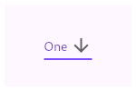
This sample shows a CustomDropdownButton with a large arrow icon,
purple text style, and bold purple underline, whose value is one of "One",
"Two", "Free", or "Four".
String dropdownValue = 'One';

@override
Widget build(BuildContext context) {
  return CustomDropdownButton<String>(
    value: dropdownValue,
    icon: Icon(Icons.arrow_downward),
    iconSize: 24,
    elevation: 16,
    style: TextStyle(
      color: Colors.deepPurple
    ),
    underline: Container(
      height: 2,
      color: Colors.deepPurpleAccent,
    ),
    items: <String>['One', 'Two', 'Free', 'Four']
      .map<DropdownMenuItem<String>>((String value) {
        return DropdownMenuItem<String>(
          value: value,
          child: Text(value),
        );
      })
      .toList(),
  );
}
{@end-tool}
If the onTap callback is null or the list of items is null
then the dropdown button will be disabled, i.e. its arrow will be
displayed in grey and it will not respond to input. A disabled button
will display the disabledHint widget if it is non-null. However, if
disabledHint is null and hint is non-null, the hint widget will
instead be displayed.
Requires one of its ancestors to be a Material widget.
See also:
- DropdownMenuItem, the class used to represent the
items. - DropdownButtonHideUnderline, which prevents its descendant dropdown buttons from displaying their underlines.
- ElevatedButton, TextButton, ordinary buttons that trigger a single action.
- material.io/design/components/menus.html#dropdown-menu
- Inheritance
-
- Object
- DiagnosticableTree
- Widget
- StatefulWidget
- CustomDropdownButton
Constructors
- CustomDropdownButton({Key? key, String? value, String? hint, String? disabledHint, required VoidCallback onTap, int elevation = 8, TextStyle? style, Widget? underline, Widget? icon, Color? iconDisabledColor, Color? iconEnabledColor, double iconSize = 24.0, bool isDense = false, bool isExpanded = false, double itemHeight = kMinInteractiveDimension, Color? focusColor, FocusNode? focusNode, bool autofocus = false, Color? dropdownColor})
-
Creates a custom dropdown button.
const
Properties
- autofocus → bool
-
True if this widget will be selected as the initial focus when no other
node in its scope is currently focused.
final
- disabledHint → String?
-
A message to show when the dropdown is disabled.
final
- dropdownColor → Color?
-
The background color of the dropdown.
final
- elevation → int
-
When a DropdownMenuItem is selected, the widget that will be displayed
from the list corresponds to the DropdownMenuItem of the same index
in
items.final - focusColor → Color?
-
The color for the button's Material when it has the input focus.
final
- focusNode → FocusNode?
-
An optional focus node to use as the focus node for this widget.
final
- hashCode → int
-
The hash code for this object.
no setterinherited
- hint → String?
-
A placeholder String that is displayed by the dropdown button.
final
- icon → Widget?
-
The widget to use for the drop-down button's icon.
final
- iconDisabledColor → Color?
-
The color of any Icon descendant of icon if this button is disabled,
i.e. if onTap is null.
final
- iconEnabledColor → Color?
-
The color of any Icon descendant of icon if this button is enabled,
i.e. if onTap is defined.
final
- iconSize → double
-
The size to use for the drop-down button's down arrow icon button.
final
- isDense → bool
-
Reduce the button's height.
final
- isExpanded → bool
-
Set the dropdown's inner contents to horizontally fill its parent.
final
- itemHeight → double
-
If null, then the menu item heights will vary according to each menu item's
intrinsic height.
final
- key → Key?
-
Controls how one widget replaces another widget in the tree.
finalinherited
- onTap → VoidCallback
-
Called when the dropdown button is tapped.
final
- runtimeType → Type
-
A representation of the runtime type of the object.
no setterinherited
- style → TextStyle?
-
The text style to use for text in the dropdown button and the dropdown
menu that appears when you tap the button.
final
- underline → Widget?
-
The widget to use for drawing the drop-down button's underline.
final
- value → String?
-
The value of the button text.
final
Methods
-
createElement(
) → StatefulElement -
Creates a StatefulElement to manage this widget's location in the tree.
inherited
-
createState(
) → State< CustomDropdownButton> -
Creates the mutable state for this widget at a given location in the tree.
override
-
debugDescribeChildren(
) → List< DiagnosticsNode> -
Returns a list of
DiagnosticsNodeobjects describing this node's children.inherited -
debugFillProperties(
DiagnosticPropertiesBuilder properties) → void -
Add additional properties associated with the node.
inherited
-
noSuchMethod(
Invocation invocation) → dynamic -
Invoked when a nonexistent method or property is accessed.
inherited
-
toDiagnosticsNode(
{String? name, DiagnosticsTreeStyle? style}) → DiagnosticsNode -
Returns a debug representation of the object that is used by debugging
tools and by DiagnosticsNode.toStringDeep.
inherited
-
toString(
{DiagnosticLevel minLevel = DiagnosticLevel.info}) → String -
A string representation of this object.
inherited
-
toStringDeep(
{String prefixLineOne = '', String? prefixOtherLines, DiagnosticLevel minLevel = DiagnosticLevel.debug}) → String -
Returns a string representation of this node and its descendants.
inherited
-
toStringShallow(
{String joiner = ', ', DiagnosticLevel minLevel = DiagnosticLevel.debug}) → String -
Returns a one-line detailed description of the object.
inherited
-
toStringShort(
) → String -
A short, textual description of this widget.
inherited
Operators
-
operator ==(
Object other) → bool -
The equality operator.
inherited