ExtendedGridView class
A scrollable, 2D array of widgets.
The main axis direction of a grid is the direction in which it scrolls (the scrollDirection).
The most commonly used grid layouts are ExtendedGridView.count, which creates a layout with a fixed number of tiles in the cross axis, and ExtendedGridView.extent, which creates a layout with tiles that have a maximum cross-axis extent. A custom SliverGridDelegate can produce an arbitrary 2D arrangement of children, including arrangements that are unaligned or overlapping.
To create a grid with a large (or infinite) number of children, use the ExtendedGridView.builder constructor with either a SliverGridDelegateWithFixedCrossAxisCount or a SliverGridDelegateWithMaxCrossAxisExtent for the gridDelegate.
To use a custom SliverChildDelegate, use ExtendedGridView.custom.
To create a linear array of children, use a ExtendedListView.
To control the initial scroll offset of the scroll view, provide a controller with its ScrollController.initialScrollOffset property set.
Transitioning to CustomScrollView
A ExtendedGridView is basically a CustomScrollView with a single SliverGrid in its CustomScrollView.slivers property.
If ExtendedGridView is no longer sufficient, for example because the scroll view is to have both a grid and a list, or because the grid is to be combined with a SliverAppBar, etc, it is straight-forward to port code from using ExtendedGridView to using CustomScrollView directly.
The key, scrollDirection, reverse, controller, primary, physics, and shrinkWrap properties on ExtendedGridView map directly to the identically named properties on CustomScrollView.
The CustomScrollView.slivers property should be a list containing just a SliverGrid.
The childrenDelegate property on ExtendedGridView corresponds to the SliverGrid.delegate property, and the gridDelegate property on the ExtendedGridView corresponds to the SliverGrid.gridDelegate property.
The new GridView, new ExtendedGridView.count, and new ExtendedGridView.extent
constructors' children arguments correspond to the childrenDelegate
being a SliverChildListDelegate with that same argument. The new
GridView.builder constructor's itemBuilder and childCount arguments
correspond to the childrenDelegate being a SliverChildBuilderDelegate
with the matching arguments.
The new ExtendedGridView.count and new ExtendedGridView.extent constructors create
custom grid delegates, and have equivalently named constructors on
SliverGrid to ease the transition: new SliverGrid.count and new
SliverGrid.extent respectively.
The padding property corresponds to having a SliverPadding in the CustomScrollView.slivers property instead of the grid itself, and having the SliverGrid instead be a child of the SliverPadding.
By default, ExtendedListView will automatically pad the list's scrollable extremities to avoid partial obstructions indicated by MediaQuery's padding. To avoid this behavior, override with a zero padding property.
Once code has been ported to use CustomScrollView, other slivers, such as SliverList or SliverAppBar, can be put in the CustomScrollView.slivers list.
{@tool sample}
This example demonstrates how to create a ExtendedGridView with two columns. The
children are spaced apart using the crossAxisSpacing and mainAxisSpacing
properties.
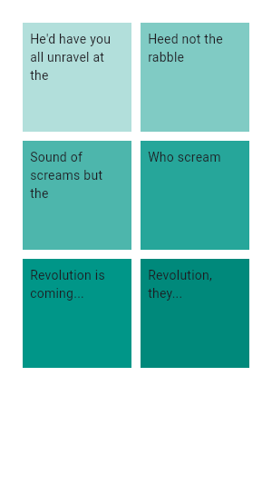
GridView.count(
  primary: false,
  padding: const EdgeInsets.all(20),
  crossAxisSpacing: 10,
  mainAxisSpacing: 10,
  crossAxisCount: 2,
  children: <Widget>[
    Container(
      padding: const EdgeInsets.all(8),
      child: const Text('He\'d have you all unravel at the'),
      color: Colors.teal[100],
    ),
    Container(
      padding: const EdgeInsets.all(8),
      child: const Text('Heed not the rabble'),
      color: Colors.teal[200],
    ),
    Container(
      padding: const EdgeInsets.all(8),
      child: const Text('Sound of screams but the'),
      color: Colors.teal[300],
    ),
    Container(
      padding: const EdgeInsets.all(8),
      child: const Text('Who scream'),
      color: Colors.teal[400],
    ),
    Container(
      padding: const EdgeInsets.all(8),
      child: const Text('Revolution is coming...'),
      color: Colors.teal[500],
    ),
    Container(
      padding: const EdgeInsets.all(8),
      child: const Text('Revolution, they...'),
      color: Colors.teal[600],
    ),
  ],
)
{@end-tool}
{@tool sample} This example shows how to create the same grid as the previous example using a CustomScrollView and a SliverGrid.
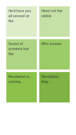
CustomScrollView(
  primary: false,
  slivers: <Widget>[
    SliverPadding(
      padding: const EdgeInsets.all(20),
      sliver: SliverGrid.count(
        crossAxisSpacing: 10,
        mainAxisSpacing: 10,
        crossAxisCount: 2,
        children: <Widget>[
          Container(
            padding: const EdgeInsets.all(8),
            child: const Text('He\'d have you all unravel at the'),
            color: Colors.green[100],
          ),
          Container(
            padding: const EdgeInsets.all(8),
            child: const Text('Heed not the rabble'),
            color: Colors.green[200],
          ),
          Container(
            padding: const EdgeInsets.all(8),
            child: const Text('Sound of screams but the'),
            color: Colors.green[300],
          ),
          Container(
            padding: const EdgeInsets.all(8),
            child: const Text('Who scream'),
            color: Colors.green[400],
          ),
          Container(
            padding: const EdgeInsets.all(8),
            child: const Text('Revolution is coming...'),
            color: Colors.green[500],
          ),
          Container(
            padding: const EdgeInsets.all(8),
            child: const Text('Revolution, they...'),
            color: Colors.green[600],
          ),
        ],
      ),
    ),
  ],
)
{@end-tool}
See also:
- SingleChildScrollView, which is a scrollable widget that has a single child.
- ExtendedListView, which is scrollable, linear list of widgets.
- PageView, which is a scrolling list of child widgets that are each the size of the viewport.
- CustomScrollView, which is a scrollable widget that creates custom scroll effects using slivers.
- SliverGridDelegateWithFixedCrossAxisCount, which creates a layout with a fixed number of tiles in the cross axis.
- SliverGridDelegateWithMaxCrossAxisExtent, which creates a layout with tiles that have a maximum cross-axis extent.
- ScrollNotification and NotificationListener, which can be used to watch the scroll position without using a ScrollController.
- Inheritance
-
- Object
- DiagnosticableTree
- Widget
- StatelessWidget
- ScrollView
- BoxScrollView
- ExtendedGridView
Constructors
-
ExtendedGridView({Key? key, Axis scrollDirection = Axis.vertical, bool reverse = false, ScrollController? controller, bool? primary, ScrollPhysics? physics, bool shrinkWrap = false, EdgeInsetsGeometry? padding, required SliverGridDelegate gridDelegate, bool addAutomaticKeepAlives = true, bool addRepaintBoundaries = true, bool addSemanticIndexes = true, double? cacheExtent, List<
Widget> children = const <Widget>[], int? semanticChildCount, required ExtendedListDelegate extendedListDelegate, DragStartBehavior dragStartBehavior = DragStartBehavior.start, Clip clipBehavior = Clip.hardEdge, ScrollViewKeyboardDismissBehavior keyboardDismissBehavior = ScrollViewKeyboardDismissBehavior.manual, String? restorationId}) - Creates a scrollable, 2D array of widgets with a custom SliverGridDelegate.
- ExtendedGridView.builder({Key? key, Axis scrollDirection = Axis.vertical, bool reverse = false, ScrollController? controller, bool? primary, ScrollPhysics? physics, bool shrinkWrap = false, EdgeInsetsGeometry? padding, required SliverGridDelegate gridDelegate, required IndexedWidgetBuilder itemBuilder, int? itemCount, bool addAutomaticKeepAlives = true, bool addRepaintBoundaries = true, bool addSemanticIndexes = true, double? cacheExtent, int? semanticChildCount, required ExtendedListDelegate extendedListDelegate, DragStartBehavior dragStartBehavior = DragStartBehavior.start, ScrollViewKeyboardDismissBehavior keyboardDismissBehavior = ScrollViewKeyboardDismissBehavior.manual, String? restorationId, Clip clipBehavior = Clip.hardEdge})
- Creates a scrollable, 2D array of widgets that are created on demand.
-
ExtendedGridView.count({Key? key, Axis scrollDirection = Axis.vertical, bool reverse = false, ScrollController? controller, bool? primary, ScrollPhysics? physics, bool shrinkWrap = false, EdgeInsetsGeometry? padding, required int crossAxisCount, double mainAxisSpacing = 0.0, double crossAxisSpacing = 0.0, double childAspectRatio = 1.0, bool addAutomaticKeepAlives = true, bool addRepaintBoundaries = true, bool addSemanticIndexes = true, double? cacheExtent, List<
Widget> children = const <Widget>[], int? semanticChildCount, DragStartBehavior dragStartBehavior = DragStartBehavior.start, required ExtendedListDelegate extendedListDelegate, ScrollViewKeyboardDismissBehavior keyboardDismissBehavior = ScrollViewKeyboardDismissBehavior.manual, String? restorationId, Clip clipBehavior = Clip.hardEdge}) - Creates a scrollable, 2D array of widgets with a fixed number of tiles in the cross axis.
- ExtendedGridView.custom({Key? key, Axis scrollDirection = Axis.vertical, bool reverse = false, ScrollController? controller, bool? primary, ScrollPhysics? physics, bool shrinkWrap = false, EdgeInsetsGeometry? padding, required SliverGridDelegate gridDelegate, required SliverChildDelegate childrenDelegate, double? cacheExtent, int? semanticChildCount, required ExtendedListDelegate extendedListDelegate, DragStartBehavior dragStartBehavior = DragStartBehavior.start, ScrollViewKeyboardDismissBehavior keyboardDismissBehavior = ScrollViewKeyboardDismissBehavior.manual, String? restorationId, Clip clipBehavior = Clip.hardEdge})
-
Creates a scrollable, 2D array of widgets with both a custom
SliverGridDelegate and a custom SliverChildDelegate.
const
-
ExtendedGridView.extent({Key? key, Axis scrollDirection = Axis.vertical, bool reverse = false, ScrollController? controller, bool? primary, ScrollPhysics? physics, bool shrinkWrap = false, EdgeInsetsGeometry? padding, required double maxCrossAxisExtent, double mainAxisSpacing = 0.0, double crossAxisSpacing = 0.0, double childAspectRatio = 1.0, bool addAutomaticKeepAlives = true, bool addRepaintBoundaries = true, bool addSemanticIndexes = true, double? cacheExtent, List<
Widget> children = const <Widget>[], int? semanticChildCount, DragStartBehavior dragStartBehavior = DragStartBehavior.start, required ExtendedListDelegate extendedListDelegate, ScrollViewKeyboardDismissBehavior keyboardDismissBehavior = ScrollViewKeyboardDismissBehavior.manual, String? restorationId, Clip clipBehavior = Clip.hardEdge}) - Creates a scrollable, 2D array of widgets with tiles that each have a maximum cross-axis extent.
Properties
- anchor → double
-
The relative position of the zero scroll offset.
finalinherited
- cacheExtent → double?
-
The viewport has an area before and after the visible area to cache items
that are about to become visible when the user scrolls.
finalinherited
- center → Key?
-
The first child in the GrowthDirection.forward growth direction.
finalinherited
- childrenDelegate → SliverChildDelegate
-
A delegate that provides the children for the ExtendedGridView.
final
- clipBehavior → Clip
-
The content will be clipped (or not) according to this option.
finalinherited
- controller → ScrollController?
-
An object that can be used to control the position to which this scroll
view is scrolled.
finalinherited
- dragStartBehavior → DragStartBehavior
-
Determines the way that drag start behavior is handled.
finalinherited
- extendedListDelegate → ExtendedListDelegate
-
A delegate that provides extensions within the
ExtendedGridView/ExtendedList/WaterfallFlow.final - gridDelegate → SliverGridDelegate
-
A delegate that controls the layout of the children within the ExtendedGridView.
final
- hashCode → int
-
The hash code for this object.
no setterinherited
- key → Key?
-
Controls how one widget replaces another widget in the tree.
finalinherited
- keyboardDismissBehavior → ScrollViewKeyboardDismissBehavior
-
ScrollViewKeyboardDismissBehavior the defines how this ScrollView will
dismiss the keyboard automatically.
finalinherited
- padding → EdgeInsetsGeometry?
-
The amount of space by which to inset the children.
finalinherited
- physics → ScrollPhysics?
-
How the scroll view should respond to user input.
finalinherited
- primary → bool?
-
Whether this is the primary scroll view associated with the parent
PrimaryScrollController.
finalinherited
- restorationId → String?
-
Restoration ID to save and restore the scroll offset of the scrollable.
finalinherited
- reverse → bool
-
Whether the scroll view scrolls in the reading direction.
finalinherited
- runtimeType → Type
-
A representation of the runtime type of the object.
no setterinherited
- scrollBehavior → ScrollBehavior?
-
A ScrollBehavior that will be applied to this widget individually.
finalinherited
- scrollDirection → Axis
-
The Axis along which the scroll view's offset increases.
finalinherited
- semanticChildCount → int?
-
The number of children that will contribute semantic information.
finalinherited
- shrinkWrap → bool
-
Whether the extent of the scroll view in the scrollDirection should be
determined by the contents being viewed.
finalinherited
Methods
-
build(
BuildContext context) → Widget -
Describes the part of the user interface represented by this widget.
inherited
-
buildChildLayout(
BuildContext context) → Widget -
Subclasses should override this method to build the layout model.
override
-
buildSlivers(
BuildContext context) → List< Widget> -
Build the list of widgets to place inside the viewport.
inherited
-
buildViewport(
BuildContext context, ViewportOffset offset, AxisDirection axisDirection, List< Widget> slivers) → Widget -
Build the viewport.
inherited
-
createElement(
) → StatelessElement -
Creates a StatelessElement to manage this widget's location in the tree.
inherited
-
debugDescribeChildren(
) → List< DiagnosticsNode> -
Returns a list of DiagnosticsNode objects describing this node's
children.
inherited
-
debugFillProperties(
DiagnosticPropertiesBuilder properties) → void -
Add additional properties associated with the node.
inherited
-
getDirection(
BuildContext context) → AxisDirection -
Returns the AxisDirection in which the scroll view scrolls.
inherited
-
noSuchMethod(
Invocation invocation) → dynamic -
Invoked when a nonexistent method or property is accessed.
inherited
-
toDiagnosticsNode(
{String? name, DiagnosticsTreeStyle? style}) → DiagnosticsNode -
Returns a debug representation of the object that is used by debugging
tools and by DiagnosticsNode.toStringDeep.
inherited
-
toString(
{DiagnosticLevel minLevel = DiagnosticLevel.info}) → String -
A string representation of this object.
inherited
-
toStringDeep(
{String prefixLineOne = '', String? prefixOtherLines, DiagnosticLevel minLevel = DiagnosticLevel.debug}) → String -
Returns a string representation of this node and its descendants.
inherited
-
toStringShallow(
{String joiner = ', ', DiagnosticLevel minLevel = DiagnosticLevel.debug}) → String -
Returns a one-line detailed description of the object.
inherited
-
toStringShort(
) → String -
A short, textual description of this widget.
inherited
Operators
-
operator ==(
Object other) → bool -
The equality operator.
inherited