theme property
********************************************** D ************************************************* ********************************************** E ************************************************ ********************************************** L *********************************************** ********************************************** T ********************************************** ********************************************** A *********************************************
********************************************** T ************************************************* ********************************************** H ************************************************ ********************************************** E *********************************************** ********************************************** M ********************************************** ********************************************** E ********************************************* Defines the configuration of the overall visual Theme for a MaterialApp or a widget subtree within the app.
The MaterialApp theme property can be used to configure the appearance of the entire app. Widget subtrees within an app can override the app's theme by including a Theme widget at the top of the subtree.
Widgets whose appearance should align with the overall theme can obtain the
current theme's configuration with Theme.of. Material components typically
depend exclusively on the colorScheme and textTheme. These properties
are guaranteed to have non-null values.
The static Theme.of method finds the ThemeData value specified for the nearest BuildContext ancestor. This lookup is inexpensive, essentially just a single HashMap access. It can sometimes be a little confusing because Theme.of can not see a Theme widget that is defined in the current build method's context. To overcome that, create a new custom widget for the subtree that appears below the new Theme, or insert a widget that creates a new BuildContext, like Builder.
{@tool snippet}
In this example, the Container widget uses Theme.of to retrieve the
primary color from the theme's colorScheme to draw an amber square.
The Builder widget separates the parent theme's BuildContext from the
child's BuildContext.

Theme(
  data: ThemeData.from(
    colorScheme: ColorScheme.fromSwatch(primarySwatch: Colors.amber),
  ),
  child: Builder(
    builder: (BuildContext context) {
      return Container(
        width: 100,
        height: 100,
        color: Theme.of(context).colorScheme.primary,
      );
    },
  ),
)
{@end-tool}
{@tool snippet}
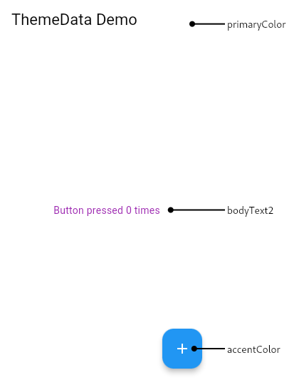
This sample creates a MaterialApp with a Theme whose ColorScheme is based on Colors.blue, but with the color scheme's ColorScheme.secondary color overridden to be green. The AppBar widget uses the color scheme's ColorScheme.primary as its default background color and the FloatingActionButton widget uses the color scheme's ColorScheme.secondary for its default background. By default, the Text widget uses TextTheme.bodyMedium, and the color of that TextStyle has been changed to purple.

MaterialApp(
  theme: ThemeData(
    colorScheme: ColorScheme.fromSwatch().copyWith(
      secondary: Colors.green,
    ),
    textTheme: const TextTheme(bodyMedium: TextStyle(color: Colors.purple)),
  ),
  home: Scaffold(
    appBar: AppBar(
      title: const Text('ThemeData Demo'),
    ),
    floatingActionButton: FloatingActionButton(
      child: const Icon(Icons.add),
      onPressed: () {},
    ),
    body: const Center(
      child: Text('Button pressed 0 times'),
    ),
  ),
)
{@end-tool}
See material.io/design/color/ for more discussion on how to pick the right colors.
Implementation
ThemeData get theme => _themeData;