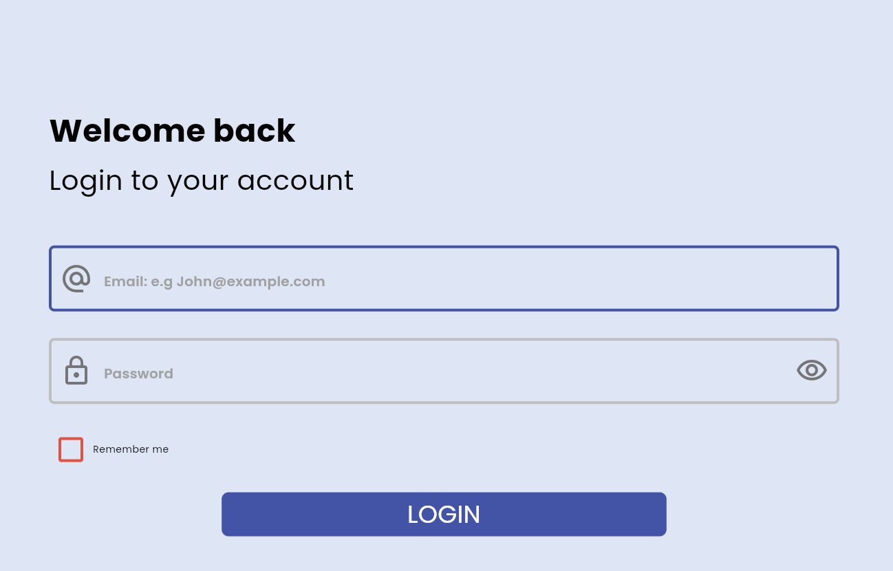
Features

This customizable input field is a modified form of Flutter text field.
- Customizable Borders: Support for both Underline and Outline border types.
- Icons: Easily add start and end icons.
- Validation: Built-in validation support.
- Autofill: Support for autofill hints.
- Custom Styling: Extensive options for text, cursor, and decoration styles.
- Editable & Clickable States: Fields can be set to editable or read-only modes.
- Input Formatting: Support for text input formatters.
- Responsive Layout: Uses sizer for responsive layouts.
Dependencies
Getting started
Add the dependency in pubspec.yaml:
dependencies:
  ...
  customized_input_field: ^0.0.1
Usage
import 'package:flutter/material.dart';
import 'package:customized_input_field/customized_input_field.dart';

void main() => runApp(const MyApp());

class MyApp extends StatelessWidget {
  const MyApp({super.key});

  @override
  Widget build(BuildContext context) {
    return MaterialApp(
      home: Scaffold(
        appBar: AppBar(title: const Text('Customized Input Field Example')),
        body: Padding(
          padding: const EdgeInsets.all(16.0),
          child: CustomizedInputField(
            heading: 'Username',
            hintText: 'Enter your username',
            controller: TextEditingController(),
            startIcon: const Icon(Icons.person),
            endIcon: const Icon(Icons.check),
            onEndIconClicked: () {
              print('End icon clicked');
            },
            borderType: BorderType.outline,
            inputFieldFillColor: Colors.grey[200],
            borderColor: Colors.blue,
            cursorColor: Colors.red,
          ),
        ),
      ),
    );
  }
}
Author
Additional information
Contributions of any kind are more than welcome! Feel free to fork and improve in any way you want, make a pull request, or open an issue.