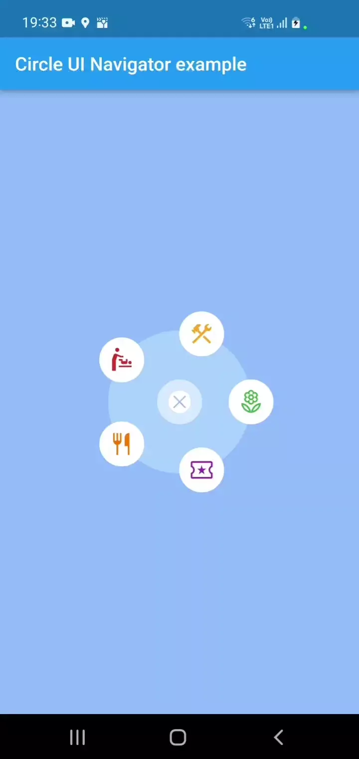
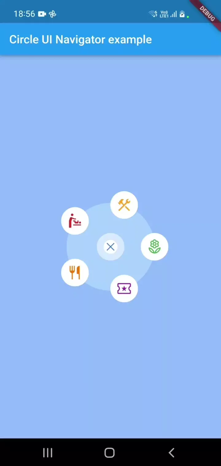
A Flutter package for showing a circular navigation widget in a gorgeous, animated way. Highly customizable.
An inspiration is a design by Johny Vino.
What does it look like?
| Open | Close |
|---|---|
 |
 |
Installation
- Run
flutter pub add circle_ui_navigator
This package requires Dart SDK version 2.19.0 or above to function properly.
Please note that only SVG assets are supported for icons, as they are a highly compatible cross-platform solution. While this should be sufficient for most projects, please be aware that other icon types are not currently supported.
Usage
To use the widget in your project, add the following import statement to the top of the file where you intend to use it:
import 'package:circle_ui_navigator/circle_ui_navigator.dart';
Then, use CircleNavigatorConfig in place of a widget.
You can customize all of the parameters shown below, and a few more.
// This code has to be inside a State of a StatefulWidget:
bool _isOpeningAnimation = true;
bool _isClosingAnimation = false;

@override
Widget build(BuildContext context) {
    return CircleNavigatorConfig(
        center: Point(200, 300), // of your choice and your responsibility to not draw a widget outside of the screen.
        animatedRippleColor: const Color(0xFF66A0FE).withOpacity(0.7),
        filledCircleColor: const Color(0xFFB4D8FF).withOpacity(0.7),
        isOpeningAnimation: _isOpeningAnimation,
        onOpenAnimationComplete: () {
            /**
              * You can add an optional reaction here if you like.
              */
            setState(() {
                _isOpeningAnimation = false;
            });
        },
        isClosingAnimation: _isClosingAnimation,
        onCloseAnimationComplete: () {
            /**
              * Add navigation call based on your navigation setup.
              */
            setState(() {
                _isClosingAnimation = false;
            });
        },
        iconSize: 48.0,
        actionIcons: [
            TappableIconData(
                assetPath: 'assets/images/local_florist.svg',
                color: Colors.green,
                tappedColor: Colors.grey,
                onTap: () {
                    /**
                      * Add navigation call based on your navigation setup.
                      */
                },
                outerBorderColor: Colors.white,
                outerBorderSize: 10,
                innerBorderColor: Colors.white,
            ),
            TappableIconData(
                assetPath: 'assets/images/local_activity.svg',
                color: Colors.purple,
                tappedColor: Colors.grey,
                onTap: () {
                    /**
                      * Add navigation call based on your navigation setup.
                      */
                },
                outerBorderColor: Colors.white,
                outerBorderSize: 10,
                innerBorderColor: Colors.white,
            ),
            TappableIconData(
                assetPath: 'assets/images/restaurant.svg',
                color: Colors.orange.shade700,
                tappedColor: Colors.grey,
                onTap: () {
                    /**
                      * Add navigation call based on your navigation setup.
                      */
                },
                outerBorderColor: Colors.white,
                outerBorderSize: 10,
                innerBorderColor: Colors.white,
            ),
            TappableIconData(
                assetPath: 'assets/images/baby_changing_station.svg',
                color: Colors.red.shade700,
                tappedColor: Colors.grey,
                onTap: () {
                    /**
                      * Add navigation call based on your navigation setup.
                      */
                },
                outerBorderColor: Colors.white,
                outerBorderSize: 10,
                innerBorderColor: Colors.white,
            ),
            TappableIconData(
                assetPath: 'assets/images/construction.svg',
                color: Colors.yellow.shade800,
                tappedColor: Colors.grey,
                onTap: () {
                    /**
                      * Add navigation call based on your navigation setup.
                      */
                },
                outerBorderColor: Colors.white,
                outerBorderSize: 10,
                innerBorderColor: Colors.white,
            ),
        ],
        closeIcon: TappableIconData(
            color: const Color(0xFF3678D0),
            assetPath: 'assets/images/close.svg',
            tappedColor: const Color(0xFF3678D0).withOpacity(0.5),
            onTap: () {
            setState(() {
                _isClosingAnimation = true;
            });
            },
            outerBorderColor: Colors.white54,
            outerBorderSize: 12,
            innerBorderColor: Colors.white,
        ),
        child: const CircleNavigator(),
    )
}
Refer to the example to learn how to place a widget in the center of the screen and explore the capabilities of CircleNavigatorConfig.
Additional information
If you find a package relevant or have learned something from it, please do not hesitate to contact me or like it :) Also, please raise any issues you have here on GitHub
I have found two issues that may impact your use of the package:
- If the animationDuration and backgroundAnimationDuration parameters represent different time values, the onCloseAnimationComplete function is called twice. Usually, the first call causes the app to leave the screen, which is fine.
- Some users may want to turn off animations entirely. If it applies to you, please let me know so that I can improve the package.
Dependencies
I tried to keep the project as minimalistic as possible. So its pubspec keeps only:
  equatable: ^2.0.5
  flutter_svg: ^2.0.2
