CircleCheckboxListTile class
A ListTile with a Checkbox. In other words, a checkbox with a label.
The entire list tile is interactive: tapping anywhere in the tile toggles the checkbox.
The value, onChanged, activeColor and checkColor properties of this widget are identical to the similarly-named properties on the Checkbox widget.
The title, subtitle, isThreeLine, dense, and contentPadding properties are like those of the same name on ListTile.
The selected property on this widget is similar to the ListTile.selected
property. This tile's activeColor is used for the selected item's text color, or
the theme's ThemeData.toggleableActiveColor if activeColor is null.
This widget does not coordinate the selected state and the value state; to have the list tile appear selected when the checkbox is checked, pass the same value to both.
The checkbox is shown on the right by default in left-to-right languages (i.e. the trailing edge). This can be changed using controlAffinity. The secondary widget is placed on the opposite side. This maps to the ListTile.leading and ListTile.trailing properties of ListTile.
To show the CircleCheckboxListTile as disabled, pass null as the onChanged callback.
{@tool dartpad --template=stateful_widget_scaffold_center}
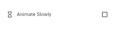
This widget shows a checkbox that, when checked, slows down all animations (including the animation of the checkbox itself getting checked!).
This sample requires that you also import 'package:flutter/scheduler.dart', so that you can reference timeDilation.
import 'package:flutter/scheduler.dart' show timeDilation;
@override
Widget build(BuildContext context) {
  return CheckboxListTile(
    title: const Text('Animate Slowly'),
    value: timeDilation != 1.0,
    onChanged: (bool? value) {
      setState(() { timeDilation = value! ? 10.0 : 1.0; });
    },
    secondary: const Icon(Icons.hourglass_empty),
  );
}
{@end-tool}
Semantics in CheckboxListTile
Since the entirety of the CheckboxListTile is interactive, it should represent itself as a single interactive entity.
To do so, a CheckboxListTile widget wraps its children with a MergeSemantics widget. MergeSemantics will attempt to merge its descendant Semantics nodes into one node in the semantics tree. Therefore, CheckboxListTile will throw an error if any of its children requires its own Semantics node.
For example, you cannot nest a RichText widget as a descendant of CheckboxListTile. RichText has an embedded gesture recognizer that requires its own Semantics node, which directly conflicts with CheckboxListTile's desire to merge all its descendants' semantic nodes into one. Therefore, it may be necessary to create a custom radio tile widget to accommodate similar use cases.
{@tool sample --template=stateful_widget_scaffold_center}
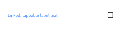
Here is an example of a custom labeled checkbox widget, called LinkedLabelCheckbox, that includes an interactive RichText widget that handles tap gestures.
import 'package:flutter/gestures.dart';
class LinkedLabelCheckbox extends StatelessWidget {
  const LinkedLabelCheckbox({
    Key? key,
    required this.label,
    required this.padding,
    required this.value,
    required this.onChanged,
  }) : super(key: key);

  final String label;
  final EdgeInsets padding;
  final bool value;
  final Function onChanged;

  @override
  Widget build(BuildContext context) {
    return Padding(
      padding: padding,
      child: Row(
        children: <Widget>[
          Expanded(
            child: RichText(
              text: TextSpan(
                text: label,
                style: const TextStyle(
                  color: Colors.blueAccent,
                  decoration: TextDecoration.underline,
                ),
                recognizer: TapGestureRecognizer()
                  ..onTap = () {
                  print('Label has been tapped.');
                },
              ),
            ),
          ),
          Checkbox(
            value: value,
            onChanged: (bool? newValue) {
              onChanged(newValue);
            },
          ),
        ],
      ),
    );
  }
}
bool _isSelected = false;

@override
Widget build(BuildContext context) {
  return LinkedLabelCheckbox(
    label: 'Linked, tappable label text',
    padding: const EdgeInsets.symmetric(horizontal: 20.0),
    value: _isSelected,
    onChanged: (bool newValue) {
      setState(() {
        _isSelected = newValue;
      });
    },
  );
}
{@end-tool}
CircleCheckboxListTile isn't exactly what I want
If the way CheckboxListTile pads and positions its elements isn't quite what you're looking for, you can create custom labeled checkbox widgets by combining Checkbox with other widgets, such as Text, Padding and InkWell.
{@tool dartpad --template=stateful_widget_scaffold_center}
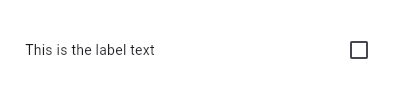
Here is an example of a custom LabeledCheckbox widget, but you can easily make your own configurable widget.
class LabeledCheckbox extends StatelessWidget {
  const LabeledCheckbox({
    Key? key,
    required this.label,
    required this.padding,
    required this.value,
    required this.onChanged,
  }) : super(key: key);

  final String label;
  final EdgeInsets padding;
  final bool value;
  final Function onChanged;

  @override
  Widget build(BuildContext context) {
    return InkWell(
      onTap: () {
        onChanged(!value);
      },
      child: Padding(
        padding: padding,
        child: Row(
          children: <Widget>[
            Expanded(child: Text(label)),
            Checkbox(
              value: value,
              onChanged: (bool? newValue) {
                onChanged(newValue);
              },
            ),
          ],
        ),
      ),
    );
  }
}
bool _isSelected = false;

@override
Widget build(BuildContext context) {
  return LabeledCheckbox(
    label: 'This is the label text',
    padding: const EdgeInsets.symmetric(horizontal: 20.0),
    value: _isSelected,
    onChanged: (bool newValue) {
      setState(() {
        _isSelected = newValue;
      });
    },
  );
}
{@end-tool}
See also:
- ListTileTheme, which can be used to affect the style of list tiles, including checkbox list tiles.
- RadioListTile, a similar widget for radio buttons.
- SwitchListTile, a similar widget for switches.
- ListTile and Checkbox, the widgets from which this widget is made.
- Inheritance
-
- Object
- DiagnosticableTree
- Widget
- StatelessWidget
- CircleCheckboxListTile
Constructors
-
CircleCheckboxListTile.new({Key? key, required bool? value, required ValueChanged<
bool?> ? onChanged, Color? activeColor, Color? checkColor, Color? tileColor, Widget? title, Widget? subtitle, bool isThreeLine = false, bool? dense, Widget? secondary, bool selected = false, ListTileControlAffinity controlAffinity = ListTileControlAffinity.platform, bool autofocus = false, EdgeInsetsGeometry? contentPadding, bool tristate = false, ShapeBorder? shape, Color? selectedTileColor}) -
Creates a combination of a list tile and a checkbox.
const
Properties
- activeColor → Color?
-
The color to use when this checkbox is checked.
final
- autofocus → bool
-
True if this widget will be selected as the initial focus when no other
node in its scope is currently focused.
final
- checkColor → Color?
-
The color to use for the check icon when this checkbox is checked.
final
- contentPadding → EdgeInsetsGeometry?
-
Defines insets surrounding the tile's contents.
final
- controlAffinity → ListTileControlAffinity
-
Where to place the control relative to the text.
final
- dense → bool?
-
Whether this list tile is part of a vertically dense list.
final
- hashCode → int
-
The hash code for this object.
no setterinherited
- isThreeLine → bool
-
Whether this list tile is intended to display three lines of text.
final
- key → Key?
-
Controls how one widget replaces another widget in the tree.
finalinherited
-
onChanged
→ ValueChanged<
bool?> ? -
Called when the value of the checkbox should change.
final
- runtimeType → Type
-
A representation of the runtime type of the object.
no setterinherited
- secondary → Widget?
-
A widget to display on the opposite side of the tile from the checkbox.
final
- selected → bool
-
Whether to render icons and text in the activeColor.
final
- selectedTileColor → Color?
-
If non-null, defines the background color when CircleCheckboxListTile.selected is true.
final
- shape → ShapeBorder?
-
final
- subtitle → Widget?
-
Additional content displayed below the title.
final
- tileColor → Color?
-
Defines the background color of
ListTilewhen selected is false.final - title → Widget?
-
The primary content of the list tile.
final
- tristate → bool
-
If true the checkbox's value can be true, false, or null.
final
- value → bool?
-
Whether this checkbox is checked.
final
Methods
-
build(
BuildContext context) → Widget -
Describes the part of the user interface represented by this widget.
override
-
createElement(
) → StatelessElement -
Creates a StatelessElement to manage this widget's location in the tree.
inherited
-
debugDescribeChildren(
) → List< DiagnosticsNode> -
Returns a list of DiagnosticsNode objects describing this node's
children.
inherited
-
debugFillProperties(
DiagnosticPropertiesBuilder properties) → void -
Add additional properties associated with the node.
inherited
-
noSuchMethod(
Invocation invocation) → dynamic -
Invoked when a nonexistent method or property is accessed.
inherited
-
toDiagnosticsNode(
{String? name, DiagnosticsTreeStyle? style}) → DiagnosticsNode -
Returns a debug representation of the object that is used by debugging
tools and by DiagnosticsNode.toStringDeep.
inherited
-
toString(
{DiagnosticLevel minLevel = DiagnosticLevel.info}) → String -
A string representation of this object.
inherited
-
toStringDeep(
{String prefixLineOne = '', String? prefixOtherLines, DiagnosticLevel minLevel = DiagnosticLevel.debug, int wrapWidth = 65}) → String -
Returns a string representation of this node and its descendants.
inherited
-
toStringShallow(
{String joiner = ', ', DiagnosticLevel minLevel = DiagnosticLevel.debug}) → String -
Returns a one-line detailed description of the object.
inherited
-
toStringShort(
) → String -
A short, textual description of this widget.
inherited
Operators
-
operator ==(
Object other) → bool -
The equality operator.
inherited