CaravaggioUI
A comprehensive UI package designed to streamline your Flutter app development process. Built with flexibility and customization in mind, CaravaggioUI offers a wide range of beautifully crafted UI components to help you create stunning user interfaces with ease.
Getting started
Within your main.dart file, initiate CarvaggioUI to harness its capabilities. This initialization step is essential for accessing CarvaggioUI's rich set of features seamlessly.
void main() {
  CaravaggioUI.initialize(
    primaryColor: const Color(0xFF662D8C),
    primaryColorLight: const Color(0xFFB58AD6), // optional
    primaryColorDark: const Color(0xFF3F145A),  // optional
    secondaryColor: const Color(0xFFED1E79),
    secondaryColorLight: const Color(0xFFFF7BB5), // optional
    secondaryColorDark: const Color(0xFFB3004C),  // optional
  );

  runApp(const MainApp());
}
After initialization, ensure that you set the theme parameter of MaterialApp with the themeData provided by CarvaggioUI. This step guarantees consistent visual styling across your entire application.
class  MainApp  extends  StatelessWidget {

    const  MainApp({Key? key}) : super(key: key);

    @override
    Widget  build(BuildContext context) {
        return  MaterialApp(
            title: 'Caravaggio UI',
            theme: CaravaggioUI.instance.themeData,
            home: const  HomeScreen(),
        );
    }
}
Usage
Upon initialization, by simply invoking
CaravaggioUI.instance
you'll ulock the core theme data of your application and a default color Palette, including primaryLight, primaryDark, secondaryLight, and secondaryDark. These predefined colors offer a quick and intuitive way to maintain visual consistency across your app, catering to various design needs.
Colors
ThemeData themeData => CaravaggioUI.instance.themeData;

MaterialColor primary = CarvaggioUI.instance.primary;
MaterialColor secondary = CarvaggioUI.instance.secondary;

Color primaryColor = CarvaggioUI.instance.primaryColor;
Color secondaryColor = CarvaggioUI.instance.secondaryColor;

Color primaryColorLight = CarvaggioUI.instance.primaryColorLight;
Color secondaryColorLight = CarvaggioUI.instance.secondaryColorLight;

Color primaryColorDark = CarvaggioUI.instance.;
Color secondaryColorDark = CarvaggioUI.instance.secondaryColorDark;
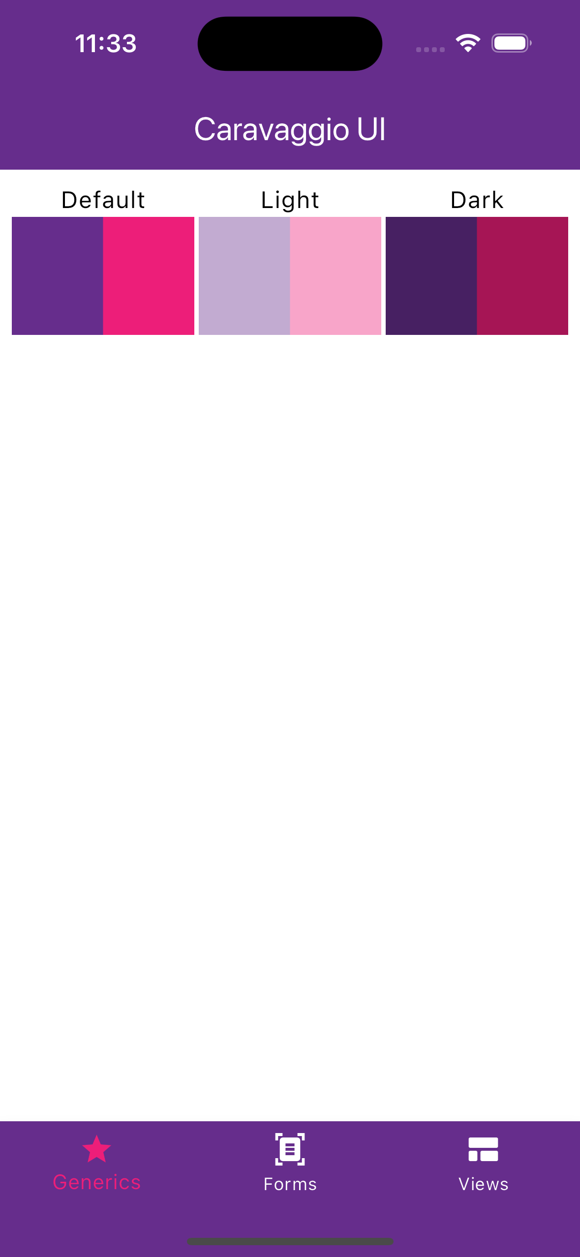
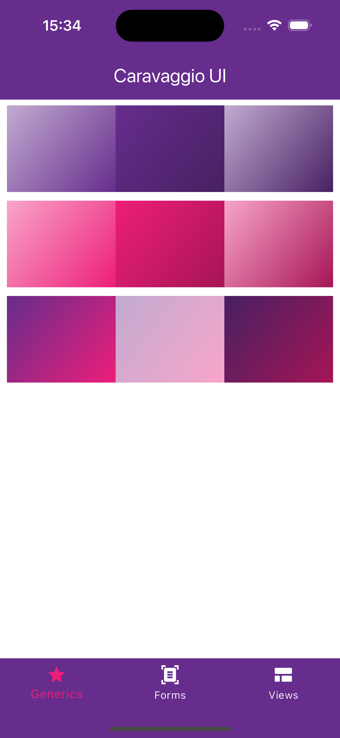
Generics
For graphic uniformity, Caravaggio UI introduces CText and CGradients. These are two classes that aim to provide easy, intuitive, and easily memorable methods so they can be readily used at any point during app development.
CText
CText is an extension of Text widget that adds a series of factory constructors and getter methods to include dimensions, colors, and styles.
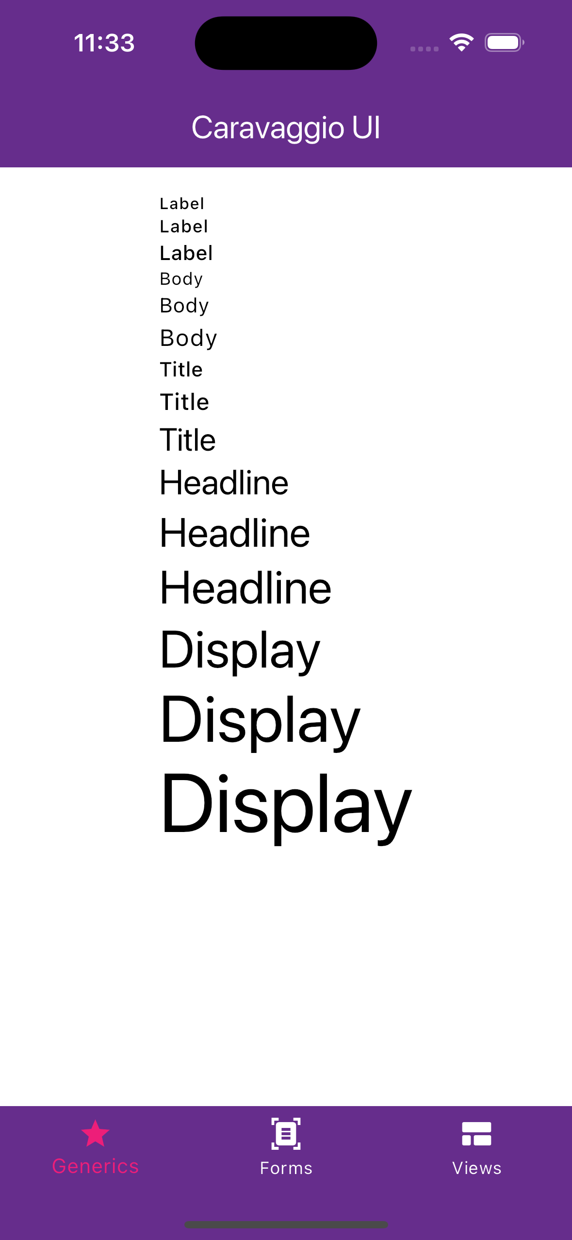
CText.label("Label", size: TextSize.small),
CText.label("Label", size: TextSize.medium),
CText.label("Label", size: TextSize.large),
CText.body("Body", size: TextSize.small),
CText.body("Body", size: TextSize.medium),
CText.body("Body", size: TextSize.large),
CText.title("Title", size: TextSize.small),
CText.title("Title", size: TextSize.medium),
CText.title("Title", size: TextSize.large),
CText.headline("Headline", size: TextSize.small),
CText.headline("Headline", size: TextSize.medium),
CText.headline("Headline", size: TextSize.large),
CText.display("Display", size: TextSize.small),
CText.display("Display", size: TextSize.medium),
CText.display("Display", size: TextSize.large),
Overrides such as italic, bold, withColor(), etc. are applied after merging, so they always retain the theme values.
Chaining (e.g., CText("hello").italic.bold.size(18)) respects the order: the last override takes precedence over previous properties.
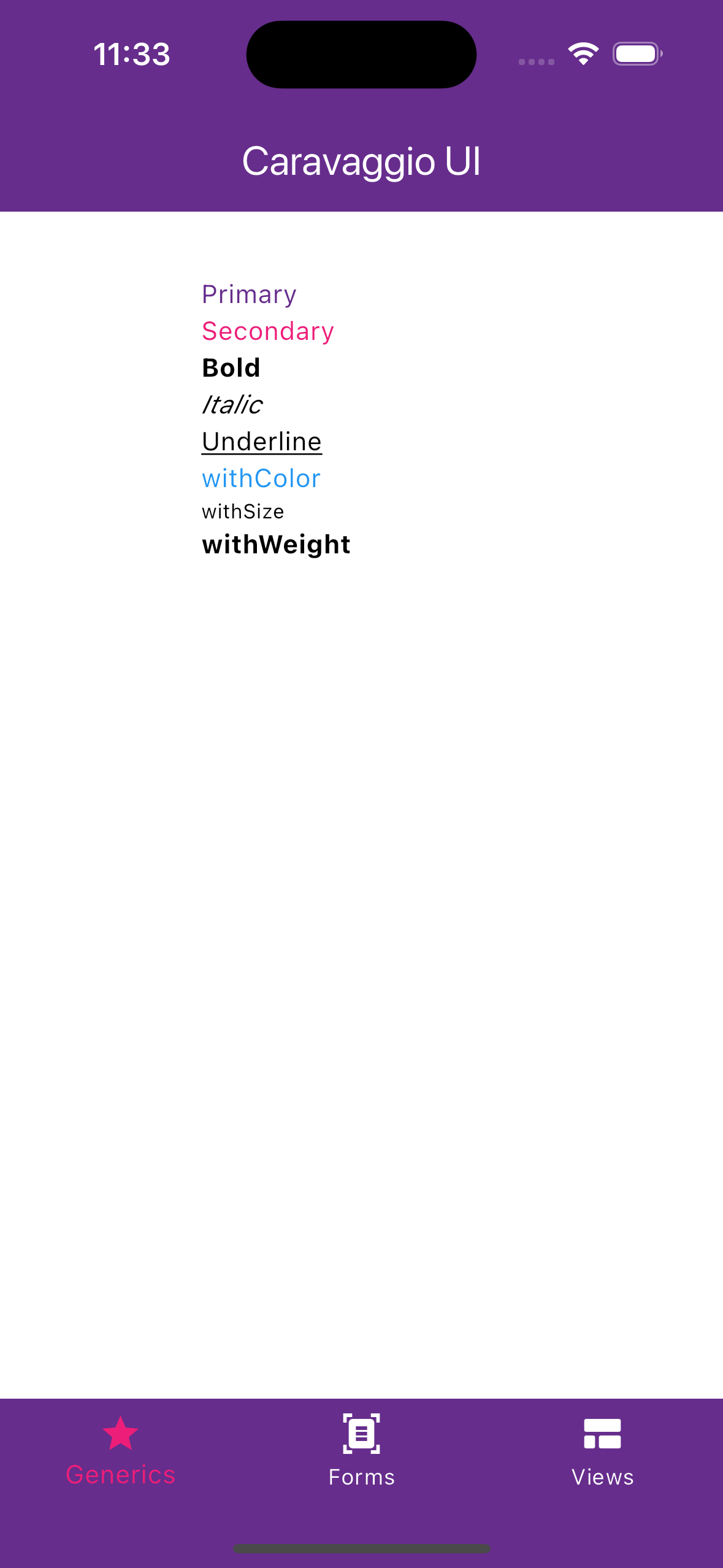
CText.body("Primary", size: TextSize.medium).primary,
CText.body("Secondary", size: TextSize.medium).secondary,
CText.body("Bold", size: TextSize.medium).bold,
CText.body("Italic", size: TextSize.medium).italic,
CText.body("Underline", size: TextSize.medium).underline,
CText.body("withColor", size: TextSize.medium).withColor(Colors.blue),
CText.body("withSize", size: TextSize.medium).withSize(11),
CText.body("withWeight", size: TextSize.medium).withWeight(FontWeight.bold),
CGradients
With the CGradient class you can quickly get gradients that match your app's theme
final LinearGradient gradient = CGradient.primaryLight;
final LinearGradient gradient = CGradient.primaryDark;
final LinearGradient gradient = CGradient.primaryHighContrast;

final LinearGradient gradient = CGradient.secondaryLight;
final LinearGradient gradient = CGradient.secondaryDark;
final LinearGradient gradient = CGradient.secondaryHighContrast;

final LinearGradient gradient = CGradient.primaryToSecondary;
final LinearGradient gradient = CGradient.primaryLightToSecondaryLign;
final LinearGradient gradient = CGradient.primaryDarkToSecondaryDark;
You can also add some customization with static getter
CGradient.primaryToSecondary.reverse,
CGradient.primaryToSecondary.opacity(0.5),
Or create a custom gradient using user friendly enums ready to use.
CGradient.custom(
colors: CGradientColorType.primaryLightToSecondaryDark,
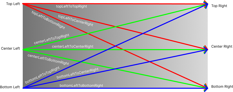
direction: CGradientDirection.centerLeftToTopRight,
opacity: 1,
),
CGradientDirection is an enum that exposes all possible gradient directions. Similarly, it considers left to right by default, as the reverse method is available
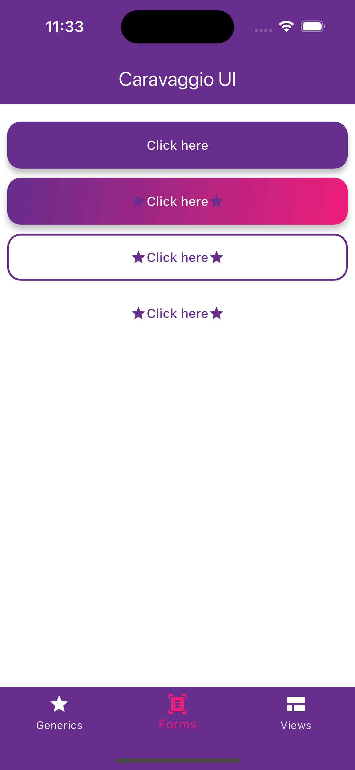
Form
CButtons
The CButton class enables easy and fast creation of buttons according to the CaravaggioUI style. It features three types of buttons, each with its corresponding small version.
-
Elevated
elevated -
Outlined
outlined -
Text
text
final CButton button = CButton.elevated({
    child: Text('Press me'),
    icon: Icon(Icons.star),
    suffixIcon: Icon(Icons.star),
    gradient: CGradients.primaryToSecodnary,
})
You can also create a sized button with size getter :
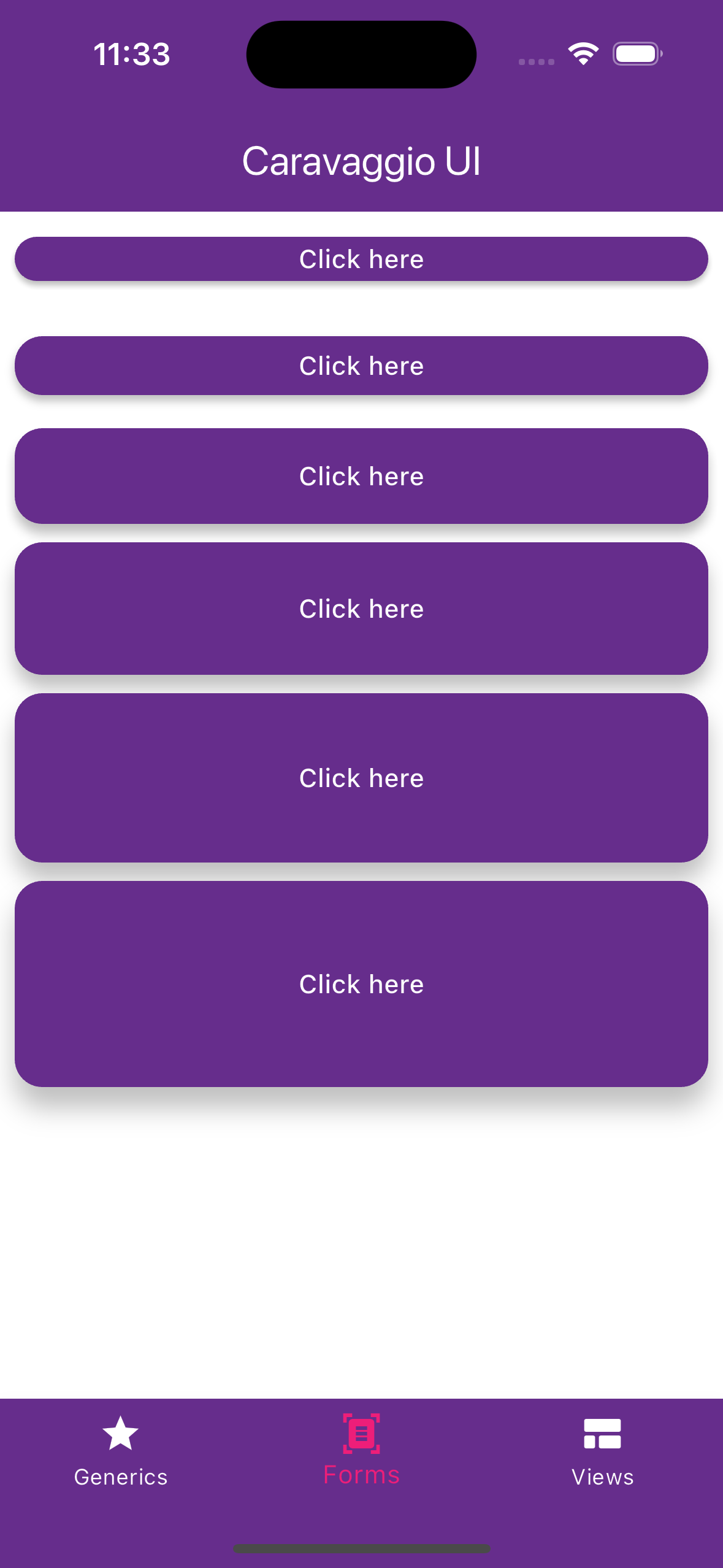
button.xSmall
button.small
button.medium
button.large
button.xLarge
button.xxLarge
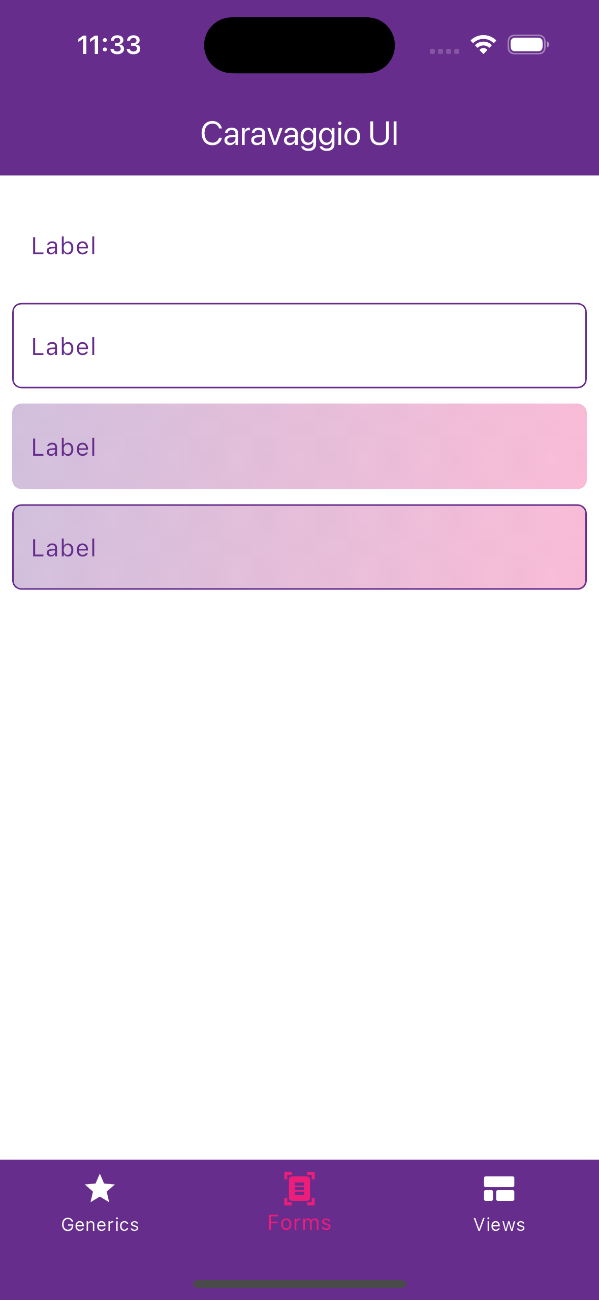
CTextField, CAutocomplete, CDropdown
The available input fields in Caravaggio are CTextField, CAutocomplete and CDropdown. All three can be in the following forms:
-
simple
-
bordered
-
filled
-
borderedFilled
and each of them can have different radius size:
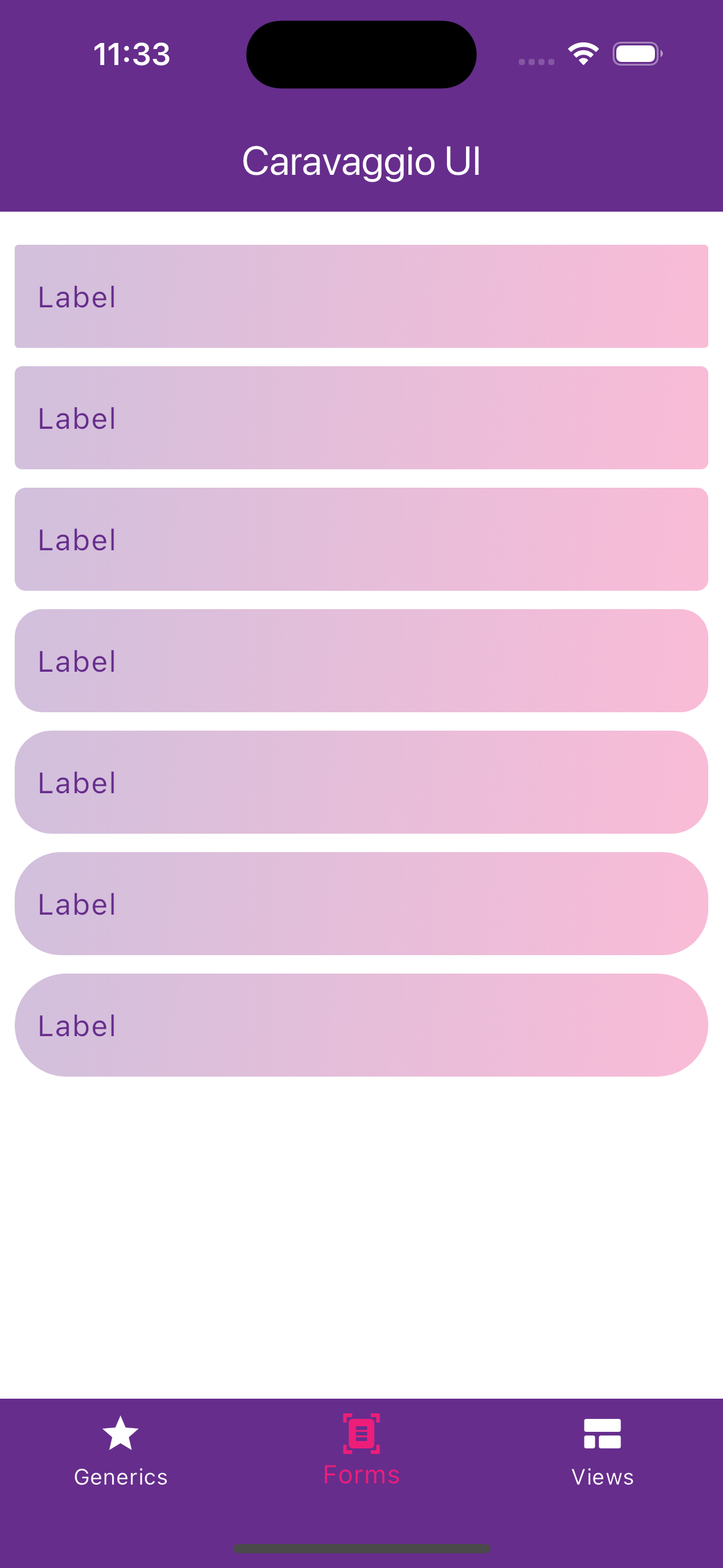
CTextField.simple(),
CTextField.bordered(),
CTextField.filled(),
CTextField.borderedFilled(),


CTextField.filled(decoration: const CFieldDecoration(radius: AppRadius.xxs)),
CTextField.filled(decoration: const CFieldDecoration(radius: AppRadius.xs)),
CTextField.filled(decoration: const CFieldDecoration(radius: AppRadius.s)),
CTextField.filled(decoration: const CFieldDecoration(radius: AppRadius.m)),
CTextField.filled(decoration: const CFieldDecoration(radius: AppRadius.l)),
CTextField.filled(decoration: const CFieldDecoration(radius: AppRadius.xl)),
CTextField.filled(decoration: const CFieldDecoration(radius: AppRadius.xxl)),
CTextField, CAutocomplete and CDropdown looks like:
CTextField
CTextField.simple(
    decoration: CFieldDecoration(
        labelText: "Label",
        hintText: "Write something here",
        prefixIcon: Icon(Icons.star),
        suffixIcon: Icon(Icons.star),
    ),
    onChanged: (_) => //...do stuff,
),
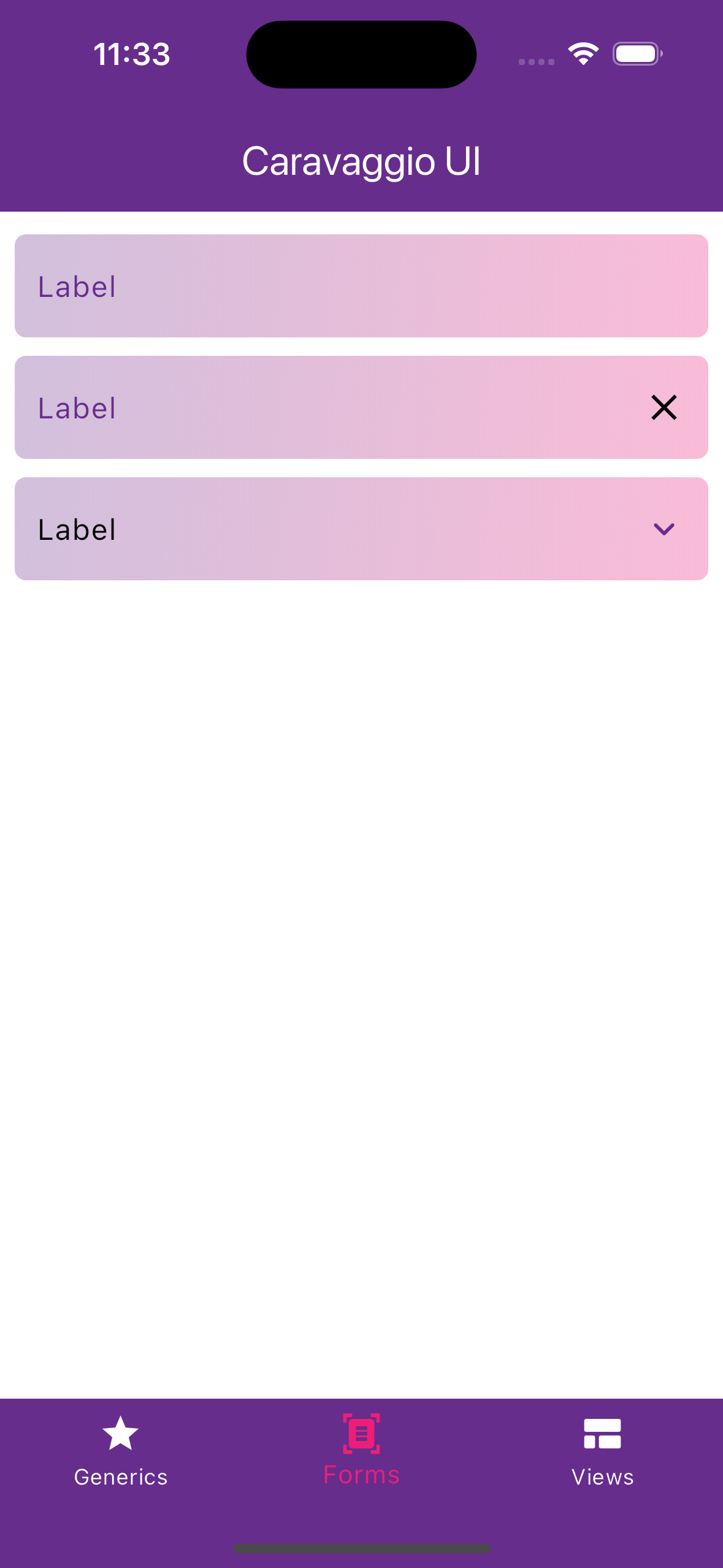
CAutocomplete
CAutocomplete<String>.simple(
    options: ["Option 1", "Option 2", "Option 3"],
    decoration: CFieldDecoration(
        labelText: "Label",
        hintText: "Write something here",
        prefixIcon: Icon(Icons.star),
    ),
    optionsValueToMatch: (value) => value.toLowerCase(),
    displayStringForOption: (value) => value,
    searchItems: () => //...do stuff
),
CDropdown
CDropdown<String>.simple(
    items: [
        CDropdownItemModel<String>(value: "item1", text: "Item 1"),
        CDropdownItemModel<String>(value: "item2", text: "Item 2"),
        CDropdownItemModel<String>(value: "item3", text: "Item 3"),
    ],
    decoration: CFieldDecoration(
        labelText: "Label",
        hintText: "Write something here",
        prefixIcon: Icon(Icons.star),
    ),
    onChanged: (_) => //...do stuff
),
CDatePicker and CTimePicker
Caravaggio UI also provides ready-to-use date and time pickers with support for single or multiple selection.
CDatePicker(
  mode: CustomDatePickerMode.single,
  onChanged: (dates) {
    // Handle selected dates
  },
);

CTimePicker(
  mode: CustomTimePickerMode.single,
  onChanged: (times) {
    // Handle selected times
  },
);
CTable, CCircularIndicator, CCircularProgressIndicator and CLoader
For data representation the library adds graphical elements such as tables, circular indicators, progress indicators and animated loaders.
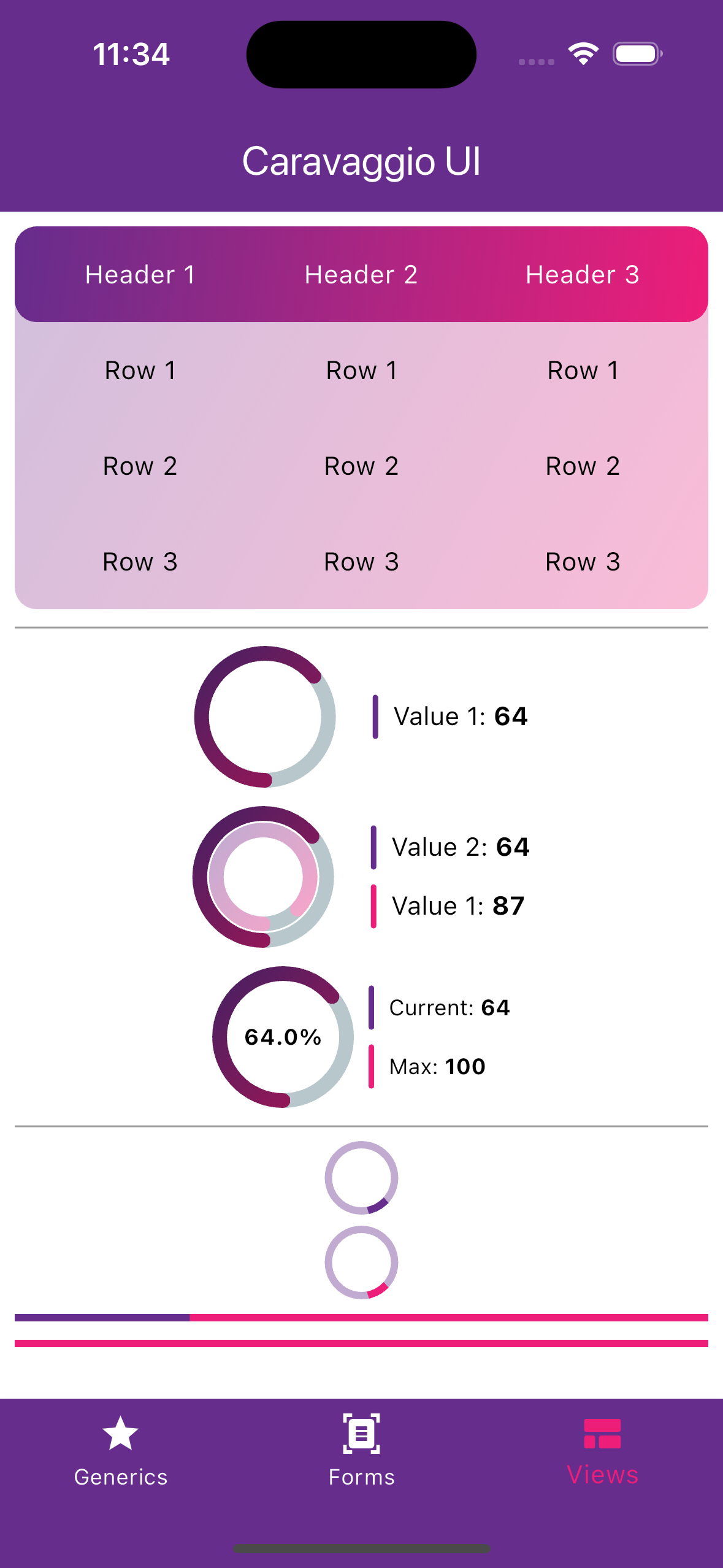
CTable
final List<String> _headerTexts = ["Header 1", "Header 2", "Header 3"];
final List<List<String>> _rowsTexts = [
  ["Row 1", "Row 1", "Row 1"],
  ["Row 2", "Row 2", "Row 2"],
  ["Row 3", "Row 3", "Row 3"],
];

final header = CTableHeader(titles: _headerTexts.map((title) => CTableCell(text: title)).toList());

final rows = _rowsTexts.map((row) => CTableRow(values: row.map((cell) => CTableCell(text: cell)).toList())).toList();

return CTable(
    header: header,
    rows: rows,
);
CCircularIndicator
CCircularIndicator.single(value: CircularValue(currentValue: 64, maxValue: 100), label: "Value 1"),

CCircularIndicator.double(
    externalValue: CircularValue(currentValue: 64, maxValue: 100),
    internalValue: CircularValue(currentValue: 87, maxValue: 100),
    internalLabel: "Value 1",
    externalLabel: "Value 2",
),

CCircularIndicator.percent(
    value: CircularValue(currentValue: 64, maxValue: 100),
    currentLabel: "Current",
    maxLabel: "Max",
    isDense: true,
),
CCircularProgressIndicator
// Circular
CCircularProgressIndicator.primary(),

CCircularProgressIndicator.secondary(),

// Linear
CLinearProgressIndicator.primary(),

CLinearProgressIndicator.secondary(),
CLoader
Animated loaders with three factory constructors. Optional color (defaults to primary) and numberOfDots (default 3; for bouncing and pulsing, max 5).
CLoader.bouncing(),
CLoader.orbit(),
CLoader.pulsing(),

// Customized
CLoader.bouncing(color: CColors.secondaryColor, numberOfDots: 5),
CLoader.orbit(color: CColors.primaryColorLight, numberOfDots: 6),
CLoader.pulsing(numberOfDots: 4),
Others
CCheckbox
CCheckbox(controller: CCheckboxController(), label: "Checkbox");
CRadioGroup
final  List<CRadioItem<String>> items = [
    CRadioItem<String>(value: "option1", label: "Option 1"),
    CRadioItem<String>(value: "option2", label: "Option 2"),
    CRadioItem<String>(value: "option3", label: "Option 3"),
];

final  CRadioController<String> controller = CRadioController<String>(initialValue: "option1");

CRadioGroup<String>(
    values: items,
    controller: controller,
    orientation: CRadioGroupOrientation.vertical,
    crossAxisAlignment: CRadioCrossAxisAlignment.start,
),