Bottom Picker

Bring beautiful bottom pickers to all your Flutter apps! Version 4.0.0 offer full customization alongside more advanced features for cupertino picker.
 |
 |
|---|---|
 |
 |
 |
 |
Features
Core Picker Types
- Simple list picker wheel
- Date picker
- Dedicated Year picker
- Month and year picker
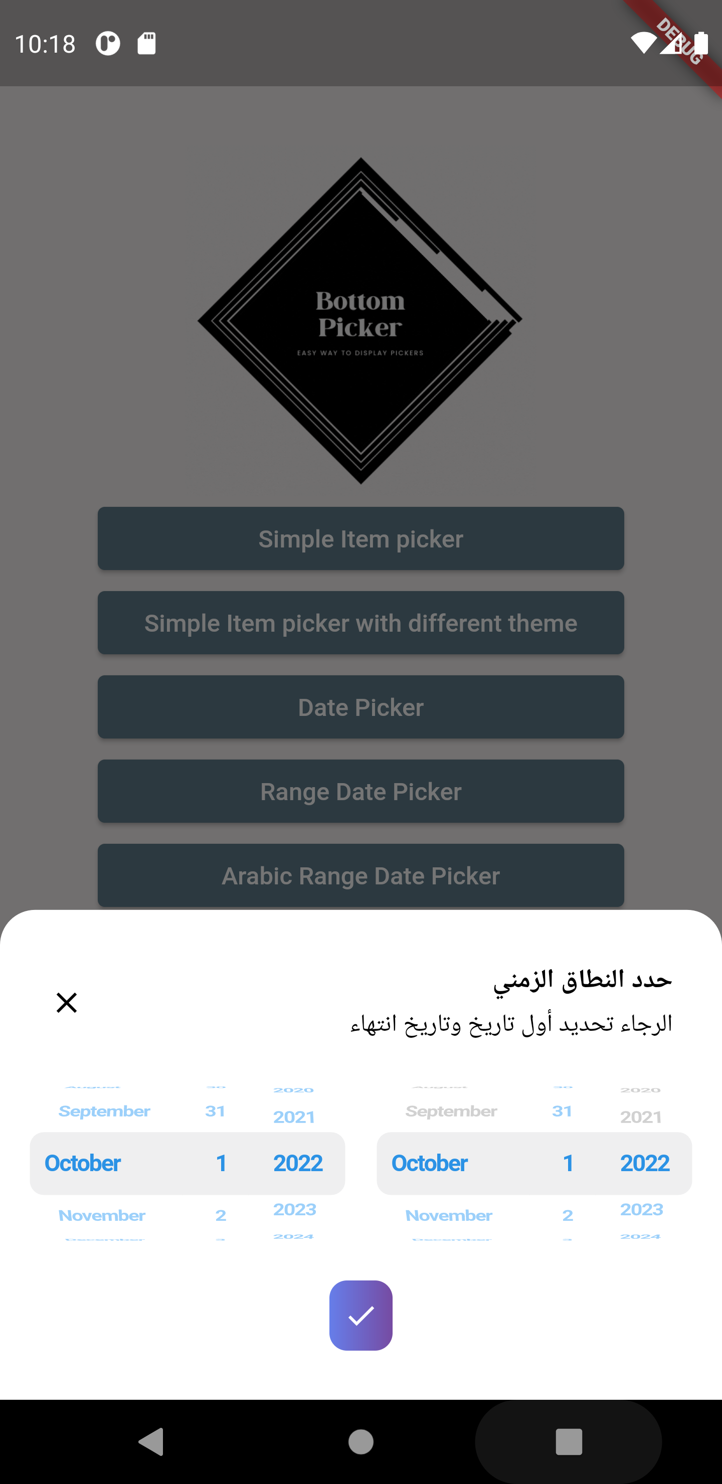
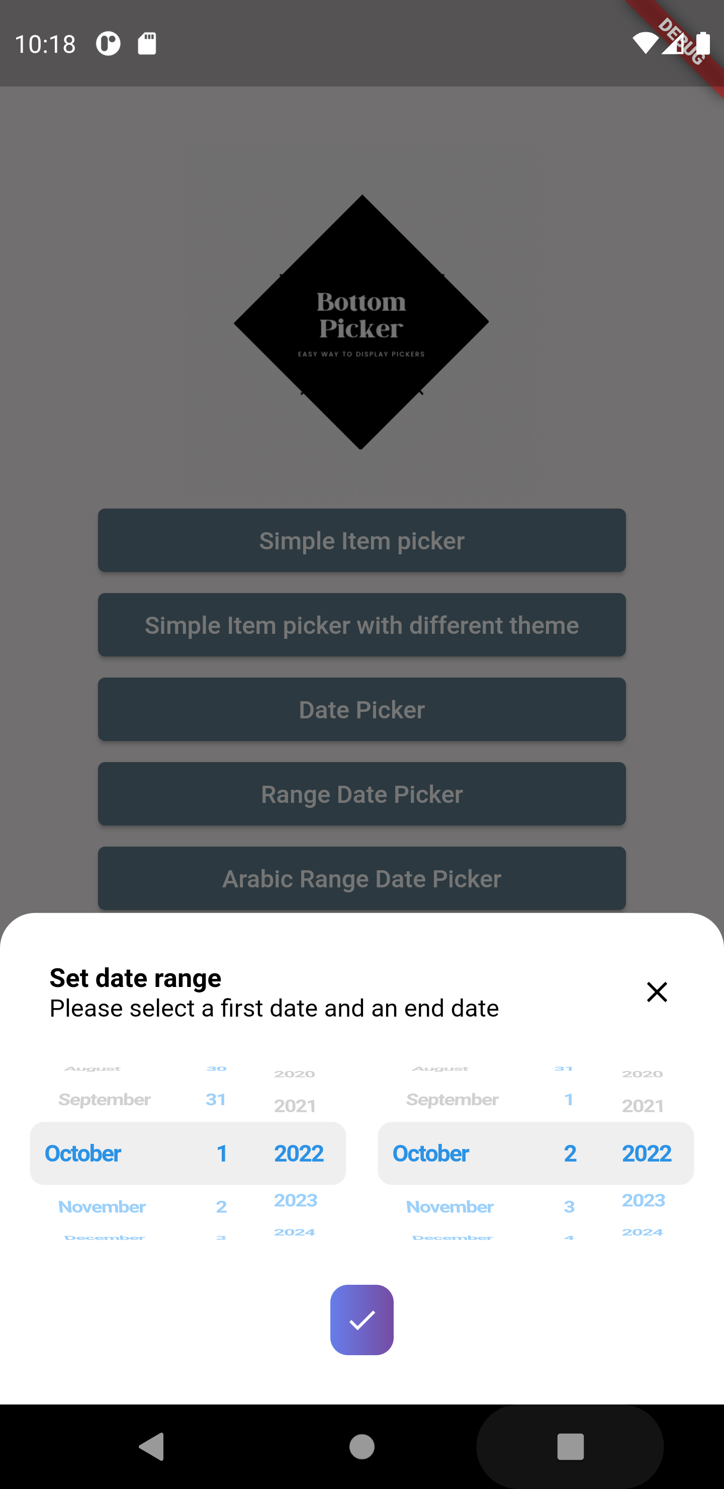
- Date range picker (RTL and LTR)
- Time picker
- Duration Timer picker
- Date and Time picker
Customization & Behavior
- 24h / 12h time format support
- Filter options for unpickable or blocked dates
- Customizable header/title via an optional builder callback
- Control auto-closing of the picker on submit
- Customize confirm button
- Customize first selected item
- Customize background color
- Customize date format order
- Customize picker text style (color, font size, font weight, etc.)
- Customize close button style and display
- Customize layout orientation (LTR / RTL)
- Customizable bottom picker height
- Customizable
minuteIntervalattribute
Platform Support & Theming
- Fully support Web and Desktop platforms (using wheel views)
- Built-in themes
- Enhanced tablet view
Getting Started
To add bottom picker to your project add this line to your pubspec.yaml file
dependencies:
 bottom_picker: ^4.1.0
Parameters
  /// Renders the header component of the bottom picker
  final Widget Function(BuildContext context)? headerBuilder;

  ///defines whether the bottom picker is dismissable or not
  ///by default it's set to false
  ///
  final bool dismissable;

  ///list of items (List of widgets) used to create simple item picker (required)
  ///and should not be empty or null
  ///
  ///for date/dateTime/time items parameter is not available
  ///
  late List<Widget>? items;

  ///Nullable function, invoked when navigating between picker items
  ///whether it's date picker or simple item picker it will return a value DateTime or int(index)
  ///
  late Function(dynamic)? onChange;

  ///Nullable function invoked  when clicking on submit button
  ///if the picker  type is date/time/dateTime it will return DateTime value
  ///else it will return the index of the selected item
  ///
  late Function(dynamic)? onSubmit;

  /// Nullable function invoked when the picker get dismissed
  /// it will return the selected value
  late Function(dynamic)? onDismiss;

  ///set the theme of the bottom picker (the button theme)
  ///possible values
  ///```
  ///{
  ///blue,
  ///orange,
  ///temptingAzure,
  ///heavyRain,
  ///plumPlate,
  ///morningSalad
  ///}
  ///```
  final BottomPickerTheme bottomPickerTheme;

  ///used for simple bottom picker
  ///by default it's 0, needs to be in the range [0, this.items.length-1]
  ///otherwise an exception will be thrown
  ///for date and time picker type this parameter is not available
  ///
  late int selectedItemIndex;

  ///The initial date time applied on the date and time picker
  ///by default it's null
  ///
  DateTime? initialDateTime;

  ///The initial time set in the time picker widget
  ///required only when using the `time` constructor
  Time? initialTime;

  /// The initial duration set for the timer picker
  /// By default it's set to null so it's `Duration.zero`
  Duration? initialTimerDuration;

  /// The time picker mode "hm", "hms" or "ms"
  /// By default it's set to "hm"
  CupertinoTimerPickerMode? timerPickerMode;

  /// The timer seconds interval
  /// Cannot be less then 1
  ///
  /// Default value is 1.
  int timerSecondsInterval = 1;

  ///The max time can be set in the time picker widget
  Time? maxTime;

  ///The min time can be set in the time picker widget
  Time? minTime;

  ///The gap between two minutes
  ///by default it's 1 minute
  int minuteInterval = 1;

  ///the max date time on the date picker
  ///by default it's null
  DateTime? maxDateTime;

  ///the minimum date & time applied on the date picker
  ///by default it's null
  ///
  DateTime? minDateTime;

  ///define whether the time uses 24h or 12h format
  ///by default it's false (12h format)
  ///
  late bool use24hFormat;

  ///the padding that will be applied to the button
  ///if the padding is null the button will be rendered null
  final double? buttonPadding;

  ///the width that will be applied to the button
  ///if the buttonWidth is null the button will be rendered with null
  final double? buttonWidth;

  ///the bottom picker background color,
  ///by default it's white
  ///
  final Color backgroundColor;

  ///date order applied on date picker or date time picker
  ///by default it's YYYY/MM/DD
  DatePickerDateOrder? dateOrder;

  /// The picker theme data
  final CupertinoTextThemeData? pickerThemeData;

  ///define the picker item extent available only for list items picker
  ///by default it's 35
  late double itemExtent;

  ///the layout orientation of the bottom picker
  ///by default the orientation is set to LTR
  ///```
  ///LAYOUT_ORIENTATION.ltr,
  ///LAYOUT_ORIENTATION.rtl
  ///```
  TextDirection? layoutOrientation;

  ///THe alignment of the bottom picker button
  ///by default it's `MainAxisAlignment.center`
  final MainAxisAlignment buttonAlignment;

  ///bottom picker main widget height
  ///if it's null the bottom picker will get the height from
  ///[bottomPickerHeight] extension on context
  final double? height;

  ///invoked when pressing on the submit button when using range picker
  ///it return two dates (first date, end date)
  ///required when using [BottomPicker.range]
  late Function(DateTime, DateTime)? onRangeDateSubmitPressed;

  ///the minimum first date in the date range picker
  ///not required if null no minimum will be set in the date picker
  DateTime? minFirstDate;

  ///the minimum second date in the date range picker
  ///not required if null no minimum will be set in the date picker
  DateTime? minSecondDate;

  ///the maximum first date in the date range picker
  ///not required if null no minimum will be set in the date picker
  DateTime? maxFirstDate;

  ///the maximum second date in the date range picker
  ///not required if null no minimum will be set in the date picker
  DateTime? maxSecondDate;

  ///the initial first date in the date range picker
  ///not required if null no minimum will be set in the date picker
  DateTime? initialFirstDate;

  ///the initial last date in the date range picker
  ///not required if null no minimum will be set in the date picker
  DateTime? initialSecondDate;

  /// A widget overlaid on the picker to highlight the currently selected entry.
  /// The [selectionOverlay] widget drawn above the [CupertinoPicker]'s picker
  /// wheel.
  Widget? selectionOverlay;

  ///The button's widget that will be displayed
  ///if null the button will have a simple 'Select' text in the center
  final Widget? buttonContent;

  ///indicates if the submit button will be displayed or not
  ///by default the submit button is shown
  late bool displaySubmitButton;

  ///a single color will be applied to the button instead of the gradient
  ///themes
  ///
  final Color? buttonSingleColor;

  ///to set a custom button theme color use this list
  ///when it's not null it will be applied
  ///
  final List<Color>? gradientColors;

  /// The style that will be applied on the button's widget
  final BoxDecoration? buttonStyle;

  /// Invoked when pressing on the submit button when using range picker
  /// it return two dates (first time, end time)
  /// required when using [BottomPicker.rangeTime]
  late Function(DateTime, DateTime)? onRangeTimeSubmitPressed;

  /// Function invoked when the picker is dismissed used with range picker
  /// and time range picker.
  late Function(DateTime, DateTime)? onRangePickerDismissed;

  ///the minimum first time in the time range picker
  ///not required if null no minimum will be set in the time picker
  DateTime? minFirstTime;

  ///the minimum second time in the time range picker
  ///not required if null no minimum will be set in the time picker
  DateTime? minSecondTime;

  ///the maximum first time in the time range picker
  ///not required if null no minimum will be set in the time picker
  DateTime? maxFirstTime;

  ///the maximum second time in the time range picker
  ///not required if null no minimum will be set in the time picker
  DateTime? maxSecondTime;

  ///the initial first time in the time range picker
  ///not required if null no minimum will be set in the time picker
  DateTime? initialFirstTime;

  ///the initial last time in the time range picker
  ///not required if null no minimum will be set in the time picker
  DateTime? initialSecondTime;

  /// Indicates whether the time seperator (":") will be shown or not.
  bool showTimeSeparator = false;

  /// Indiacate whether the bottom picker will be closed (poped out of the Navigator)
  /// when the submit button is pressed.
  ///
  /// By default closeOnSubmit = true.
  bool? closeOnSubmit;

  /// The datepicker calendar type
  List<int> calendarDays = CupertinoDatePickerWidget.fullWeek;

  /// The bottom picker selector diameter ratio.
  final double diameterRatio;

  /// A predicate that can be used to select which hours are selectable.
  SelectableHourPredicate? hourPredicate;

  /// Indicates whether to use SafeArea to avoid content overflow.
  final bool useSafeArea;
Examples
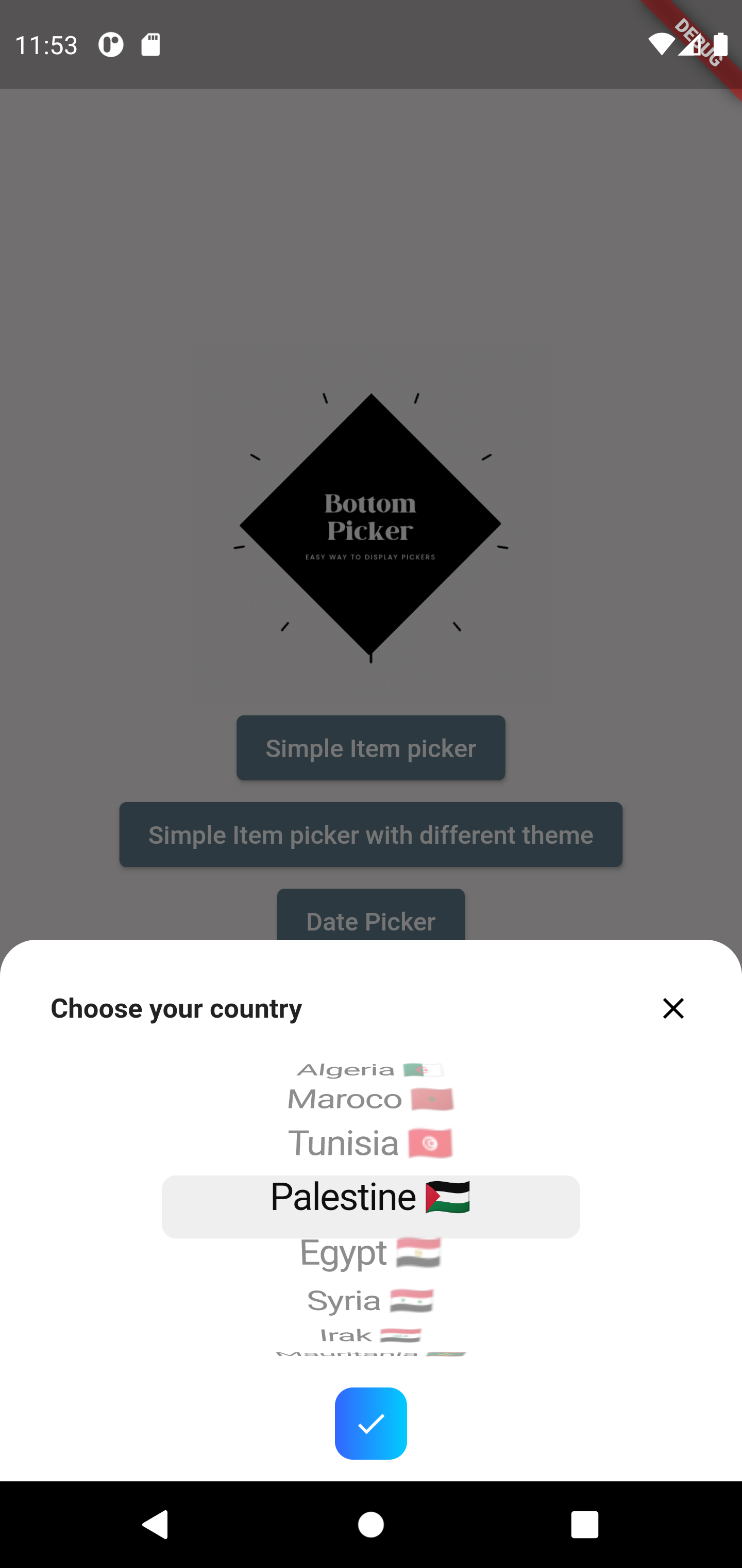
Simple item picker
BottomPicker(
  items: items,
  headerBuilder: (context) {
    return Row(
      children: [
        Expanded(
          child: Text(
            'Choose your country',
            style: TextStyle(
              fontWeight: FontWeight.bold,
              fontSize: 15,
            ),
          ),
        ),
        InkWell(
          onTap: () {
            Navigator.pop(context);
          },
          child: Icon(Icons.close),
        ),
      ],
    );
  },
).show(context);
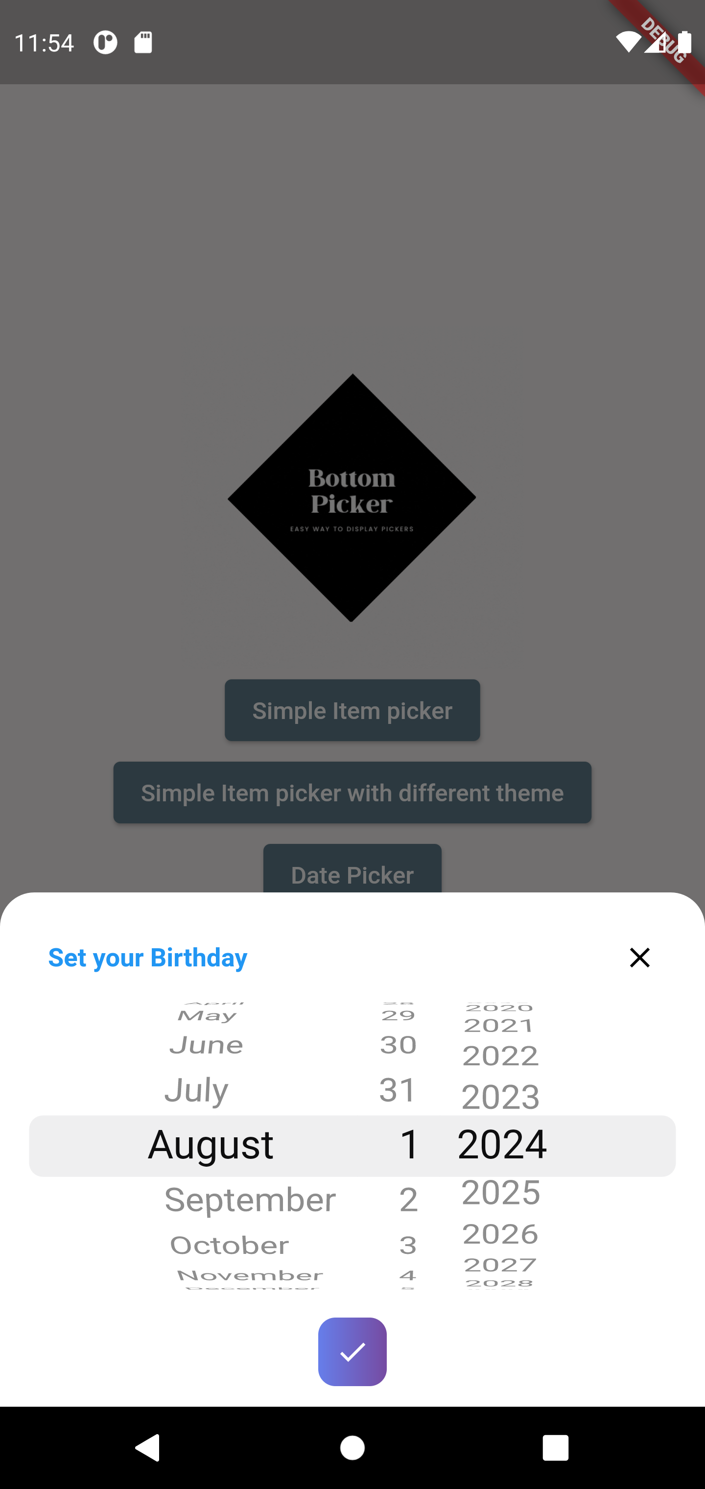
DateTime picker
BottomPicker.date(
  headerBuilder: (context) {
    return Row(
      children: [
        Text(
          'Set your Birthday',
          style: TextStyle(
            fontWeight: FontWeight.bold,
            fontSize: 15,
            color: Colors.blue,
          ),
        ),
      ],
    );
  },
  dateOrder: DatePickerDateOrder.dmy,
  initialDateTime: DateTime(1996, 10, 22),
  maxDateTime: DateTime(1998),
  minDateTime: DateTime(1980),
  onChange: (index) {
    print(index);
  },
  onSubmit: (index) {
    print(index);
  },
  onDismiss: (p0) {
    print(p0);
  },
  bottomPickerTheme: BottomPickerTheme.plumPlate,
).show(context);
Year picker
BottomPicker.year(
  headerBuilder: (context) {
    return Row(
      children: [
        Text(
          'Set your Birthday Year',
          style: TextStyle(
            fontWeight: FontWeight.bold,
            fontSize: 15,
            color: Colors.blue,
          ),
        ),
      ],
    );
  },
  initialDateTime: DateTime(1996),
  maxDateTime: DateTime(1998),
  minDateTime: DateTime(1980),
  onChange: (index) {
    print(index);
  },
  onSubmit: (index) {
    print(index);
    Navigator.pop(context);
  },
  onDismiss: (p0) {
    print(p0);
  },
  bottomPickerTheme: BottomPickerTheme.plumPlate,
).show(context);
Custom days picker
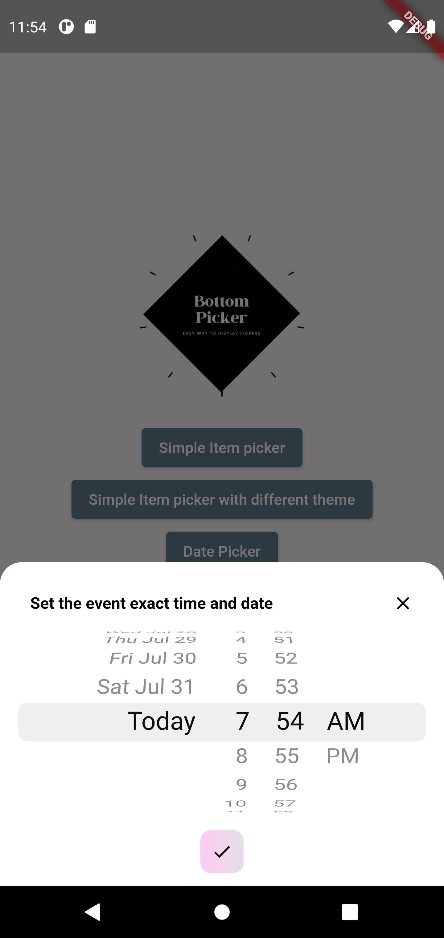
BottomPicker.dateTime(
  headerBuilder: (context) {
    return Row(
      mainAxisAlignment: MainAxisAlignment.spaceBetween,
      children: [
        Text(
          'Set the event exact time and date',
          style: TextStyle(
            fontWeight: FontWeight.bold,
            fontSize: 15,
            color: Colors.black,
          ),
        ),
        InkWell(
          onTap: () {
            print('Picker closed');
            Navigator.pop(context);
          },
          child: Text(
            'close',
            style: TextStyle(
              decoration: TextDecoration.underline,
            ),
          ),
        ),
      ],
    );
  },
  onSubmit: (date) {
    print(date);
  },
  calendarDays: CupertinoDatePickerWidget.workDays,
).show(context);
Contributing
We warmly welcome contributions to the bottom_picker package! Your help in making it even better is highly appreciated.
How you can contribute:
- Found a bug? Please open a new issue with clear steps to reproduce the problem. The more detail you provide, the easier it will be to fix.
- Have a great idea for a new feature? We'd love to hear it! Please open a new issue to discuss your suggestion. Explain the use case and how it would benefit users.
- Want to get your hands dirty and contribute code? Fantastic! Here's how:
- Fork the repository.
- Create a new branch for your feature or bug fix.
- Make your changes, ensuring you follow the project's coding style and conventions.
- Write clear and concise commit messages.
- Submit a pull request with a detailed description of your changes and why they should be merged.
We'll review your contributions and provide feedback as soon as possible. Thank you for your interest in improving bottom_picker!