App Service
Major Update in Version 4.0.0: Added system dark mode follow feature. If dark mode is manually set, the system follow feature is automatically disabled.
App Service is an application service based on GetX, providing application-level management services such as theme management, dark mode management, and localization management.
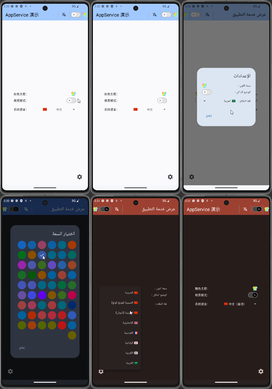
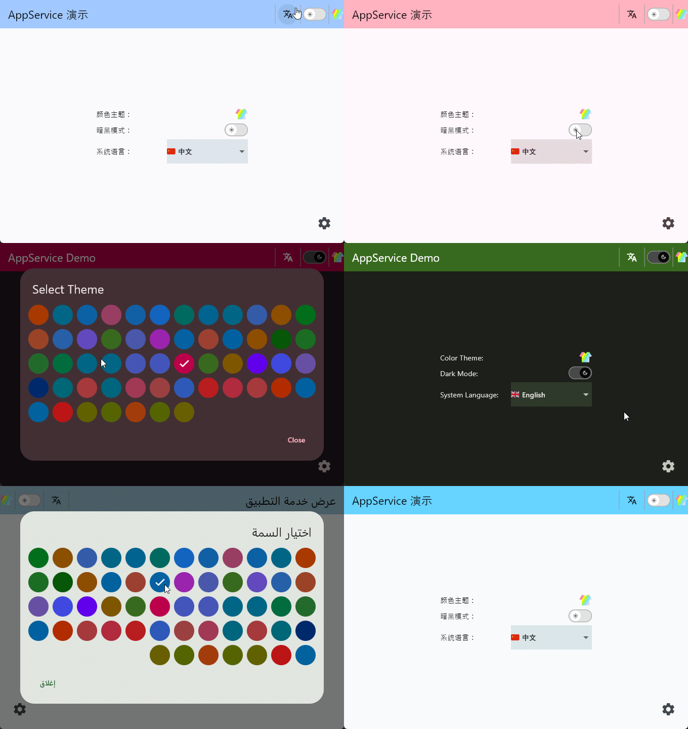
作者: 李俊才
1. Getting Started Guide
You can install the latest version of App Service in your project using the flutter pub add command:
flutter pub add app_service
This will add app_service as a dependency in the dependencies field of your project's pubspec.yaml file and implicitly run flutter pub get.
2. Managing App Service in Dependency Injection
In real projects, besides AppService, there may be many other dependencies that need to be managed. Therefore, I like to create an injections.dart file to describe these dependencies.
The following example uses the Get library to manage dependencies.
import 'package:app_service/app_service.dart';
import 'package:get/instance_manager.dart';
import 'package:shared_preferences/shared_preferences.dart';

Future<void> initDependencies() async {
  final SharedPreferences prefs = await SharedPreferences.getInstance();
  Get.put<SharedPreferences>(prefs);

  // 应用管理
  Get.lazyPut<AppService>(
    () => AppService(
      Get.find<SharedPreferences>(),
      supportedLanguages: const [
        LanguageEnum.zh,
        LanguageEnum.zhHk,
        LanguageEnum.zhMO,
        LanguageEnum.zhTW,
        LanguageEnum.en,
        LanguageEnum.enUK,
        LanguageEnum.enUS,
        LanguageEnum.de,
        LanguageEnum.ru,
        LanguageEnum.uk,
        LanguageEnum.be,
        LanguageEnum.kk,
        LanguageEnum.sr,
        LanguageEnum.fr,
        LanguageEnum.ja,
        LanguageEnum.ko,
        LanguageEnum.ar,
      ],
    ),
    fenix: true,
  );
}
In older versions, you needed to configure the default language using defaultLang: LanguageEnum.zh,. Currently, the first configuration in the list serves as the default.
2.1 Theme Management
Theme management in the application service is used to switch between different color themes, each theme consisting of two modes: dark mode and light mode. The library comes with many built-in theme data generated by flex_color_scheme.
Below is the table of built-in themes:
| Theme Name | Light Theme | Dark Theme |
|---|---|---|
| amberBlue | amberBlueLightTheme | amberBlueDarkTheme |
| aquaBlue | aquaBlueLightTheme | aquaBlueDarkTheme |
| bahamaTrinidad | bahamaTrinidadLightTheme | bahamaTrinidadDarkTheme |
| barossa | barossaLightTheme | barossaDarkTheme |
| bigStoneTulip | bigStoneTulipLightTheme | bigStoneTulipDarkTheme |
| blueDelight | blueDelightLightTheme | blueDelightDarkTheme |
| blueStoneTeal | blueStoneTealLightTheme | blueStoneTealDarkTheme |
| blueWhale | blueWhaleLightTheme | blueWhaleDarkTheme |
| blumine | blumineLightTheme | blumineDarkTheme |
| brandBlue | brandBlueLightTheme | brandBlueDarkTheme |
| brownOrange | brownOrangeLightTheme | brownOrangeDarkTheme |
| camaroneGreen | camaroneGreenLightTheme | camaroneGreenDarkTheme |
| damaskLunar | damaskLunarLightTheme | damaskLunarDarkTheme |
| deepBlueSea | deepBlueSeaLightTheme | deepBlueSeaDarkTheme |
| deepPurple | deepPurpleLightTheme | deepPurpleDarkTheme |
| dellGenoaGreen | dellGenoaGreenLightTheme | dellGenoaGreenDarkTheme |
| ebonyClay | ebonyClayLightTheme | ebonyClayDarkTheme |
| eggplantPurple | eggplantPurpleLightTheme | eggplantPurpleDarkTheme |
| endeavourBlue | endeavourBlueLightTheme | endeavourBlueDarkTheme |
| espressoCrema | espressoCremaLightTheme | espressoCremaDarkTheme |
| flutterDash | flutterDashLightTheme | flutterDashDarkTheme |
| goldSunset | goldSunsetLightTheme | goldSunsetDarkTheme |
| greens | greensLightTheme | greensDarkTheme |
| greenForest | greenForestLightTheme | greenForestDarkTheme |
| greenJungle | greenJungleLightTheme | greenJungleDarkTheme |
| greenMoney | greenMoneyLightTheme | greenMoneyDarkTheme |
| greyLaw | greyLawLightTheme | greyLawDarkTheme |
| hippieBlue | hippieBlueLightTheme | hippieBlueDarkTheme |
| indigoNight | indigoNightLightTheme | indigoNightDarkTheme |
| indigoSanMarino | indigoSanMarinoLightTheme | indigoSanMarinoDarkTheme |
| lipstickPink | lipstickPinkLightTheme | lipstickPinkDarkTheme |
| mallardValencia | mallardValenciaLightTheme | mallardValenciaDarkTheme |
| mangoMojito | mangoMojitoLightTheme | mangoMojitoDarkTheme |
| material3 | material3LightTheme | material3DarkTheme |
| material3HighContrast | material3HighContrastLightTheme | material3HighContrastDarkTheme |
| material3Purple | material3PurpleLightTheme | material3PurpleDarkTheme |
| midnight | midnightLightTheme | midnightDarkTheme |
| mosqueCyan | mosqueCyanLightTheme | mosqueCyanDarkTheme |
| ohMandyRed | ohMandyRedLightTheme | ohMandyRedDarkTheme |
| outerSpace | outerSpaceLightTheme | outerSpaceDarkTheme |
| pinkSakura | pinkSakuraLightTheme | pinkSakuraDarkTheme |
| purpleBrown | purpleBrownLightTheme | purpleBrownDarkTheme |
| redBlue | redBlueLightTheme | redBlueDarkTheme |
| redTornado | redTornadoLightTheme | redTornadoDarkTheme |
| redWine | redWineLightTheme | redWineDarkTheme |
| rosewood | rosewoodLightTheme | rosewoodDarkTheme |
| rustDeepOrange | rustDeepOrangeLightTheme | rustDeepOrangeDarkTheme |
| sanJuanBlue | sanJuanBlueLightTheme | sanJuanBlueDarkTheme |
| sharkOrange | sharkOrangeLightTheme | sharkOrangeDarkTheme |
| thunderbirdRed | thunderbirdRedLightTheme | thunderbirdRedDarkTheme |
| verdunGreen | verdunGreenLightTheme | verdunGreenDarkTheme |
| verdunLime | verdunLimeLightTheme | verdunLimeDarkTheme |
| vesuviusBurned | vesuviusBurnedLightTheme | vesuviusBurnedDarkTheme |
| willowWasabi | willowWasabiLightTheme | willowWasabiDarkTheme |
| yukonGoldYellow | yukonGoldYellowLightTheme | yukonGoldYellowDarkTheme |
Switching themes can be achieved using the setColorTheme method of the AppService instance object, which has the following type signature:
void setColorTheme(ColorThemesEnum themeEnum)
For example:
// Get the AppService instance
final AppService appService = GetIt.instance.get<AppService>();

// Switch theme to bigStoneTulip
appService.setColorTheme(ColorThemesEnum.bigStoneTulip);
ThemeModal
You can use the ThemeModal modal dialog component to provide users with a more intuitive theme selection, for example:
const ThemeModal(),
It displays as a theme icon on the page:

If you touch or click on this icon, a dialog will appear for the user to select a theme:
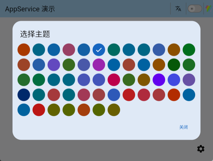
Each theme will be displayed as a circular shape with its primaryColor in the modal, and the selected theme will have a checkmark symbol.
Starting from version 3.0.0, you can specify available themes in the ThemeModal component using the themes parameter. If not specified or specified as an empty array, all built-in themes will be used by default.
showThemeModal
showThemeModal is a function that provides more flexibility compared to ThemeModal. For example:
// 某一个组件的onTap参数
onTap: (_) {
  showThemeModal(
    context,
    themes: [
      ColorThemesEnum.amberBlue,
      ColorThemesEnum.brownOrange,
      ColorThemesEnum.dellGenoaGreen,
      ColorThemesEnum.camaroneGreen,
    ],
  );
},
2.2 Dark Mode Management
In the App Service library, Dark/Light mode is two sub-states under the same theme, essentially defining two sets of corresponding theme data. You can directly toggle dark mode using the toggleDarkMode method in the singleton of AppService:
// Get the singleton instance of AppService
final AppService appService = GetIt.instance.get<AppService>();
// Toggle dark mode
appService.toggleDarkMode()
Additionally, on the instance object appService, methods setDarkMode and setLightMode are available for setting dark/light mode.
DarkModeSwitch is a readily usable switch for toggling dark mode, which you can directly utilize in your code. In appearance, it looks like this:

2.3 Follow System Mode
Starting from V4.0.0, a new feature of following the system's dark mode has been added. By changing the value of followSystem property in AppService, you can set whether to follow the system. Once you manually change the dark mode, the value of followSystem will be set to false. followSystem is a variable of type RxBool, meaning it is reactive. For example:
Obx(
  () => Row(
    mainAxisAlignment: MainAxisAlignment.spaceBetween,
    children: [
      Text('app_service.follow_system'.tr + 'app_service.:'.tr),
      Checkbox(
        value: Get.find<AppService>().followSystem.value,
        onChanged: (value) {
          Get.find<AppService>().followSystem.value = value!;
          Get.find<AppService>().saveFollowSystem();
        },
      ),
    ],
  ),
),
The behavior of system mode follow varies across different platforms; on Windows platform, it forcibly follows the system's dark mode.
3. Localization
3.1 Messages
Messages is a translation container that accepts a list, which can contain multiple translations. Its type signature is:
Messages Messages(
    List<Map<String, Map<String, String>>> translations
)
You should pass it into the top-level component GetMaterialApp through the translations parameter, and it must include AppServiceMessages().keys in the list, which is a translation file for App Service. For example:
GetMaterialApp(
  translations: Messages([
    AppServiceMessages().keys,
    // Other translations
    HomeMessages().keys,
  ]),
);
Where HomeMessages is an assumed custom translation file, it looks like this:
import 'package:get/get.dart';

class HomeMessages extends Translations {
  @override
  Map<String, Map<String, String>> get keys => {
        'zh_CN': {
          'home.appService_demo': 'AppService 演示',
        },
        'en': {
          'home.appService_demo': 'AppService Demo',
        },
        'ko_KR': {
          'home.appService_demo': 'AppService 데모',
        },
        'ja_JP': {
          'home.appService_demo': 'AppService デモ',
        },
        // More language translate...
      };
}
Of course, depending on the needs of your project, you can define more translation files like this and load them in the translations list of Messages.
When implementing internationalization, specifying the supported languages is done through the supportedLanguages parameter of the AppService constructor. It accepts a list composed of multiple LanguageEnum enum values. Additionally, AppService needs to specify a default language. For example:
AppService appService = AppService(
  supportedLanguages: const [
    LanguageEnum.zh,
    LanguageEnum.en,
    LanguageEnum.fr,
  ],
  defaultLang: LanguageEnum.zh,
);
The default value of defaultLang is LanguageEnum.en. This definition needs to correspond with the locale parameter in the top-level component.
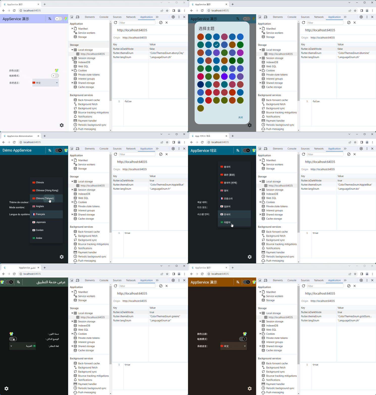
The application title cannot be translated using GetX's .tr because this method is unavailable before the initialization of the top-level component. This limitation is particularly noticeable in the localization switch effect on the Web:

To achieve this dynamic switching, you can use a switch statement as shown in the following example:
import 'package:app_service/app_service.dart';

// ...
GetMaterialApp(
  // ...
  title: switch (Get.locale?.languageCode) {
    'zh' => 'AppService 演示',
    'en' => 'AppService Demo',
    'fr' => 'AppService démonstration',
    'ja' => 'AppServiceデモ',
    'ko' => 'App 서비스 데모',
    'ar' => 'تطبيق AppService',
    _ => 'AppService Demo',
  },
  translations: Messages([
    AppServiceMessages().keys,
    HomeMessages().keys,
  ]),
  locale: Locale(appService.currentLangStr),
  home: const HomeView(),
);
To switch languages, you can use the updateLocale method on the AppService instance object, which has the following type signature:
void updateLocale(LanguageEnum newLanguage)
For example:
appService.updateLocale(LanguageEnum.zh);
3.2 Switching Local Language
There are two Widgets available for displaying a language selection menu to switch the local language: LangSelectMenu and Wen.
3.2.1 LangSelectMenu
LangSelectMenu is a regular rectangular dropdown button, for example:
const LangSelectMenu(),
It looks like this:
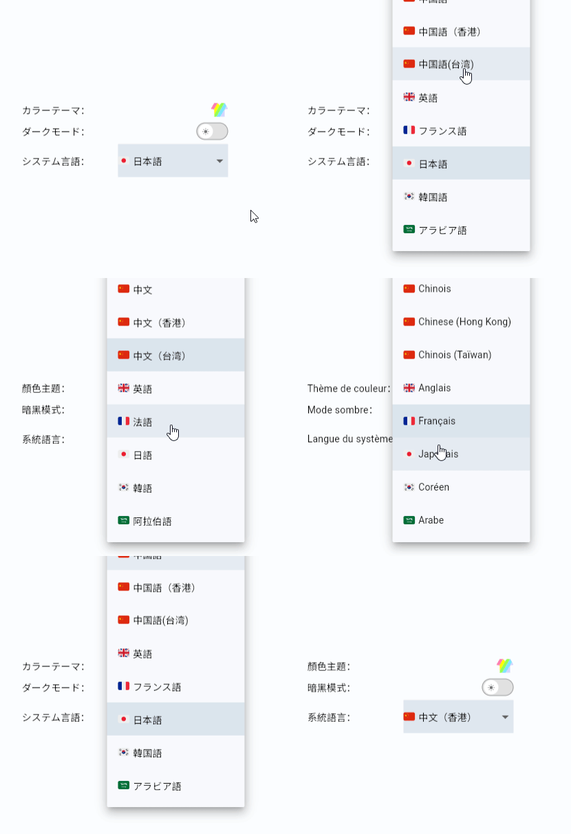
Wen is also a button for a popup menu, but it displays an icon, typically used within a Header:
const Wen()
It appears as follows:
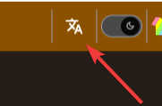
You can customize the displayed icon, its size, and it can be any widget.
LanguageSelectPage & CupertinoLanguageSelectPage
If you wish to select a language in a settings page, you may consider using LanguageSelectPage or CupertinoLanguageSelectPage components. These components represent a language selection page, which you can open from a settings item.
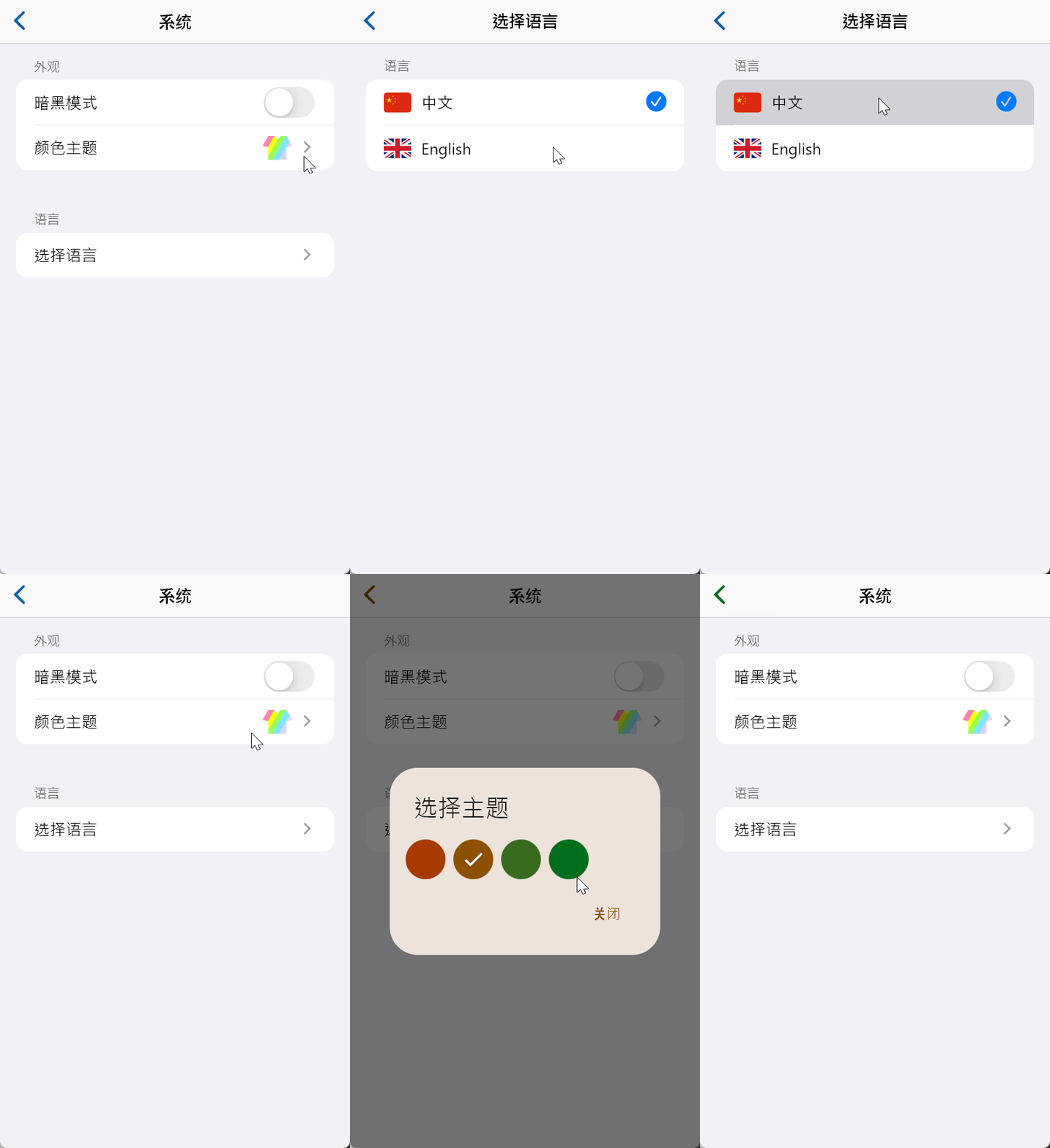
3. Web App
In a Web App, the current sharedPreferencesWeb library implements key-value pair storage through localStorage. Changes in relevant states managed by the AppService will be directly reflected in the browser's localStorage:
4. Example App
You can find an example application of App Service at https://github.com/jacklee1995/flutter_app_service/tree/master/example.
5. Appendix
About Versions
The App Service library depends on the following modules.
You can install any version you prefer; any GetX version within a major version range should work:
| Library | Recommended Major Version |
|---|---|
| GetX | 4.6 |
Versions within a small difference are generally compatible.
Enums
LanguageEnum
/// Enum representing different language codes.
enum LanguageEnum {
  zh,      // Chinese
  zhHans,  // Chinese (Simplified)
  zhHant,  // Chinese (Traditional)
  zhHk,    // Chinese (Hong Kong)
  zhTw,    // Chinese (Taiwan)
  ru,      // Russian
  de,      // German
  fr,      // French
  ja,      // Japanese
  ko,      // Korean
  es,      // Spanish
  ar,      // Arabic
  en,      // English
  enUs,    // English (United States)
  enUk,    // English (United Kingdom)
  pt,      // Portuguese
  it,      // Italian
  nl,      // Dutch
  tr,      // Turkish
  hi,      // Hindi
  id,      // Indonesian
  vi,      // Vietnamese
  th,      // Thai
  ms,      // Malay
  fil,     // Filipino
  sv,      // Swedish
  pl,      // Polish
  hu,      // Hungarian
  ro,      // Romanian
  cs,      // Czech
  el,      // Greek
  he,      // Hebrew
  da,      // Danish
  fi,      // Finnish
  no,      // Norwegian
  sk,      // Slovak
  sl,      // Slovenian
  bg,      // Bulgarian
  af,      // Afrikaans
  sq,      // Albanian
  hy,      // Armenian
  az,      // Azerbaijani
  eu,      // Basque
  bn,      // Bengali
  bs,      // Bosnian
  ca,      // Catalan
  hr,      // Croatian
  cy,      // Welsh
  et,      // Estonian
  tl,      // Filipino
  gl,      // Galician
  ka,      // Georgian
  gu,      // Gujarati
  ht,      // Haitian Creole
  ha,      // Hausa
  haw,     // Hawaiian
  iw,      // Hebrew
  jw,      // Javanese
  kk,      // Kazakh
  km,      // Khmer
  kn,      // Kannada
  ky,      // Kyrgyz
  lo,      // Lao
  la,      // Latin
  lv,      // Latvian
  lt,      // Lithuanian
  lb,      // Luxembourgish
  mk,      // Macedonian
  mg,      // Malagasy
  mt,      // Maltese
  mi,      // Maori
  mr,      // Marathi
  mn,      // Mongolian
  ne,      // Nepali
  ps,      // Pashto
  pa,      // Punjabi
  qu,      // Quechua
  gd,      // Scottish Gaelic
  sr,      // Serbian
  st,      // Sesotho
  sn,      // Shona
  sd,      // Sindhi
  si,      // Sinhala
  su,      // Sundanese
  sw,      // Swahili
  tg,      // Tajik
  ta,      // Tamil
  te,      // Telugu
  ur,      // Urdu
  uz,      // Uzbek
  xh,      // Xhosa
  yi,      // Yiddish
  zu,      // Zulu
}
ColorThemesEnum
/// Enum representing different color themes, including the name of each theme.
enum ColorThemesEnum {
  /// Amber Blue
  amberBlue,

  /// Aqua Blue
  aquaBlue,

  /// Bahama Trinidad
  bahamaTrinidad,

  /// Barossa
  barossa,

  /// Big Stone Tulip
  bigStoneTulip,

  /// Blue Delight
  blueDelight,

  /// Blue Stone Teal
  blueStoneTeal,

  /// Blue Whale
  blueWhale,

  /// Blumine
  blumine,

  /// Brand Blue
  brandBlue,

  /// Brown Orange
  brownOrange,

  /// Camarone Green
  camaroneGreen,

  /// Damask Lunar
  damaskLunar,

  /// Deep Blue Sea
  deepBlueSea,

  /// Deep Purple
  deepPurple,

  /// Dell Genoa Green
  dellGenoaGreen,

  /// Ebony Clay
  ebonyClay,

  /// Eggplant Purple
  eggplantPurple,

  /// Endeavour Blue
  endeavourBlue,

  /// Espresso Crema
  espressoCrema,

  /// Flutter Dash
  flutterDash,

  /// Gold Sunset
  goldSunset,

  /// Greens
  greens,

  /// Green Forest
  greenForest,

  /// Green Jungle
  greenJungle,

  /// Green Money
  greenMoney,

  /// Grey Law
  greyLaw,

  /// Hippie Blue
  hippieBlue,

  /// Indigo Night
  indigoNight,

  /// Indigo San Marino
  indigoSanMarino,

  /// Lipstick Pink
  lipstickPink,

  /// Mallard Valencia
  mallardValencia,

  /// Mango Mojito
  mangoMojito,

  /// Material3
  material3,

  /// Material3 High Contrast
  material3HighContrast,

  /// Material3 Purple
  material3Purple,

  /// Midnight
  midnight,

  /// Mosque Cyan
  mosqueCyan,

  /// Oh Mandy Red
  ohMandyRed,

  /// Outer Space
  outerSpace,

  /// Pink Sakura
  pinkSakura,

  /// Purple Brown
  purpleBrown,

  /// Red Blue
  redBlue,

  /// Red Tornado
  redTornado,

  /// Red Wine
  redWine,

  /// Rosewood
  rosewood,

  /// Rust Deep Orange
  rustDeepOrange,

  /// San Juan Blue
  sanJuanBlue,

  /// Shark Orange
  sharkOrange,

  /// Thunderbird Red
  thunderbirdRed,

  /// Verdun Green
  verdunGreen,

  /// Verdun Lime
  verdunLime,

  /// Vesuvius Burned
  vesuviusBurned,

  /// Willow Wasabi
  willowWasabi,

  /// Yukon Gold Yellow
  yukonGoldYellow,
}
Utils
Lang
/// Language enum value to string
String? langEnumToStr(LanguageEnum lang)
/// Convert the language logo to the corresponding country logo
String getCountryCode(String item)
/// Convert a language string to the corresponding language enum
LanguageEnum? strToLangEnum(String langStr)
Theme
/// Combine color themes with dark mode and return the corresponding ThemeData object.
/// - themeName: The name of the theme.
/// - isDarkMode: Whether to use dark mode.
ThemeData getThemeDataByName(String themeName, bool isDarkMode)
/// Get theme data (ThemeData) based on the enum.
ThemeData getThemeDataByEnum(ColorThemesEnum themeEnum, bool isDarkMode)
7. Issue Tracker
You can report issues on Github: https://github.com/jacklee1995/flutter_app_service/issues
8. licence
This project is licensed under the MIT License - see the LICENSE file for details.