app_error_widget - A customizable error UI for uncaught exceptions during runtime

Before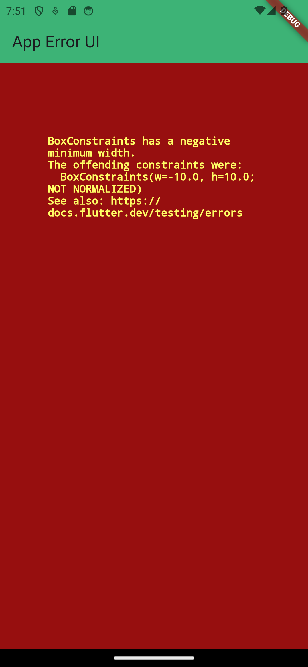
|
➡ |
After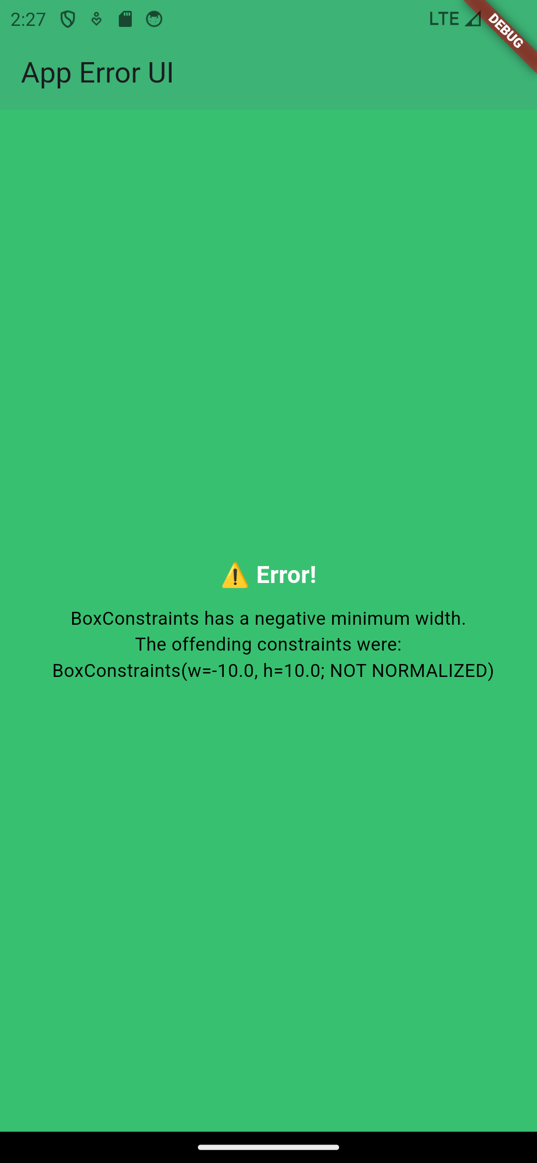
|
app_error_widget is a Flutter package that provides a customizable error UI for handling uncaught exceptions during runtime. It allows you to display a custom error widget, giving you full control over the error display style in your Flutter applications.
Installation 🚀
First, we need to add app_error_widget to our pubspec.yaml file.
Install the package by running the following command from the project root:
flutter pub add app_error_widget
Features ✨
- Customizable error widget to display uncaught exceptions.
- Supports various customization options like text styles, background color, and header text.
- Simple to integrate into your app's error handling mechanism.
Usage 🧑💻
Now that we have successfully installed app_error_widget, we can import app_error_widget in main.dart.
import 'package:app_error_widget/app_error_widget.dart';
To use this package, you need to set the custom error widget in the main.dart file of your app.
In your main.dart, set the ErrorWidget.builder to use the AppErrorWidget:
import 'package:app_error_widget/app_error_widget.dart';
import 'package:flutter/material.dart';

void main() {
  //APP-ERROR-UI--------------------------
  ErrorWidget.builder = (details) => AppErrorWidget(exceptionText: details.exception.toString());
  runApp(const MyApp());
}
Example
To handle uncaught exceptions and display a custom error UI, follow this example:
import 'package:app_error_widget/app_error_widget.dart';
import 'package:flutter/material.dart';

void main() {
  //APP-ERROR-UI--------------------------
  ErrorWidget.builder = (details) => AppErrorWidget(exceptionText: details.exception.toString());
  runApp(const MyApp());
}

class MyApp extends StatelessWidget {
  const MyApp({super.key});
  @override
  Widget build(BuildContext context) {
    return const MaterialApp(
      debugShowCheckedModeBanner: true,
      home: AppErrorExample(),
    );
  }
}

class AppErrorExample extends StatelessWidget {
  const AppErrorExample({super.key});
  @override
  Widget build(BuildContext context) {
    return Scaffold(
      appBar: AppBar(
        title: const Text("App Error UI"),
        backgroundColor: const Color(0xFF38C071),
        elevation: 7,
      ),
      body: const SizedBox(
        width: -10,
        height: 10,
      ),
    );
  }
}
Parameters (AppErrorWidget):
exceptionText: The message you want to display for the exception. (Required)
headerText: Optional header text (default is "Error!").
exceptionTextStyle: Optional style for the exception text.
headerTextStyle: Optional style for the header text.
backgroundColor: Optional background color (default is Color(0xFF38C071)).
Test Cases
Test cases verify error display, default values, handling of null parameters (headerText, exceptionTextStyle, headerTextStyle, backgroundColor), custom styles, long text handling, and ensure widget functionality.
License
This package is licensed under the BSD 3-Clause License. See the LICENSE file for more information.