AdvancedSearch
Flutter library provides advanced capabilitis for searching through a predefined list using TextField
How it works? Code talks better:
List<String> searchableList = ['Orange', 'Watermelon', 'Banana', ...etc];

AdvancedSearch( // This is basically an Input Text Field
    data: searchableList,
    maxElementsToDisplay: 7,
    onItemTap: (index) {
      // user just found what he needs, now it's your turn to handle that
    },
    onSearchClear: () {
      // may be display the full list? or Nothing? it's your call
    },
    onSubmitted: (value, value2) {
      // now you have a submitted search
    },
    onEditingProgress: (value, value2) {
      // user is trying to lookup something, may be you want to help him?
    },
)
The complete set of features this package gives you
Callbacks:
@required onItemTap // when user selects one of the displayed search results
onSearchClear // when user clears his search
onSubmitted // on submitting a search result
onEditingProgress // when the user is writing down his search words, want to give him live results? use this one
Required Inputs:
@required searchItems // your set of searchable data (give empty list if you don't want to provide one, then you can take the submitted search text and do whatever you want)
Options:
selectedTextColor // what is the text color that should reflects the matching text in search results
unSelectedTextColor // what is the text color that should reflects the unmatching text in search results
enabledBorderColor // Border color of TextField when it's enabled
disabledBorderColor // Border color of TextField when it's disabled
focusedBorderColor // Border color of TextField when it's on focus
cursorColor // Cursor Color, nothing more to tell
searchItemsWidget // Here you can pass a function that takes a String (will be replaced by search result item) and returns a Widget which will be used to list the search results instead of the default one [Don't forget to pass a reasonable singleItemHeight if you are passing this attribute]
maxElementsToDisplay (Default = 7) // as search results, what is the Maximum number you want to have
borderRadius (Default = 10.0) // radius for search results list border
fontSize (Default = 14.0) // for TextField and Search Results
singleItemHeight (Default = 45.0) // height for every single item in the search results list
verticalPadding (Default = 10.0) // Vertical Padding for the TextField
horizontalPadding (Default = 10.0) // Horizontal Padding for the TextField
itemsShownAtStart (Default = 10) // if the user didn't start sraching yet but clicked the search TextField, how many items should be displayed to him
hintText (Default = 'Enter a name') // hint text for search TextField
hintTextColor (Default = Colors.grey) // hint text color
autoCorrect (Default = false) // AutoCorrect functioanlity for TextField inputs
enabled (Default = true) // is the search should be enabled now, or not
bgColor (Default = Colors.white) // Background Color for Search Results widget
inputTextFieldBgColor // Background Color for the TextField itself
borderColor (Default = const Color(0xFFFAFAFA)) // Border Color for Search Results widget
searchMode (Default = SearchMode.CONTAINS) // what is the search criteria you want to Apply? should the results CONTAINS, STARTING_WITH, or EXACT_MATCH your search
caseSensitive (Default = false) // want your search to be applied on the searchable list as case sensitive, or not
minLettersForSearch (Default = 0) // what is the minimum letters that the user should type before starting to receive search results
clearSearchEnabled (Default = true) // should the user be able to clear his search, or not
showListOfResults (Default = true) // should a list of results be displayed to the user, or shall you just get what he searches for and you will do your things by your own
hideHintOnTextInputFocus (Default = false) // an option to hide the hin t text once the TextField get focused
autoListing (Default = false) // an option to display the results instandly without searching (in this case it shall display the max elements to be shown)
So basically you can build your widget like that
AdvancedSearch(
data: ['Orange', 'Watermelon', 'Banana', 'Red Grapes'],
maxElementsToDisplay: 10,
singleItemHeight: 50,
borderColor: Colors.grey,
minLettersForSearch: 0,
selectedTextColor: Color(0xFF3363D9),
fontSize: 14,
borderRadius: 12.0,
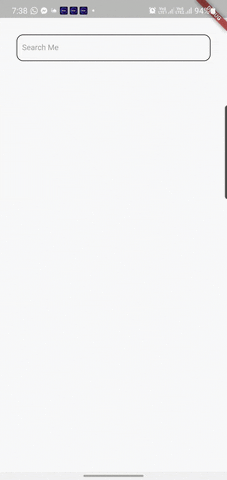
hintText: 'Search Me',
cursorColor: Colors.blueGrey,
autoCorrect: false,
focusedBorderColor: Colors.blue,
searchResultsBgColor: Color(0xFAFAFA),
disabledBorderColor: Colors.cyan,
enabledBorderColor: Colors.black,
enabled: true,
caseSensitive: false,
inputTextFieldBgColor: Colors.white10,
clearSearchEnabled: true,
itemsShownAtStart: 10,
searchMode: SearchMode.CONTAINS,
showListOfResults: true,
unSelectedTextColor: Colors.black54,
verticalPadding: 10,
horizontalPadding: 10,
hideHintOnTextInputFocus: true,
hintTextColor: Colors.grey,
onItemTap: (index, value) {
print("selected item index is $index");
},
onSearchClear: () {
print("Cleared Search");
},
onSubmitted: (searchText, listOfResults) {
print("Submitted: " + searchText);
},
onEditingProgress: (searchText, listOfResults) {
print("TextEdited: " + searchText);
print("LENGTH: " + listOfResults.length.toString());
},
),