TrimAreaProperties constructor
Helps defining the Trim Area properties.
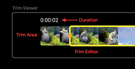
A better look at the structure of the Trim Viewer:
All the parameters are optional:
-
thumbnailFit for specifying the image fit type of each thumbnail image. By default it is set to
BoxFit.fitHeight. -
thumbnailQuality for specifying the quality of each generated image thumbnail, to be displayed in the trimmer area. By default it is set to
75. -
blurEdges for adding a blur to the trim area edges. Use
blurColorfor specifying the color of the blur (usually it's the background color which helps in blending). By default it is set tofalse. -
blurColor for specifying the color of the blur. Use the color of the background to blend with it. By default it is set to
Colors.black. -
startIcon for specifying the widget to be placed at the start of the trimmer area. You can pass
nullfor hiding the widget. -
endIcon for specifying the widget to be placed at the end of the trimmer area. You can pass
nullfor hiding the widget. -
borderRadius for specifying the size of the circular border radius to be applied to each corner of the trimmer area Container. By default it is set to
4.0.
Implementation
const TrimAreaProperties({
  this.thumbnailFit = BoxFit.fitHeight,
  this.thumbnailQuality = 75,
  this.blurEdges = false,
  this.blurColor = Colors.black,
  this.startIcon,
  this.endIcon,
  this.borderRadius = 4.0,
});