💳 u_credit_card: ^1.4.0
Credit Card UI as Flutter Widget 💎
🔥 u_credit_card is a Flutter package for creating customizable and realistic-looking credit card UI with engaging animations. Elevate the visual appeal of your app and improve user interaction effortlessly!

Resources 📚
Installation 💻
-
Add
u_credit_cardto yourpubspec.yaml:dependencies: u_credit_card: ^1.4.0 -
Install the package:
flutter packages get
Usage
To use the CreditCardUi() widget, import the package:
import 'package:u_credit_card/u_credit_card.dart';
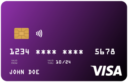
Create a CreditCardUi(...) widget with the required parameters:
CreditCardUi(
  cardHolderFullName: 'John Doe',
  cardNumber: '1234567812345678',
  validThru: '10/24',
),
Parameters
| Name | Type | Description |
|---|---|---|
cardHolderFullName |
String |
The cardholder's full name. Required. |
cardNumber |
String |
The full credit card number. Required. |
validThru |
String |
The expiration date in "MM/YY" format. Required. |
validFrom |
String |
The "Valid From" date in "MM/YY" format. Optional. |
topLeftColor |
Color |
Top-left gradient color. Defaults to Colors.purple. |
bottomRightColor |
Color |
Bottom-right gradient color. Defaults to a darker shade of topLeftColor. |
doesSupportNfc |
bool |
Displays NFC icon if set to true. Defaults to true. |
placeNfcIconAtTheEnd |
bool |
Places NFC icon at the opposite side of the chip if set to true. Defaults to false. |
cardType |
CardType |
Specifies card type. Defaults to CardType.credit. You can set it to CardType.other if you prefer not to specify a card type. This is optional. |
creditCardType |
CreditCardType |
Specifies the credit card payment network logo. You can set it to CreditCardType.none if you prefer not to specify a card type and not show on the card UI. This is optional. |
cardProviderLogo |
Widget |
Adds a provider logo. Optional. |
backgroundDecorationImage |
DecorationImage |
Sets a background image. Optional. |
showValidThru |
bool |
Toggles "Valid Thru" section. Defaults to true. |
currencySymbol |
String |
Currency symbol. Defaults to $. |
balance |
double |
Balance amount. Defaults to 0.0. |
showBalance |
bool |
Toggles the balance display. Defaults to false. |
enableFlipping |
bool |
Enables card flipping. Defaults to false. |
autoHideBalance |
bool |
Hides balance with a placeholder until tapped. Defaults to false. |
cvvNumber |
String |
CVV number shown as ***. |
disableHapticFeedBack |
bool |
Disables haptic feedback on interactions. |
width |
double |
Width of the card, up to a max of 300. |
shouldMaskCardNumber |
bool |
Masks middle digits of the card number if set to true. Defaults to true. |
Example
CreditCardUi(
  cardHolderFullName: 'John Doe',
  cardNumber: '1234567812345678',
  validFrom: '01/23',
  validThru: '01/28',
  topLeftColor: Colors.blue,
),
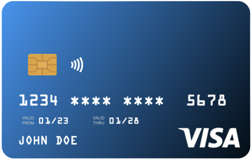
By default, the card will have a chic blue gradient and an NFC icon. But don't worry, if you don't want the NFC icon, simply pass doesSupportNfc: false.
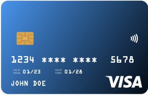
Want to switch things up and place the NFC icon on the opposite side of the chip? No problem! Just enable it by passing placeNfcIconAtTheEnd: true, but remember to also pass doesSupportNfc: true.
Let's make your app look as sleek as that shiny new credit card!
CreditCardUi(
    cardHolderFullName: 'John Doe',
    cardNumber: '1234567812345678',
    validFrom: '01/23',
    validThru: '01/28',
    topLeftColor: Colors.blue,
    doesSupportNfc: true,
    placeNfcIconAtTheEnd: true, // 👈 NFC icon will be at the end,
),
Custom Gradient
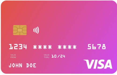
CreditCardUi(
  cardHolderFullName: 'John Doe',
  cardNumber: '1234567812345678',
  validThru: '10/24',
  topLeftColor: Colors.red,
  bottomRightColor: Colors.purpleAccent,
),
This will create a credit card user interface with a red-to-purple gradient.
Setting the card width
If you want to set the width of the card, use width: property.
Better NOT wrap with SizedBox(width: ..., child: CreditCardUi(....)), instead use width: right from the CreditCardUi()
CreditCardUi(
  width: 300, // 👈 this will set the width of the card
  cardHolderFullName: 'John Doe',
  cardNumber: '1234567812345678',
  validThru: '10/24',
  topLeftColor: Colors.red,
  bottomRightColor: Colors.purpleAccent,
),
Note: Setting up any value more than 300 is not considered, maximum width can be 300 only.
Additional Customizations
To further customize the card, you can add a background image by using the backgroundDecorationImage property. Additionally, you can include a logo for the card provider using the cardProviderLogo property. This logo can be positioned on either the left or the right side of the card using the cardProviderLogoPosition property.
If you want to specify a particular card type to display, you can set it using the cardType property. If you prefer not to specify a card type, you can set cardType: CardType.other.
Here is an example of how to use these customization options:
Example:
CreditCardUi(
    cardHolderFullName: 'John Doe',
    cardNumber: '1234567812345678',
    validFrom: '01/23',
    validThru: '01/28',
    topLeftColor: Colors.blue,
    doesSupportNfc: true,
    placeNfcIconAtTheEnd: true,
    cardType: CardType.debit,
    cardProviderLogo: FlutterLogo(), // 👈 Set your logo here, supports any widget
    cardProviderLogoPosition: CardProviderLogoPosition.right,
    backgroundDecorationImage: DecorationImage(
    fit: BoxFit.cover,
    image: NetworkImage( // 👈 `AssetImage` is also supported
        'https://....',
      ),
    ),
),
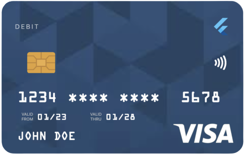
To display the balance of your card, simply set showBalance: true and provide the balance amount using balance: 200.0 (any double value). Enabling autoHideBalance: true will generate a placeholder labeled "Tap to see balance". Users can then tap on this placeholder to reveal the balance.
CreditCardUi(
    cardHolderFullName: 'John Doe',
    cardNumber: '1234567812345678',
    validFrom: '01/23',
    validThru: '01/28',
    topLeftColor: Colors.blue,
    doesSupportNfc: true,
    placeNfcIconAtTheEnd: true,
    cardType: CardType.debit,
    cardProviderLogo: FlutterLogo(),
    cardProviderLogoPosition: CardProviderLogoPosition.right,
    showBalance: true,
    balance: 128.32434343,
    autoHideBalance: true,
),
Card Flipping Animation
To enable the flipping animation by default, simply set the property enableFlipping: true. You can set CVV by cvvNumber: 000.
CreditCardUi(
    cardHolderFullName: 'John Doe',
    cardNumber: '1234567812345678',
    validFrom: '01/23',
    validThru: '01/28',
    topLeftColor: Colors.blue,
    doesSupportNfc: true,
    placeNfcIconAtTheEnd: true,
    cardType: CardType.debit,
    cardProviderLogo: FlutterLogo(),
    cardProviderLogoPosition: CardProviderLogoPosition.right,
    showBalance: true,
    balance: 128.32434343,
    autoHideBalance: true,
    enableFlipping: true, // 👈 Enables the flipping
    cvvNumber: '123', // 👈 CVV number to be shown on the back of the card
),
ধন্যবাদ
Contributor

Utpal Barman 🇧🇩
License
This package is released under the BSD 3-Clause License.
Libraries
- u_credit_card
- Credit Card UI


