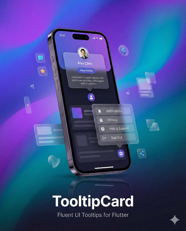
TooltipCard
A powerful, highly customizable tooltip and popover widget for Flutter


📸 Screenshots


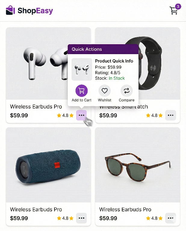
🎯 Overview
TooltipCard is a feature-rich tooltip and popover library for Flutter, inspired by Microsoft Fluent UI's TeachingTip. It provides an elegant way to display contextual information, onboarding tips, feature discovery hints, and interactive popovers.
Why TooltipCard?
| Feature | Flutter Tooltip | TooltipCard |
|---|---|---|
| Smart Auto-positioning | ❌ | ✅ 12 placement options with auto-flip |
| Beak/Arrow Pointer | ❌ | ✅ With matching shadow |
| Structured Content | ❌ | ✅ Icons, titles, actions |
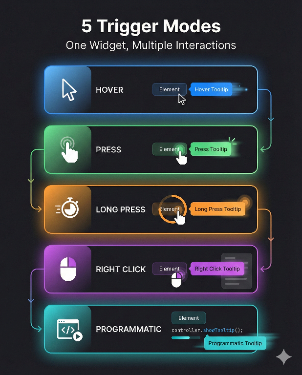
| Trigger Modes | Hover only | ✅ 7 modes: tap, hover, double-tap, right-click, long-press, force-press |
| Animation Types | Basic fade | ✅ 9 types: fade, scale, bounce, elastic, slide, zoom |
| Touch-Friendly | ❌ | ✅ Long press, force press (3D Touch) |
| Programmatic Control | ❌ | ✅ Controller API with data passing |
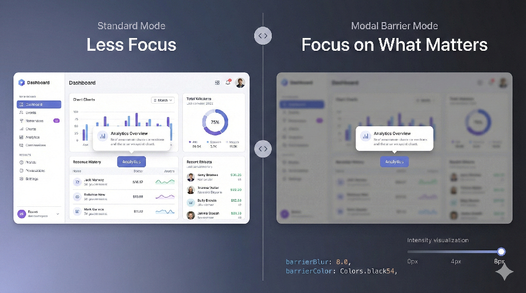
| Modal Barrier | ❌ | ✅ With blur effect |
| Material 3 | Partial | ✅ Full theming support |
| RTL Support | ❌ | ✅ Complete |
| Accessibility | Basic | ✅ Keyboard + Screen reader |
✨ Features
🎯 Smart Positioning
|
🔺 Fluent Beak
|
🎨 Material 3 Theming
|
⚡ 7 Trigger Modes
|
🌫️ Modal Barrier
|
🎬 9 Animation Types
|
♿ Accessibility
|
📱 Cross-Platform
|
📦 Installation
Add tooltip_card to your pubspec.yaml:
dependencies:
  tooltip_card: ^2.6.1
Then run:
flutter pub get
Import the package:
import 'package:tooltip_card/tooltip_card.dart';
🚀 Quick Start
Basic Tooltip
TooltipCard.builder(
  child: const Icon(Icons.info_outline),
  builder: (context, close) => const Padding(
    padding: EdgeInsets.all(12),
    child: Text('This is a simple tooltip!'),
  ),
)
With Beak and Placement
TooltipCard.builder(
  beakEnabled: true,
  placementSide: TooltipCardPlacementSide.bottom,
  child: ElevatedButton(
    onPressed: () {},
    child: const Text('Show Tip'),
  ),
  builder: (context, close) => const Padding(
    padding: EdgeInsets.all(16),
    child: Text('Tooltip appears below with an arrow'),
  ),
)
Structured Content (TeachingTip Style)
TooltipCard.builder(
  beakEnabled: true,
  placementSide: TooltipCardPlacementSide.bottom,
  modalBarrierEnabled: true,
  barrierBlur: 2.0,
  child: IconButton(
    icon: const Icon(Icons.lightbulb_outline),
    onPressed: () {},
  ),
  builder: (context, close) => TooltipCardContent(
    icon: const Icon(Icons.auto_awesome),
    iconColor: Colors.amber,
    title: 'Pro Tip',
    subtitle: 'Discover this amazing feature that will boost your productivity',
    content: const Text(
      'Click the settings icon to customize your experience and unlock advanced options.',
    ),
    primaryAction: FilledButton(
      onPressed: close,
      child: const Text('Got it!'),
    ),
    secondaryAction: OutlinedButton(
      onPressed: () {
        // Learn more action
        close();
      },
      child: const Text('Learn more'),
    ),
    onClose: close,
  ),
)
📖 API Reference
TooltipCard Widget
The main widget for displaying tooltips and popovers.
Constructors
| Constructor | Description |
|---|---|
TooltipCard.builder() |
Creates a tooltip with dynamic content via builder function |
TooltipCard() |
Creates a tooltip with static content widget |
Core Properties
| Property | Type | Default | Description |
|---|---|---|---|
child |
Widget |
required | The trigger widget that shows the tooltip |
builder |
Widget Function(BuildContext, VoidCallback) |
- | Builder for dynamic tooltip content with close callback |
flyoutContent |
Widget |
- | Static tooltip content (alternative to builder) |
Appearance Properties
| Property | Type | Default | Description |
|---|---|---|---|
placementSide |
TooltipCardPlacementSide |
top |
Preferred placement position |
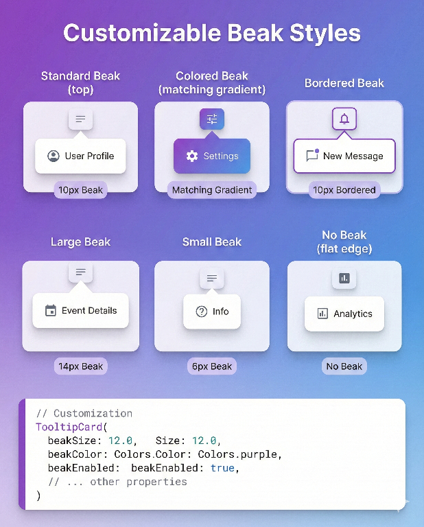
beakEnabled |
bool |
true |
Whether to show the arrow/beak |
beakSize |
double |
10.0 |
Size of the beak triangle |
beakColor |
Color? |
null |
Custom beak color (defaults to background) |
beakInset |
double |
20.0 |
Minimum inset from panel edges |
elevation |
double |
8.0 |
Shadow elevation |
borderRadius |
BorderRadius |
circular(8) |
Corner radius of the panel |
flyoutBackgroundColor |
Color? |
null |
Custom background (defaults to theme) |
padding |
EdgeInsetsGeometry? |
EdgeInsets.zero |
Content padding |
constraints |
BoxConstraints? |
null |
Size constraints for tooltip |
awaySpace |
double |
0.0 |
Gap between trigger and tooltip |
offset |
Offset |
Offset.zero |
Additional position offset |
borderColor |
Color? |
null |
Border color for panel and beak |
borderWidth |
double |
0.0 |
Border stroke width |
Behavior Properties
| Property | Type | Default | Description |
|---|---|---|---|
whenContentVisible |
WhenContentVisible |
pressButton |
Trigger mode for showing |
whenContentHide |
WhenContentHide |
goAway |
Dismiss behavior |
hoverOpenDelay |
Duration |
500ms |
Delay before showing on hover |
hoverCloseDelay |
Duration |
250ms |
Delay before hiding after hover exit |
showDuration |
Duration? |
null |
Auto-close after this duration |
dismissOnPointerMoveAway |
bool |
false |
Close when pointer leaves tooltip area |
Viewport & Layout Properties
| Property | Type | Default | Description |
|---|---|---|---|
fitToViewport |
bool |
true |
Ensure tooltip stays within viewport |
viewportMargin |
EdgeInsetsDirectional |
all(8) |
Margin from viewport edges |
autoFlipIfZeroSpace |
bool |
true |
Auto-flip to opposite side if no space |
wrapContentInScrollView |
bool |
true |
Wrap content in scroll view if needed |
useRootOverlay |
bool |
true |
Use root overlay for positioning |
Modal Barrier Properties
| Property | Type | Default | Description |
|---|---|---|---|
modalBarrierEnabled |
bool |
false |
Show backdrop scrim |
barrierColor |
Color? |
null |
Custom backdrop color |
barrierBlur |
double |
0.0 |
Backdrop blur sigma |
barrierDismissible |
bool? |
null |
Allow tap outside to dismiss |
Controller & Callbacks
| Property | Type | Description |
|---|---|---|
controller |
TooltipCardController? |
Controller for programmatic control |
publicState |
TooltipCardPublicState? |
Shared state for single-open behavior |
onOpen |
VoidCallback? |
Called when tooltip opens |
onClose |
VoidCallback? |
Called when tooltip closes |
onOpenChanged |
ValueChanged<bool>? |
Called when open state changes |
TooltipCardPlacementSide
Enum defining 12 placement options for precise positioning.
Basic Placements
| Value | Description |
|---|---|
top |
Above the trigger, centered |
bottom |
Below the trigger, centered |
start |
Start side (left in LTR, right in RTL) |
end |
End side (right in LTR, left in RTL) |
Compound Placements
| Value | Description |
|---|---|
topStart |
Above, aligned to start edge |
topEnd |
Above, aligned to end edge |
bottomStart |
Below, aligned to start edge |
bottomEnd |
Below, aligned to end edge |
startTop |
Start side, aligned to top |
startBottom |
Start side, aligned to bottom |
endTop |
End side, aligned to top |
endBottom |
End side, aligned to bottom |
// Example: Position tooltip at bottom-start
TooltipCard.builder(
  placementSide: TooltipCardPlacementSide.bottomStart,
  // ...
)
WhenContentVisible
Enum defining how the tooltip is triggered to show.
| Value | Description | Use Case |
|---|---|---|
pressButton |
Show on tap/click | Mobile primary |
hoverButton |
Show on hover | Desktop tooltips |
doubleTapButton |
Show on double tap | Secondary actions |
secondaryTapButton |
Show on right-click | Context menus |
// Hover tooltip for desktop
TooltipCard.builder(
  whenContentVisible: WhenContentVisible.hoverButton,
  hoverOpenDelay: const Duration(milliseconds: 300),
  // ...
)
WhenContentHide
Enum defining how the tooltip is dismissed.
| Value | Description |
|---|---|
goAway |
Hide when pointer leaves the tooltip area |
pressOutSide |
Hide when tapping outside the tooltip |
TooltipCardContent
A structured content widget inspired by Fluent UI's TeachingTip, perfect for onboarding and feature discovery.
Properties
| Property | Type | Default | Description |
|---|---|---|---|
icon |
Widget? |
null |
Leading icon widget |
iconColor |
Color? |
null |
Icon tint color |
iconSize |
double |
24.0 |
Icon size |
title |
String? |
null |
Title text |
titleStyle |
TextStyle? |
null |
Custom title style |
subtitle |
String? |
null |
Subtitle/description text |
subtitleStyle |
TextStyle? |
null |
Custom subtitle style |
content |
Widget? |
null |
Custom content widget |
primaryAction |
Widget? |
null |
Primary action button |
secondaryAction |
Widget? |
null |
Secondary action button |
tertiaryAction |
Widget? |
null |
Tertiary action button |
onClose |
VoidCallback? |
null |
Close button callback |
showCloseButton |
bool |
true |
Show close button (when onClose provided) |
maxWidth |
double |
360.0 |
Maximum content width |
padding |
EdgeInsetsGeometry |
all(16) |
Content padding |
spacing |
double |
12.0 |
Spacing between elements |
TooltipCardContent(
  icon: const Icon(Icons.rocket_launch),
  iconColor: Theme.of(context).colorScheme.primary,
  title: 'New Feature!',
  subtitle: 'We just launched something amazing',
  content: const Text('Check out the new dashboard with real-time analytics.'),
  primaryAction: FilledButton(
    onPressed: () => Navigator.pushNamed(context, '/dashboard'),
    child: const Text('Explore'),
  ),
  secondaryAction: TextButton(
    onPressed: close,
    child: const Text('Maybe later'),
  ),
  onClose: close,
)
TooltipCardController
Programmatic control for showing/hiding tooltips.
class MyWidget extends StatefulWidget {
  @override
  State<MyWidget> createState() => _MyWidgetState();
}

class _MyWidgetState extends State<MyWidget> {
  final _controller = TooltipCardController();

  @override
  void dispose() {
    _controller.dispose();
    super.dispose();
  }

  @override
  Widget build(BuildContext context) {
    return Column(
      children: [
        TooltipCard.builder(
          controller: _controller,
          child: const Text('Trigger'),
          builder: (ctx, close) => const Text('Controlled tooltip'),
        ),
        ElevatedButton(
          onPressed: () => _controller.toggle(),
          child: const Text('Toggle Tooltip'),
        ),
      ],
    );
  }
}
Methods
| Method | Description |
|---|---|
open({data}) |
Show the tooltip (optionally with data) |
close() |
Hide the tooltip and clear data |
toggle({data}) |
Toggle between open and closed |
updateData(data) |
Update data while tooltip stays open |
Properties
| Property | Type | Description |
|---|---|---|
isOpen |
bool |
Current open state |
data |
dynamic |
The data passed when opening |
dataAs<T>() |
T? |
Type-safe data access |
hasData(value) |
bool |
Check if data equals value |
isDataType<T>() |
bool |
Check if data is of type T |
Data Passing Example
// Open tooltip with data
controller.open(data: {'id': 1, 'name': 'Product A'});

// Update data while tooltip is open (no close/reopen)
controller.updateData({'id': 2, 'name': 'Product B'});

// Access data in builder
TooltipCard.builder(
  controller: controller,
  builder: (ctx, close) {
    final product = controller.dataAs<Map<String, dynamic>>();
    return Text(product?['name'] ?? 'No product');
  },
  child: Text('Show Product'),
)
TooltipCardPublicState
Global state manager ensuring only one tooltip is open at a time.
// Use global singleton (default behavior)
TooltipCard.builder(
  publicState: TooltipCardPublicState.global,
  // Opening this tooltip will close any other open tooltip
  // ...
)

// Create isolated scope
final myScope = TooltipCardPublicState();

// Tooltips in this scope won't affect other scopes
TooltipCard.builder(
  publicState: myScope,
  // ...
)
🎨 Theming
TooltipCard provides comprehensive theming support through TooltipCardThemeData, a ThemeExtension that allows you to define consistent tooltip styles across your entire application.
Using TooltipCardThemeData
Add the theme extension to your MaterialApp:
MaterialApp(
  theme: ThemeData(
    colorScheme: ColorScheme.fromSeed(seedColor: Colors.blue),
    useMaterial3: true,
    extensions: [
      TooltipCardThemeData(
        backgroundColor: Colors.white,
        beakColor: Colors.white,
        elevation: 8.0,
        borderRadius: BorderRadius.circular(12),
        beakSize: 12.0,
        titleStyle: const TextStyle(
          fontSize: 16,
          fontWeight: FontWeight.w600,
        ),
        subtitleStyle: TextStyle(
          fontSize: 14,
          color: Colors.grey.shade600,
        ),
        iconColor: Colors.blue,
      ),
    ],
  ),
  darkTheme: ThemeData(
    colorScheme: ColorScheme.fromSeed(
      seedColor: Colors.blue,
      brightness: Brightness.dark,
    ),
    useMaterial3: true,
    extensions: [
      TooltipCardThemeData.dark(primaryColor: Colors.lightBlue),
    ],
  ),
)
Factory Constructors
TooltipCardThemeData provides convenient factory constructors:
// Light theme
TooltipCardThemeData.light(primaryColor: Colors.blue)

// Dark theme
TooltipCardThemeData.dark(primaryColor: Colors.lightBlue)

// Fluent UI inspired theme
TooltipCardThemeData.fluent(
  brightness: Brightness.light,
  accentColor: Colors.blue,
)
Accessing Theme in Widgets
// Using the context extension
final tooltipTheme = context.tooltipCardTheme;

// Or the standard way
final tooltipTheme = Theme.of(context).extension<TooltipCardThemeData>();
TooltipCardThemeData Properties
| Property | Type | Description |
|---|---|---|
backgroundColor |
Color? |
Panel background color |
beakColor |
Color? |
Beak/arrow color |
elevation |
double? |
Shadow elevation |
borderRadius |
BorderRadius? |
Panel corner radius |
padding |
EdgeInsetsGeometry? |
Content padding |
constraints |
BoxConstraints? |
Size constraints |
awaySpace |
double? |
Gap from trigger |
beakEnabled |
bool? |
Show beak |
beakSize |
double? |
Beak size |
beakInset |
double? |
Beak edge inset |
hoverOpenDelay |
Duration? |
Hover open delay |
hoverCloseDelay |
Duration? |
Hover close delay |
showDuration |
Duration? |
Auto-close duration |
barrierColor |
Color? |
Modal barrier color |
barrierBlur |
double? |
Barrier blur amount |
titleStyle |
TextStyle? |
Title text style |
subtitleStyle |
TextStyle? |
Subtitle text style |
contentTextStyle |
TextStyle? |
Content text style |
iconColor |
Color? |
Icon tint color |
iconSize |
double? |
Icon size |
actionSpacing |
double? |
Action buttons spacing |
contentMaxWidth |
double? |
Max content width |
contentPadding |
EdgeInsetsGeometry? |
Content padding |
contentSpacing |
double? |
Content elements spacing |
Custom Styling (Per Widget)
TooltipCard.builder(
  flyoutBackgroundColor: Colors.indigo.shade900,
  beakColor: Colors.indigo.shade900,
  elevation: 12.0,
  borderRadius: BorderRadius.circular(16),
  child: const Icon(Icons.palette),
  builder: (context, close) => const Padding(
    padding: EdgeInsets.all(16),
    child: Text(
      'Custom styled tooltip',
      style: TextStyle(color: Colors.white),
    ),
  ),
)
Bordered Tooltip
TooltipCard.builder(
  beakEnabled: true,
  borderColor: Colors.blue.shade300,
  borderWidth: 1.5,
  elevation: 4.0,
  child: const Icon(Icons.info_outline),
  builder: (context, close) => const Padding(
    padding: EdgeInsets.all(12),
    child: Text('Tooltip with a subtle border'),
  ),
)
🔧 Design Tokens
Use built-in design tokens for consistency across your app:
// Spacing
TooltipCardSpacing.xs   // 4.0
TooltipCardSpacing.sm   // 8.0
TooltipCardSpacing.md   // 12.0
TooltipCardSpacing.lg   // 16.0
TooltipCardSpacing.xl   // 24.0

// Timing
TooltipCardTiming.enterDuration     // 200ms
TooltipCardTiming.exitDuration      // 150ms
TooltipCardTiming.hoverOpenDelay    // 500ms
TooltipCardTiming.hoverCloseDelay   // 250ms

// Constants
TooltipCardConstants.defaultMaxWidth      // 360.0
TooltipCardConstants.defaultElevation     // 8.0
TooltipCardConstants.defaultBeakSize      // 10.0
TooltipCardConstants.defaultBeakInset     // 20.0
TooltipCardConstants.defaultBorderRadius  // BorderRadius.circular(8)

// Animation Curves
TooltipCardCurves.fade      // Curves.easeOut
TooltipCardCurves.scaleIn   // Curves.easeOutBack
TooltipCardCurves.scaleOut  // Curves.easeIn
♿ Accessibility
TooltipCard is built with accessibility in mind:
Keyboard Navigation
| Key | Action |
|---|---|
Enter / Space |
Open tooltip when trigger is focused |
Escape |
Close tooltip |
Tab |
Navigate through focusable elements |
Screen Reader Support
- Semantic labels for trigger and tooltip content
- Proper role announcements
- Focus management on open/close
// Accessibility is built-in, but you can enhance it:
TooltipCard.builder(
  child: Semantics(
    label: 'Help button, tap for more information',
    child: const Icon(Icons.help_outline),
  ),
  builder: (context, close) => Semantics(
    liveRegion: true,
    child: const Text('Help content'),
  ),
)
📱 RTL Support
Full right-to-left language support with logical positioning:
Directionality(
  textDirection: TextDirection.rtl,
  child: TooltipCard.builder(
    placementSide: TooltipCardPlacementSide.start, // Appears on right in RTL or left in LTR
    child: const Text('مرحبا'),
    builder: (ctx, close) => const Text('محتوى التلميح'),
  ),
)
📋 Examples
Onboarding Tour
class OnboardingTooltip extends StatelessWidget {
  final TooltipCardController controller;
  final String title;
  final String description;
  final VoidCallback onNext;
  final VoidCallback onSkip;
  final Widget child;

  @override
  Widget build(BuildContext context) {
    return TooltipCard.builder(
      controller: controller,
      beakEnabled: true,
      modalBarrierEnabled: true,
      barrierBlur: 3.0,
      child: child,
      builder: (context, close) => TooltipCardContent(
        icon: const Icon(Icons.school),
        title: title,
        subtitle: description,
        primaryAction: FilledButton(
          onPressed: () {
            close();
            onNext();
          },
          child: const Text('Next'),
        ),
        secondaryAction: TextButton(
          onPressed: () {
            close();
            onSkip();
          },
          child: const Text('Skip'),
        ),
      ),
    );
  }
}
Context Menu
TooltipCard.builder(
  whenContentVisible: WhenContentVisible.secondaryTapButton,
  whenContentHide: WhenContentHide.pressOutSide,
  placementSide: TooltipCardPlacementSide.bottomStart,
  padding: const EdgeInsets.symmetric(vertical: 8),
  child: const ListTile(
    title: Text('Right-click me'),
  ),
  builder: (context, close) => Column(
    mainAxisSize: MainAxisSize.min,
    children: [
      ListTile(
        leading: const Icon(Icons.edit),
        title: const Text('Edit'),
        onTap: () { close(); /* edit action */ },
      ),
      ListTile(
        leading: const Icon(Icons.delete),
        title: const Text('Delete'),
        onTap: () { close(); /* delete action */ },
      ),
    ],
  ),
)
Hover Tooltip (Desktop)
TooltipCard.builder(
  whenContentVisible: WhenContentVisible.hoverButton,
  whenContentHide: WhenContentHide.goAway,
  hoverOpenDelay: const Duration(milliseconds: 400),
  hoverCloseDelay: const Duration(milliseconds: 200),
  beakEnabled: true,
  child: const Icon(Icons.info_outline),
  builder: (context, close) => const Padding(
    padding: EdgeInsets.all(8),
    child: Text('Hover tooltip content'),
  ),
)
🧪 Running the Example
cd example
flutter pub get
flutter run
📄 License
MIT License

Copyright (c) 2025 Genius Systems

Permission is hereby granted, free of charge, to any person obtaining a copy
of this software and associated documentation files (the "Software"), to deal
in the Software without restriction, including without limitation the rights
to use, copy, modify, merge, publish, distribute, sublicense, and/or sell
copies of the Software, and to permit persons to whom the Software is
furnished to do so, subject to the following conditions:

The above copyright notice and this permission notice shall be included in all
copies or substantial portions of the Software.

THE SOFTWARE IS PROVIDED "AS IS", WITHOUT WARRANTY OF ANY KIND, EXPRESS OR
IMPLIED, INCLUDING BUT NOT LIMITED TO THE WARRANTIES OF MERCHANTABILITY,
FITNESS FOR A PARTICULAR PURPOSE AND NONINFRINGEMENT. IN NO EVENT SHALL THE
AUTHORS OR COPYRIGHT HOLDERS BE LIABLE FOR ANY CLAIM, DAMAGES OR OTHER
LIABILITY, WHETHER IN AN ACTION OF CONTRACT, TORT OR OTHERWISE, ARISING FROM,
OUT OF OR IN CONNECTION WITH THE SOFTWARE OR THE USE OR OTHER DEALINGS IN THE
SOFTWARE.
🔗 Links
Made with ❤️ by Genius Systems
Libraries
- tooltip_card
- TooltipCard — A powerful, customizable tooltip library for Flutter