TOML Viewer

A Flutter widget for displaying TOML files as interactive, expandable tree views with syntax highlighting, error reporting, and full customisation.
Features
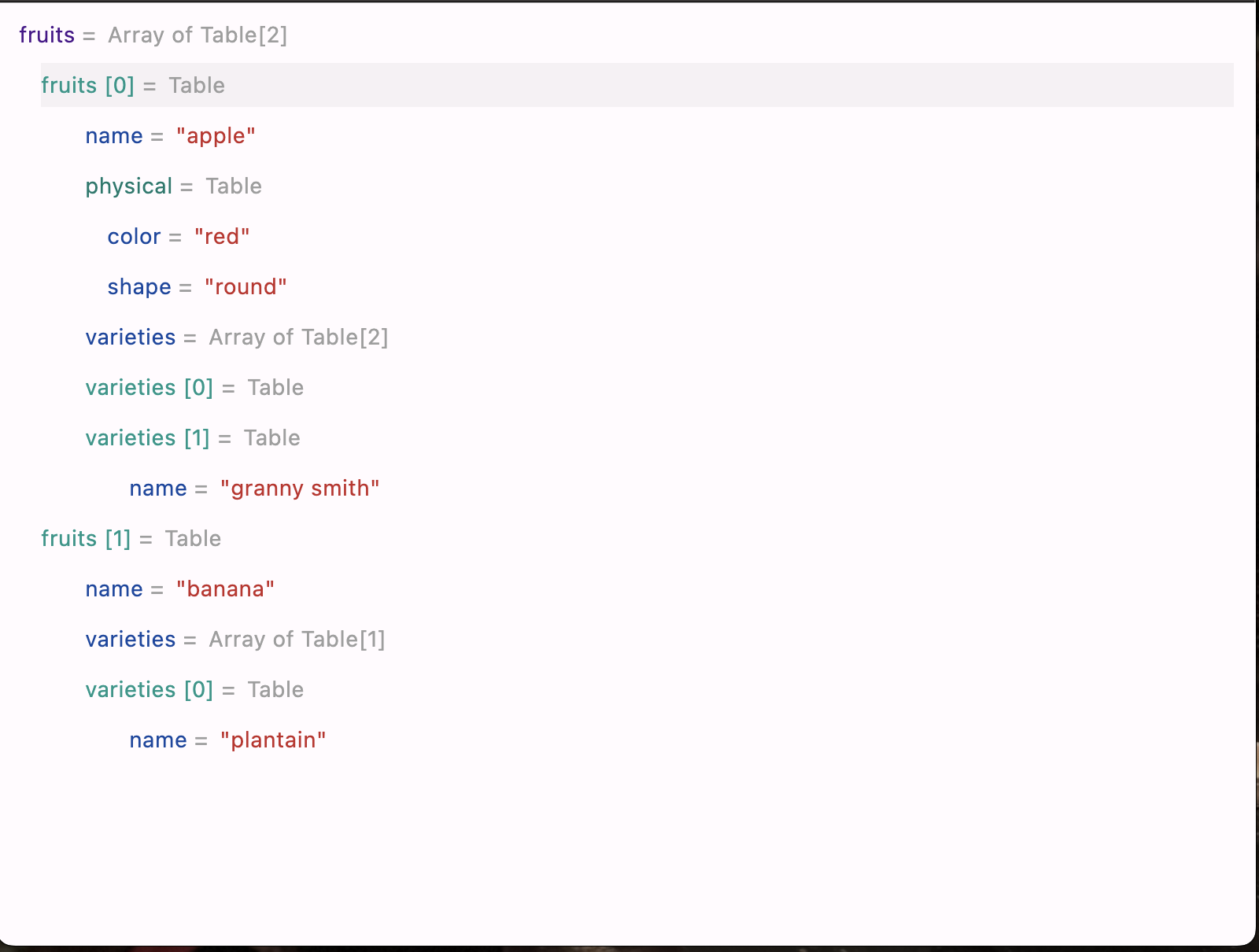
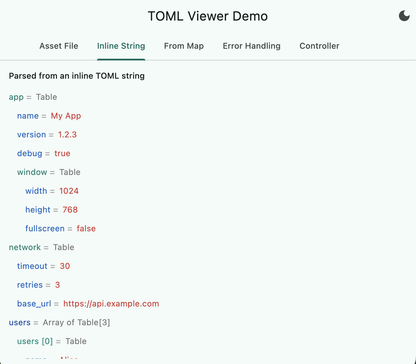
- Three data sources — load from a TOML string, a Flutter asset, or a pre-parsed
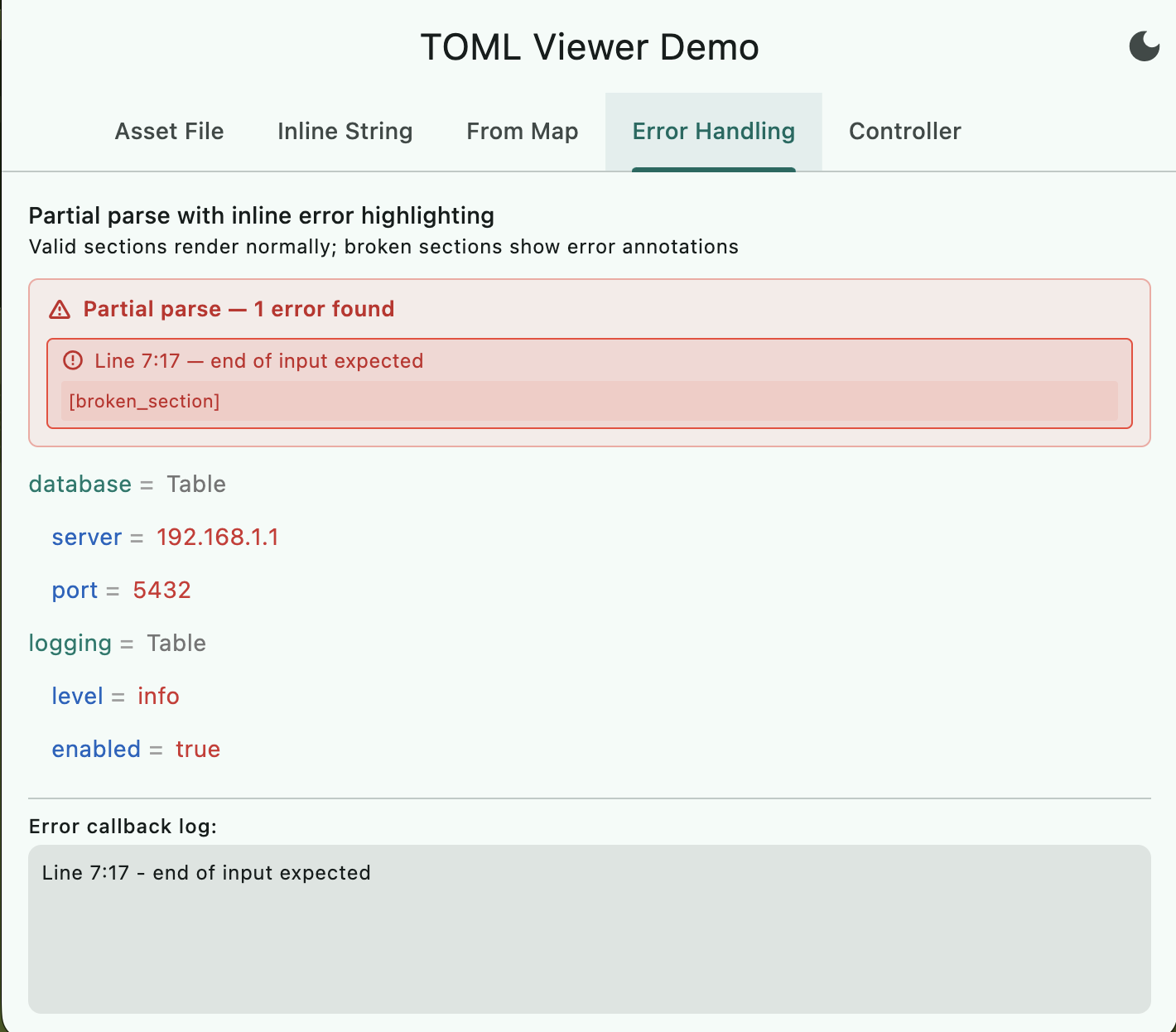
Map. - Partial-parse error handling — valid sections render normally; broken sections show inline error annotations with line numbers and source context.
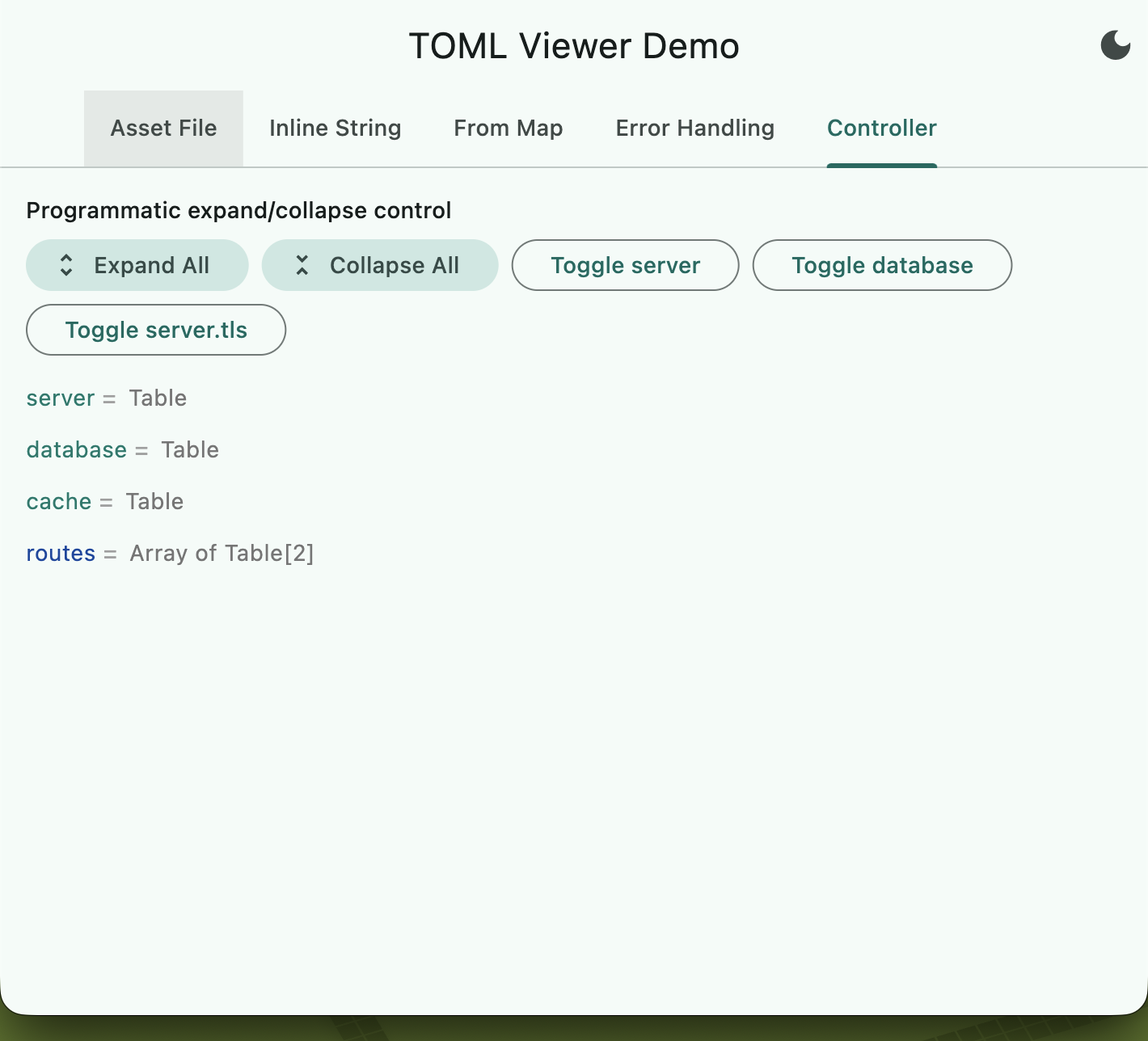
- Expand / collapse — tap any table or array to toggle. Use
TomlExpandControllerfor programmatic control. - Light / Dark theme —
TomlViewerConfig.of(context)auto-adapts to the current theme brightness, or pick.light()/.dark()explicitly. - Custom styling —
TomlViewerStylegives full control over fonts, spacing, indentation, separator text, and expand/collapse icons. - Extensible builders —
keyBuilder,valueBuilder, androwBuilderlet you replace any widget in the tree with your own. - Interaction callbacks —
onValueTapandonValueLongPressfor copy-to-clipboard, navigation, or any custom action. - InheritedWidget theming —
TomlViewerThemeprovides config and style to an entire subtree without prop-drilling. - Performance — large files (>50 KB) parse in a background isolate; root lists >50 entries use
ListView.builder; collapsed subtrees are never built. - Accessibility —
Semanticslabels on every expandable node; RTL-aware layout viaEdgeInsetsDirectional.
Getting Started
Add the dependency to your pubspec.yaml:
dependencies:
  toml_viewer: ^0.2.0
Then import:
import 'package:toml_viewer/toml_viewer.dart';
Usage
From a TOML string
TomlView(content: '''
[server]
host = "localhost"
port = 8080
''')
From a Flutter asset
TomlView.asset('assets/config.toml')
From a pre-parsed Map
TomlView.fromMap({'title': 'My App', 'debug': true})
Light / Dark theme support
// Auto-detect from current Theme brightness:
TomlView(content: toml, config: TomlViewerConfig.of(context))

// Explicit:
TomlView(content: toml, config: TomlViewerConfig.light())
TomlView(content: toml, config: TomlViewerConfig.dark())

// Auto-detect with overrides:
TomlView(
  content: toml,
  config: TomlViewerConfig.of(context, expandMode: false),
)
Custom configuration
TomlView(
  content: tomlString,
  config: const TomlViewerConfig(
    expandMode: false,
    valueColor: Colors.orange,
    rootKeyColor: Colors.indigo,
  ),
)
Error handling
TomlView(
  content: tomlWithErrors,
  config: TomlViewerConfig(
    showInlineErrors: true,
    onParseErrors: (errors) {
      for (final e in errors) {
        debugPrint('Line ${e.line}:${e.column} — ${e.message}');
      }
    },
  ),
)
Custom loading and error widgets
TomlView.asset(
  'assets/config.toml',
  loadingBuilder: (_) => const Text('Loading...'),
  errorBuilder: (_, error) => Text('Failed: $error'),
)
Programmatic expand/collapse
final controller = TomlExpandController(defaultExpanded: false);

// In your widget tree:
TomlView(content: tomlString, expandController: controller)

// Programmatically:
controller.expandAll();
controller.collapse('server.database');
controller.toggle('server.port');
Custom styling (fonts, spacing, icons)
TomlView(
  content: toml,
  config: TomlViewerConfig.of(context).copyWith(
    style: const TomlViewerStyle(
      rootKeyStyle: TextStyle(fontSize: 16, fontWeight: FontWeight.bold),
      valueStyle: TextStyle(fontFamily: 'monospace'),
      indentation: 24,
      separator: ' : ',
      collapsedIcon: Icons.add_circle_outline,
      expandedIcon: Icons.remove_circle_outline,
    ),
  ),
)
Custom value rendering (builders)
TomlView(
  content: toml,
  config: TomlViewerConfig(
    valueBuilder: (context, value, path) {
      if (value is bool) {
        return Icon(value ? Icons.check_circle : Icons.cancel);
      }
      return null; // use default rendering
    },
  ),
)
Interaction callbacks
TomlView(
  content: toml,
  config: TomlViewerConfig(
    onValueTap: (context, key, value, path) {
      Clipboard.setData(ClipboardData(text: value.toString()));
      ScaffoldMessenger.of(context).showSnackBar(
        SnackBar(content: Text('Copied $key')),
      );
    },
  ),
)
InheritedWidget theming
TomlViewerTheme(
  config: TomlViewerConfig.dark(),
  style: const TomlViewerStyle(indentation: 20),
  child: TomlView(content: toml),
)
Configuration Reference
TomlViewerConfig
| Property | Default | Description |
|---|---|---|
expandMode |
true |
Whether nodes start expanded |
valueColor |
Red | Primitive values (strings, numbers, booleans, dates) |
typeTextColor |
Grey | Type labels (Array[3], Table) |
symbolColor |
Grey | The separator symbol |
rootKeyColor |
Blue | Top-level keys |
nonRootKeyColor |
Blue | Nested keys |
keyColor |
Teal | Table (Map) keys |
arrayIndexColor |
Grey | Non-expandable array indices |
arrayExpandableColor |
Teal | Expandable array indices |
errorHighlightColor |
Red | Error annotation background/border |
errorTextColor |
Dark red | Error message text |
showInlineErrors |
true |
Show inline error markers |
errorMessageStyle |
null |
TextStyle override for error text |
onParseErrors |
null |
Callback: void Function(List<TomlParseError>) |
style |
TomlViewerStyle() |
Text and layout styling |
keyBuilder |
null |
Custom key widget builder |
valueBuilder |
null |
Custom value widget builder |
rowBuilder |
null |
Custom row widget builder |
onValueTap |
null |
Tap callback on primitive values |
onValueLongPress |
null |
Long-press callback on primitive values |
TomlViewerStyle
| Property | Default | Description |
|---|---|---|
rootKeyStyle |
null |
TextStyle for top-level keys |
nonRootKeyStyle |
null |
TextStyle for nested keys |
tableKeyStyle |
null |
TextStyle for table keys |
valueStyle |
null |
TextStyle for primitive values |
separatorStyle |
null |
TextStyle for the separator |
typeStyle |
null |
TextStyle for type labels |
arrayIndexStyle |
null |
TextStyle for array indices |
arrayExpandableStyle |
null |
TextStyle for expandable array indices |
indentation |
14.0 |
Pixels per nesting level |
rowSpacing |
4.0 |
Vertical gap between rows |
rowVerticalPadding |
4.0 |
Padding inside each row |
separator |
" = " |
Separator string between key and value |
separatorGap |
3.0 |
Horizontal gap after separator |
collapsedIcon |
chevron_right |
Icon when collapsed (null to hide) |
expandedIcon |
expand_more |
Icon when expanded (null to hide) |
expandIconSize |
16.0 |
Expand/collapse icon size |
expandIconColor |
null |
Icon colour (defaults to symbolColor) |
Screenshots
| Tree View | Inline String | Error Handling |
|---|---|---|
 |
 |
 |
| Controller | Custom Style |
|---|---|
 |
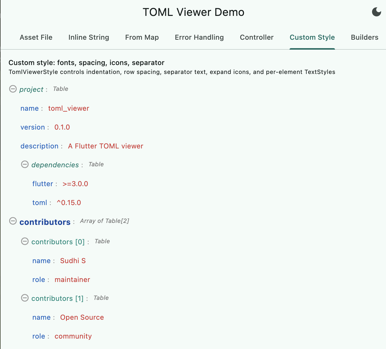 |
Public API
The library exports only what consumers need:
| Export | Description |
|---|---|
TomlView |
Main widget (3 constructors: content, .asset(), .fromMap()) |
TomlViewerConfig |
Colour, behaviour, builder, and callback configuration |
TomlViewerStyle |
Text style, layout, and icon configuration |
TomlViewerTheme |
InheritedWidget for providing config/style to a subtree |
TomlParseResult |
Structured parse result with partial-success support |
TomlParseError |
Individual parse error with line/column/message |
TomlExpandController |
Programmatic expand/collapse ChangeNotifier |
Requirements
- Dart SDK:
>=3.3.3 <4.0.0 - Flutter:
>=3.10.0 - Platforms: Android, iOS, Linux, macOS, Web, Windows
Contributing
Contributions are welcome. Before submitting a PR:
- Run
flutter analyze— zero issues expected. - Run
flutter test— all tests must pass. - Follow the existing code style and commit conventions.
- Update documentation and CHANGELOG if applicable.
Bugs or Requests
Open an issue on GitHub. Feature requests and pull requests are welcome.
License
MIT License. See LICENSE for details.
Author
Sudhi S — GitHub | mail@sudhi.in