Taha Effortless Widgets
taha_effortless_widgets is a Flutter package that provides a collection of reusable and customizable widgets to simplify and enhance your Flutter development process. These widgets are designed to save time and effort, allowing you to focus on building great apps.
 |
 |
Features
- TButton: Customizable button with various states (idle, loading, success, fail).
- TContainer: Flexible container with options for gradients, shadows, and shapes.
- TCarouselIndicators: Carousel indicators with customizable active and inactive states.
- TDottedLine: Dotted line widget with customizable dash length, gap, and color.
- TExpandableWidget: Expandable container with animation for hiding/showing content.
- TGridViewBuilder: Simplified grid view with flexible cross-axis count and spacing.
- TGridView: Fixed-count grid view for arranging items in a grid layout.
- TListView: Customizable list view with optional separators and scroll direction.
- TPageView: Page view widget with customizable scroll direction and page controller.
- TPageViewBuilder: Page view builder widget with customizable scroll direction and page controller.
- TRichText: Rich text widget for combining multiple text styles in a single widget.
- TTextFormField: Flexible text form field with extensive customization options.
- TText: Simplified text widget with options for styling and shadow.
- TVisibility: Conditional visibility widget for showing or hiding content.
- Notch: Decorative notch for UI separation.
- VerticalSpace & HorizontalSpace: Widgets for adding vertical or horizontal spacing.
- VerticalLine & HorizontalLine: Widgets for drawing vertical or horizontal lines.
- TCircularProgress: Customizable circular progress indicator.
Installation
Add taha_effortless_widget to your pubspec.yaml:
dependencies:
  taha_effortless_widget: ^0.0.1
Examples
We will implement this design in two different ways
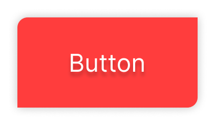
1- Normal Code with flutter
GestureDetector(
  onTap: () {

              },
              child: Container(
                padding: const EdgeInsets.symmetric(
                  horizontal: 20,
                  vertical: 10,
                ),
                decoration: BoxDecoration(
                  color: Colors.redAccent,
                  borderRadius: const BorderRadius.only(
                    topLeft: Radius.circular(10),
                    bottomRight: Radius.circular(10),
                  ),
                  boxShadow: [
                    BoxShadow(
                        blurRadius: 5,
                        spreadRadius: 3,
                        color: Colors.black.withOpacity(0.05))
                  ],
                ),
                child: const Text(
                  "Button",
                  style: TextStyle(
                    color: Colors.white,
                    fontSize: 18,
                    fontWeight: FontWeight.w300,
                    shadows: [
                      BoxShadow(
                        color: Colors.black26,
                        blurRadius: 5,
                        blurStyle: BlurStyle.outer,
                        spreadRadius: 2,
                        offset: Offset(3, 0),
                      ),
                    ],
                  ),
                ),
              ),
            ),
2- Code using effortless widgets
 TButton(
   onTap: () {},
  backgroundColor: Colors.redAccent,
  radius: 10,
  withShadow: true,
  radiusSides: const [RadiusSides.topLeft, RadiusSides.bottomRight],
  child: const TText(
  "Button",
  color: Colors.white,
  withShadow: true,
  ),
),
Contributing
Contributions are welcome! Please open an issue or submit a pull request if you have any improvements or suggestions.
License
This project is licensed under the MIT License. See the LICENSE file for more details.
Author
Developed by Taha Chabana.