Syntaxify ⚡
The Flutter UI Compiler. Define once, compile to any design system. Build Your Next Flutter App Designs in Minutes, And Toggle Design Systems in Seconds, throughout the app with Syntaxify.
Stop writing repetitive UI code. Define components once, render in any design system.


👀 See It In Action
Check out the example app - A working Flutter app demonstrating all features with live style switching!
cd example && flutter run
⚡ Quick Win: Generate Screens in Seconds
// Create meta/login.screen.dart
final loginScreen = ScreenDefinition(
  id: 'login',
  appBar: App.appBar(title: 'Login'),
  layout: App.column(children: [
    App.text(text: 'Welcome', variant: TextVariant.headlineLarge),
    App.textField(label: 'Email', keyboardType: KeyboardType.email),
    App.textField(label: 'Password', obscureText: true),

    // New Interactive Components
    App.row(children: [
        App.checkbox(label: 'Remember me', binding: 'rememberMe'),
        App.toggle(label: 'Dark Mode', binding: 'isDarkMode'),
    ]),
    App.slider(min: 0, max: 100, binding: 'volume'),

    App.button(label: 'Login', onPressed: 'handleLogin'),
  ]),
);
Run: dart run syntaxify build
Get: Complete Flutter screen in lib/screens/login_screen.dart
// GENERATED by Syntaxify

import 'package:flutter/material.dart';
import 'package:test_app/syntaxify/index.dart';
import 'package:test_app/syntaxify/design_system/design_system.dart';

class LoginScreen extends StatefulWidget {
  const LoginScreen({super.key, this.handleLogin});

  final VoidCallback? handleLogin;

  @override
  State<LoginScreen> createState() => _LoginScreenState();
}

class _LoginScreenState extends State<LoginScreen> {
  late final TextEditingController _emailController;

  late final TextEditingController _passwordController;

  bool _rememberMe = false;

  bool _isDarkMode = false;

  double _volume = 0.0;

  @override
  void initState() {
    super.initState();
    _emailController = TextEditingController();
    _passwordController = TextEditingController();
  }

  @override
  void dispose() {
    _emailController.dispose();
    _passwordController.dispose();
    super.dispose();
  }

  @override
  Widget build(BuildContext context) {
    return Scaffold(
      appBar: AppBar(title: AppText(text: 'Login')),
      body: Column(
        children: [
          AppText(text: 'Welcome', variant: TextVariant.headlineMedium),
          AppInput(
            label: 'Email',
            controller: _emailController,
            keyboardType: TextInputType.emailAddress,
          ),
          AppInput(
            label: 'Password',
            controller: _passwordController,
            obscureText: true,
          ),
          Row(
            children: [
              AppCheckbox(
                value: _rememberMe,
                onChanged: (value) {
                  setState(() {
                    _rememberMe = value ?? false;
                  });
                },
              ),
              SizedBox(width: 8),
              Text('Remember me'),
            ],
          ),
          Row(
            mainAxisAlignment: MainAxisAlignment.spaceBetween,
            children: [
              Text('Dark Mode'),
              AppToggle(
                value: _isDarkMode,
                onChanged: (value) {
                  setState(() {
                    _isDarkMode = value;
                  });
                },
              ),
            ],
          ),
          AppSlider(
            value: _volume,
            onChanged: (value) {
              setState(() {
                _volume = value;
              });
            },
            min: 0.0,
            max: 100.0,
          ),
          AppButton(
            label: 'Login',
            onPressed: widget.handleLogin,
            variant: ButtonVariant.primary,
          ),
        ],
      ),
    );
  }
}
No boilerplate. No repetition. Just results. ✨
🤔 Why Syntaxify?
The Problem: Flutter's Design System Scalability Crisis
Flutter developers face a fundamental dilemma when building production apps:
The Multi-Platform UI Duplication Problem:
- Material Design for Android
- Cupertino for iOS
- Custom designs for brand identity
Traditional approach means writing everything 3 times:
// You write this for EVERY component!
Widget buildButton() {
  if (Platform.isIOS) {
    return CupertinoButton(
      onPressed: onPressed,
      child: Text(label),
    );
  } else if (useCustom) {
    return CustomButton(
      onPressed: onPressed,
      label: label,
    );
  } else {
    return ElevatedButton(
      onPressed: onPressed,
      child: Text(label),
    );
  }
}
Real-World Impact:
- 🏢 Large Apps: 100+ screens, 1000+ components
- 👥 Team Scale: Multiple developers, changing requirements
- 🔄 Maintenance Nightmare: "Change all buttons to rounded corners" = touching 500+ files
- 💸 Cost: "Toggle from Material to Cupertino" = rewriting the entire app
- 🎨 Design Changes: "Our designer wants a custom look" = building everything from scratch
The Solution: Separation of WHAT and HOW
Syntaxify delivers on Flutter's original promise: "write once, run anywhere" - but for design systems.
With Syntaxify:
// Write once
AppButton(label: 'Click Me', onPressed: ...)

// Renders appropriately everywhere
AppTheme(style: MaterialStyle())   // Material on Android
AppTheme(style: CupertinoStyle())  // iOS-native on iPhone
AppTheme(style: NeoStyle())        // Custom brand design
Change your entire app's design system in one line:
// Before: Material Design
AppTheme(style: MaterialStyle(), child: MyApp())

// After: iOS-native Cupertino
AppTheme(style: CupertinoStyle(), child: MyApp())
// Zero component code changes needed!
What Makes Syntaxify Different
Most Flutter solutions offer partial fixes:
- ❌ Widget libraries - Still manual integration, not design-system-aware
- ❌ Themes - Only styling, not structure
- ❌ Code generation - Not multi-platform aware
Syntaxify combines all three:
- ✅ Code generation - Eliminate boilerplate
- ✅ Design system architecture - WHAT vs HOW separation
- ✅ Multi-platform rendering - One component, any design
- ✅ Type-safe APIs - Compile-time safety
🎨 The Design System Architecture
The Renderer Pattern
Syntaxify uses a unique renderer pattern that separates concerns:
WHAT (Component Definition):
AppButton.primary(
  label: 'Click Me',
  onPressed: () => print('Hello!'),
)
HOW (Style Rendering):
- Material: Renders as
ElevatedButtonwith Material Design tokens - Cupertino: Renders as
CupertinoButtonwith iOS styling - Neo: Renders with modern, neumorphic design
The Magic: Same component code, different visual output based on AppTheme:
AppTheme(
  style: MaterialStyle(),  // or CupertinoStyle() or NeoStyle()
  child: MaterialApp(home: YourApp()),
)
Why This Matters
- Write Once, Render Anywhere - One component definition works across all design systems
- Easy Theme Switching - Change one line to switch your entire app's design
- Consistent Behavior - Button logic stays the same, only visuals change
- Custom Styles - Create your own design system by implementing
DesignStyle
📦 What's Currently Available
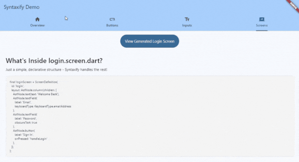
🌟 Screen Generation from .screen.dart Files (Star Feature!)
The fastest way to build Flutter screens:
// meta/login.screen.dart
final loginScreen = ScreenDefinition(
  id: 'login',
  layout: App.column(children: [
    App.text(text: 'Welcome Back'),
    App.textField(label: 'Email'),
    App.button(label: 'Sign In', onPressed: 'handleLogin'),
  ]),
);
Run syntaxify build → Get a complete Flutter screen!
- ✅ Generate entire screens from simple definitions
- ✅ Editable after generation (you own the code)
- ✅ Type-safe callbacks and imports
- ✅ Proper structure and scaffolding
- ✅ No boilerplate, no repetition
✅ Supported Components
Syntaxify's component system is categorized into three types:
1. Interactive Nodes (Design System Wrappers)
These nodes render using the active DesignStyle (Material/Cupertino/Neo).
- AppButton (
App.button) - With variants (primary, secondary, etc.) - AppInput (
App.textField) - Text fields with validation - AppCheckbox (
App.checkbox) - Tri-state checkboxes - AppToggle (
App.toggle) - Toggle switches - AppSlider (
App.slider) - Range sliders - AppRadio (
App.radio) - Radio groups
2. Structural Nodes (Layout)
These define the layout structure of your screen.
- Column/Row (
App.column,App.row) - Container (
App.container) - Card (
App.card) - ListView/GridView (
App.listView,App.gridView) - Stack (
App.stack)
3. Primitive Nodes (Display)
Basic display elements without complex interaction.
- Text (
App.text) - Icon (
App.icon) - Image (
App.image) - Divider (
App.divider)
7 interactive components × 3 styles = 21 styled variants!
🛠️ Custom Components (NEW in v0.2.0)
You can define any custom component (e.g., Card, Avatar), and Syntaxify will:
- ✅ Generate the component class (
AppCard) - ✅ Add a
renderCard()method toDesignStyle - ✅ Generate stub renderers (
MaterialCardRenderer, etc.) that you can implement
How It Works:
- Define your component in
meta/card.meta.dart:
@SyntaxComponent(
  name: 'Card',
  variants: ['elevated', 'outlined'],
)
class CardMeta {
  final Widget child;
  final CardVariant variant;
}
-
Run
syntaxify build→ Generator creates:lib/syntaxify/generated/components/app_card.dartlib/syntaxify/design_system/components/card/material_renderer.dart(stub)- Updates
DesignStylewithWidget renderCard(...)
-
Implement the renderer (optional - stubs work by default):
mixin MaterialCardRenderer on DesignStyle {
  @override
  Widget renderCard({required Widget child, required CardVariant variant}) {
    return Card(
      child: child,
      elevation: variant == CardVariant.elevated ? 4 : 0,
    );
  }
}
Result: Your custom component works with ALL design styles automatically!
🚀 Complete Getting Started Guide
Step 1: Install Syntaxify
Option A: From pub.dev (Recommended)
# pubspec.yaml
dev_dependencies:
  syntaxify: ^0.2.0
Then run:
dart pub get
Option B: From GitHub (Latest)
# pubspec.yaml
dev_dependencies:
  syntaxify:
    git:
      url: https://github.com/ihardk/syntaxify.git
      ref: v0.2.0
      path: generator
Optional: Global Installation
If you want syntaxify available system-wide (not just in your project):
dart pub global activate syntaxify
Then you can run syntaxify commands from anywhere. Otherwise, use dart run syntaxify in your project.
Step 2: Initialize Your Project
cd your_flutter_project
dart run syntaxify init
This creates:
meta/- Where you define component APIslib/syntaxify/design_system/- Customizable design system
Step 3: Define Components
Edit meta/button.meta.dart:
import 'package:syntaxify/syntaxify.dart';

@SyntaxComponent(description: 'A customizable button')
class ButtonMeta {
  /// The button label text
  @Required()
  final String label;

  /// The action to trigger (e.g. 'action:login')
  @Optional()
  final String? onPressed;

  /// Button variant (filled, outlined, etc)
  @Optional()
  final String? variant;

  /// Button size (sm, md, lg)
  @Optional()
  final String? size;

  /// Whether the button shows loading state
  @Optional()
  @Default('false')
  final bool isLoading;

  /// Whether the button is disabled
  @Optional()
  @Default('false')
  final bool isDisabled;
}
Step 4: Build
dart run syntaxify build
This generates:
lib/syntaxify/generated/components/app_button.dart- The componentlib/syntaxify/design_system/- Design system files (Material, Cupertino, Neo)lib/syntaxify/index.dart- Barrel export
Step 5: Use in Your App
import 'package:flutter/material.dart';
import 'package:your_app/syntaxify/index.dart';

void main() {
  runApp(
    AppTheme(
      style: MaterialStyle(),  // Try CupertinoStyle() or NeoStyle()!
      child: MaterialApp(
        home: Scaffold(
          body: Center(
            child: AppButton.primary(
              label: 'Click Me',
              onPressed: () => print('Hello from Syntaxify!'),
            ),
          ),
        ),
      ),
    ),
  );
}
Step 6: Generate Screens (Optional)
Create meta/login.screen.dart:
import 'package:syntaxify/syntaxify.dart';

final loginScreen = ScreenDefinition(
  id: 'login',
  layout: App.column(children: [
    App.text(text: 'Welcome Back'),
    App.textField(label: 'Email', keyboardType: KeyboardType.emailAddress),
    App.textField(label: 'Password', obscureText: true),
    App.button(label: 'Sign In', onPressed: 'handleLogin'),
  ]),
);
Run dart run syntaxify build again - generates lib/screens/login_screen.dart (editable!)
🎯 Real-World Example
Before Syntaxify (Manual Approach)
Material Button:
ElevatedButton(
  onPressed: onPressed,
  style: ElevatedButton.styleFrom(
    backgroundColor: Colors.blue,
    padding: EdgeInsets.all(16),
  ),
  child: Text(label),
)
Cupertino Button:
CupertinoButton.filled(
  onPressed: onPressed,
  padding: EdgeInsets.all(16),
  child: Text(label),
)
Custom Button:
Container(
  decoration: BoxDecoration(
    gradient: LinearGradient(...),
    borderRadius: BorderRadius.circular(12),
    boxShadow: [BoxShadow(...)],
  ),
  child: Material(
    color: Colors.transparent,
    child: InkWell(
      onTap: onPressed,
      child: Padding(
        padding: EdgeInsets.all(16),
        child: Text(label),
      ),
    ),
  ),
)
Problem: 3 different implementations, hard to maintain, inconsistent behavior.
After Syntaxify
One Definition:
AppButton.primary(label: 'Submit', onPressed: handleSubmit)
Three Renderings:
- Wrap with
MaterialStyle()→ Material Design - Wrap with
CupertinoStyle()→ iOS Design - Wrap with
NeoStyle()→ Modern Design
Result: Consistent API, different visuals, easy to switch.
📂 Project Structure
your_project/
├── meta/                          # YOU EDIT: Component & screen definitions
│   ├── button.meta.dart
│   ├── input.meta.dart
│   ├── text.meta.dart
│   ├── login.screen.dart
│   └── app_icons.dart
│
└── lib/
    ├── screens/                   # EDITABLE: Generated screens
    │   └── login_screen.dart      # Generated once, then you own it
    │
    └── syntaxify/
        ├── design_system/         # CUSTOMIZABLE: Styles & tokens
        │   ├── design_system.dart
        │   ├── app_theme.dart
        │   ├── styles/
        │   │   ├── material_style.dart
        │   │   ├── cupertino_style.dart
        │   │   └── neo_style.dart
        │   └── tokens/
        │       ├── button_tokens.dart
        │       └── input_tokens.dart
        │
        ├── generated/             # DON'T EDIT: Auto-regenerated
        │   └── components/
        │       ├── app_button.dart
        │       ├── app_input.dart
        │       └── app_text.dart
        │
        └── index.dart             # Barrel export
📖 API Reference
For detailed API documentation, see API Reference.
Quick Overview:
| Component | Description |
|---|---|
AppButton |
Primary, secondary, outlined button variants |
AppText |
Typography with 6 text style variants |
AppInput |
Text fields with keyboard types & validation |
AppCheckbox |
Checkboxes with design-aware styling |
AppToggle |
Toggle switches |
AppSlider |
Range sliders with custom themes |
AppRadio |
Radio buttons |
Design Styles: MaterialStyle(), CupertinoStyle(), NeoStyle()
Import: import 'package:your_app/syntaxify/index.dart';
🔄 Development Workflow
- Define - Edit
meta/*.meta.dartto define component APIs - Build - Run
dart run syntaxify buildto generate implementations - Use - Import from
package:your_app/syntaxify/and use - Customize - Edit design system tokens in
lib/syntaxify/design_system/ - Toggle Styles - Change
AppTheme(style: ...)to try different designs
Understanding Generated Code
Important: Two types of generated code with different lifecycles:
Components (Regenerate Every Build)
Location: lib/syntaxify/generated/components/
Behavior: Regenerated on EVERY syntaxify build
Rule: ⚠️ DO NOT EDIT - Your changes will be lost!
// lib/syntaxify/generated/components/app_button.dart
// This file is REGENERATED on every build
class AppButton extends StatelessWidget {
  // Generated code - DO NOT MODIFY
}
Screens (Generate Once)
Location: lib/screens/
Behavior: Generated ONCE, then YOU own it
Rule: ✅ FREELY EDIT - Won't be overwritten
// lib/screens/login_screen.dart
// Generated once, then it's yours to edit
class LoginScreen extends StatelessWidget {
  // Edit this freely - it won't be regenerated
}
What happens when you rebuild?
- Components: Completely regenerated from meta files
- Screens: Skipped (only generated if file doesn't exist)
🛠️ Advanced Usage
For advanced topics, see the detailed documentation:
- Design System Guide - Creating custom design styles, renderer pattern
- API Reference - Build options, CLI commands
🐛 Troubleshooting
Having issues? See Troubleshooting Guide for common errors and solutions.
Quick fixes:
TextVariant.headline→ UseTextVariant.headlineMediumKeyboardType.email→ UseTextInputType.emailAddress- Component not updating? → Edit
meta/*.meta.dart, not generated files
Need help? GitHub Issues
✨ Features
- AST-Based Generation - Type-safe, declarative UI definitions
- Renderer Pattern - Separates WHAT (behavior) from HOW (rendering)
- Multi-Style Support - Material, Cupertino, Neo (3 components currently, more coming)
- Smart Defaults - Auto-detects project structure
- Screen Generation - Generate editable screen scaffolds
- Design Tokens - Centralized styling with tokens
- Git-Friendly - Clean, readable generated code
- Extensible - Create custom design styles by implementing
DesignStyle
🗺️ Roadmap
v0.2.0 (Current)
- ✅ Core architecture with renderer pattern
- ✅ 7 components (Button, Text, Input, Checkbox, Toggle, Slider, Radio)
- ✅ 3 design styles (Material, Cupertino, Neo)
- ✅ Screen generation
- ✅ Configuration file (
syntaxify.yaml) - ✅ Watch mode (
--watch) - ✅ Dry run mode (
--dry-run) - ✅ 303 tests passing
v0.3.0 (Next)
- 🔄 More components
- 🔄 Golden tests for visual regression
- 🔄 Improved error messages
v1.0.0 (Future)
- 🔮 Complete component library
- 🔮 Theme editor UI
- 🔮 VS Code extension
- 🔮 Component marketplace
📚 Documentation
| Guide | Description |
|---|---|
| Getting Started | Installation & first steps |
| API Reference | Component usage & options |
| Design System | Renderer pattern & custom styles |
| Troubleshooting | Common issues & solutions |
| User Manual | Comprehensive user guide |
| Developer Manual | Architecture & contributing |
🤝 Contributing
See Developer Manual for architecture details and contribution guidelines.
📄 License
MIT License - See LICENSE for details
Built with ❤️ for Flutter developers who value consistency, productivity, and beautiful code
Libraries
- generator
- lints/layout_node_lints
- syntaxify
- Syntaxify UI code generator
- syntaxify_lints